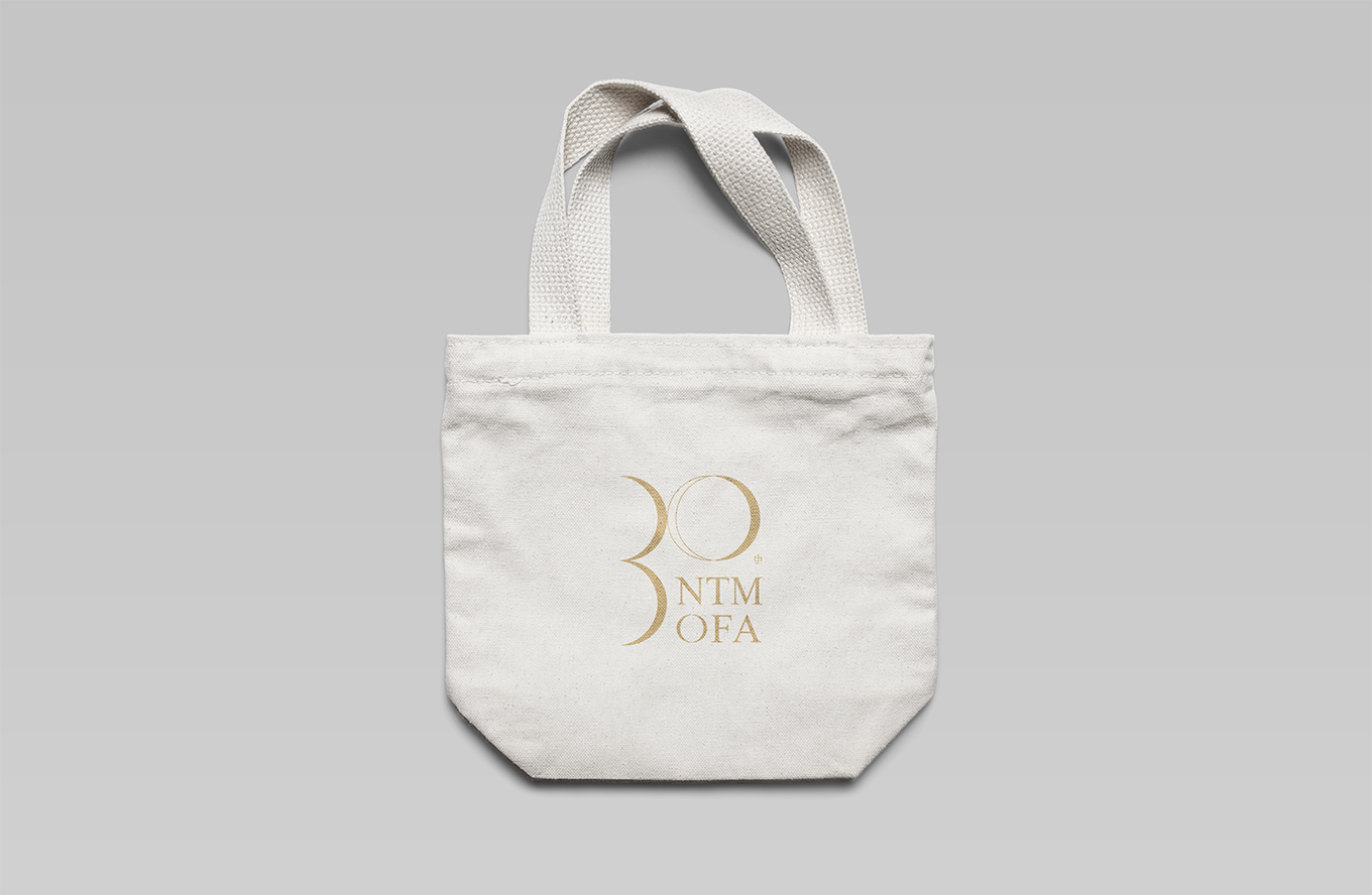
NTMOFA
NTMOFA 30 Years Anniversary
Event Identity Design
品牌 : 國立台灣美術館
Client : National Taiwan Museum of Fine Art
Brand : NTMOFA
Published on 11. 06. 2018
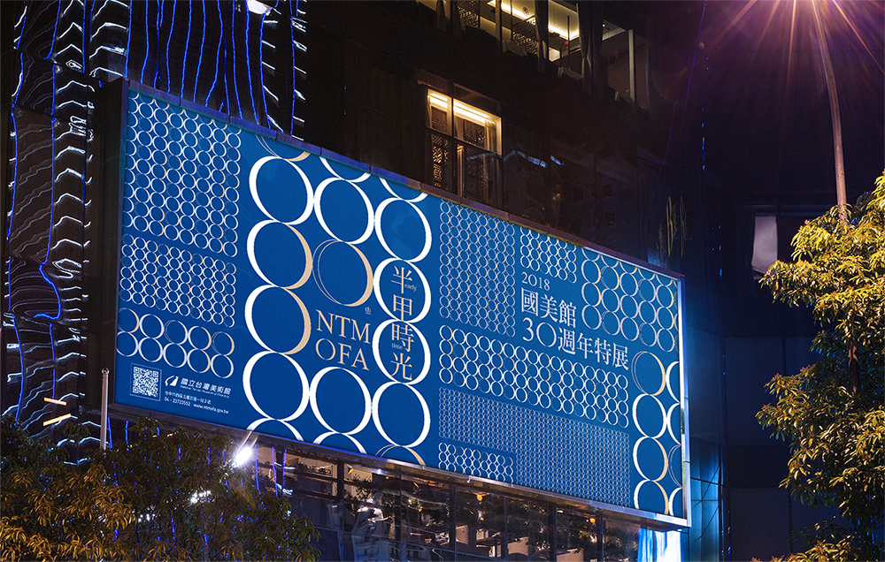
NTMOFA
NTMOFA 30 Years Anniversary
Event Identity Design
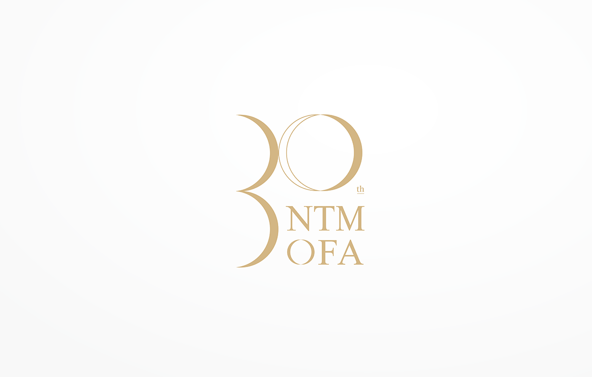
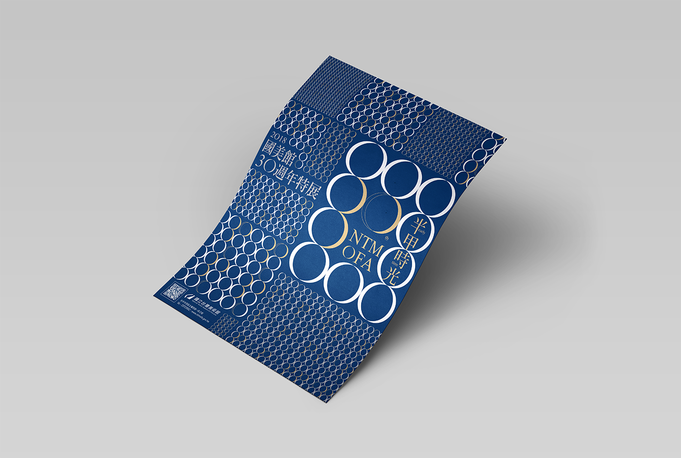
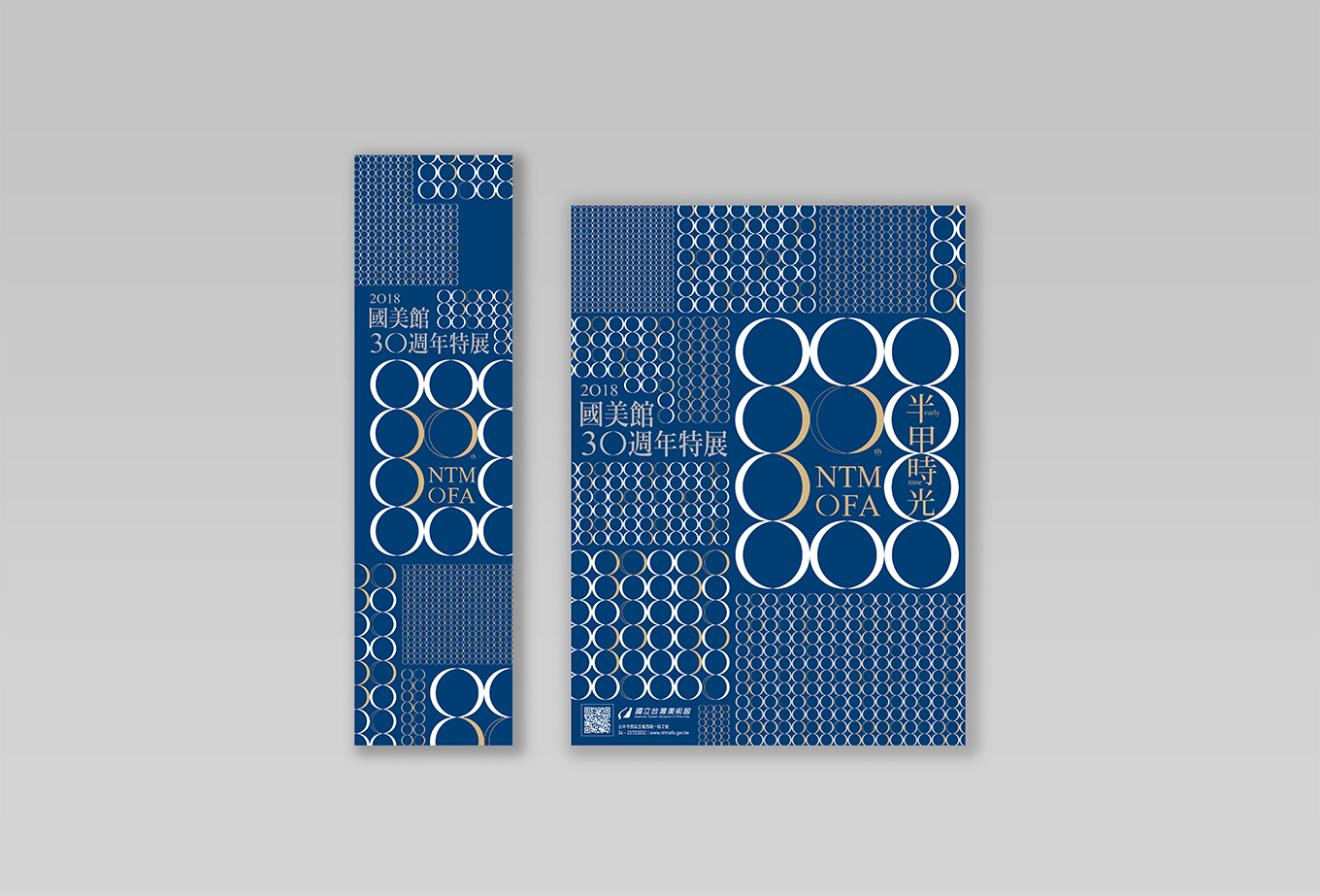
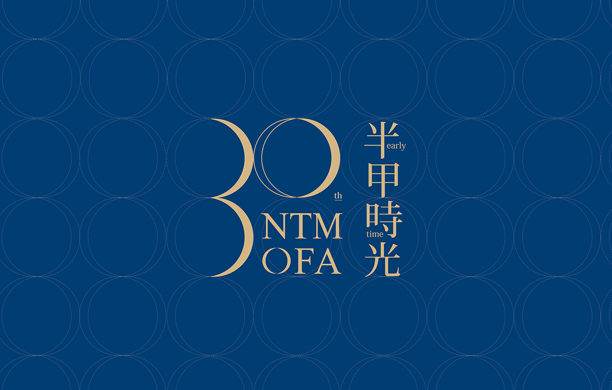
30歲,是帶著一些赤子心、一些浪漫情懷,經歷了數載時光堆砌,慢慢從細長缺口漸漸累積成一個完整的圓。
屆滿國美館30週年,美可特發揮同樣醞釀30年的文化設計力,以相同的心情設計了本次的活動識別。
概念取自60為一甲子、30為「半甲」的延伸,透過剖半手法與上下弦月的組合傳達時光遞移流轉,貫穿國美館形塑一個「穿越」的空間體驗為建築理念,也意味著國美館與藝術產生對話的過程與變化,以白、金、深藍的色系組合營造出時光漫走與積累30年的歷史深度。
Thirty years, is with a little bit childish mind, is with little romance. From zero to a complete circle takes three decades.While NTMOFA is passing through the thirty years anniversary as long as Victor, and we design this visual identity with the same mind of the 30th anniversary.
Sixty years is a time circle in Chinese tradition, and three decades is a half-circle as the main concept, combine the half circle and the first quarter of moon with white, gold and dark blue for creating the feeling of time passing and the 30 years of historical depth.