CHFOODS
Retro Series
Packaging Design
品牌 : 中祥食品
Client : CHUNG HSIANG FOODS IND CO., LTD.
Brand : CHFOODS
Published on 07. 24. 2014
CHFOODS
Retro Series
Packaging Design
陪你經典走過,邁向五十!
1966年,《中祥食品》成立前,親切的叔公-李金水以及敦厚的老闆-李武麒,叔姪倆從學徒做起,親手製作了美味的蘇打餅乾。1970年,他們攜手創立了《中祥食品》,之後倚靠著【自然の顏】系列蘇打餅打響名號,從純樸的手工製餅到設廠機械化的生產,始終不變的用心與專業,讓產品遍佈國內外各大通路,至今,即將邁向第五十個年頭…
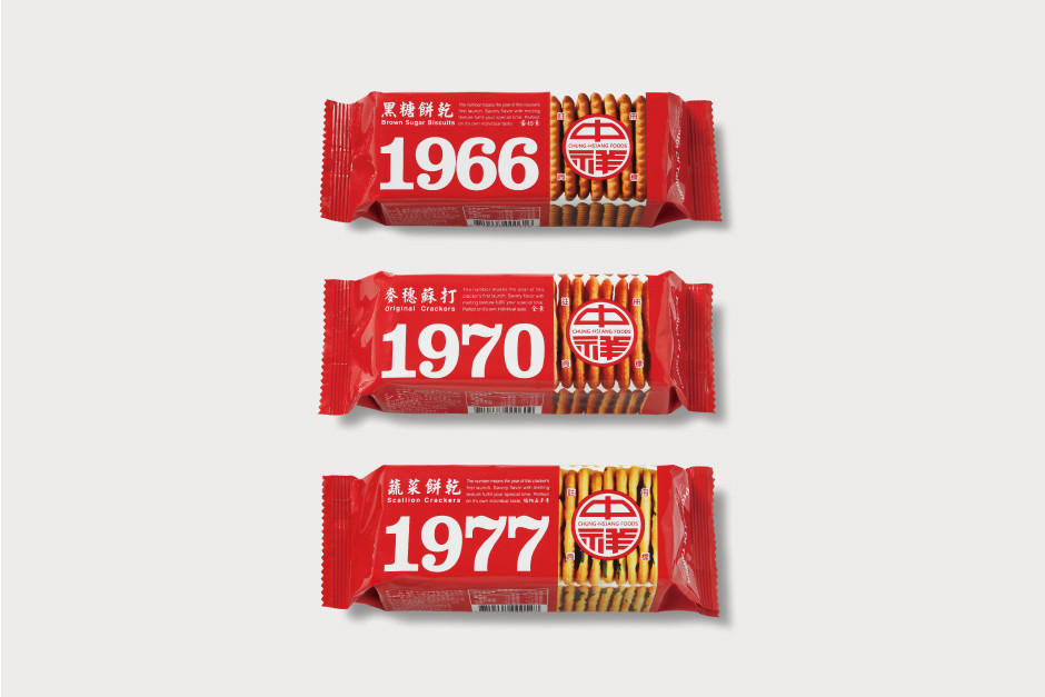
第五十個年頭,要怎麼不一樣?先從每個人對蘇打餅的最初印象、記憶中的經典紅色Logo透明包裝開始…因應現代飲食趨勢,減少份量的條裝包裝,攜帶輕便,餅乾大小也合乎適口性,一口一片剛剛好;另微調品牌識別,以《中祥食品》深植人心的經典大紅色,強烈的為復古系列重新做出詮釋。每款包裝上清楚標示出產品口味所推出的年份,別具懷舊意義;1966年問世的黑糖餅乾、1970年的麥穗蘇打、1977年推出的蔬菜餅乾,以包裝設計,娓娓道出品牌重要大記事;而包材選擇上,以不透光性的鋁製包材,有效隔絕空氣與光線,也提高了蘇打餅的保存性,並仿擬開窗的形式,看得見蘇打餅側面,增添安心感與趣味。
Towards fifty, walk through the classic with you.
In 1966, before Chung Hsiang Food was established, the boss Wu-Chi Li with his uncle Jin-Shui Li started as apprentices and learn how to make soda crackers. In 1977, they founded “Chung Hsiang Food”, and became famous for the natural face series of soda crackers. Their attention and profession were never changed, from hand-made cookies to mechanized development. And now, is about heading five decades.
What will be different in the five decades? Let’s start with the first imaging of soda crackers, which is the classic red logo on the transparency package. The classic red of “Chung Hsiang Food” is deeply rooted in people’s minds, so we keep the red and make a strong retro series, moreover, minute adjustments the branding identity. Using the packaging tells the important things of the brand in each age, so there are different years of the product released on the package that shows nostalgia, from the brown sugar cookies in 1966, wheat soda in 1970 to the vegetable cookies in 1977. Furthermore, the opaque aluminum material isolated the air and light which also increases the preservation.