Branding visual
identity design
品牌 : 福忠字號
Client : FU CHUNG
Brand : FU CHUNG
Published on 03. 11. 2015
2015 Golden Pin Design Award

2016 台灣年度傑出設計公司 商業設計類金獎
2016 Taiwan Advertlsers' Assoclation

Branding visual
identity design
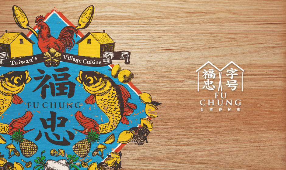
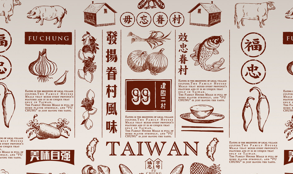
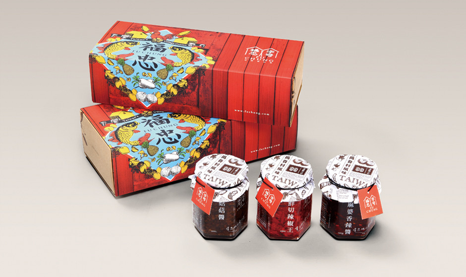
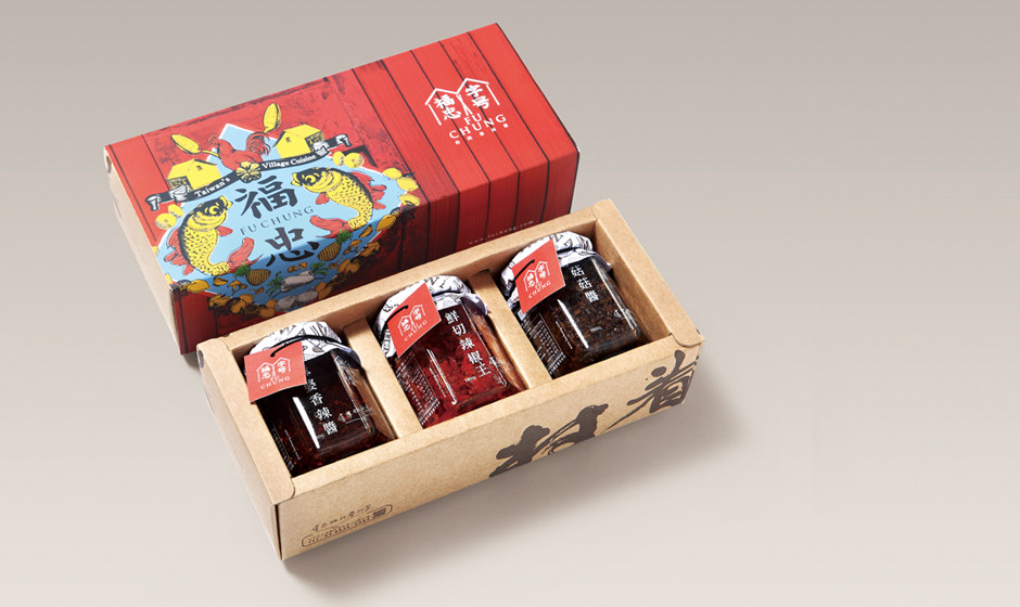
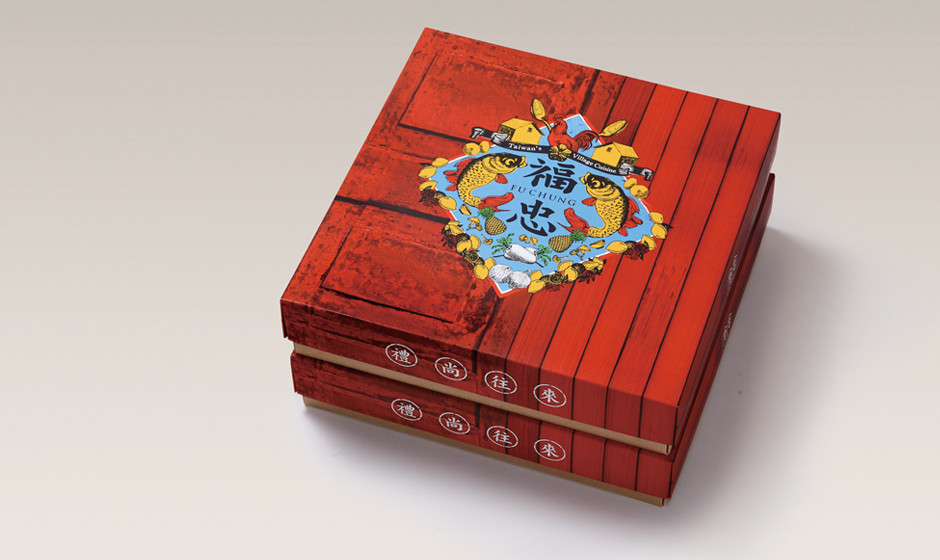
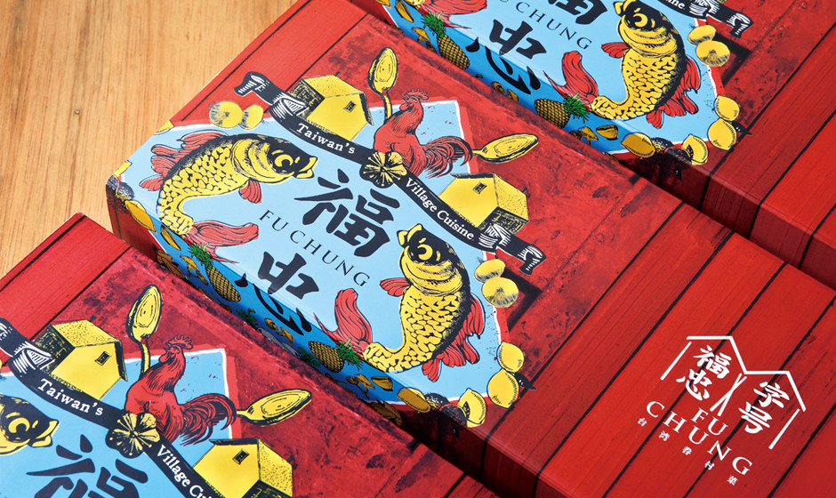
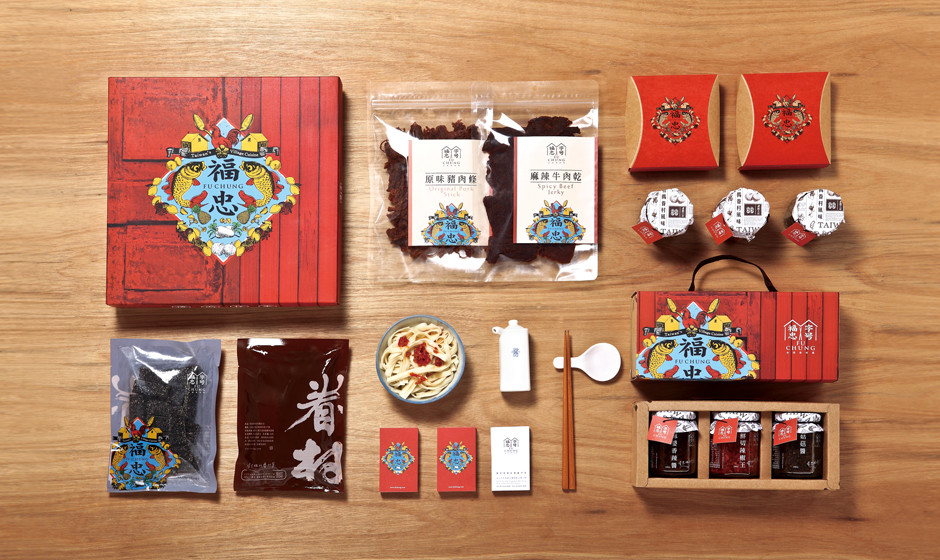
眷村,1949年起至1960年代,是台灣特殊建築與居住型態,乘載了許多人的成長記憶與生命經驗,也是珍貴的文化資產,品牌《福忠字號》藉由眷村飲食,濃縮出常民生活的樣貌,發揚台灣眷村風味。
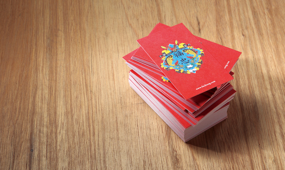
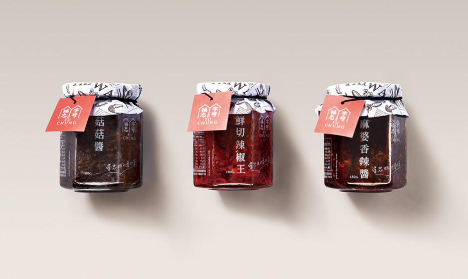
毋忘眷村,設計概念保留台灣老眷村印象,融入現代美術風格,建構出形象與包裝的整體感;強化品牌識別《福忠字號》中文四字的比重,將臺灣眷村風味的清晰大器提煉出來,運用筷子的意象,撐起最家常的眷村飲食風味;更以紅磚色為主色,輔助圖騰凝聚眷村生活軌跡,將其轉化再造設計元素,運用真筆插畫,描繪出眷村物件與樣貌,每一筆畫都是眷戀,都是老家的味道;另外,更加強產品系統化、重新建構商品的中英文字體規範系統,改善銷售排面的統一性。
The family village is a special type of architecture and residence in Taiwan from 50th to 60th, which is a precious cultural treasure and the growth memory and life experience for many people. Fu Chung shows the village lifestyle by cuisine, and additionally, carries forward Taiwanese Village flavor. The old Taiwanese village image as the concept creates visual identity and package by blending with the modern art style, furthermore, making the overall style. Bringing out the Taiwanese village flavor by strengthening the visual identity proportion of《FU CHUNG》, the chopsticks is representing the warming home flavor. The brick red is the main color, the auxiliary pattern represents the village life, moreover, the hand drawing style shows the warm and the home.