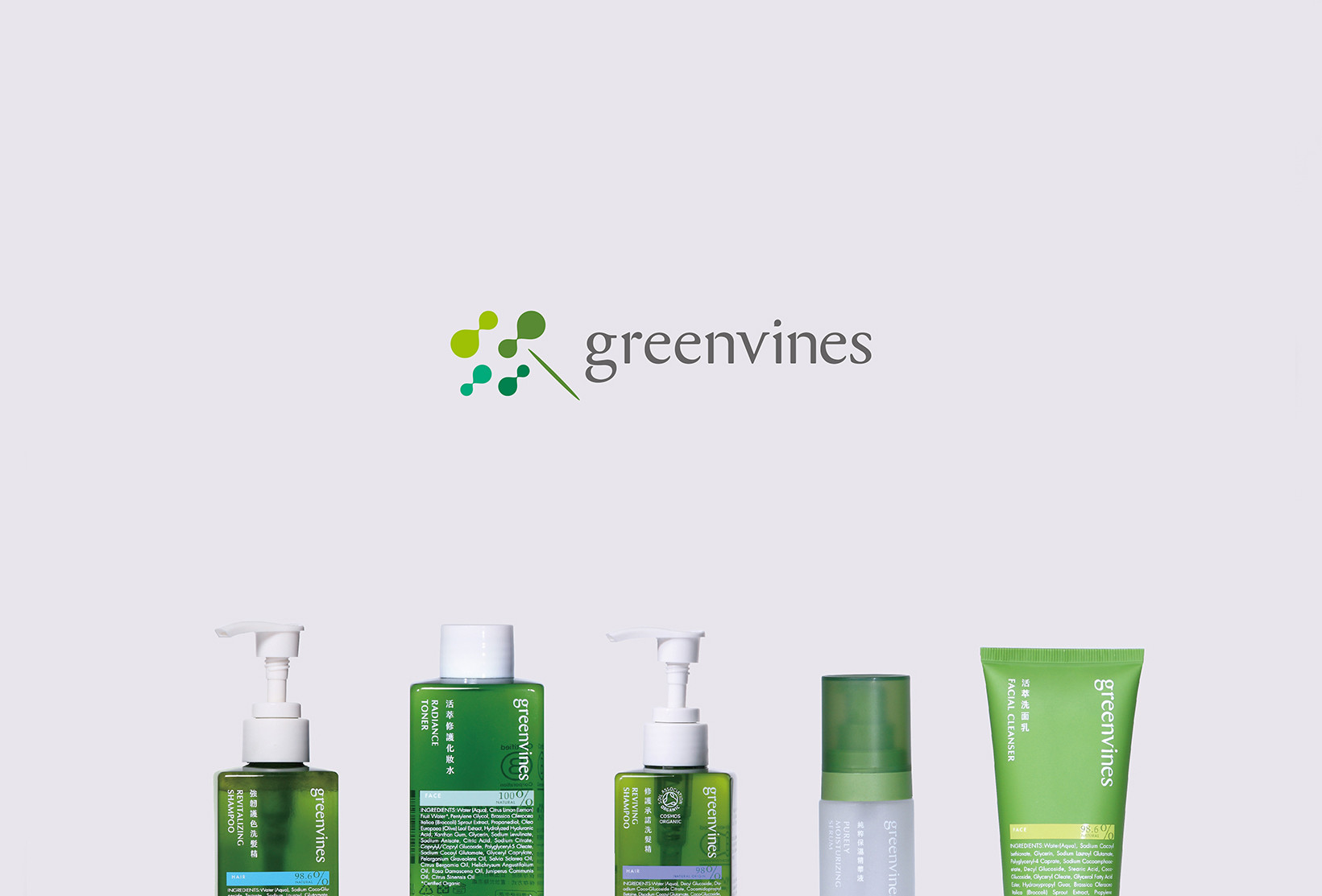
Greenvines
Branding Visual
Identity Design
品牌 : 綠藤生機
Client : Greenvines BIO. CO., LTD.
Brand : Greenvines
Published on 09. 01. 2017
Greenvines
Branding Visual
Identity Design
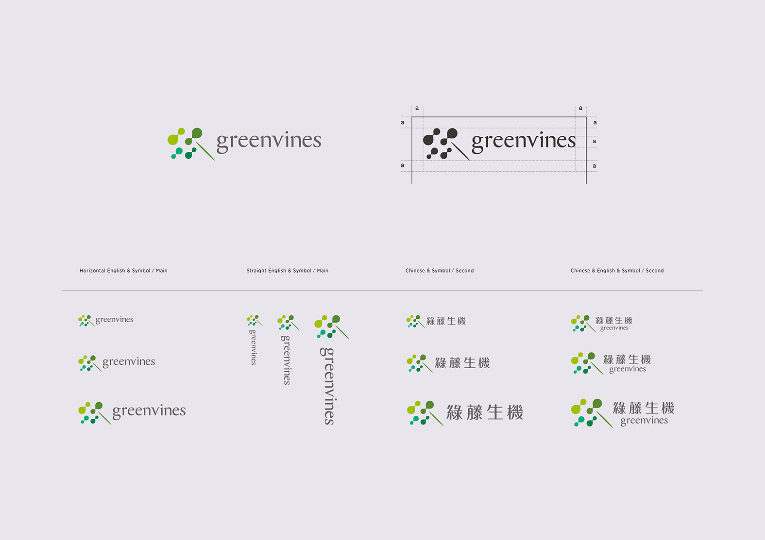
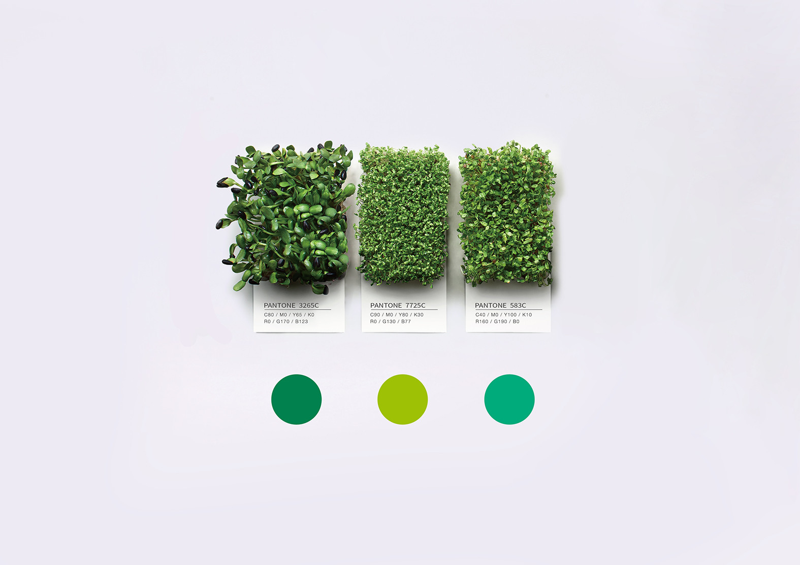
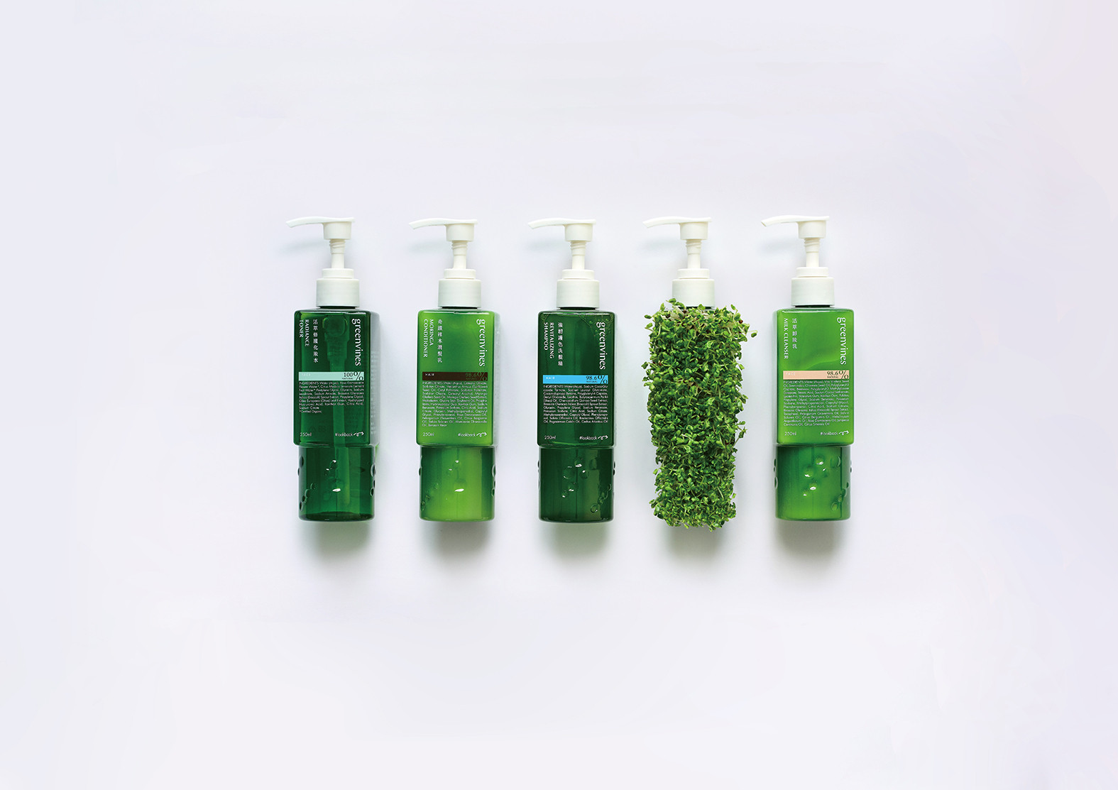
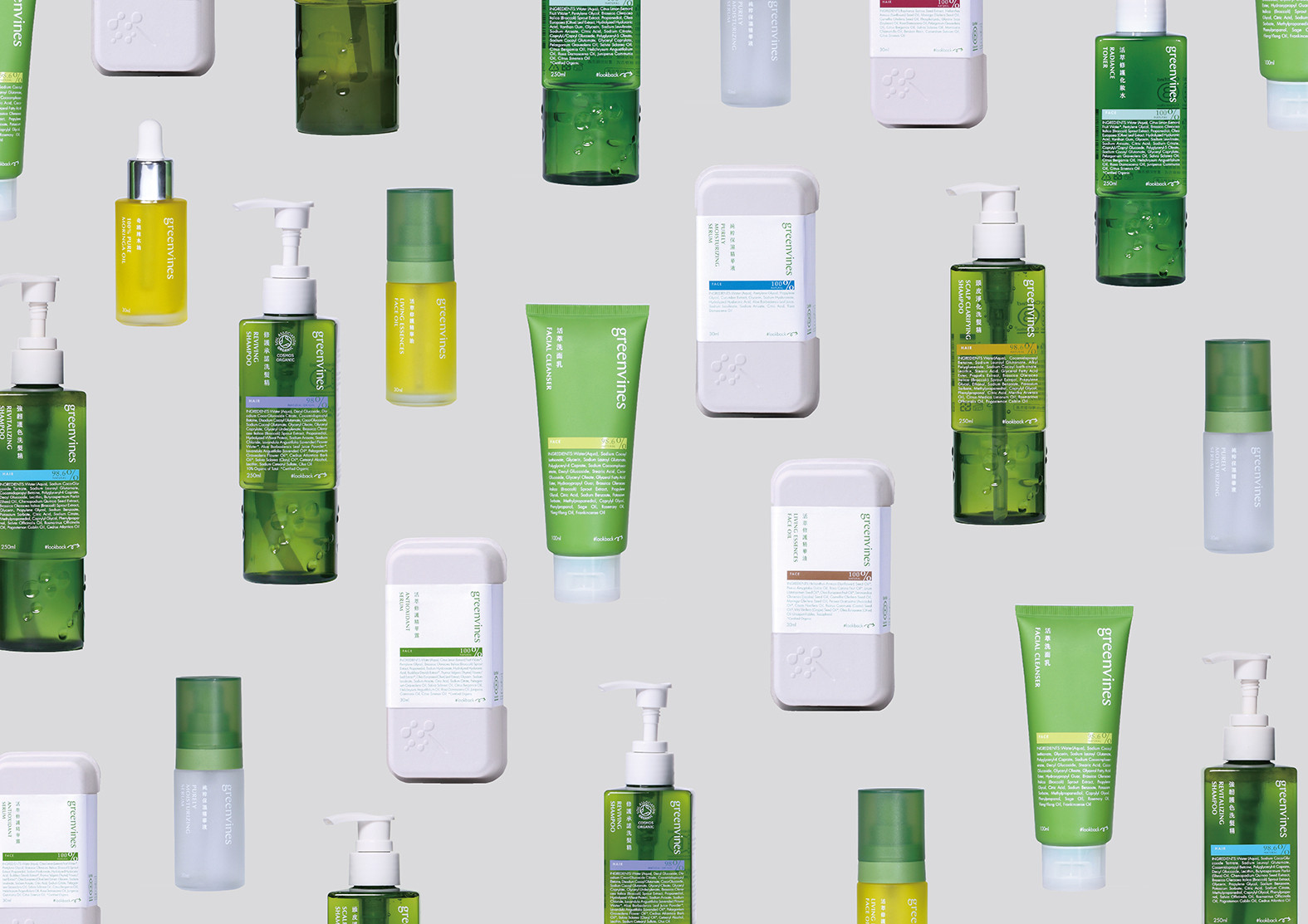
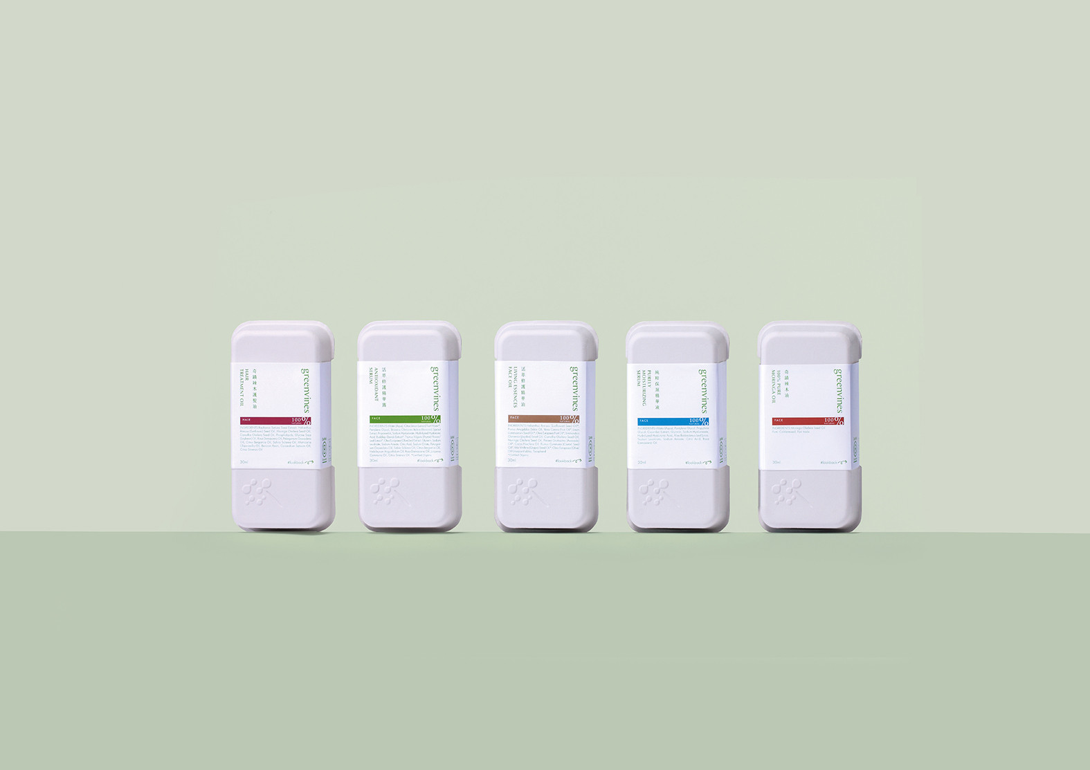
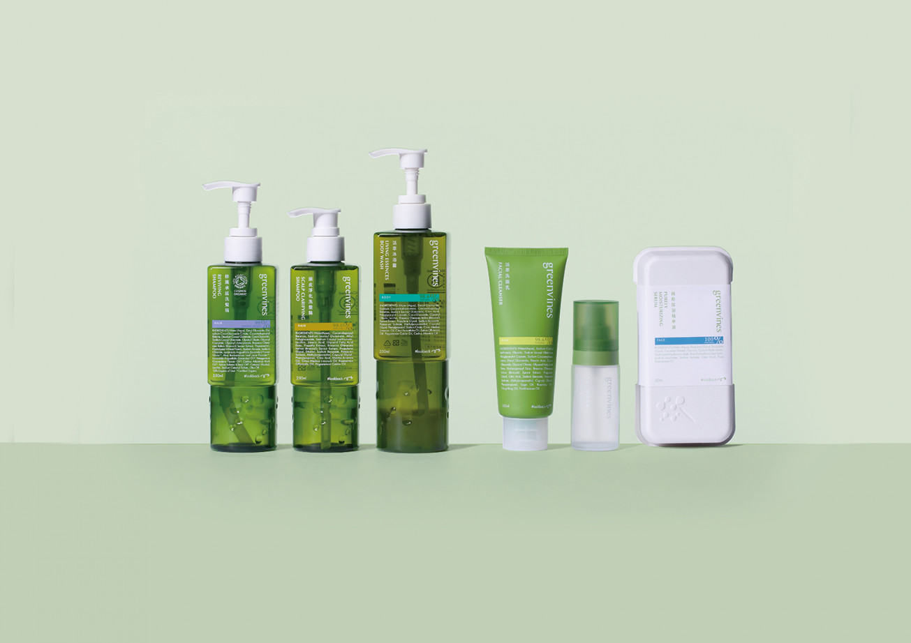
以芽菜為品牌出發點,運用知識科技以水種植出真正營養的活芽菜,從飲食延伸到生活洗淨的保養品牌。綠藤:「To sprout a more genuine, healthier lifestyle that sustains. 讓一個更真實、更健康的永續生活型態萌芽」我們便取自綠藤的起源信念,回歸事物的本質與做這件事的初衷,對人好,對環境也好,是透明的,是真實的。我們將核心定位在「回歸本質,傳遞真實」,識別以芽菜和水相組構而成,轉換為設計圖像,象徵自然生命的成長,也意味著品牌自然透露出的活力談吐,再帶點鮮活的想像。再者,為綠藤定義了三種綠色,在品牌名上也直接連結品牌代表色。整體傳達出亦溫潤亦專業的調合色調。
Start from the sprout for the brand, use the knowledge technique to grow a fresh sprout, this is a maintenance brand from food to living washing: Greenvines.
We take the starting faith from Greenvines: 「To sprout a more genuine, healthier lifestyle that sustains.」so return to the original essence and mind, is good for humanity, is treat the environment well, is transparent, is real.
「Return to the essence, pass on the real」is the main concept, the visual identity combine sprout and water present to the growth of nature life, moreover, shows the vitality of brand with some fresh imagination. In addition, we made three kinds of green for Greenvines, also shows on logo.