
Nestbloom
品牌形象識別&燕窩包裝設計
Nestbloom
Branding Visual Identity Design
& Bird’s Nest
Branding Visual Identity Design
& Bird’s Nest
客戶 : 新加坡 燕苑
品牌 : Nestbloom
Client : Singapore Yan Yuan
Brand : Nestbloom
Published on 04. 19. 2018
品牌 : Nestbloom
Client : Singapore Yan Yuan
Brand : Nestbloom
Published on 04. 19. 2018
Nestbloom
Branding Visual Identity Design
& Bird’s Nest
Branding Visual Identity Design
& Bird’s Nest
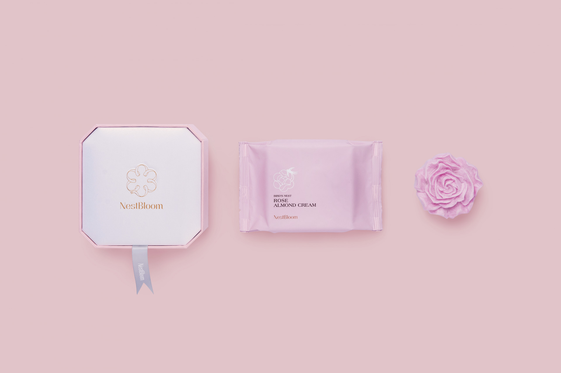
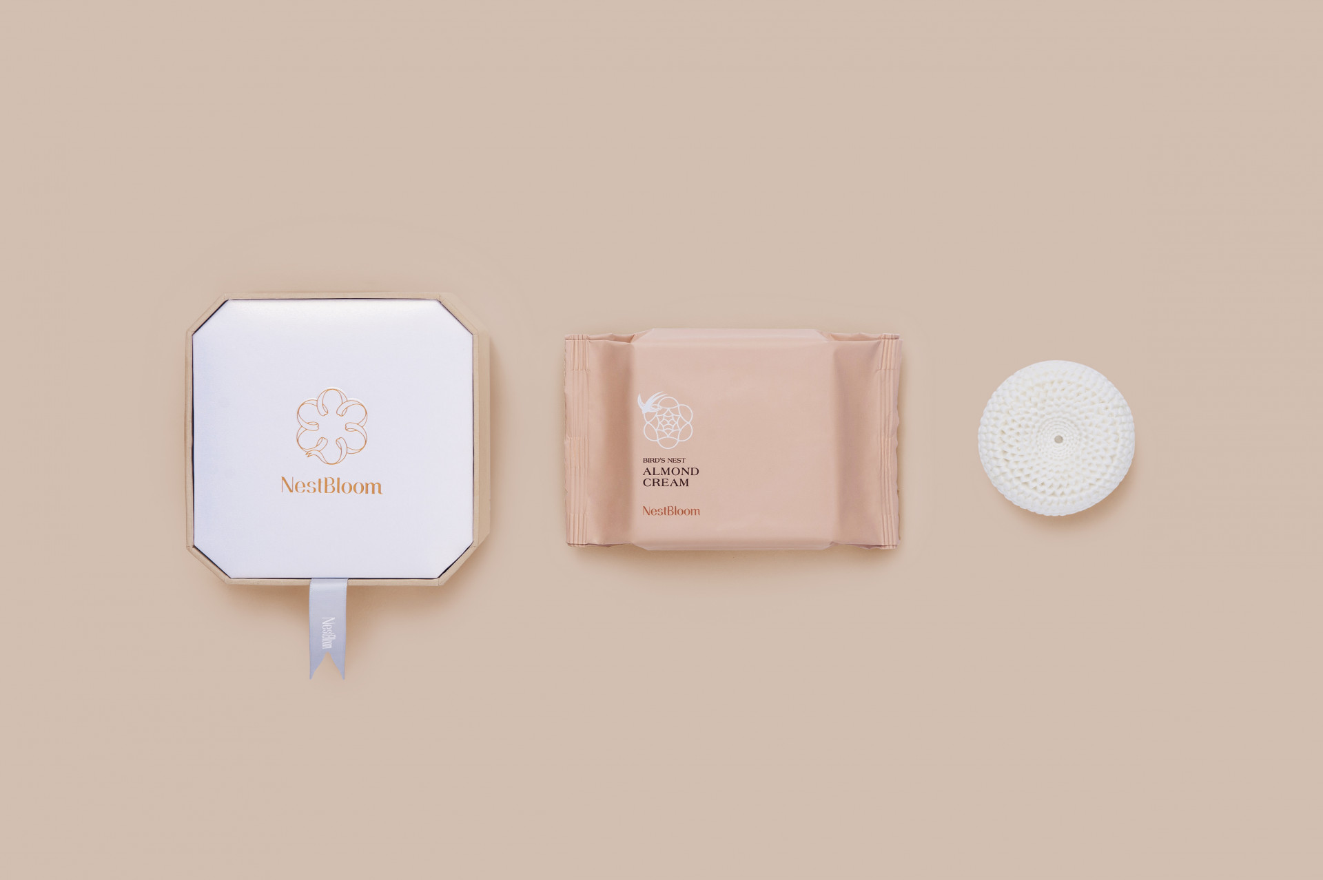
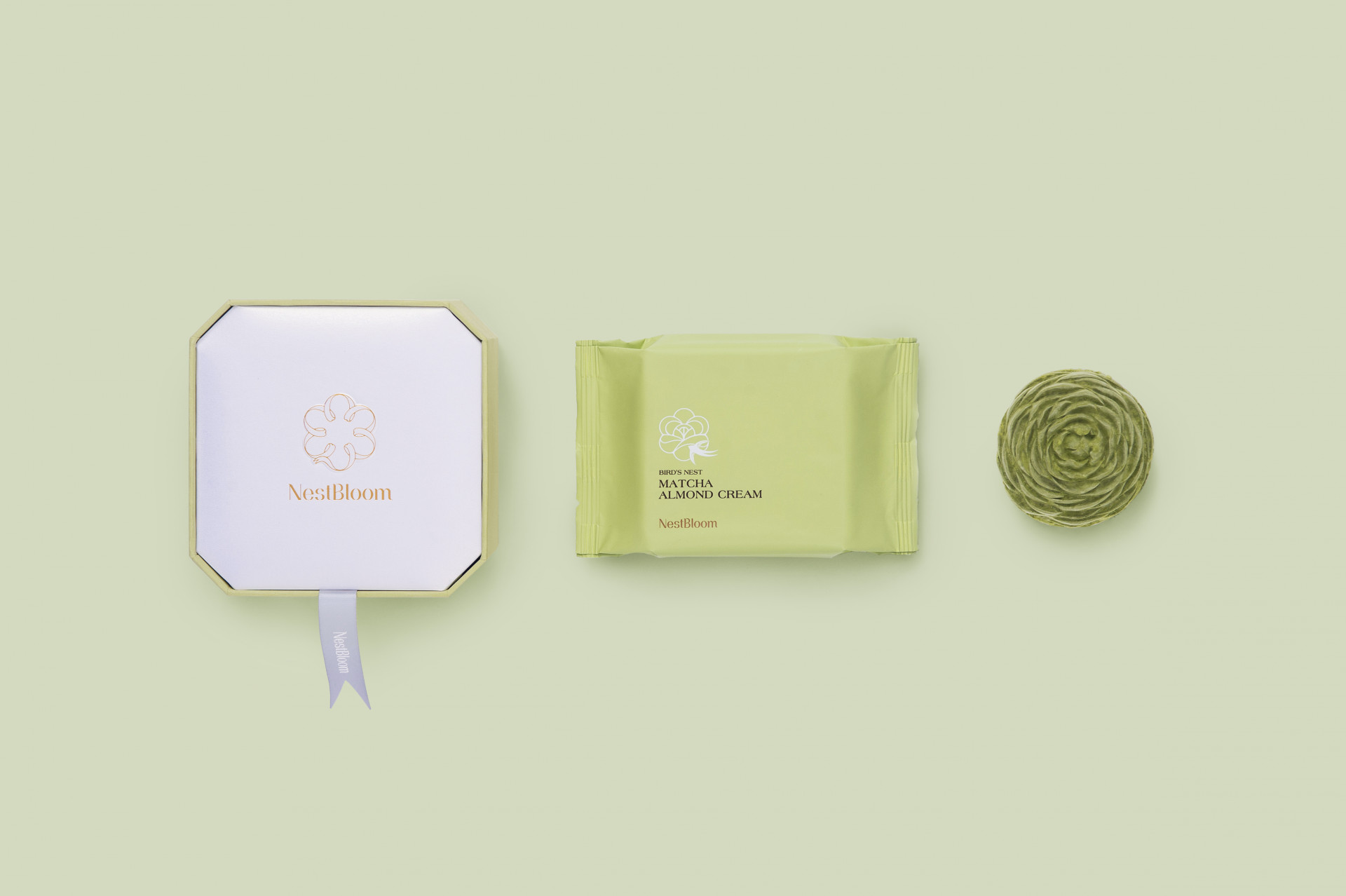
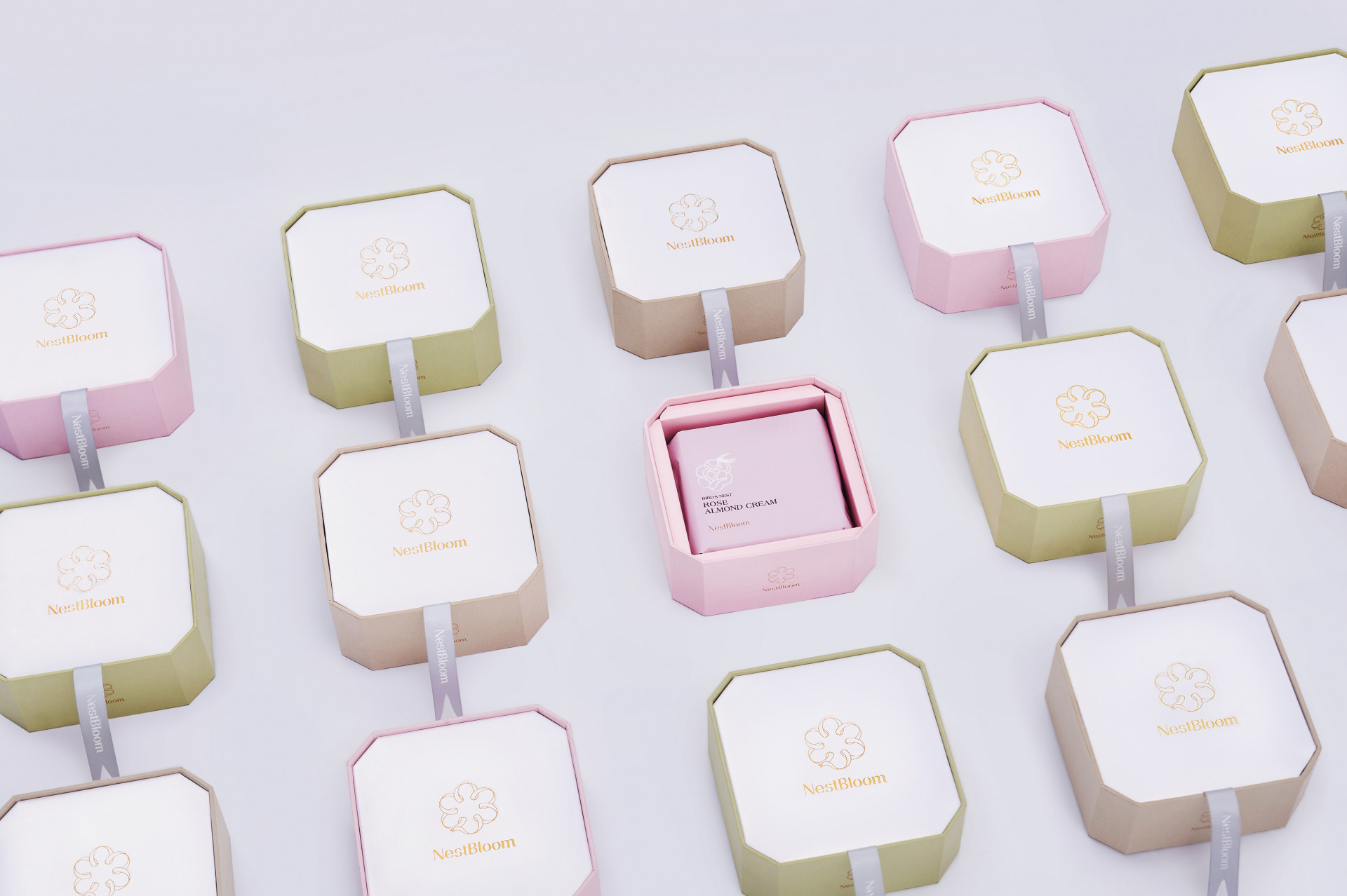
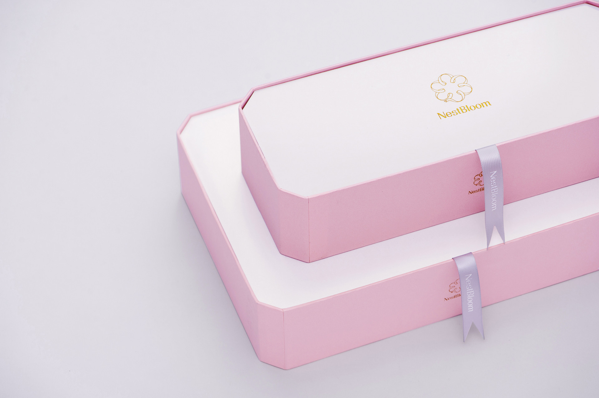
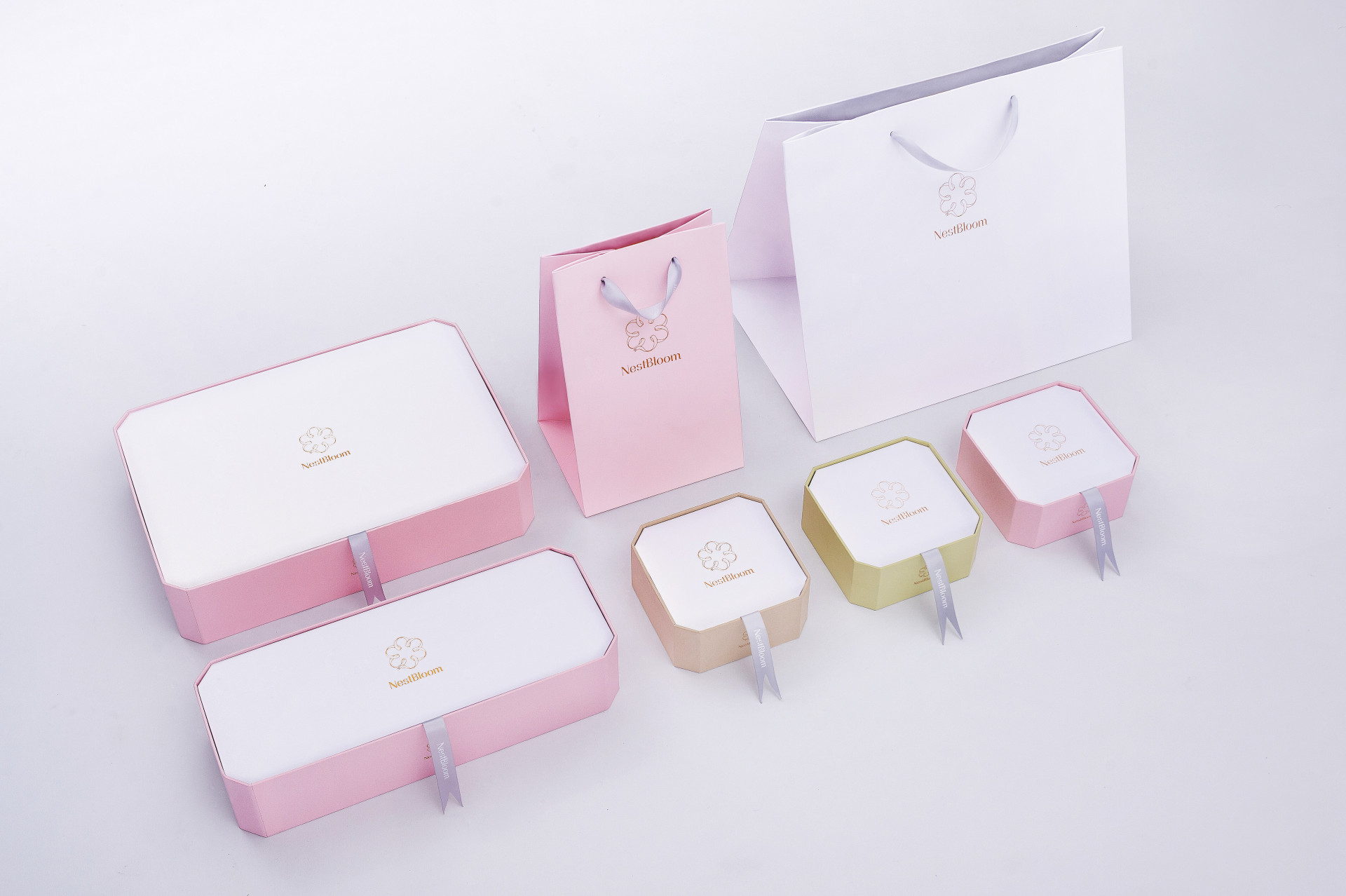
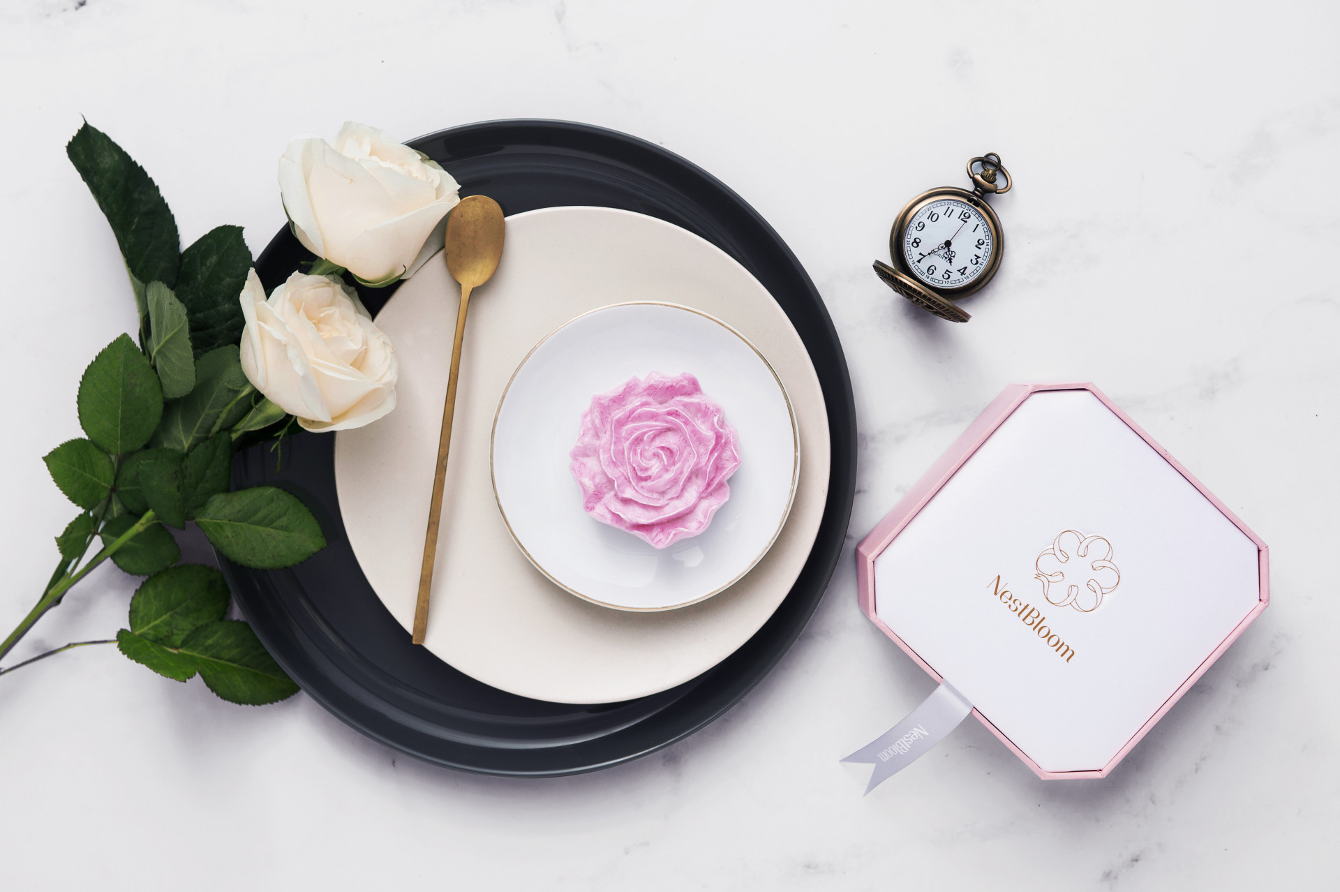
我們所熟知的燕窩大部分皆為透明白色條狀,而來自新加坡的「Nestbloom」研發出新型態的花型燕窩,透過品牌的整體規劃和包裝設計,形塑摩登雅緻的燕窩品牌形象。識別上以織帶的柔美線條圈圍出花的樣態,如同產品的外型沖泡後的流動感。燕窩給人的感受本就高貴,在形象上以簡約素雅的留白和柔嫩色彩相搭配,在包裝上嘗試了切角寶盒型,盒邊的切角與盒蓋的蓬度皆考量比例美感,外盒上的織帶刻意與燕子尾巴作為呼應,也與品牌的識別有緊密的一致性。一個將東方美學融合食癒美學的燕窩品牌,如同得到一個祝福,享受當下的高雅氛圍,視覺和味覺都得到滿足了呀!
Transparent white strip is the bird’s nest shape that we know the most, [Nestbloom] from Singapore created a new flower shape for the bird’s nest. Moreover, we try to plan a modern and elegant branding image of the bird’s nestfrom the brand integrated plan and packaging design.The smooth curve wreathes a flower image for the visual design. Bird’s nest accords a noble imaging, on the packaging design we create a jewelry box with simply color -white and soft color to match each other.
A bird’s nest brand connect with eastern beauty and health food art, both vision and taste are satisfied.


