Lim Tea note
Packaging Design
品牌 : 聆.茶音符
Client : Water city CO., LTD.
Brand : Lim Tea note
Published on 10. 25. 2018
Lim Tea note
Packaging Design
聆茶旋律,聽茶音符。
從眼觀茶、用耳聽一曲茶,至鼻聞香茶,再從口中入喉,連貫性的動作,品飲泡茶時茶湯緩流而下,流轉出旋律的意象,聆聽Lim的侍茶師呈現台灣茶美好多樣的風貌。
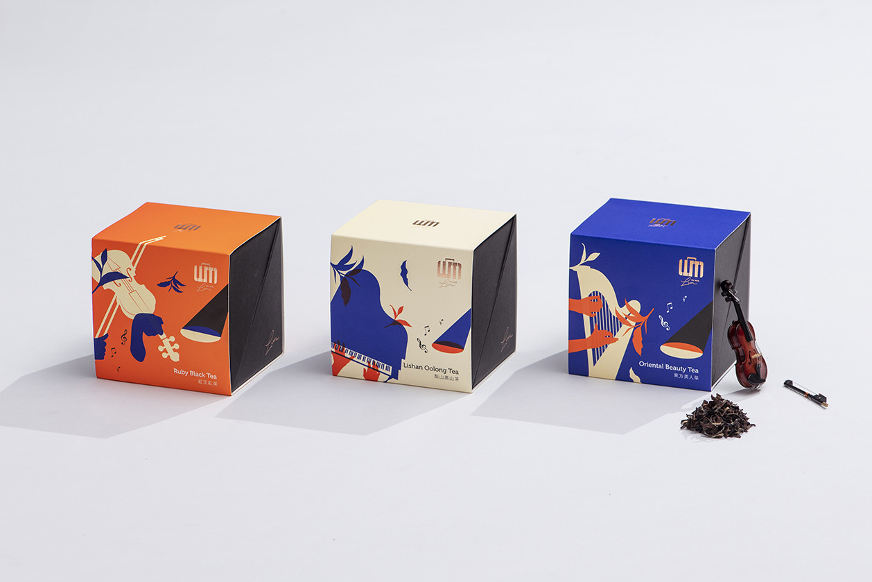
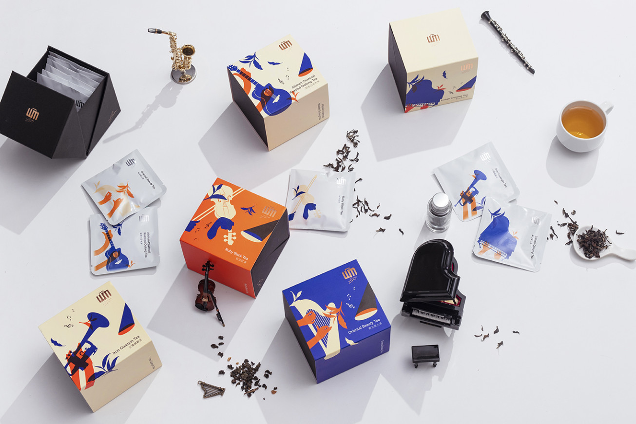
SOLO高山獨奏系列 - 每支台灣茶皆是一枝獨秀,將台灣茶的高品質與獨特性,以樂器獨奏揉合獨特曲風、多變及豐富特性的概念傳達,用茶葉及音符帶出茶品入口中的豐富味覺感受。
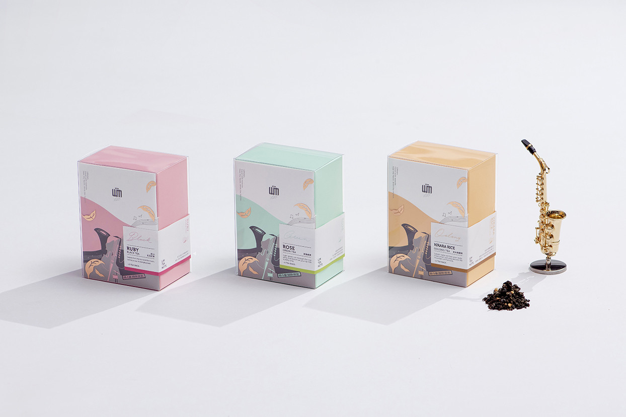
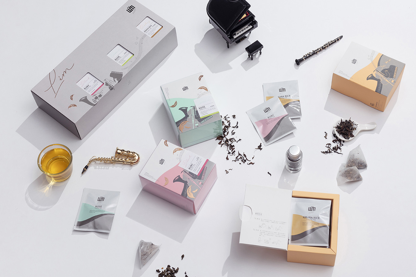
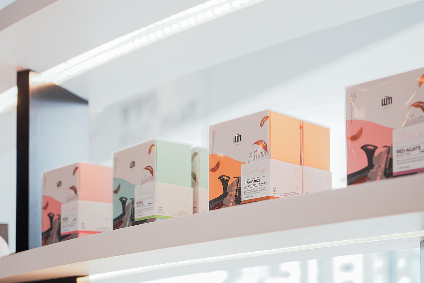
Fusion Series 精選重奏系列 - 外盒採用透明殼與盒上的樂器巧妙融合,單一包裝則用簡潔的曲線組成色塊象徵茶品隨音頻的流動,四入的包裝設計,以旅行口袋包為一單位,方便攜帶。
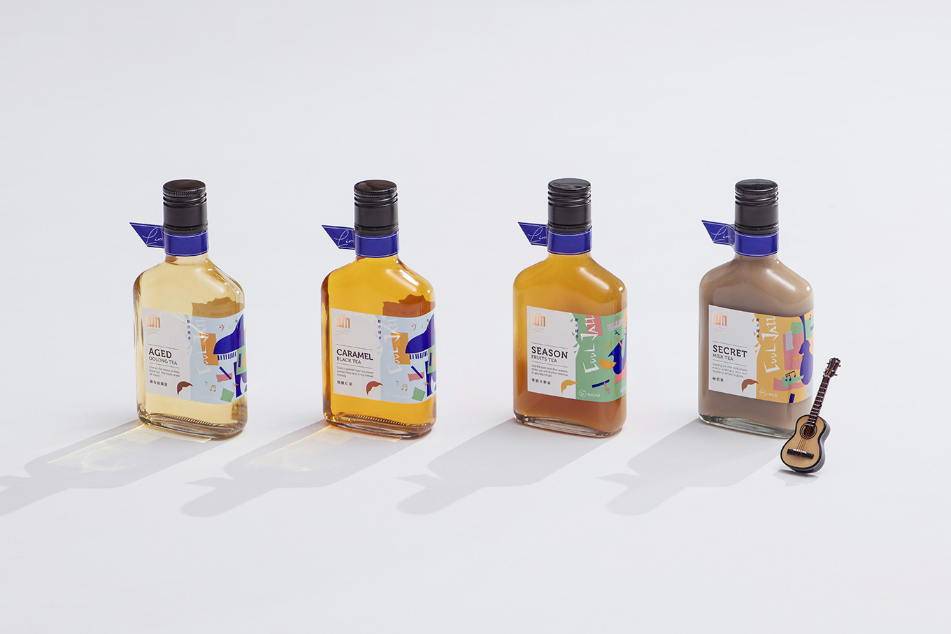
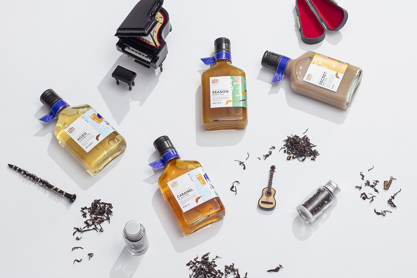
COOL Series冷泡酷派系列 - 以樂器及音符帶入視覺,利用簡約鮮明的色塊做堆疊,表現茶風自由、隨性、奔放的節奏,色彩計畫將此系列以寶石藍為主色,向酷派爵士致敬。
Drink tea melody, Limsten tea note.
From eyes, ears, nose to mouth; see tea, listen tea, smell tea and taste it, this coherent action is the best way to taste the multi flavor of Taiwanese tea.
SOLO - Every single Taiwanese tea is unique and special, just like instruments have different features style, both items have the same concept of characteristics – changeable and rich feelings, thus, combine tea leaves and music note bringing out the rich taste felling.
Fusion Series - The outside transparent box merge with the box with instruments skillfully, the simple curve is like the wave of tea and music on single pack, three packs for a set.
COOL series - Bringing instruments and music note onto visual, make layers with simple bright color block, present to freedom, casualness and untrammeled of the tea’s style, this series of color plan will use sapphire as the main color for greeting the jazz cool.