Family Fresh Food
Family Mart Fresh Food
Branding Design
品牌 : 全家鮮食品牌
Client : TAIWAN FAMILYMART CO., LTD.
Brand : Family Fresh Food Brand
Published on 03. 22. 2019
Family Fresh Food
Family Mart Fresh Food
Branding Design
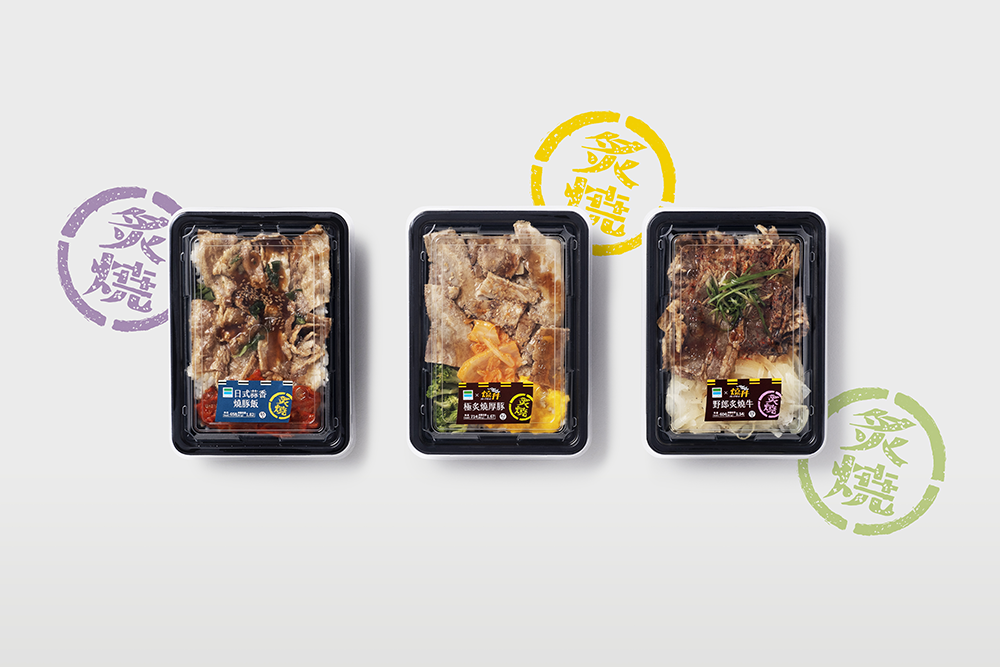
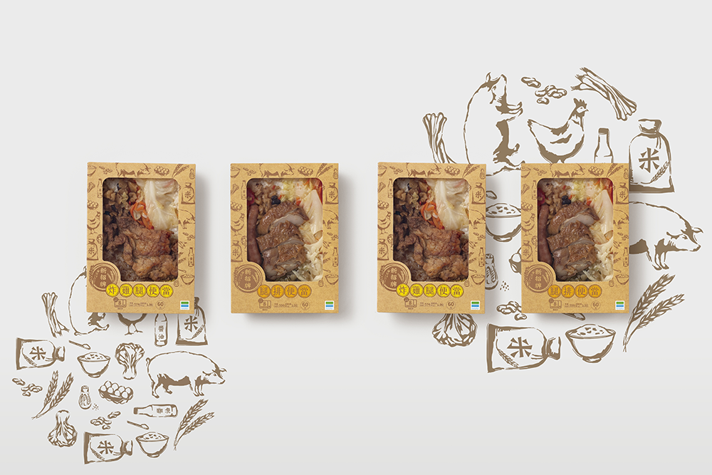
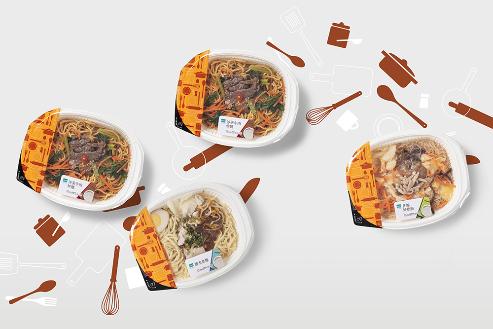
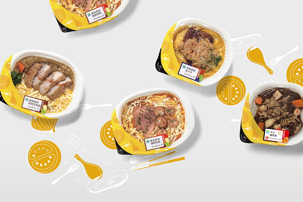
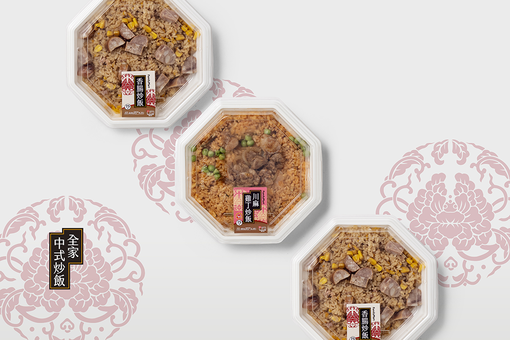
便利商店鮮食品牌包裝設計規範,2018年全家鮮食便當系列系統規範案例。
設計規範第三波:全家鮮食類主食便當品項。本次規範設計劃分為炙燒系列、新招牌系列、飯&麵類微波系列等品項。我們維持一貫的美感與美味兼顧原則,在種類上依照菜色風格與主食的不同,打造出各自獨特的設計語彙:炙燒系列跳脫普遍使用的標籤貼紙,以日式居酒屋的暖簾風格,傳遞濃郁的鹹香滋味;新招牌便當使用樸實牛皮紙材,表現親民實惠的口味與價格。微波系列將主食區分為中西式的飯、麵類,在外盒上我們嘗試使用截然不同的八邊與橢圓形狀,做出整體明顯的區隔,同時合乎產品本身風味與個性。
排版清楚明確,不僅考量消費者的選擇需求,也須為每個系列建立專有設計屬性、成功傳達產品特色,一次滿足多種品項背後的嚴謹規範及設計條件。
Design for more flavors.
Convenience store fresh food branding package design specification, the project of 2018 Family Mart fresh food series of meal box system specification.
The third part of system specification: Family mart fresh food series of meal box. This system classifies to the series of grilled, new specialty, and microwaved rice & noodles. We keep the principle of beauty and tasty to create the specific word for each series by the difference of meal’s style: The series of grilled jumped out form the normal label sticker and design a curtain sticker with Japanese Izakaya style trying to present the rich of salty taste. Second, the new specialty uses the craft paper for making the meal box, thus presenting the taste and price with material comforts. Last, there are two parts of the series of microwaved: rice and noodles, for distinguish it clearly, as a result, create octagon and oval shape of meal box, and also accord to the taste and character of the product.
With the clarity layout and create the specific style for each series, additionally, express the characters of products is not only for the requirement of customer’s choice, furthermore for following the strict specification and design condition for multi-product in one time as well.