T.K Food
This is CHIAYI
Packaging Design
品牌 : 老楊方塊酥
Client : T.K FOOD CO., LTD.
Brand : T.K Food
Published on 04. 12. 2019
T.K Food
This is CHIAYI
Packaging Design
「This is cubic pastry, this is CHIAYI!」
作為嘉義代表知名品牌,包裝設計除了兼顧銷售任務之外,也兼負連結地方特色之傳達。
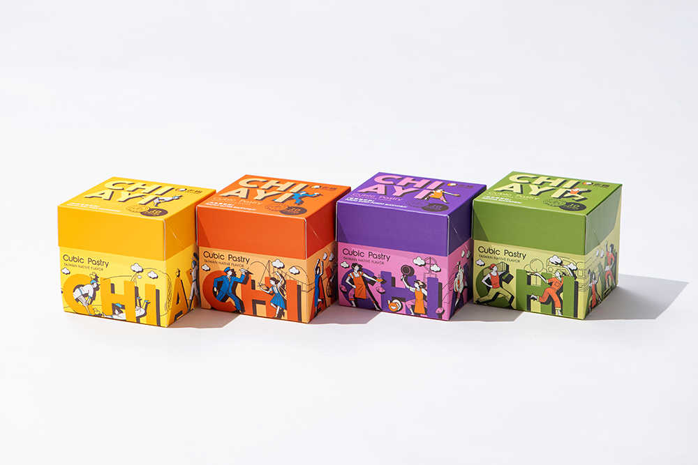
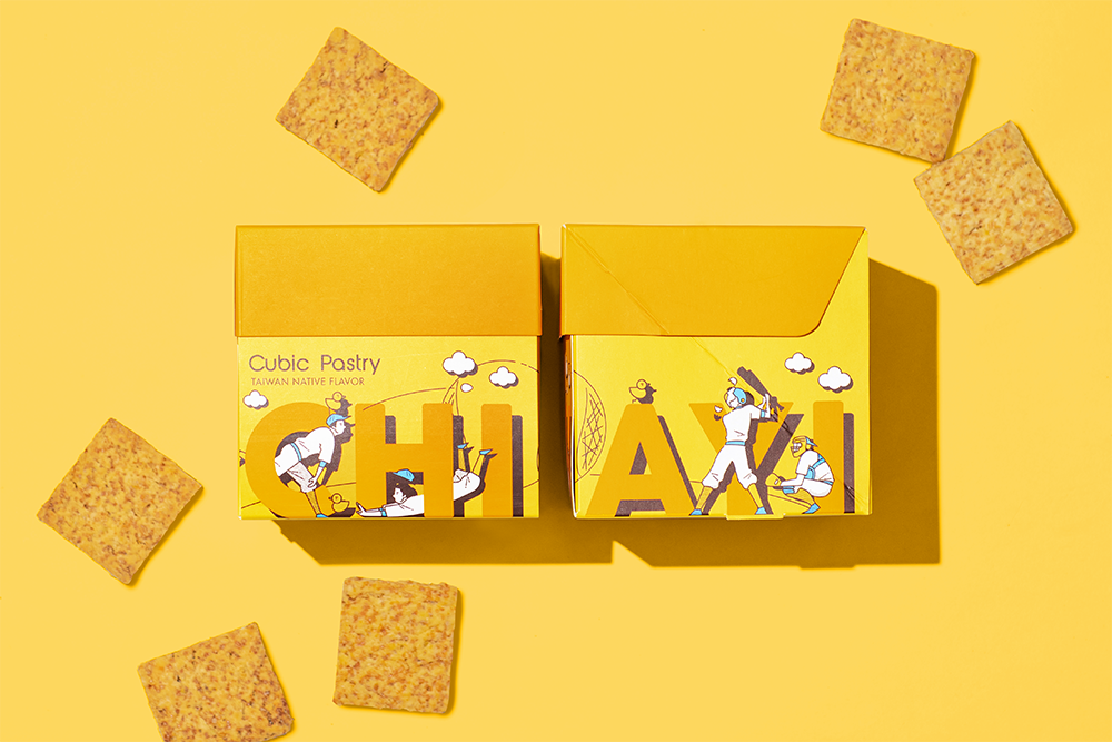
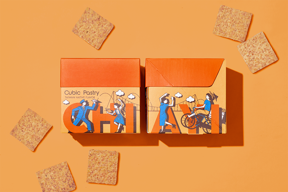
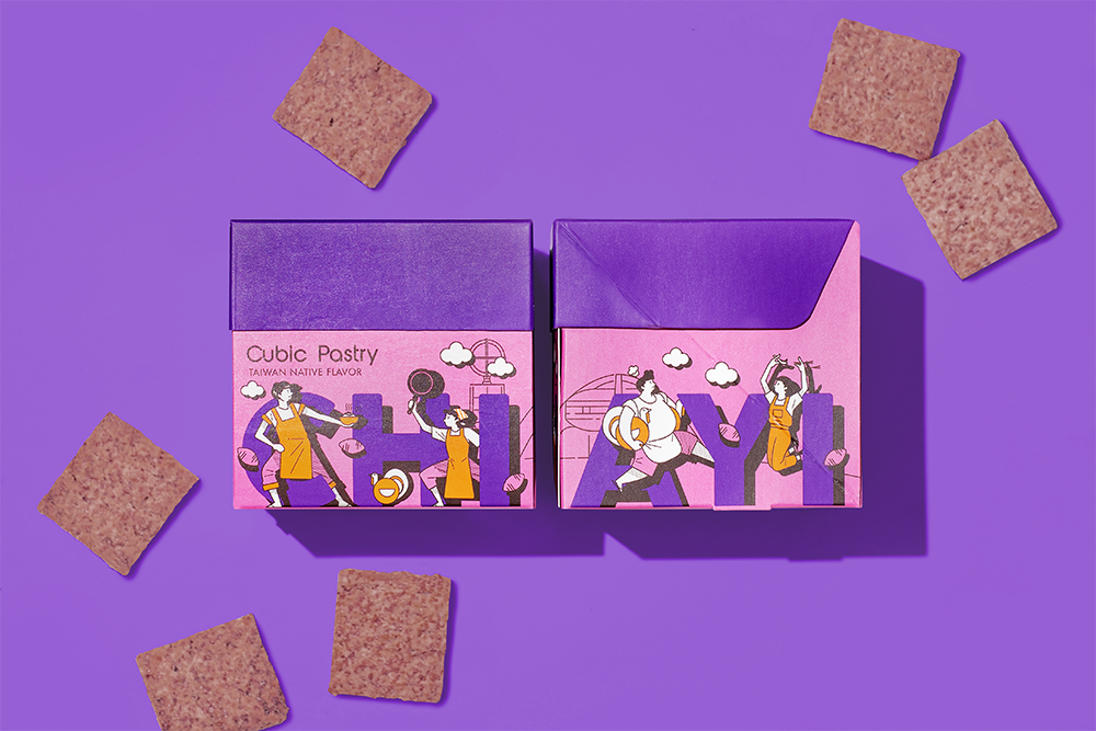
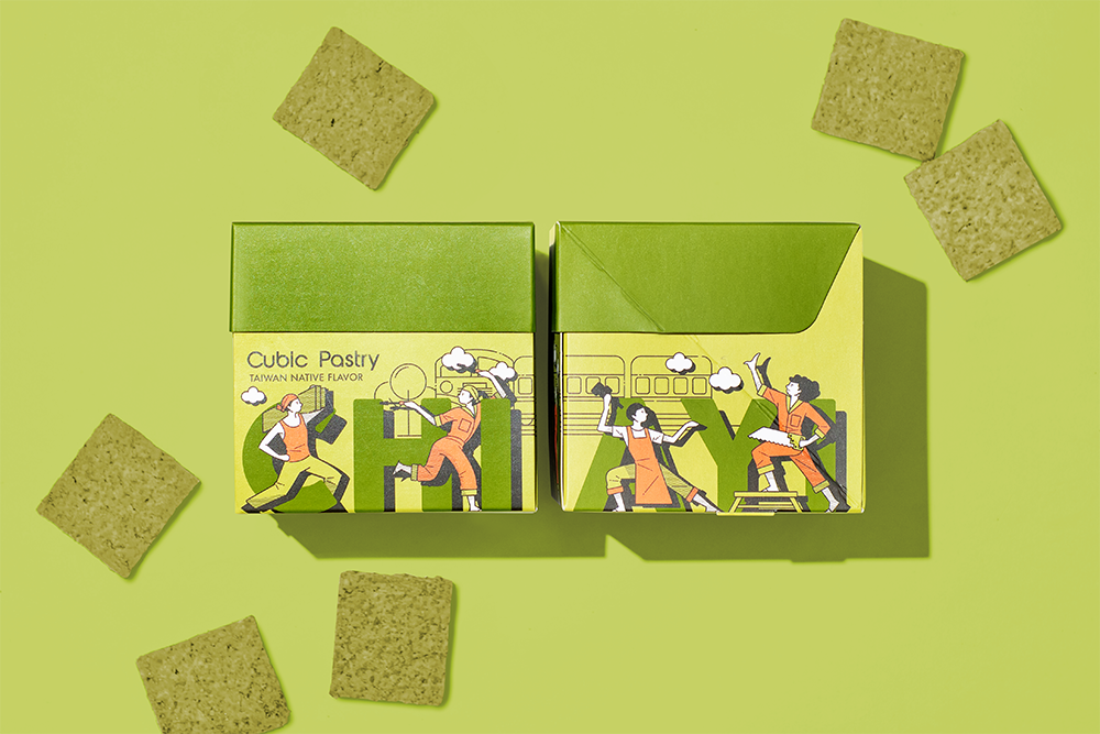
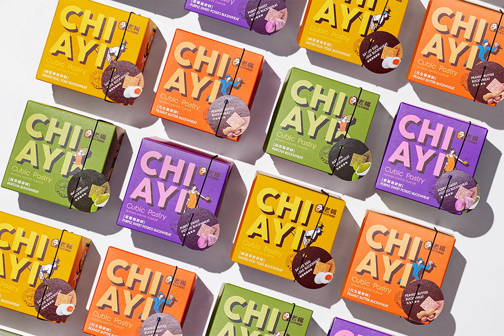
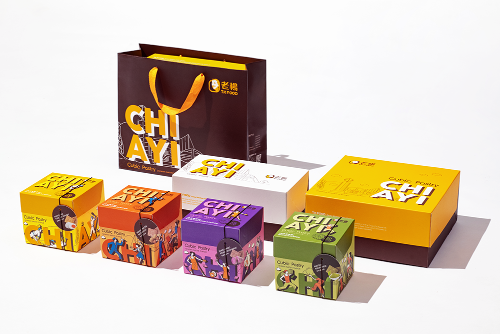
老楊飄香三十餘年的方塊酥傳承自嘉義老師傅好手藝,在時間淬煉之下,已是嘉義代表特色之一。我們以此做為創意出發點,擷取代表嘉義的人文風情景點icon轉化至包裝設計中,運用簡單的漫畫風格,大面積配色則是對應一般對口味的色彩印象,搭配幽默有趣的故事性畫面,呈現嘉義這片土地的文化色彩,我們可以驕傲地說「THIS IS CHIAYI !」
「This is cubic pastry, this is CHIAYI!」
As the famous brand of Chiayi, the package design is not only for selling, and connect the characteristic of the local as well.
Pass down from the Chiayi master’s baking skill, T.K food has established for three more decades, and became one of local specialty in Chiayi nowadays. We take the cultural attractions as the creation point, convert to an icon with simple comic style, additionally, the color is matching with flavors. In conclusion, present to the cultural color of Chiayi with humor interesting story, that we could say「THIS IS CHIAYI !」proudly.