Oreal Made Series
Packaging Design
品牌 : 樹重奏
Client : Sanguo CO., LTD.
Brand : trreeo
Published on 11. 28. 2019
Oreal Made Series
Packaging Design
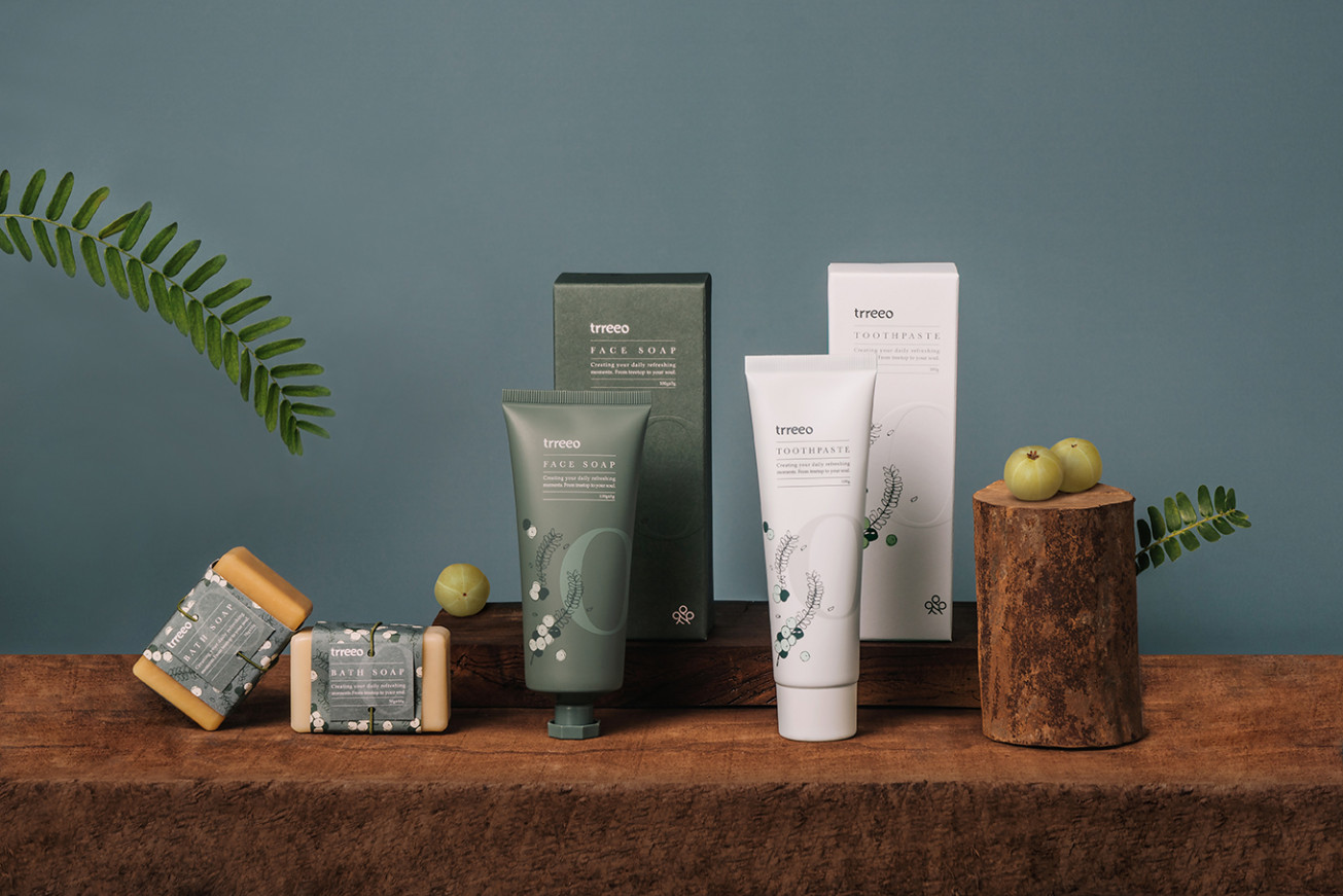
以油甘果為推廣的「trreeo 樹重奏」,透過酵道自然農法,三層立體種作,讓土地復甦和生態平衡,提供純淨的原料製成相關產品。
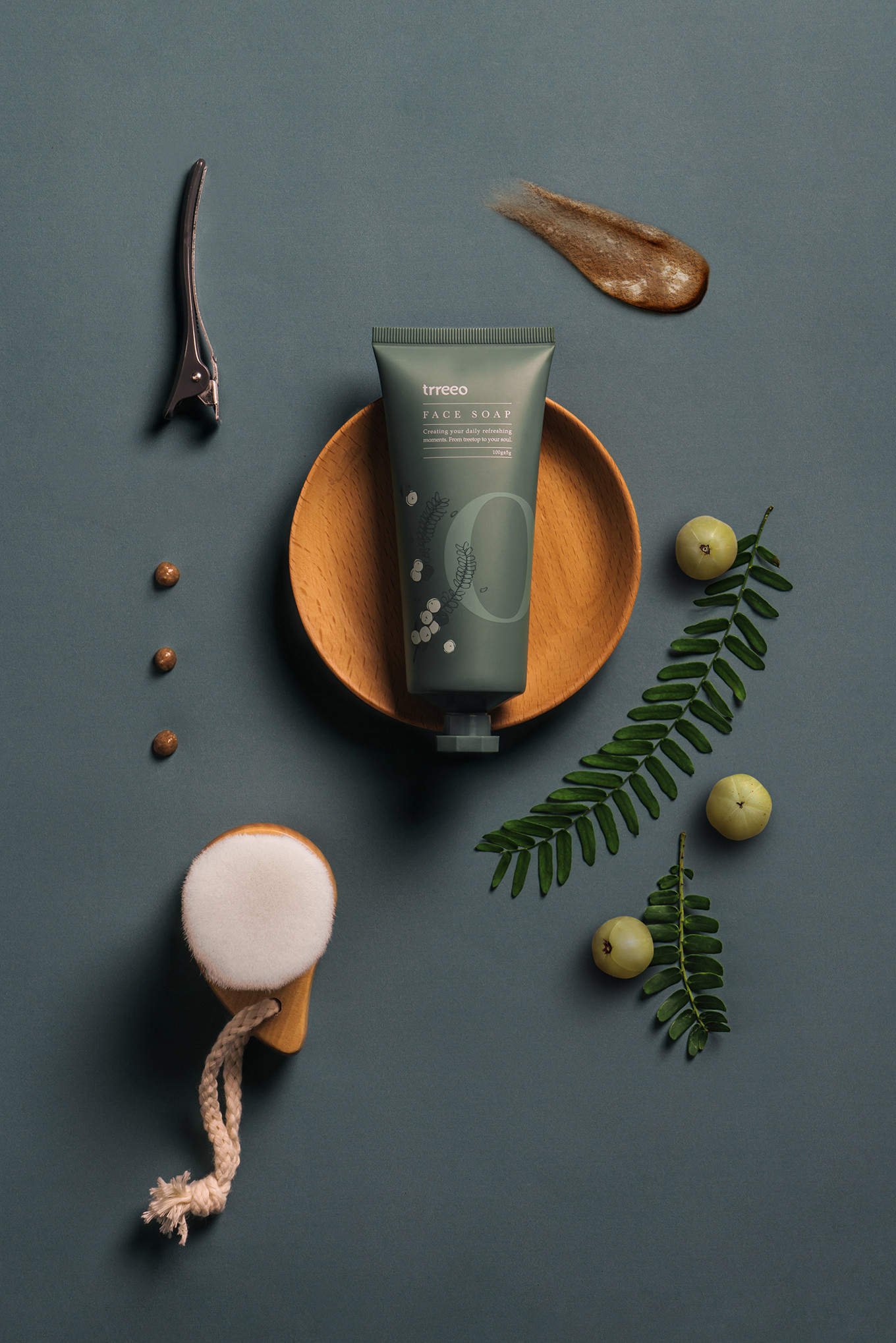
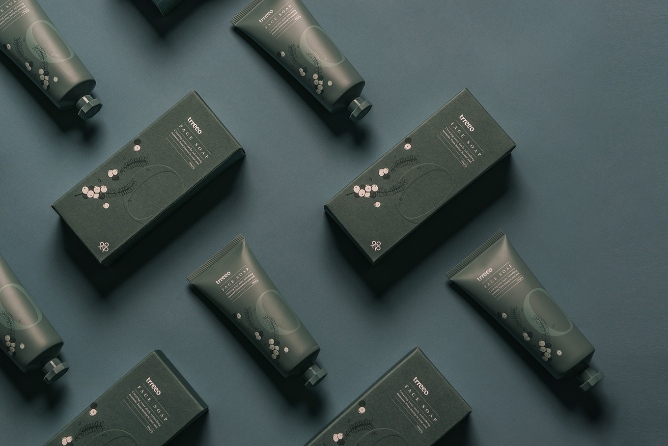
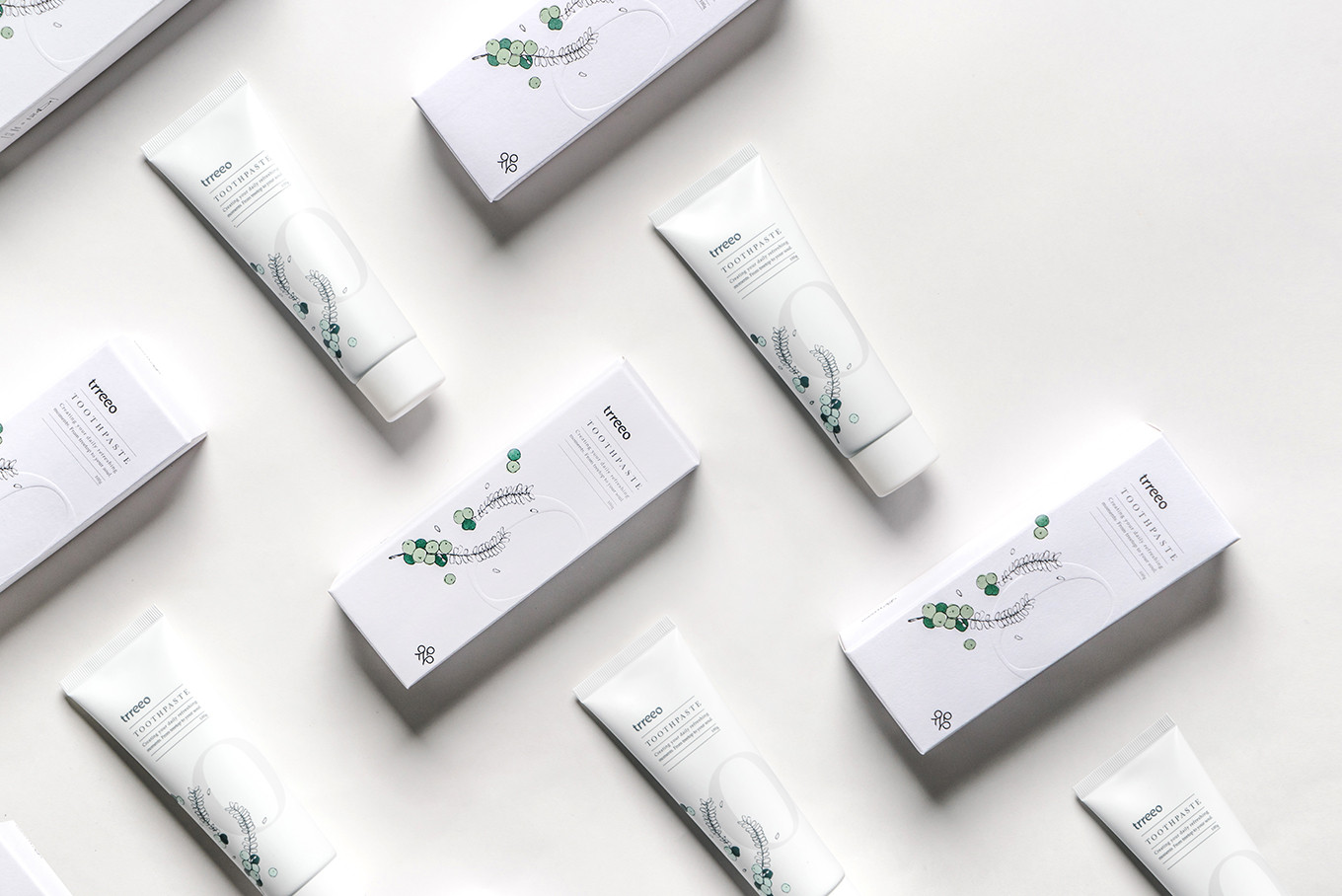
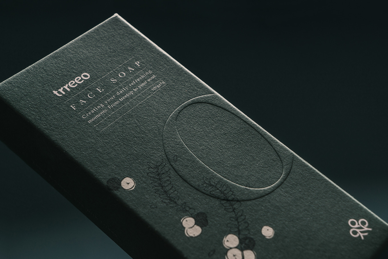
森然清潔系列則以油甘果為基底,只加入天然植萃成分,無酒精、香精、色料的添加,從自然而然地為身體清潔保養。在外包裝上,森然清潔系列運用 trreeo 的O,加上油甘果的葉子及果實作為此系列的主要視覺概念,顏色上為提升消費者的感官感受,淨白牙膏使用白色作為基底色,讓視覺效果多了清潔、植萃及亮白的感覺;而潔顏露則採用樹重奏的識別色,不僅強調了品牌的連結度,亦呈現出產品的穩定、舒緩及調理的效果。包裝上採用FSC環保認證紙,一如既往地為環保盡一份心力。讓清潔保養不會造成人體及環境的負擔。
trreeo promote the Indian Gooseberry with Eco Enzyme Farming and three layers growing way to make the land and ecology balanced.
The Oreal Made series is based on the India Gooseberry, and adds in natural plant extract ingredients, with no alcohol, essence, or pigment, to maintain clean from nature naturally. On the package design, the Oreal Made series use the [O] and the leaves and fruit of Indian Gooseberry as the main visual concept. To increase the customers’ sense of feeling uses a white background to strengthen the clean, plant, and whitening for the toothpaste. And the face soap uses the identity color of trreeo, which shows the connection of the brand, and additionally represents the effect of stability, comfortable and condition-able.
Use FSC environmentally certified paper on the package protecting the environment as usual. Furthermore, it won’t be a burden for humans and the environment by the products.