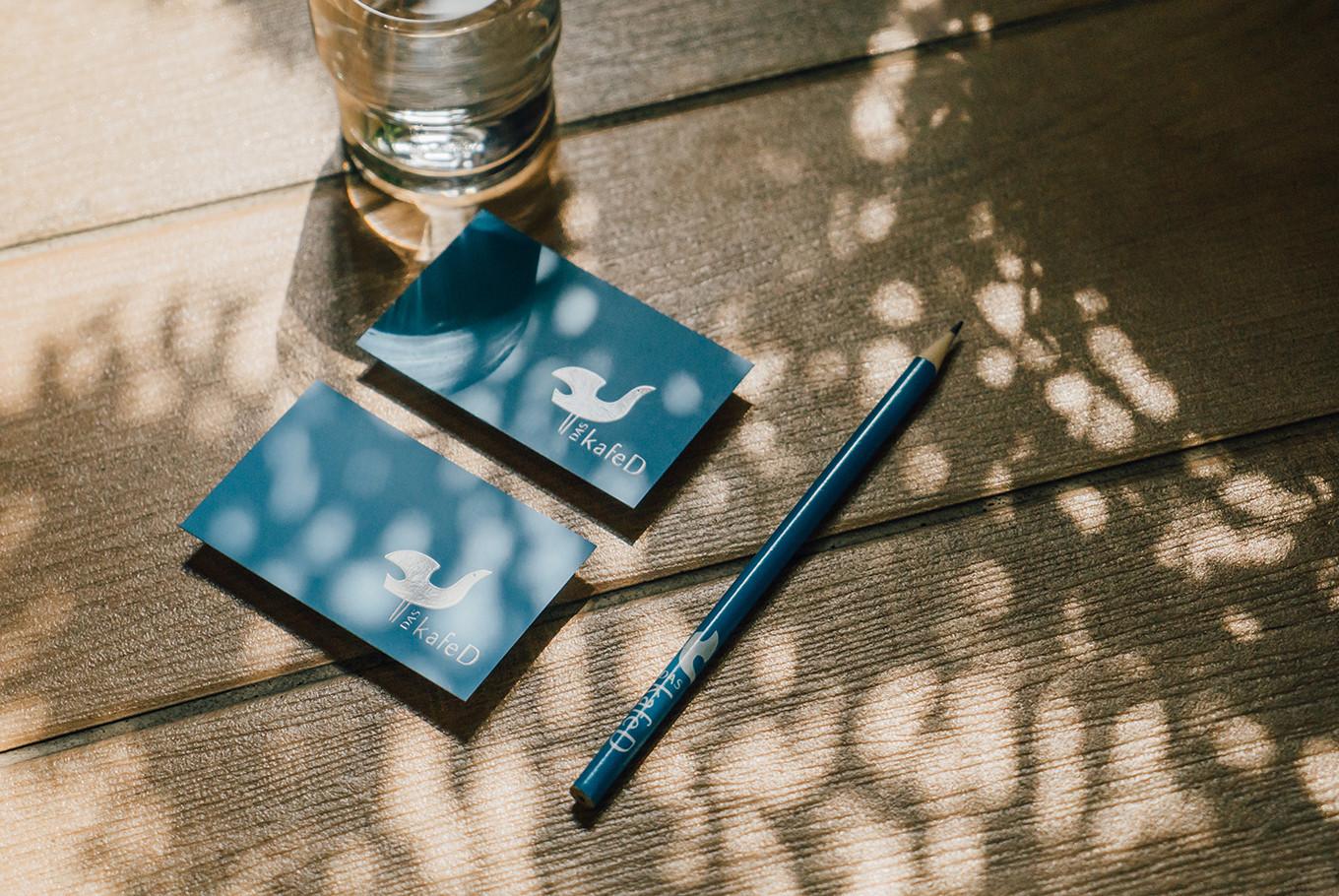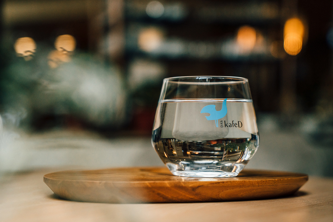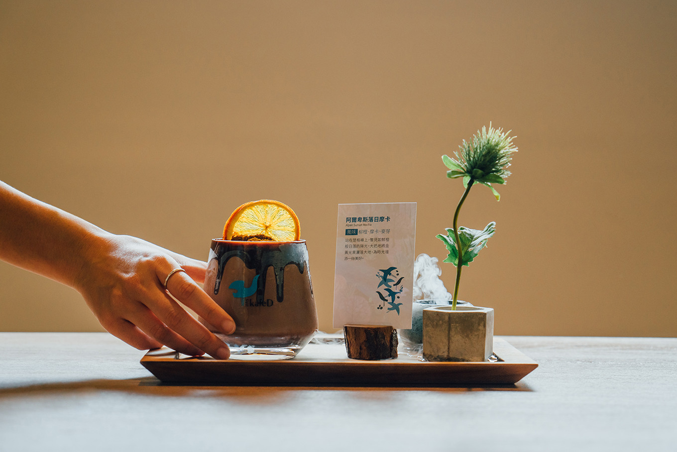
DAS KafeD
Branding Visual
Identity Design
品牌 : DAS KafeD
Client : Ju Ho Feng CO., LTD.
Brand : DAS KafeD
Published on 03. 05. 2020
DAS KafeD
Branding Visual
Identity Design
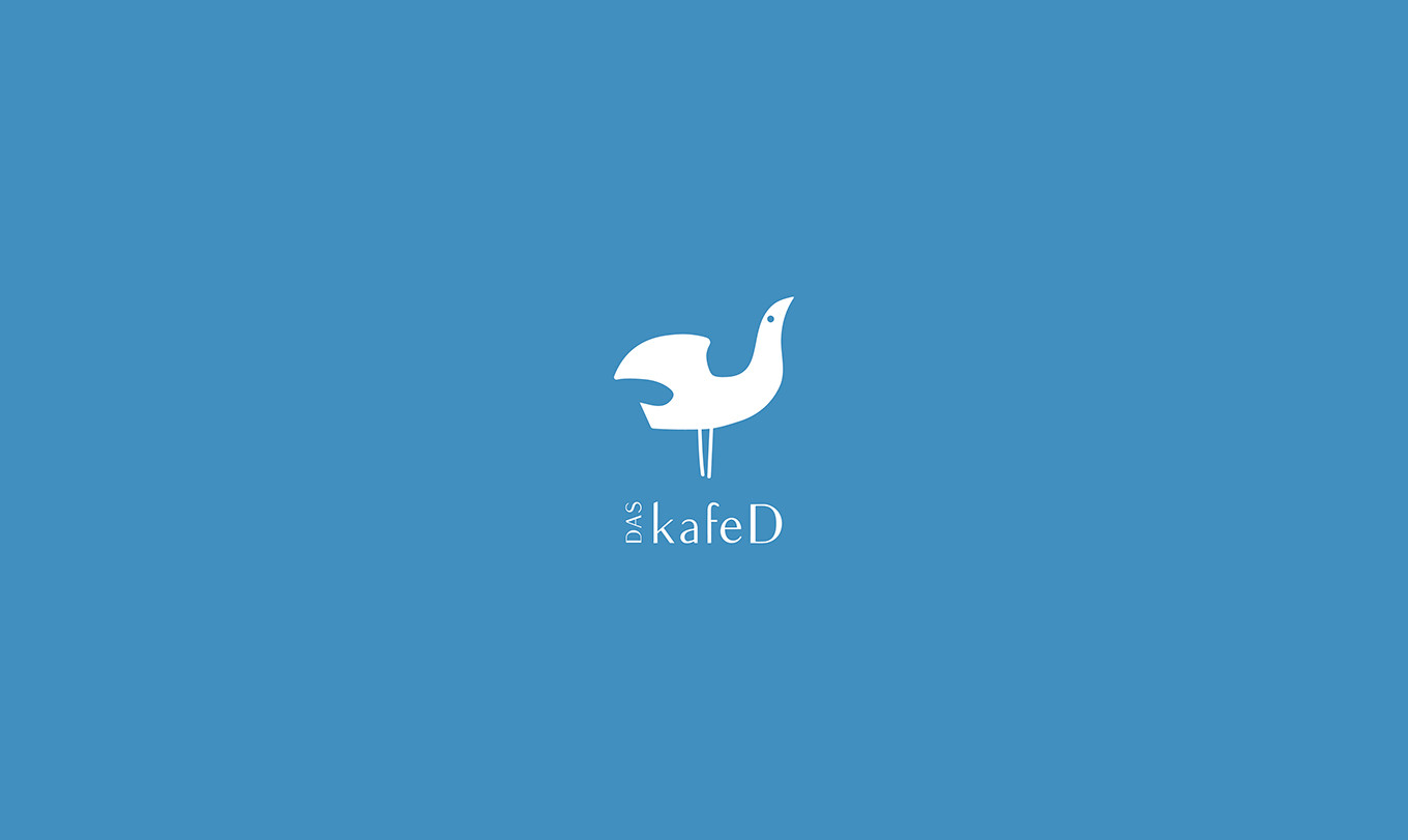
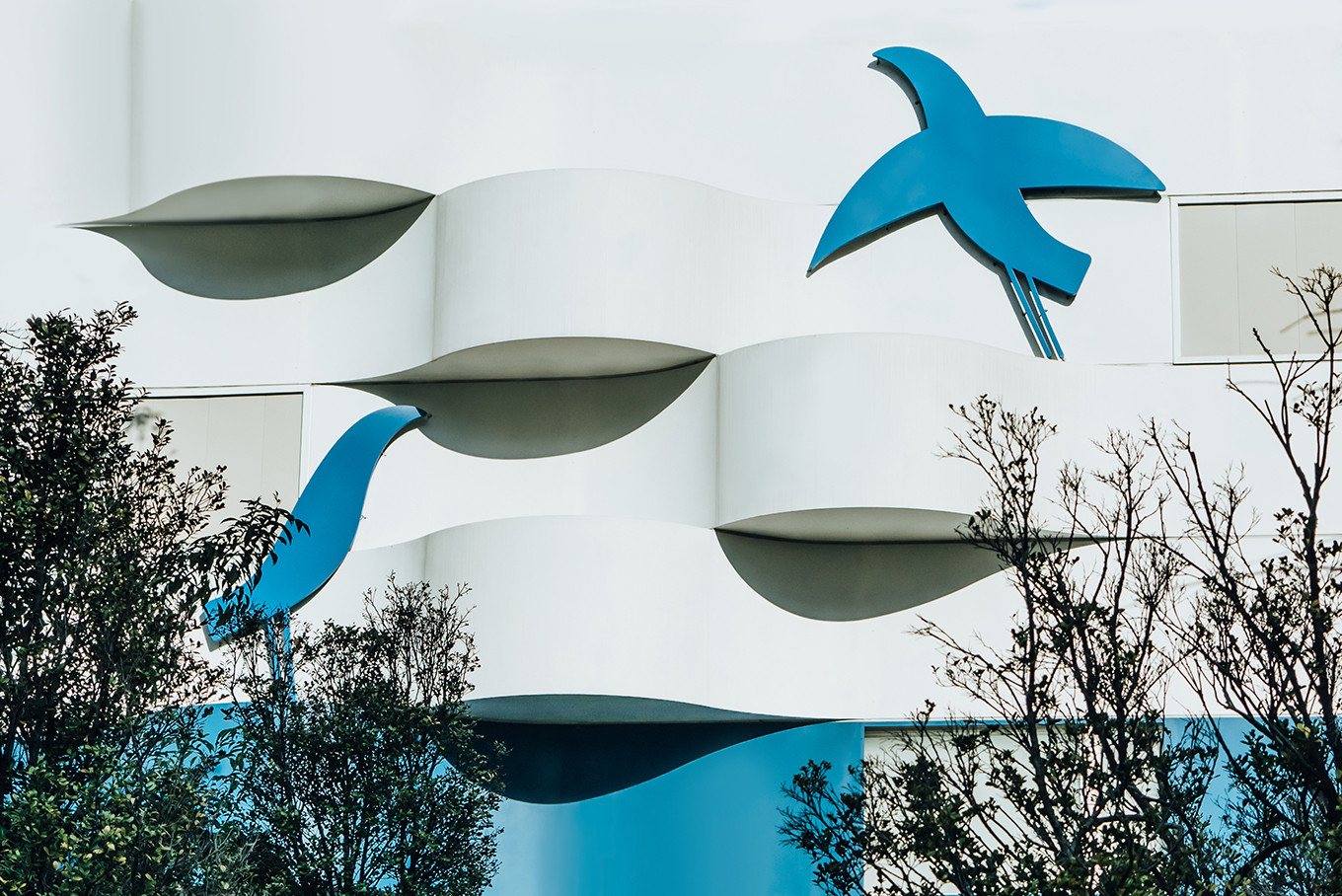
嚴謹的態度,自由的靈魂。
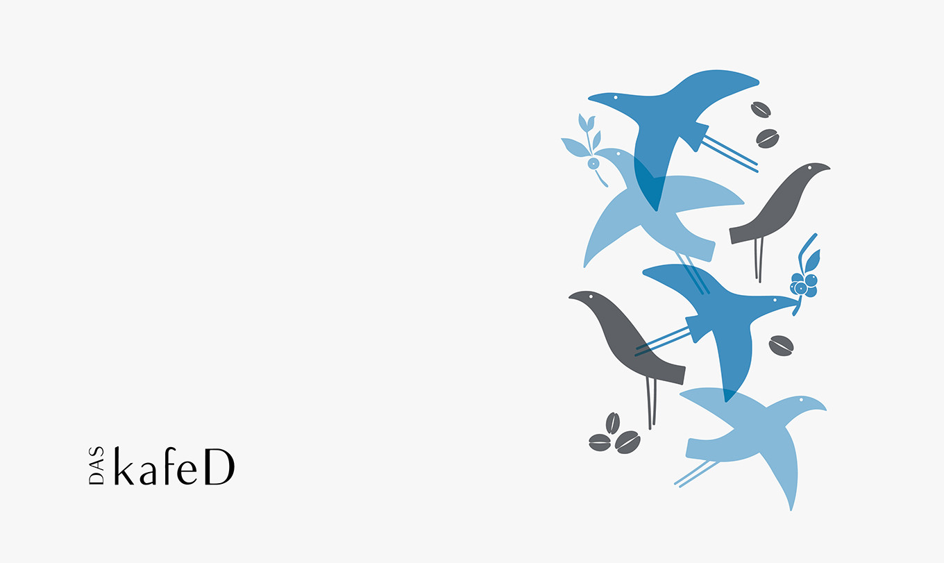
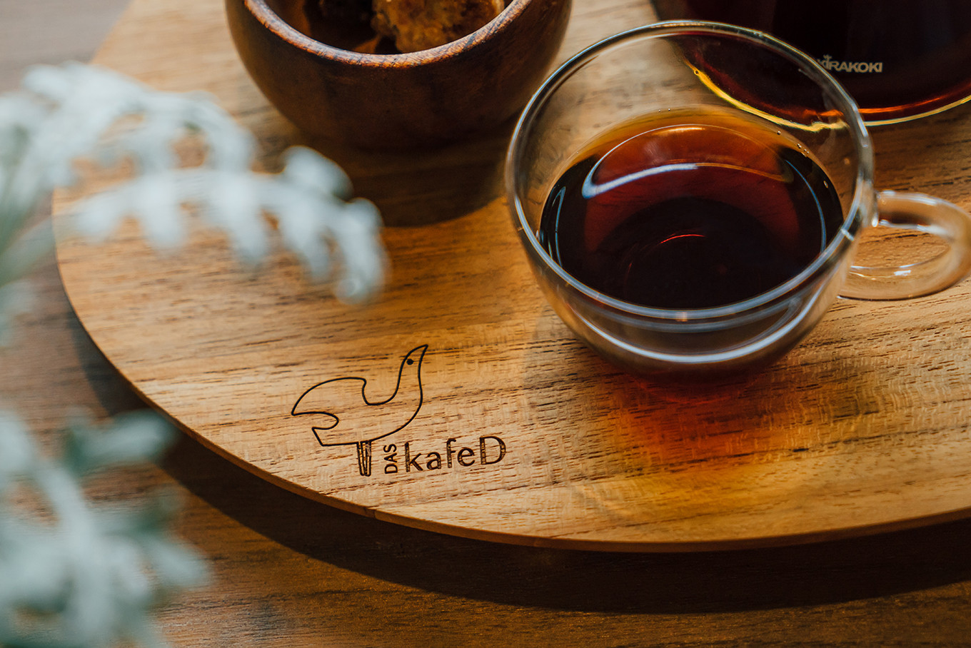
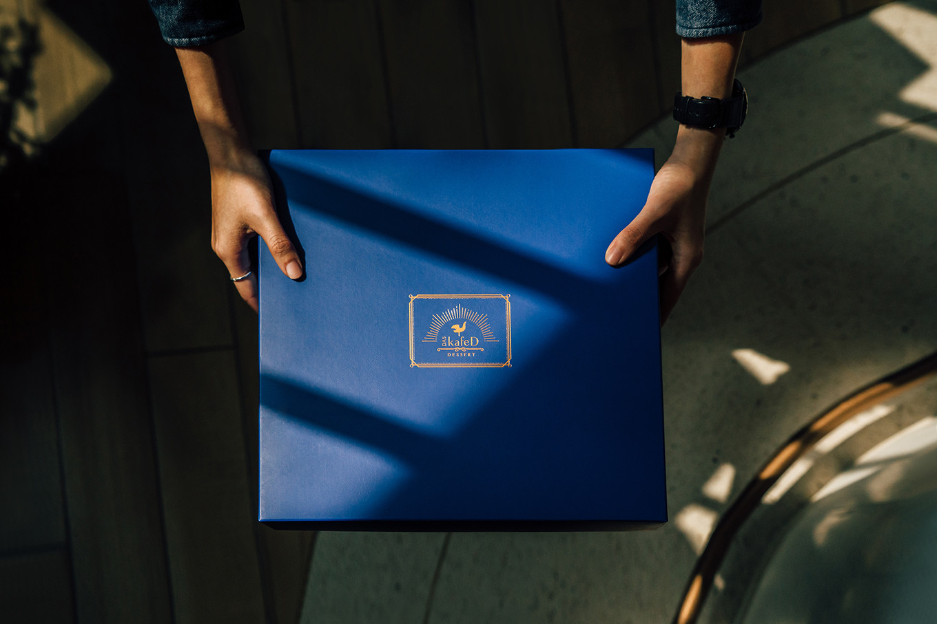
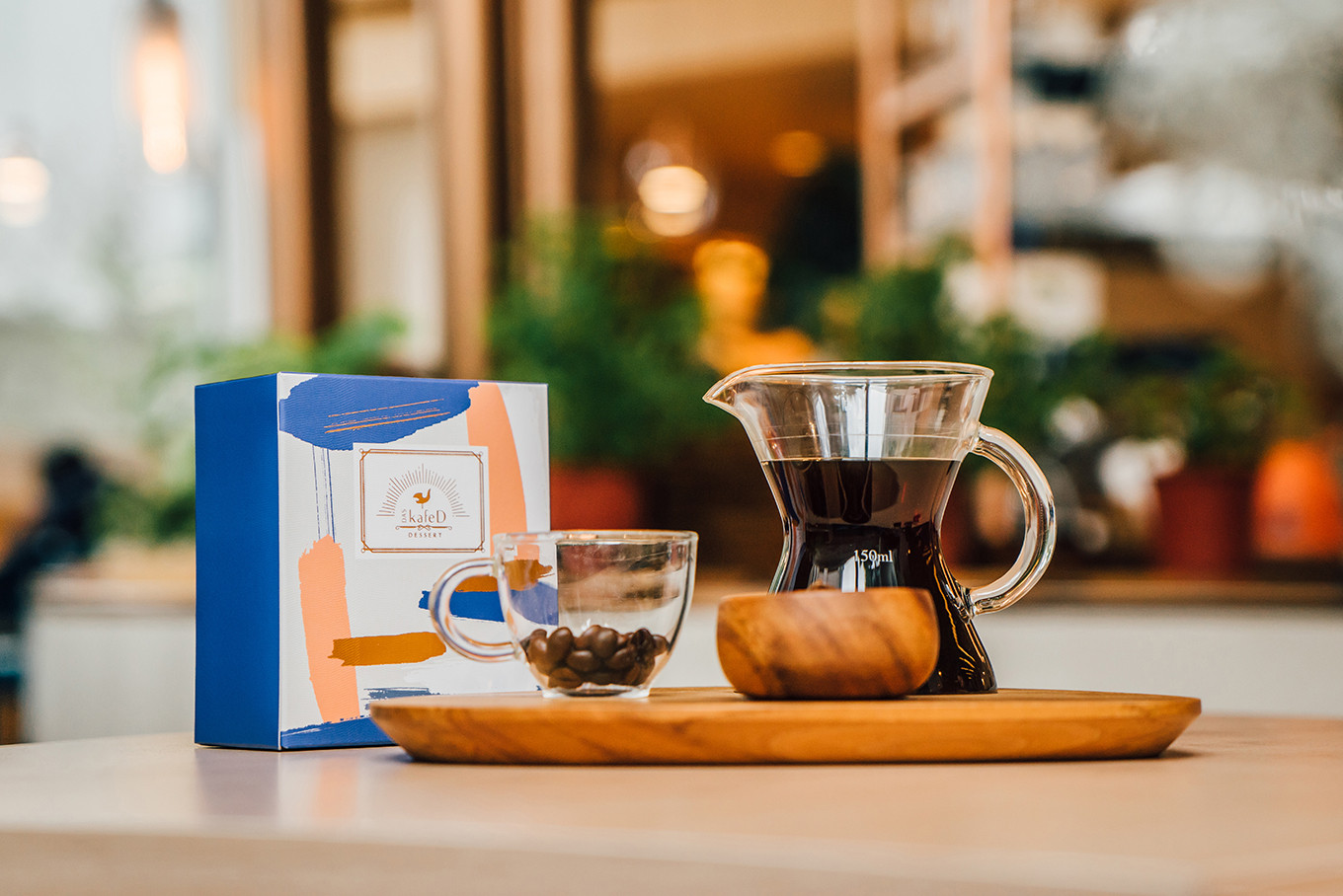
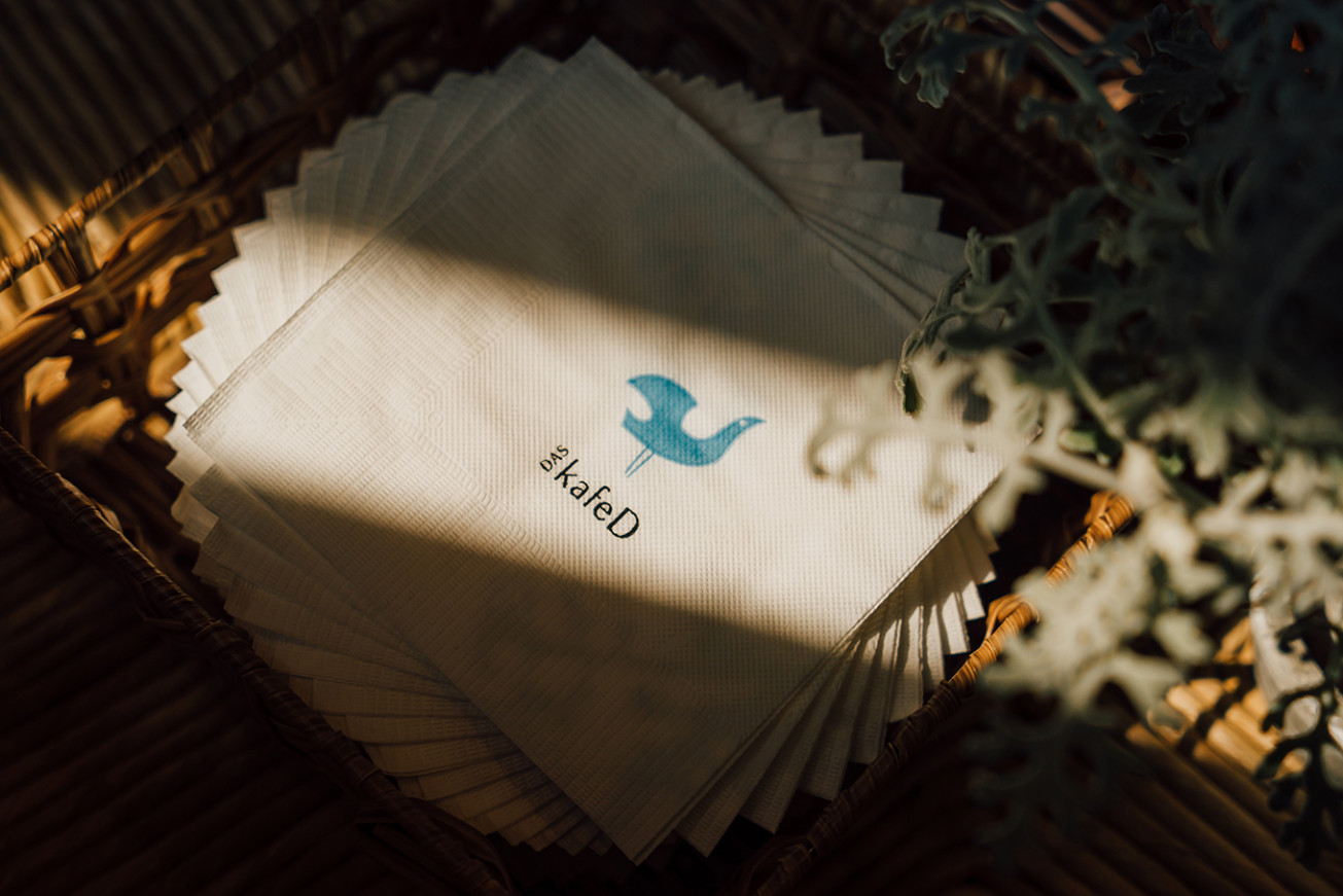
有一種象徵自由的鳥,翱翔於天空中,尋找的人生美好的事物,用著最嚴苛的標準,將好物帶回。DAS kafeD 堅持品味的挑剔與敏銳的味覺,就如同挑好果實的鳥,有著對於自我專注的要求。
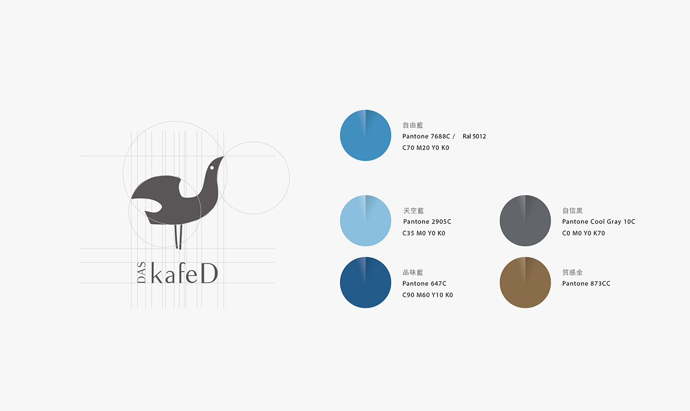
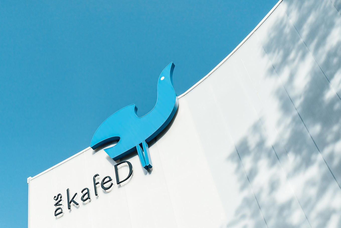
在品牌的識別設計上,仰角的頭與展翅的動作象徵著對於品質的高標準選擇,搭配著天空藍有著廣闊翱翔的意義。字體的設計上,為了凸顯下午茶的優閒時光,特意選擇了較為優雅纖細的字體。在識別設計的搭配上,能夠靈活的應用,如同自由之鳥,只願停留在好的事物上,而DAS kafeD永遠都有讓它停駐的理由。
Rigorous attitude, unrestrained soul.
There is a kind of bird calls freedom that flying on the sky and looking for the wonderful things in life. As like as DAS kafeD insists on choosing good ingredients for making nice coffee and dessert.
On the branding visual identity design that takes the freedom bird as the concept, the shape of the head and the flying pose representing the choice of high quality, moreover, match with the color of blue that means expanse and liberty. For highlighting the leisure afternoon tea time, chose the elegant and thin text font on the text design.