DAS KafeD
Gift Box
Packaging Design
品牌 : DAS KafeD
Client : Ju Ho Feng CO., LTD.
Brand : DAS KafeD
Published on 03. 26. 2020
DAS KafeD
Gift Box
Packaging Design
DAS kafeD 一如既往地為著美味把關著,在甜點的挑選上,始終用著最嚴謹的標準看待。
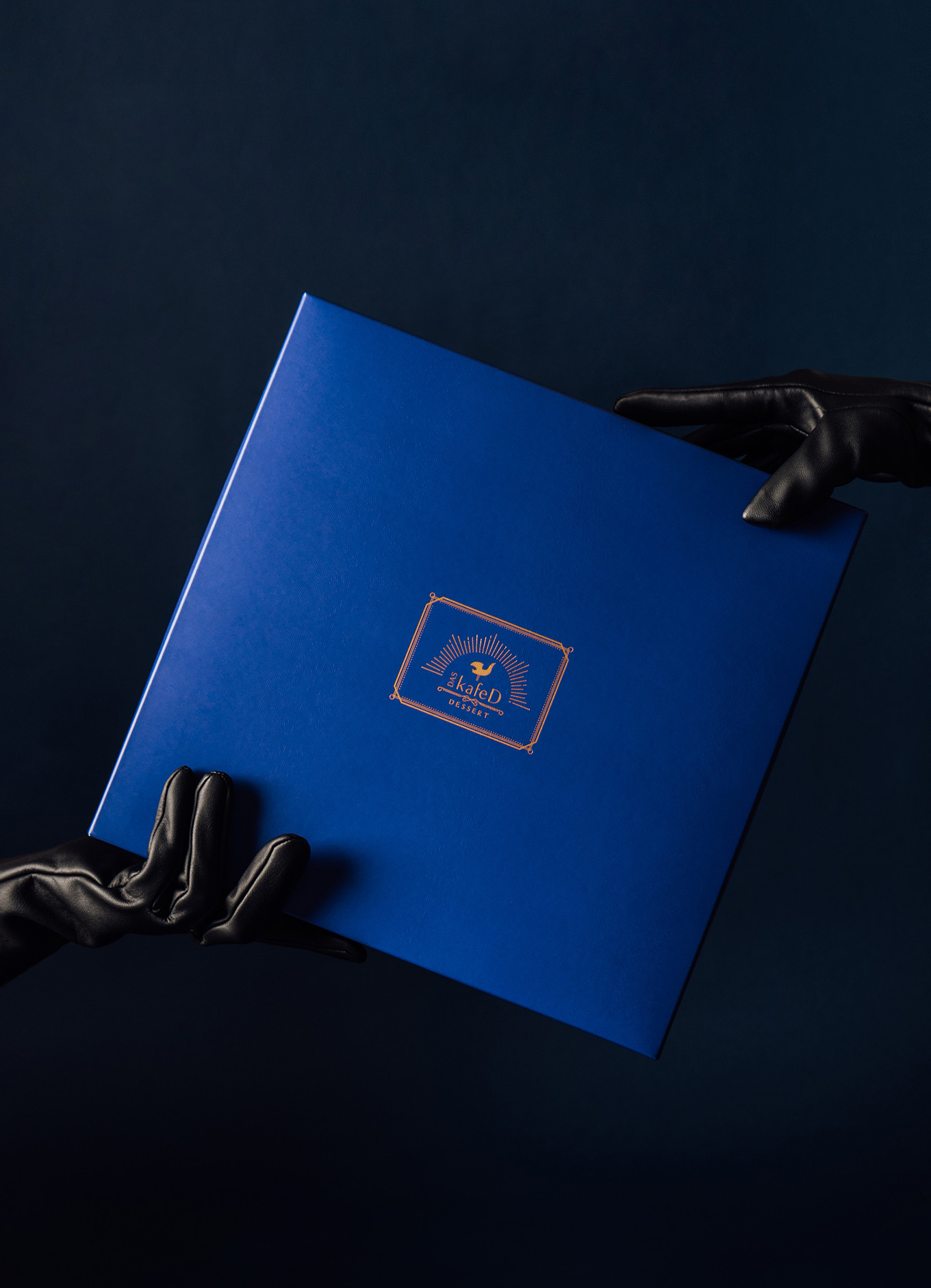
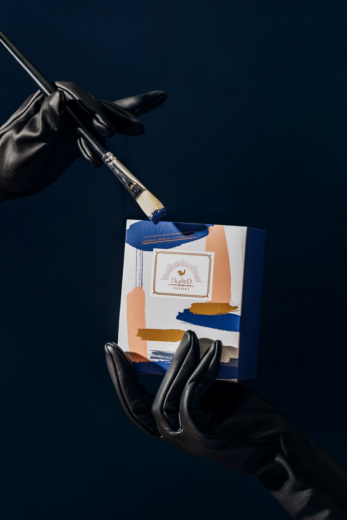
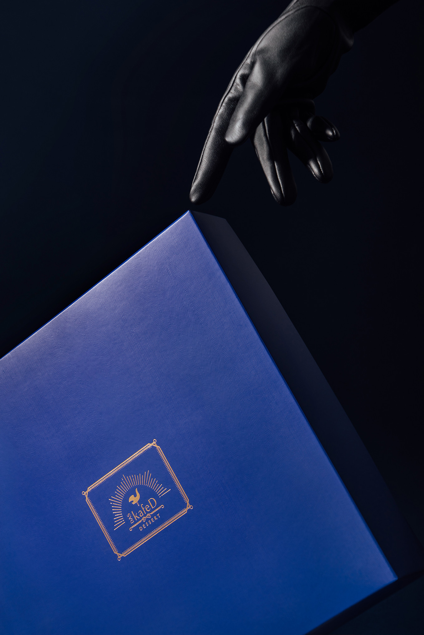
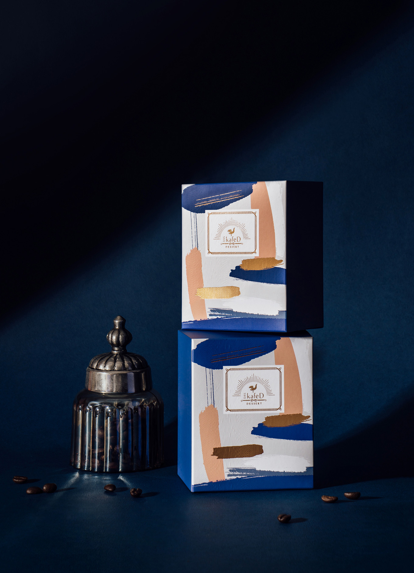
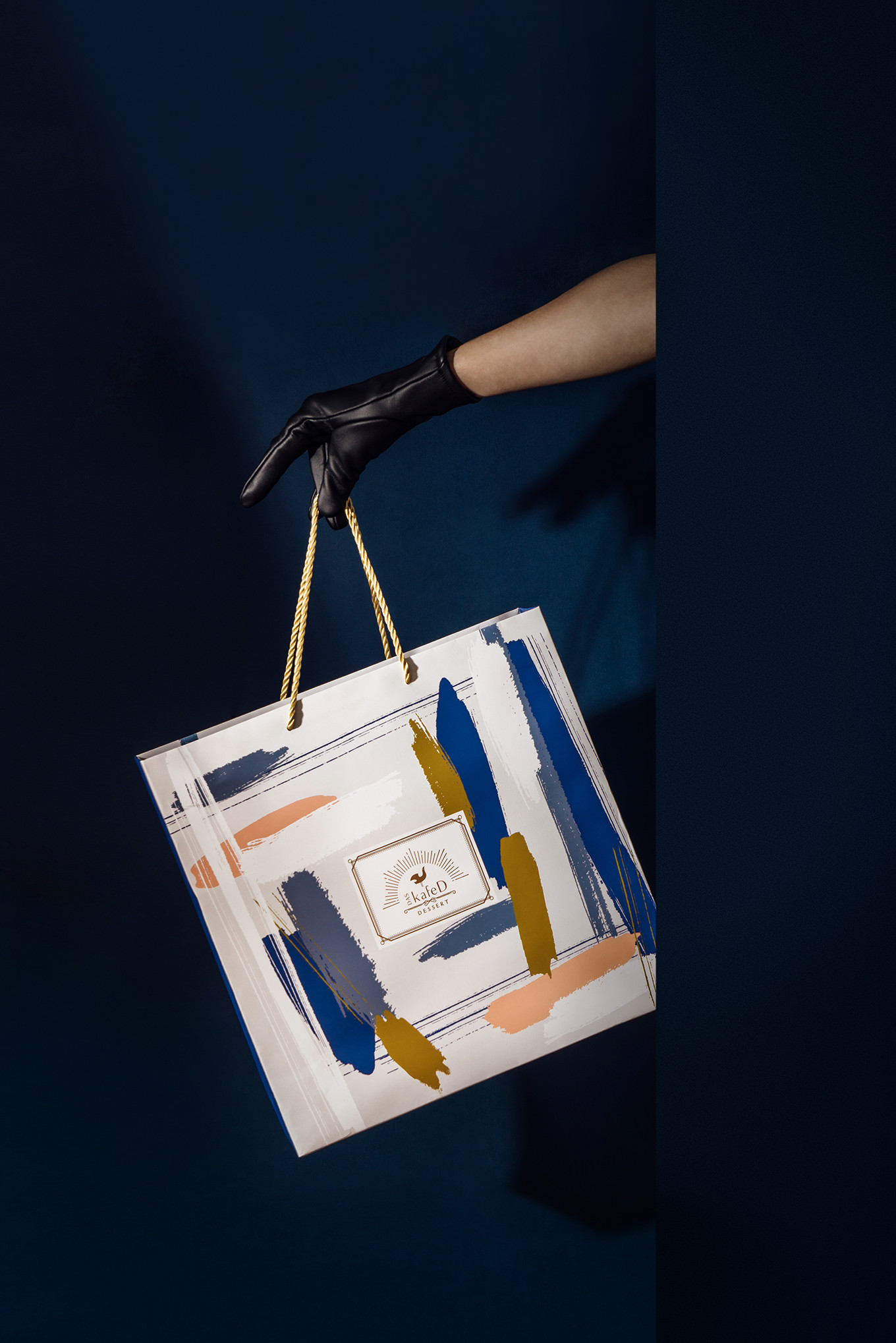
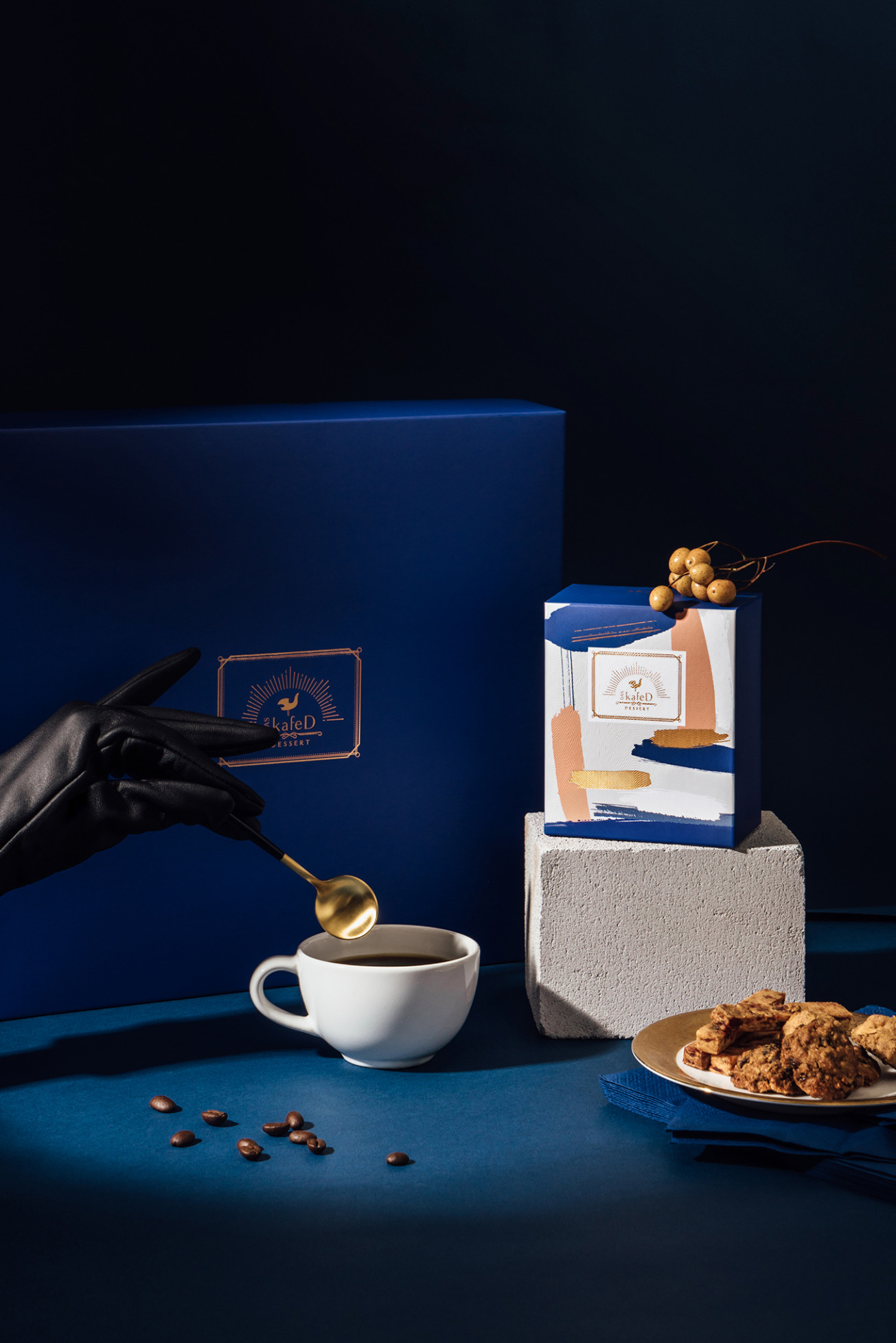
甜點如同藝術品般,需要細細品嚐,不只滿足味蕾,視覺亦感到撫慰;以象徵自由的形象藍做為禮盒的主色,壓上古銅色的燙金,在視覺的感受度上有著低調的高級感。另外,紙材的挑選上,運用了特殊紋路的壓紋,除了隱隱的視覺感官的不同外,在手感上增加了細緻與溫暖的觸感。甜點師在屬於他們的專業中恣意揮灑,隨意的美,無法刻意隱藏。在內盒的設計上以揮灑為概念,將甜點的形狀轉化成畫筆的揮霍,一筆一毫之間皆精準到位。
在 DAS kafeD 你能悠閒的享受,亦能將美味帶走,願你,在家也能享受到如此用心製作的下午茶。
DAS kafeD as usual with the strictest standard on choosing dessert.
Dessert is just like the artwork, which needs to be enjoyed gently, that not just for taste the visual will be satisfied as well. The freedom blue as the main color of the gift box with the bronze hot foil die-stamping, which represents the high quality with a low key. In addition, to the special grain on the paper choosing for making the package meticulous and warm.
On the inside box design, takes the dessert as the concept, transformed the shape of the dessert to the paint, every single stroke is art.
In DAS kafeD, you are able to enjoy and take the delicious away as well.