Graminton
Branding Visual
Identity Design
品牌 : 鉅瑋
Client : Graminton Enterprise LTD.
Brand : Graminton
Published on 12. 17. 2020
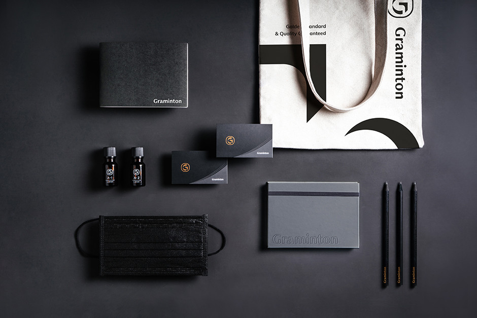
Graminton
Branding Visual
Identity Design
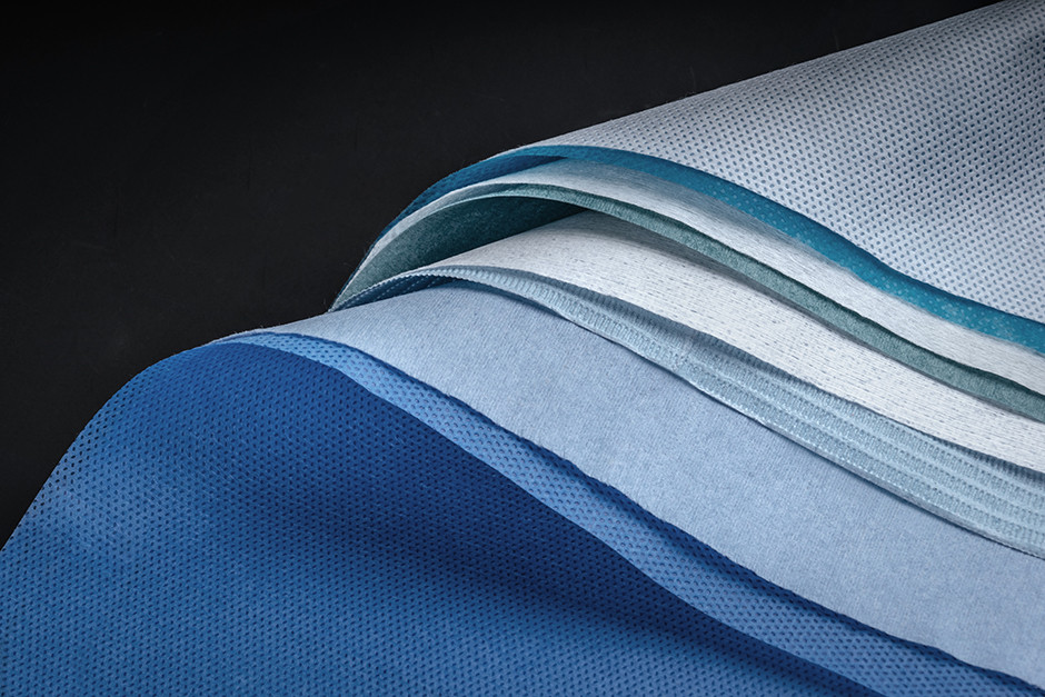
創立於西元1992年,著重在專業用紙與不織布的進出口貿易、國內外銷售及加工體系。二十年來不斷提升產品開發與品質,隨著產品範圍擴大,成立兩大研究中心,並著手進行統整與規劃,作為企業前瞻性的佈局。
在前期品牌挖掘的過程中,制定了「黃金標準 Golden Standard」作爲執行準則,並設定3G為鉅瑋三大核心優勢,分別為Good Material、Good Quality、Good Product,傳達出鉅瑋不只是品牌商的好夥伴,更是消費者可以信賴的製造商。
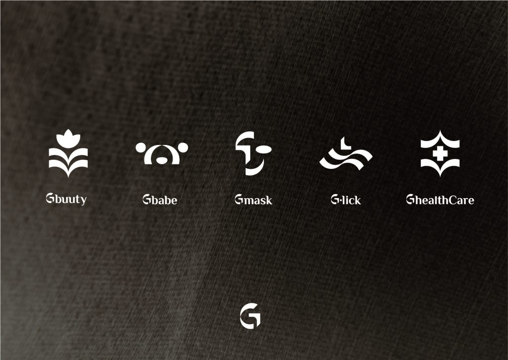
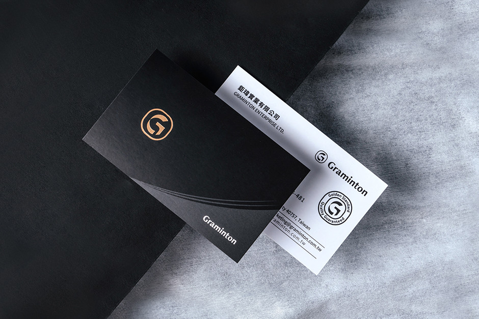
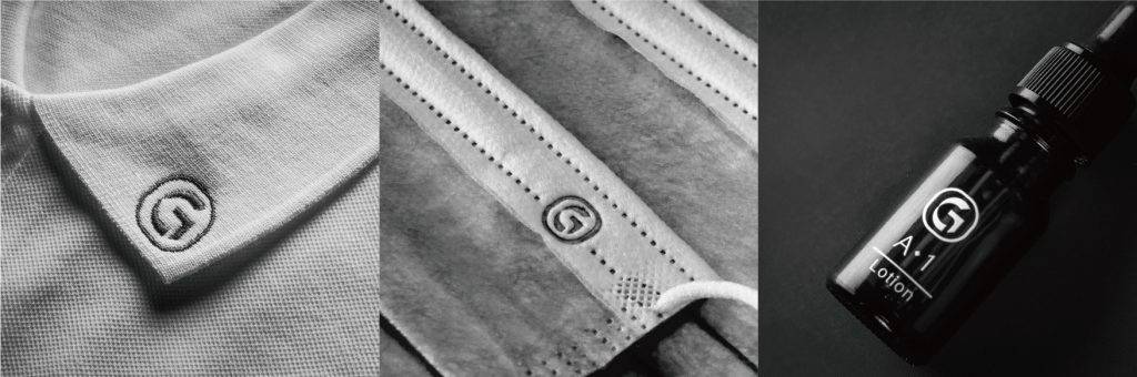
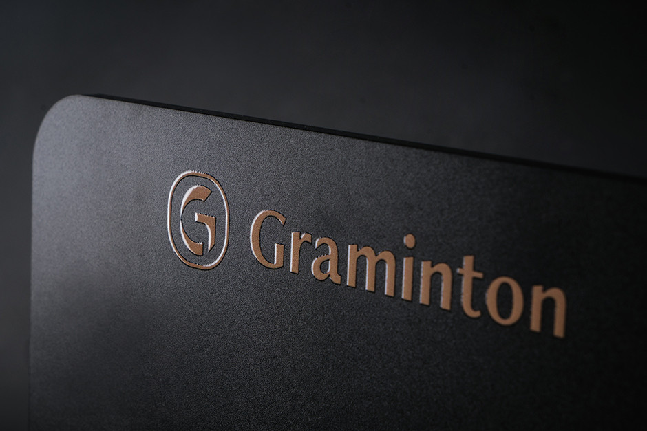
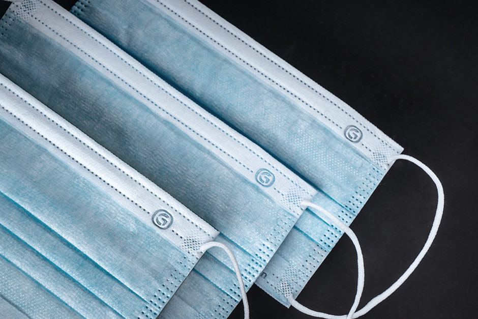
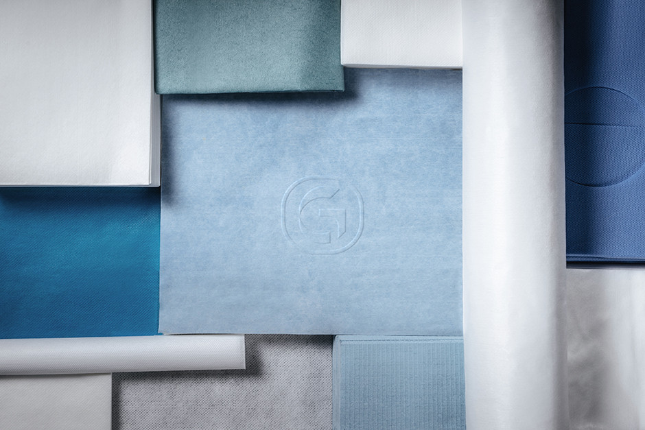
在識別設計上,以專業認證蓋章的概念,將G變化為專屬於鉅瑋的標章,並制定出一款對外使用的標章,打造出高品質材料的認證,顏色上著以金色與黑色凸顯品牌專業度;另外在不同系列的規劃則以識別的G做變化,依照不同的系統輔以小Icon與系統色,讓整體品牌有著各自系統的同時亦與鉅瑋有所連結。
鉅瑋,從纖維開始,用著最嚴苛的標準及最新的科技,一步一步的改善消費者的生活。
Graminton established in 1992, focus on import and export trade, domestic and foreign sales, and machining system of professional paper and fabric. Increasing product development and quality for over twenty years keeps, and start organizing and planning for the forward-looking arrangement to establish two research centers.
In the process of prophase branding excavation, we made a “Golden Standard” as the implementation guidelines, and create 3G as the main concept of Graminton which is Good Material, Good Quality, and Good Product, which tells Graminton is not just a good partner on business and also a trustable manufacturer for customers.
With the professional certification stamp as the concept on the identity design, alter the “G” to a specific stamp for representing Graminton. Moreover, creates the stamp for the certification of high-quality material. Choose gold and black to bring out the brand’s professionalism. Additionally, each series has its own logo that is changed by the “G”, according to different system match with a small icon and color, that make the whole brand connected and has their own system at the same time.