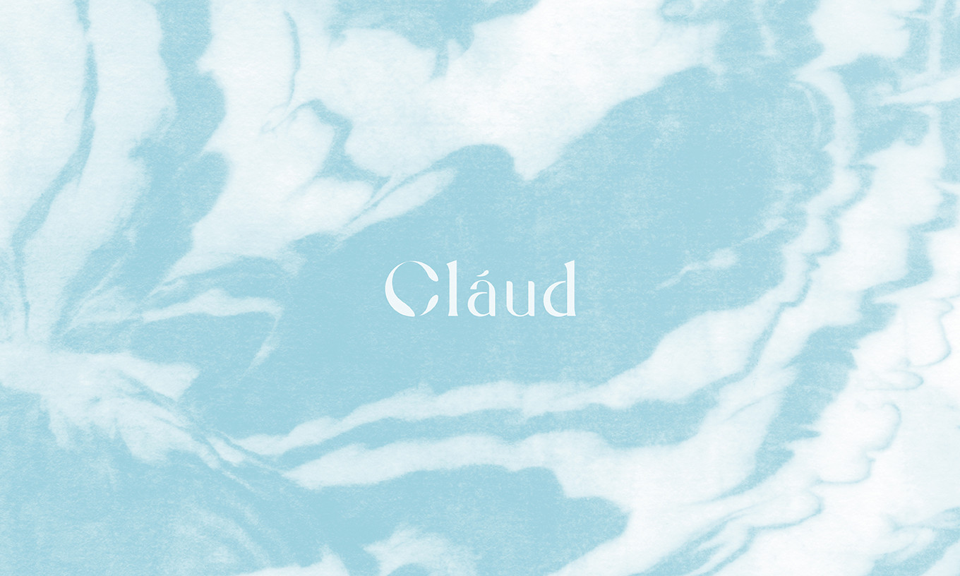
Cláud
Branding Visual Identity Design Project
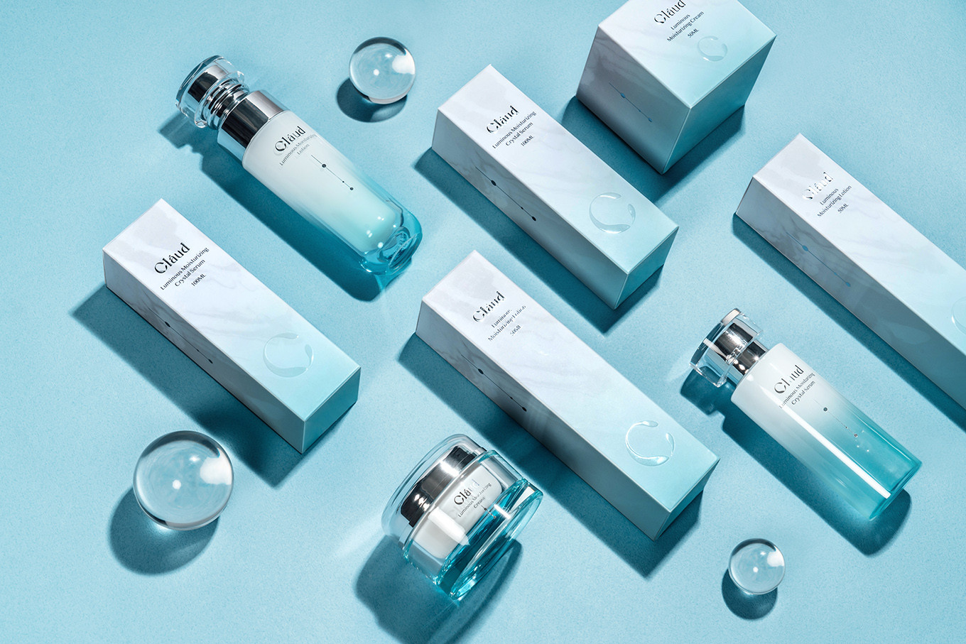
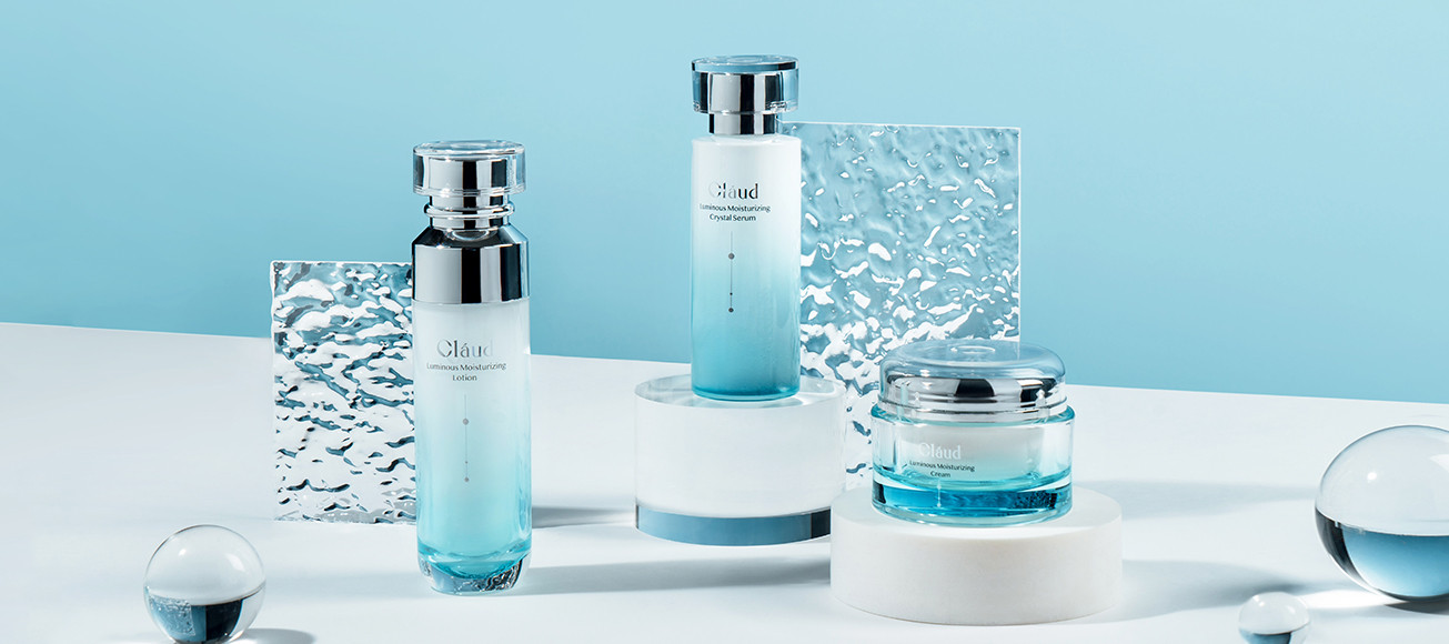
Luminous Moisturizing Series Packaging Design
品牌 : 可洛迪
Client : MEET SIANG YU International INC.
Brand : Cláud
Published on 05. 11. 2022
Cláud
Branding Visual Identity Design Project
Luminous Moisturizing Series Packaging Design
致力於研究敏感肌友好產品的可洛迪,一路上專注在產品的研發與推廣,然而,好的產品在網路上銷量高,但在品牌認知度與知名度上,卻比產品稍顯薄弱了些;在品牌重塑的路上,需要改變的很多,因為相較於以往可洛迪以產品打造聲量的方式,未來,將以可洛迪為首,打造專屬品牌形象,並以品牌核心結構推出一系列產品。
從小,創辦人看著母親深受敏感肌所苦,在保養品的選擇上,總是需要一再挑選才能放心使用,因此創辦人致力於使用溫和的配方,針對敏感肌打造專屬保養品,自己敢用並真實有效,才推出到市場。
而可洛迪,並不止於生產保養品,更多的是希望消費者能透過可洛迪,找回女性自身的原始魅力與自信。因此,在品牌核心的統合過程中,找出女性於不同階段所追求的美,年輕時從注重外表的樣貌,到成長過程中內心健康的平衡,每一個時期追求的美都不同,而美,不只有一種方式,“內外共好”才更完整;以“內外共好”為品牌基礎核心,創造出雲理循環的保養美學,在保養的過程中探索自己、了解自己、與自我對話,三向對話,凝聚美的循環,進而達到身心靈共美的狀態。
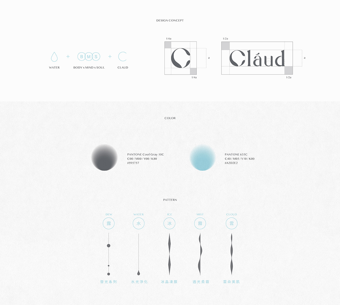
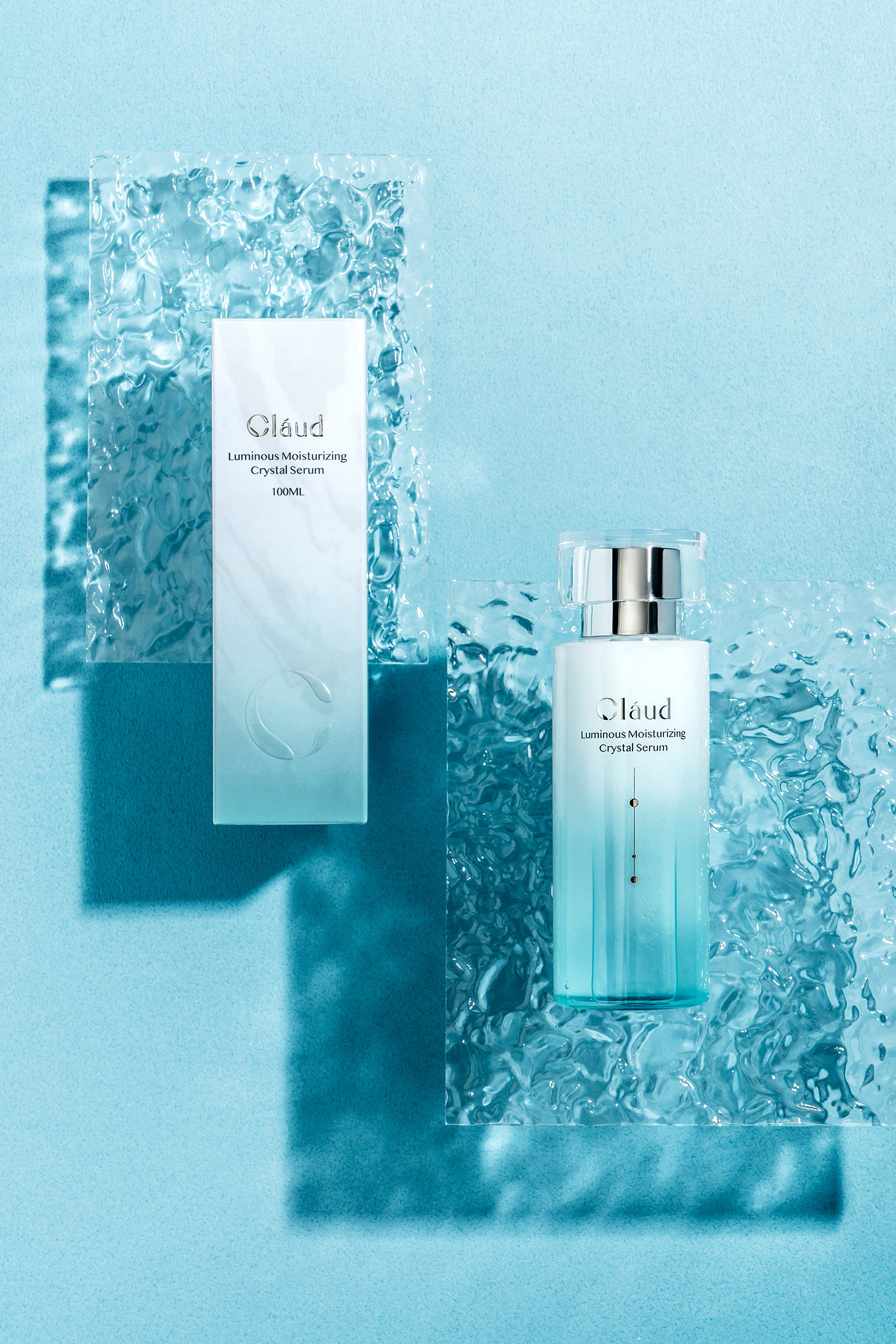
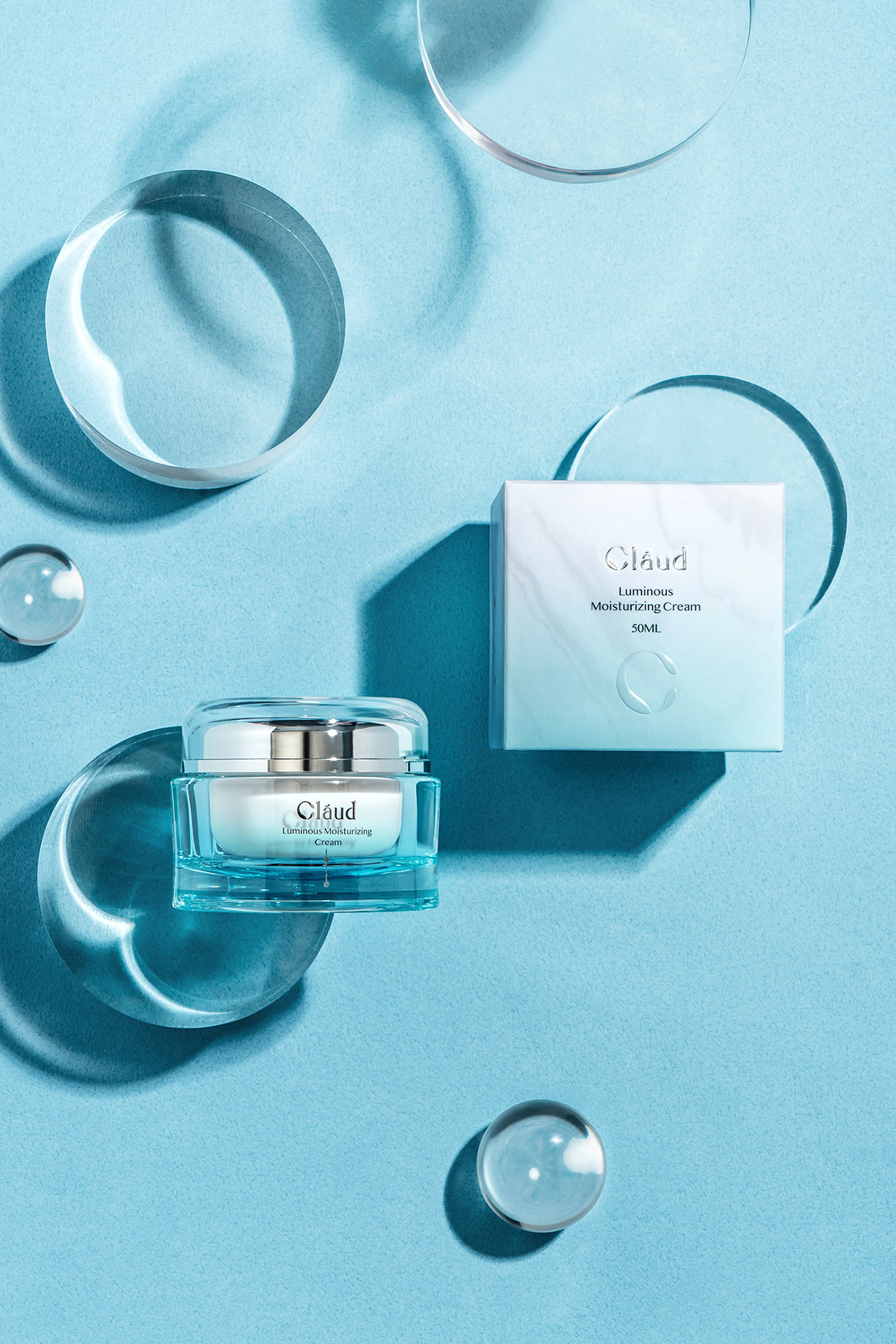
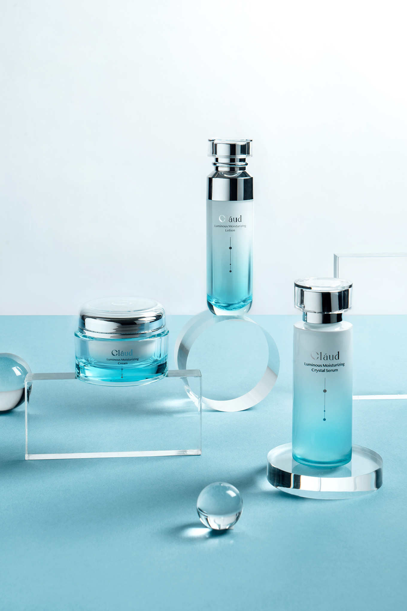
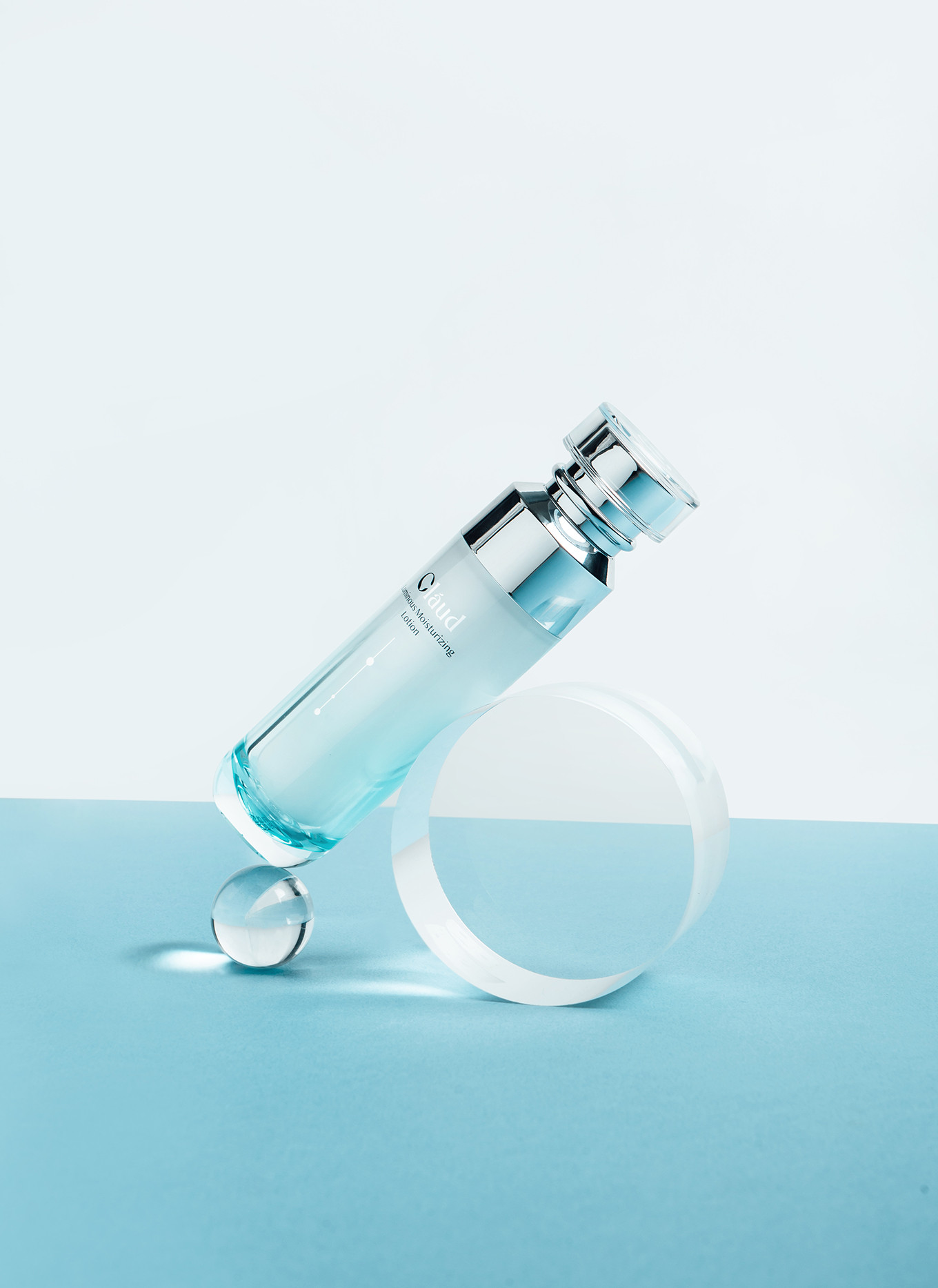
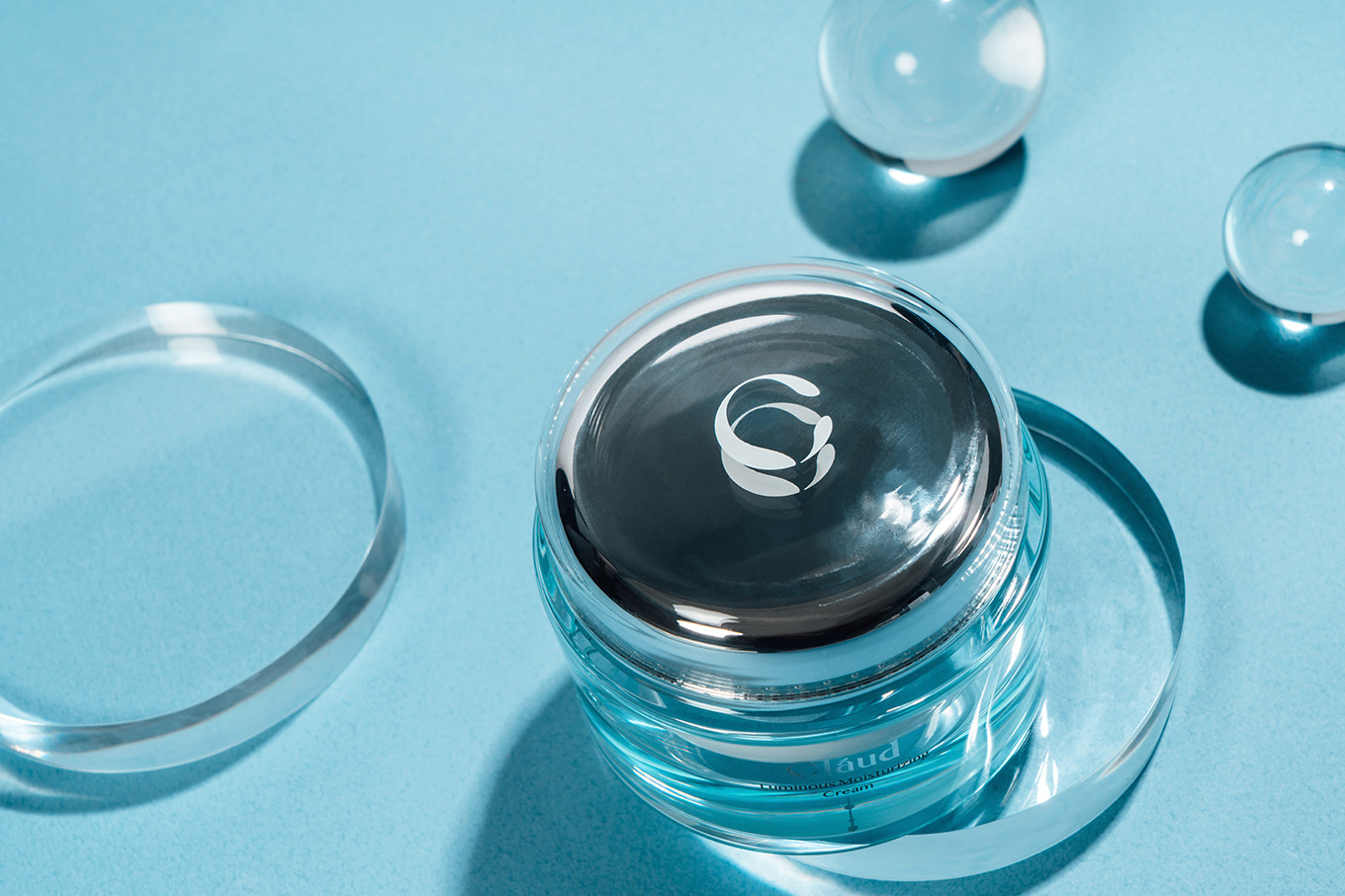
以水的循環美學為概念,將身心靈轉化為3個水滴,並於品牌字母C結合,打造專屬識別形象,並傳達出品牌清新柔軟的形象,水滴的型態易代表了原料的嚴選與單純,以此建立起品牌信任感;字體的表現上,以霧水藍作為識別主色,在字型的彎角處以更平滑的設計方式雕琢,讓識別以更柔和的方式結合水態。
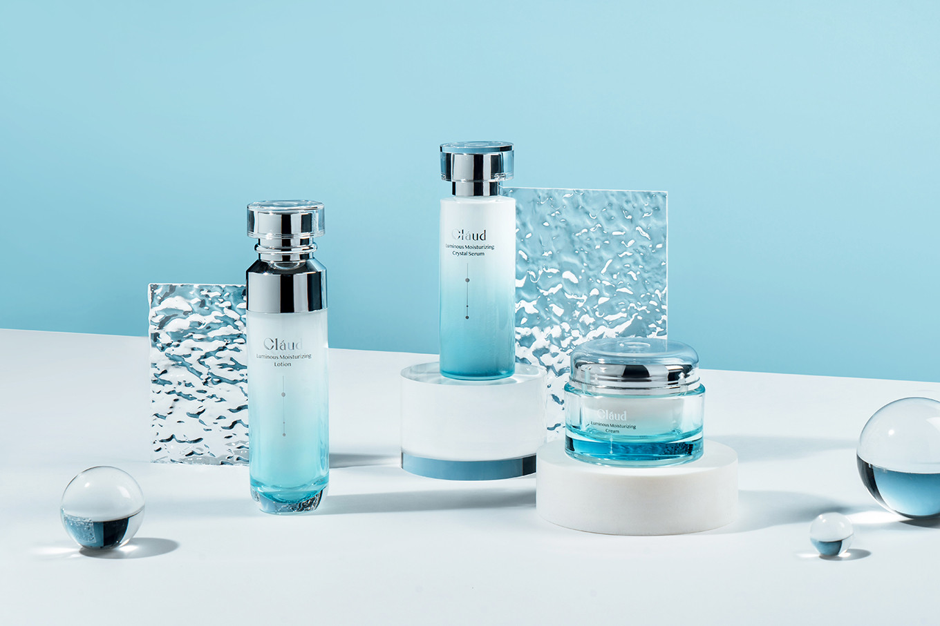
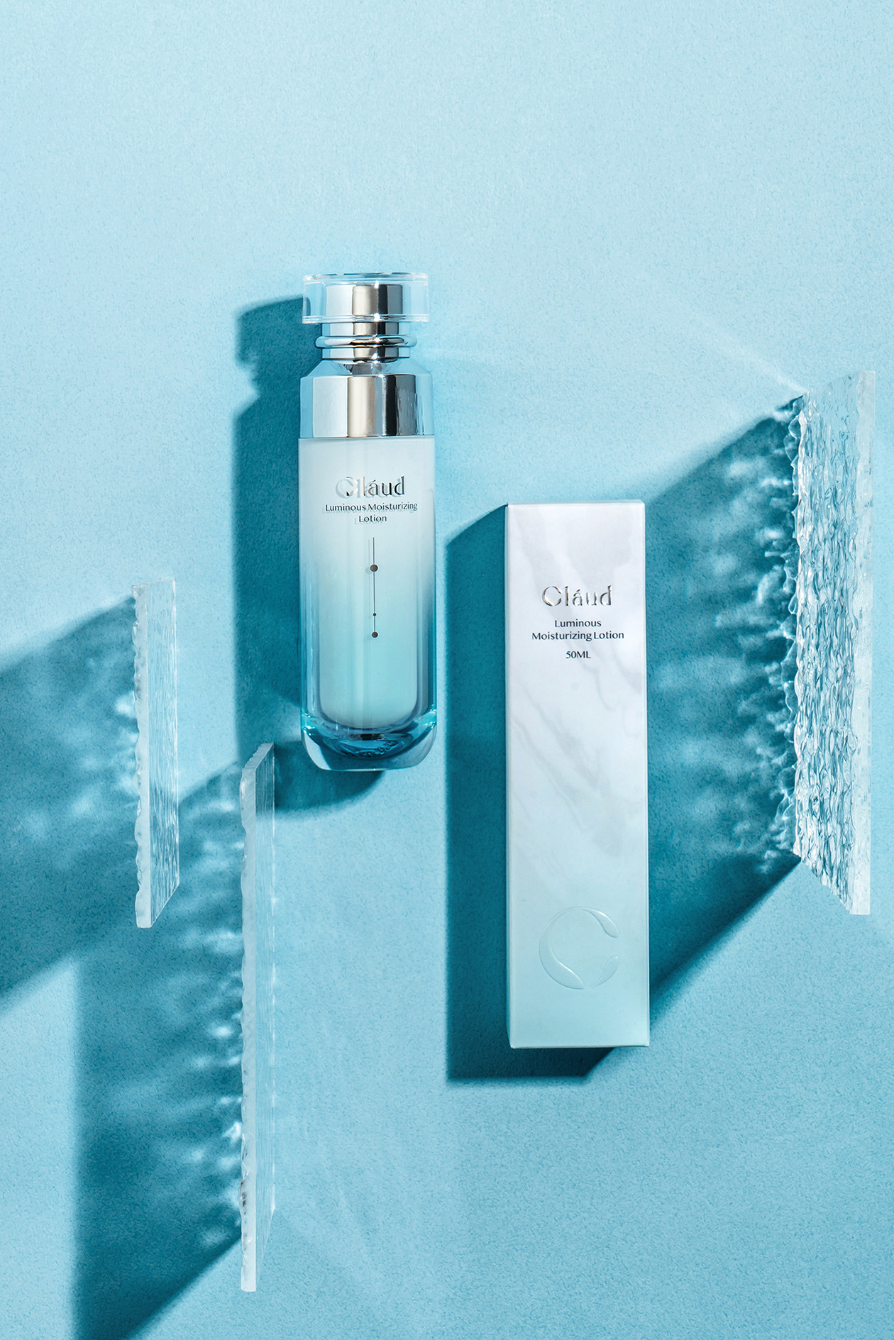
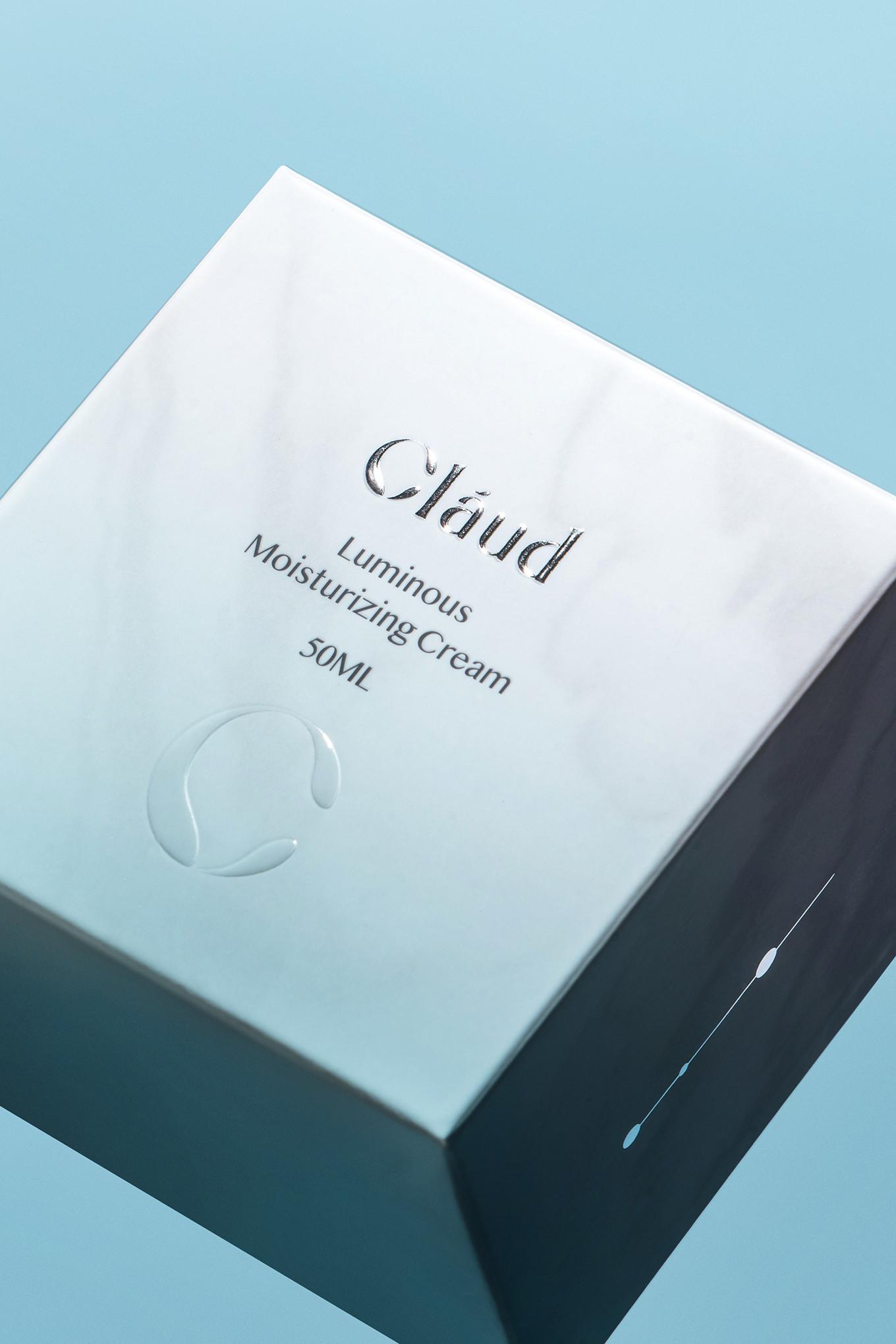
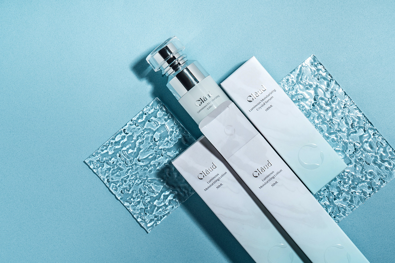
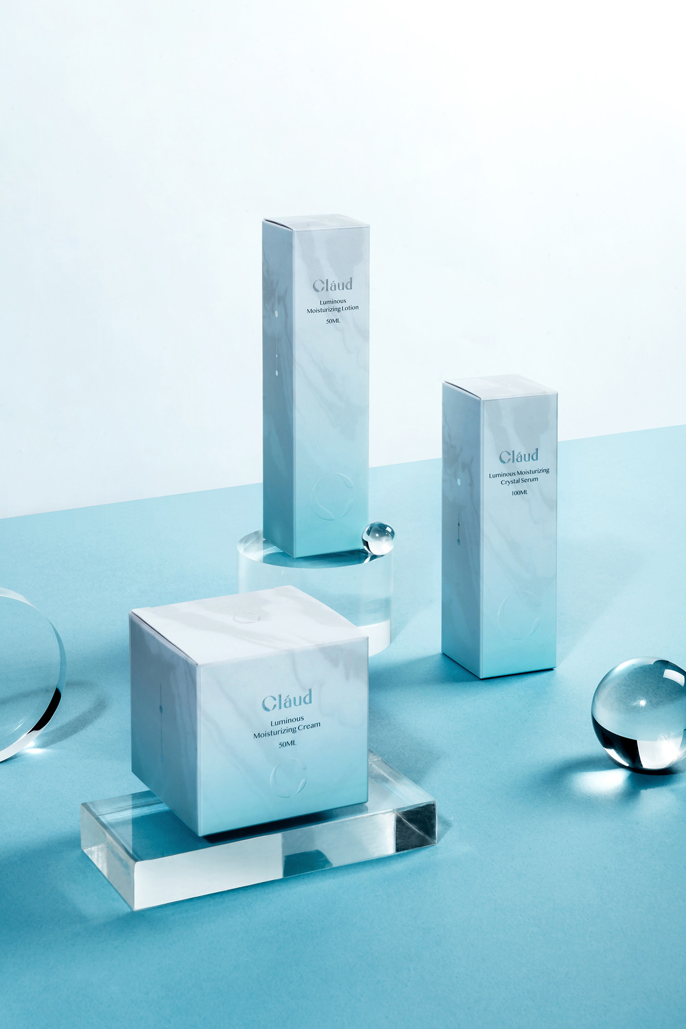
不同系列的商品,皆以水的不同型態進行規劃,而此次晨露發光系列,以“露”傳達出萃取的型態,在漸層的色彩表現下,呈現出黑夜幻化成白天的微光變化,由氣體轉化成的液態,是最純粹的,而在紙盒流動的姿態有著最單純的營養。外盒以水波紋表現出清澈流動感,並以漸層的顏色表現創造出輕透感,將露型態轉化成專屬Icon,以燙銀的方式呈現於側面包裝上,增加不同系列商品的辨識度;而在識別C的表現上,上光的加工方式讓水滴的凸起面與透明感被營造出來;在打開包裝時,加入了一句小巧思的對話,讓消費者在使用的過程中,更有情境與期待感;打開後,最先看到的是印在瓶蓋上與鏡子反射的識別,以霧白網印的方式塑造雲般的清透漂浮感;瓶身以兩種顏色加工方式,表達與外盒的一致性,不透白色由上往下噴出漸層感,而有彩度的顏色則以半透明的方式由下往上與白色相連形成層次感,瓶身的LOGO與ICON以燙銀的方式表現出鏡面的效果,與瓶蓋相互呼應。
整體品牌概念以水態作為串連,以塑造完整的品牌形象,再一步步建立起品牌價值與辨識度,傳達出美麗的型態不只一種,每個人都是自己的一片雲、一滴水、一個循環,在成長的過程中,都擁有各自的形狀,各自美麗。