
Art Cave
Branding Visual Identity Design Project
品牌 : 臺灣|兒童藝術基地
Client : National Taiwan Museum of Fine Art
Brand : Taiwan Children’s Art Cave
Published on 08. 16. 2022
Art Cave
Branding Visual Identity Design Project
「 孩子,就是世界。」
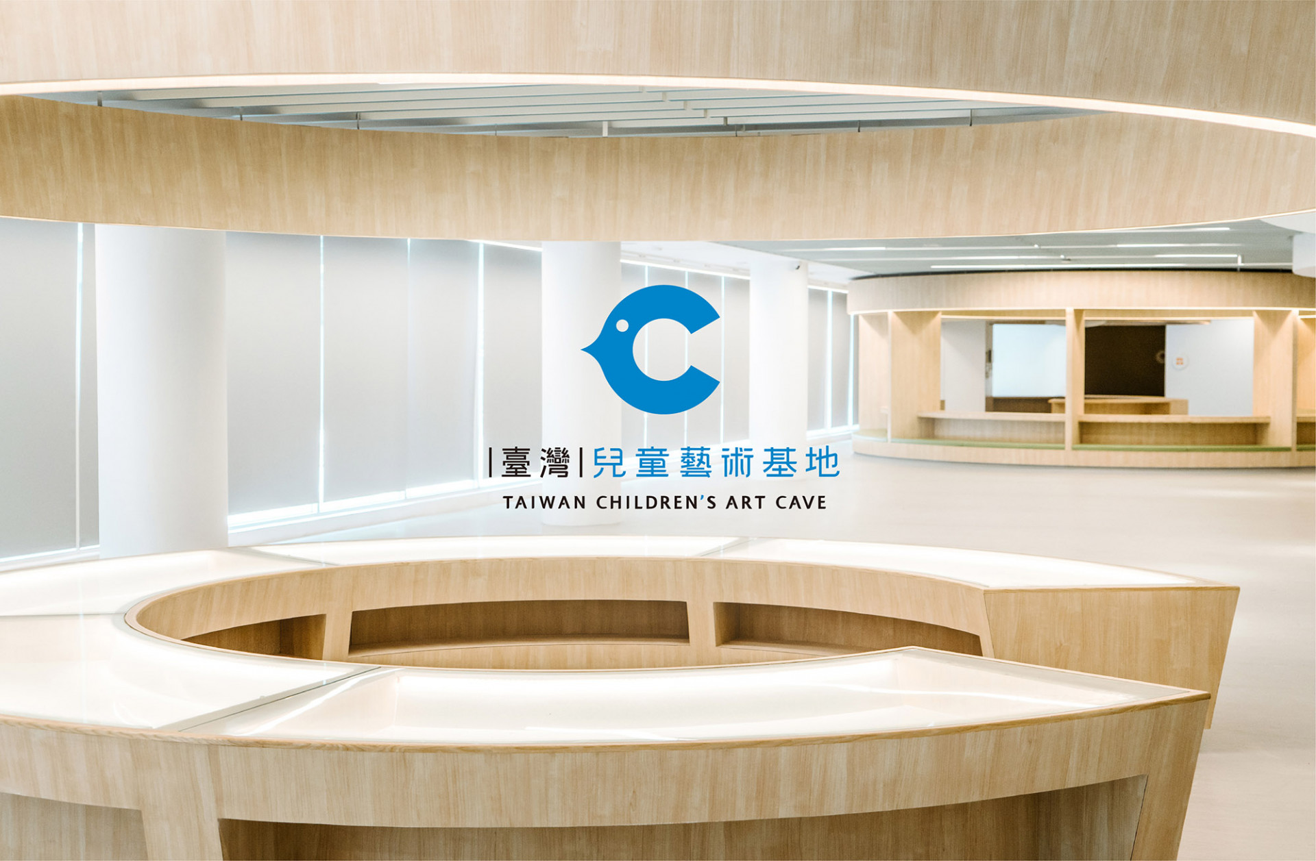
國立臺灣美術館,以國家美術館為地基概念,打造一個專屬於兒童的藝術天地。在充滿多元與想像的空間中,給予兒童一把魔法鑰匙,開啟靈感,並進入探索生活中的美學;以連接人類藝術起源的洞穴概念出發,扮演孩子們喜愛的秘密基地,給予更多體驗與陪伴,在安全的空間中奠定美感的基礎,放大無限藝術想像。
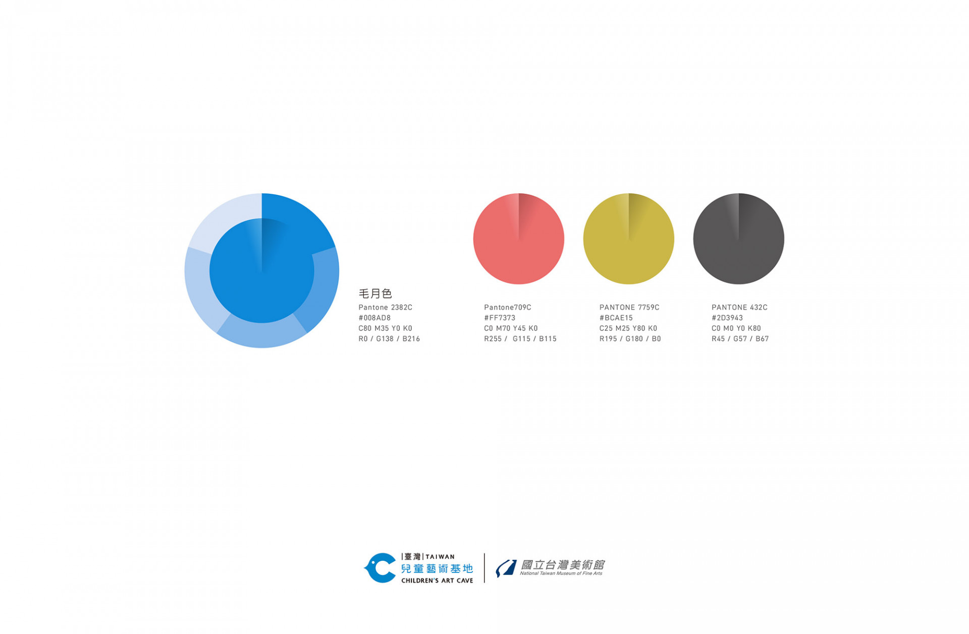
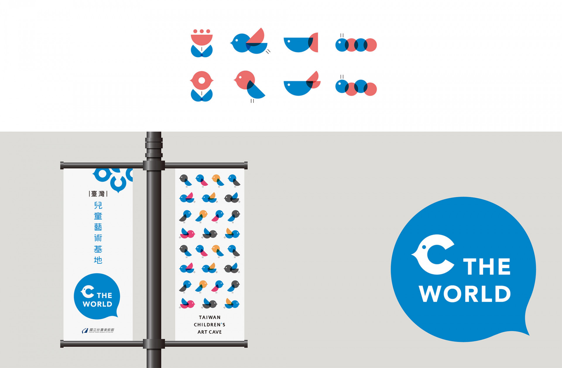
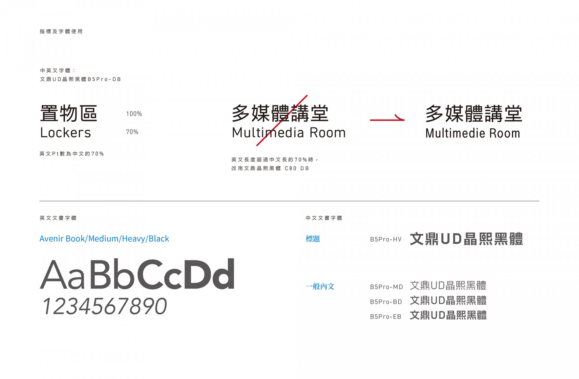
視覺與感官是接觸一切美麗事物的關鍵媒介,透過孩子最純潔無礙的靈魂之窗,能看到更多生活中隱藏的美;在命名的發想過程以 Children 的 C 作為主要概念發想, 品牌整體調性以童趣的插畫加上鮮明的色彩呈現,富有故事性的風格帶出玩味想像與創新活力,希望在這個充滿多元與想像的空間中,為孩子打開藝術與日常生活的連結與陪伴。視覺主色系為深毛月色的國立臺灣美術館,為串連出國美館與兒童藝術基地的相連性,在視覺識別的色彩計畫中,主色系以國美館的深毛月色為基礎,延伸出青藍的淺毛月色帶出藝術延續感,另加上降低彩度的紅、黃、黑色結合毛月色,以專屬於兒童藝術基地的 CMYK 色系,期望未來兒童們有著無限的創意色彩;品牌搭配字體選用文鼎晶熙黑體,除了在空間中扮演清晰辨識度的重要角色,更能在識別上兼具簡約又不失國家美術館整體風格的沈穩感受;而品牌的輔助圖形,以幾何建構圖形,延伸出生活中能接觸到的花蟲魚鳥,讓形象識別富有彈性趣味與活潑感,也讓孩子們在創意發想中,以更多不同角度拼湊出屬於自己的內心世界。
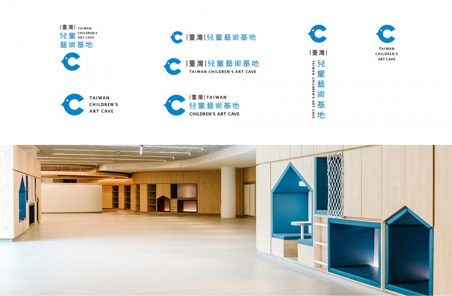
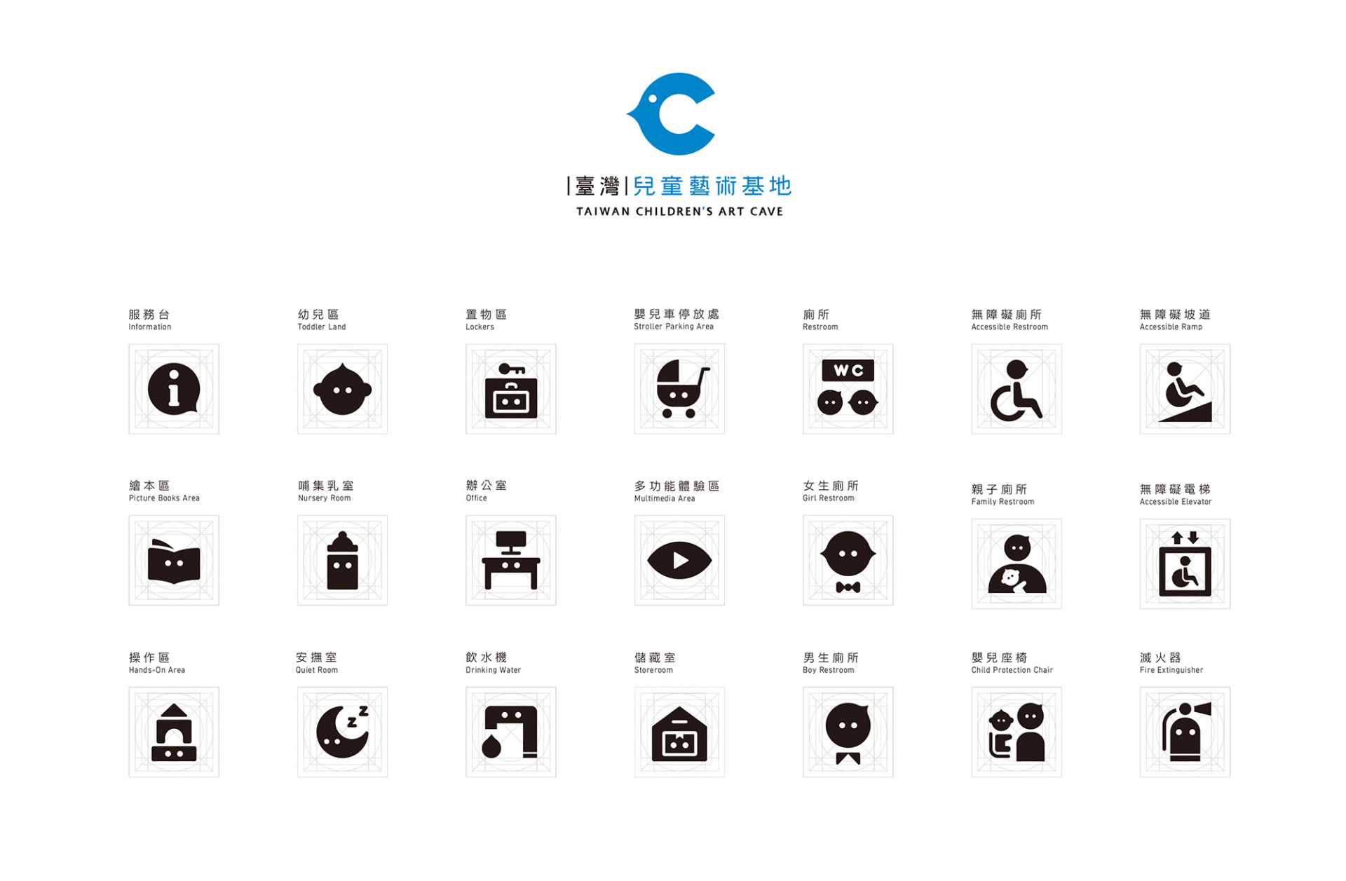
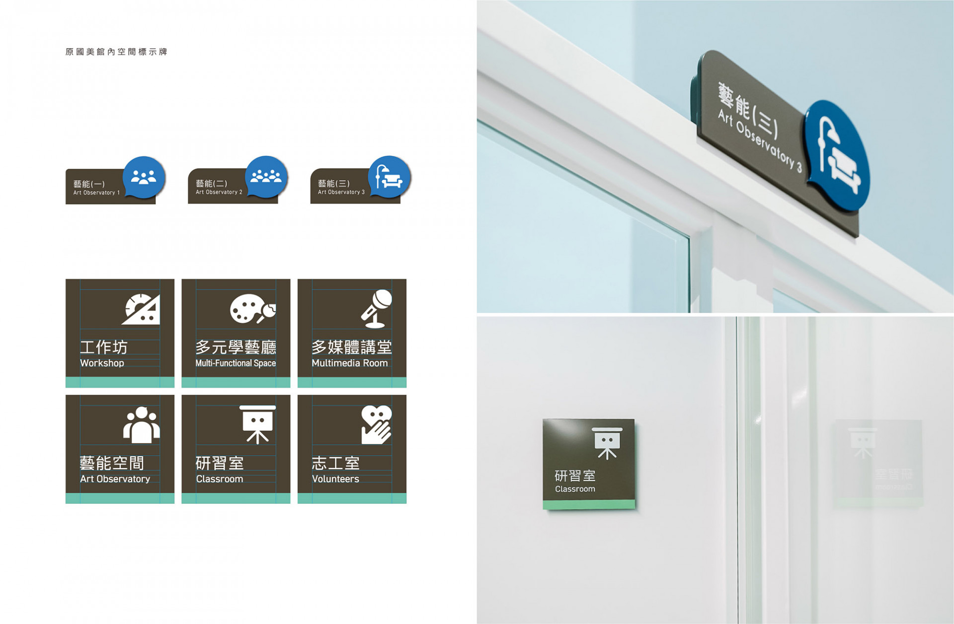
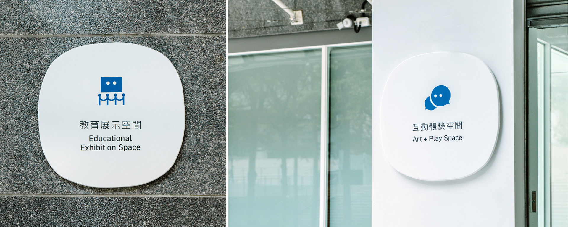
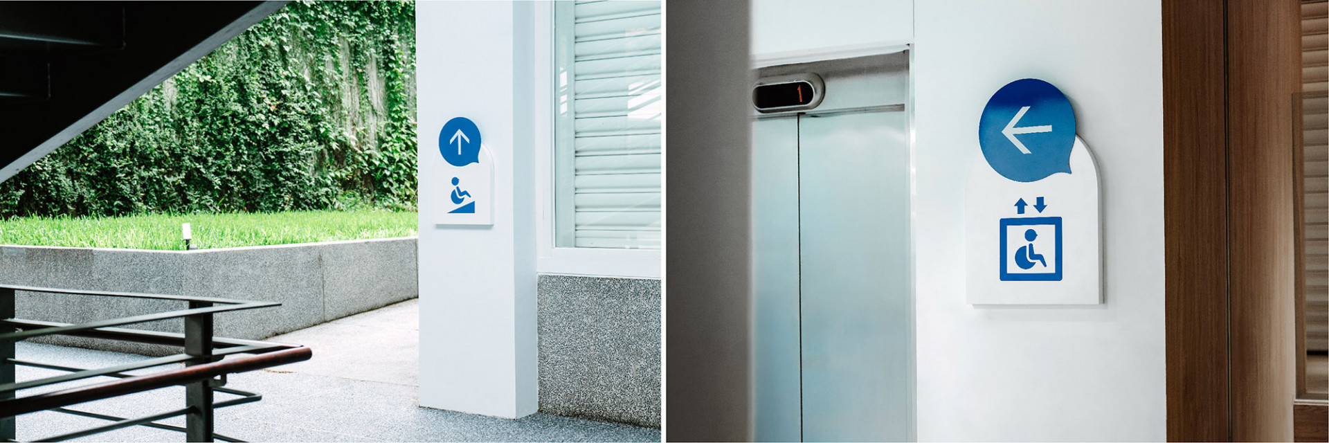
為建立出與空間設計一致性的指標系統,在設計上不僅結合識別的造型,以識別的輪廓加上指標製造出對話與方向感,每個縮圖皆代表了空間的功能,另外每款設計指標延續了 C the World 的概念,皆加上代表雙眼的圓點,中英文雙辨識說明與顏色的搭配上,完整傳達兒童館內的空間意義。
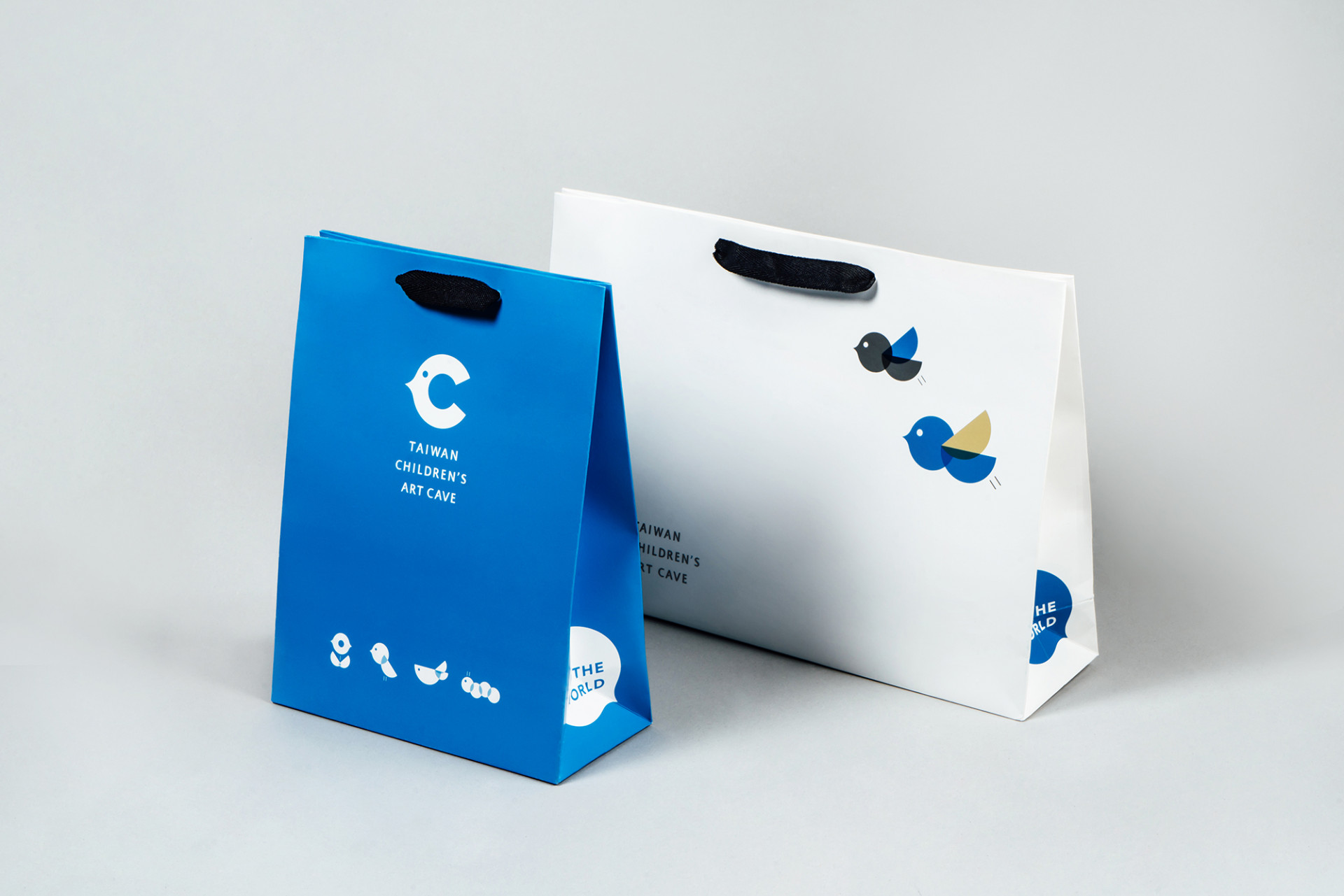
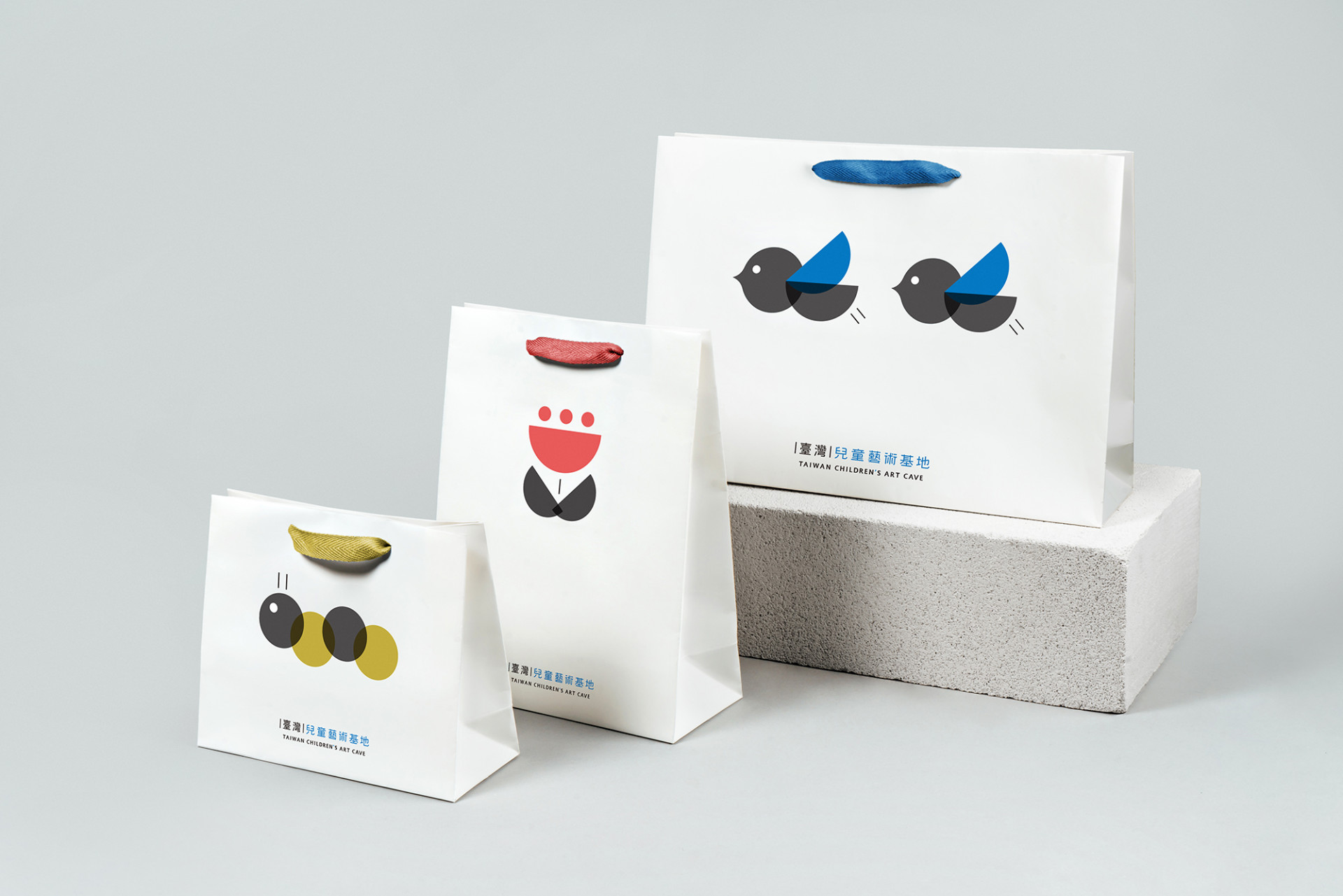
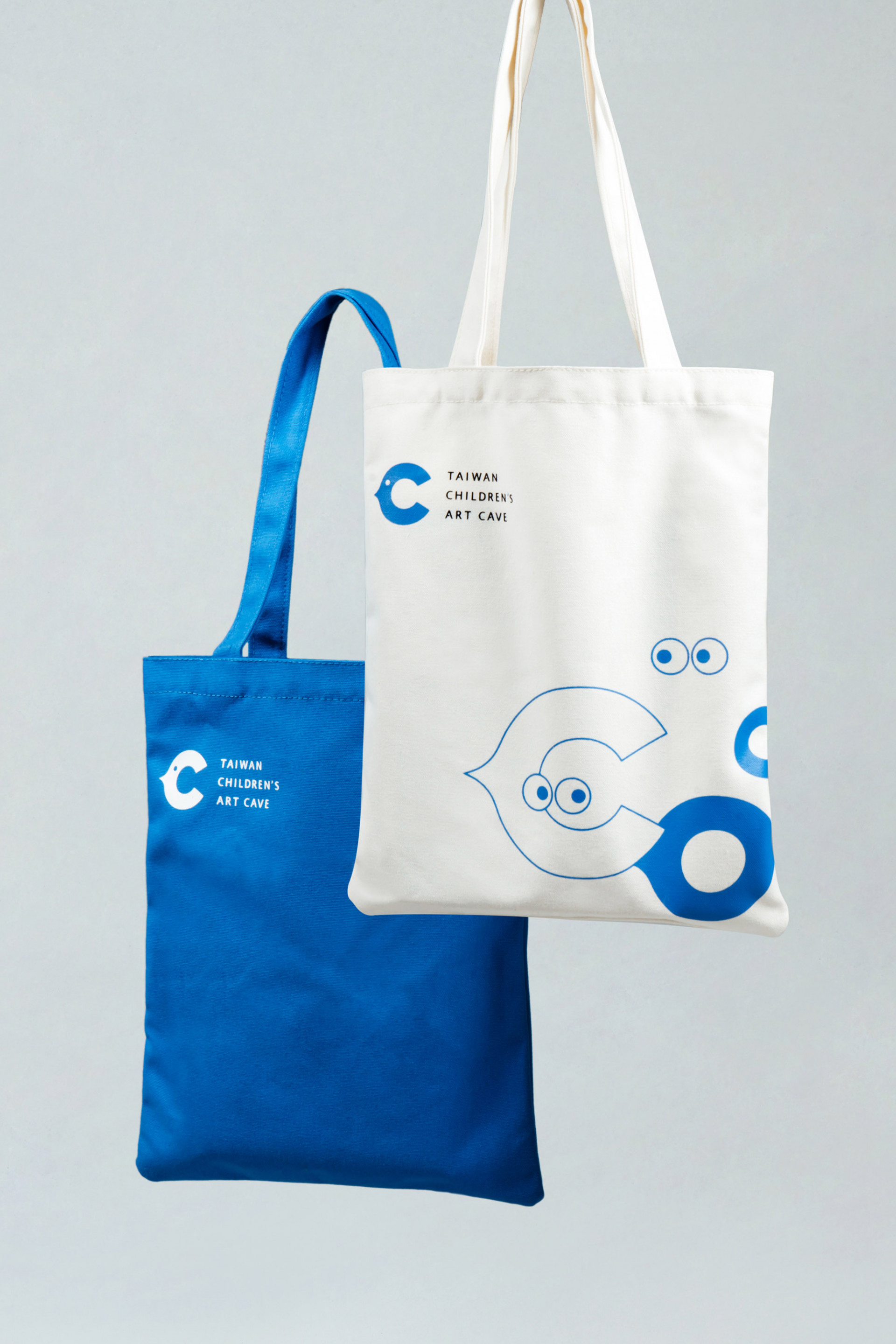
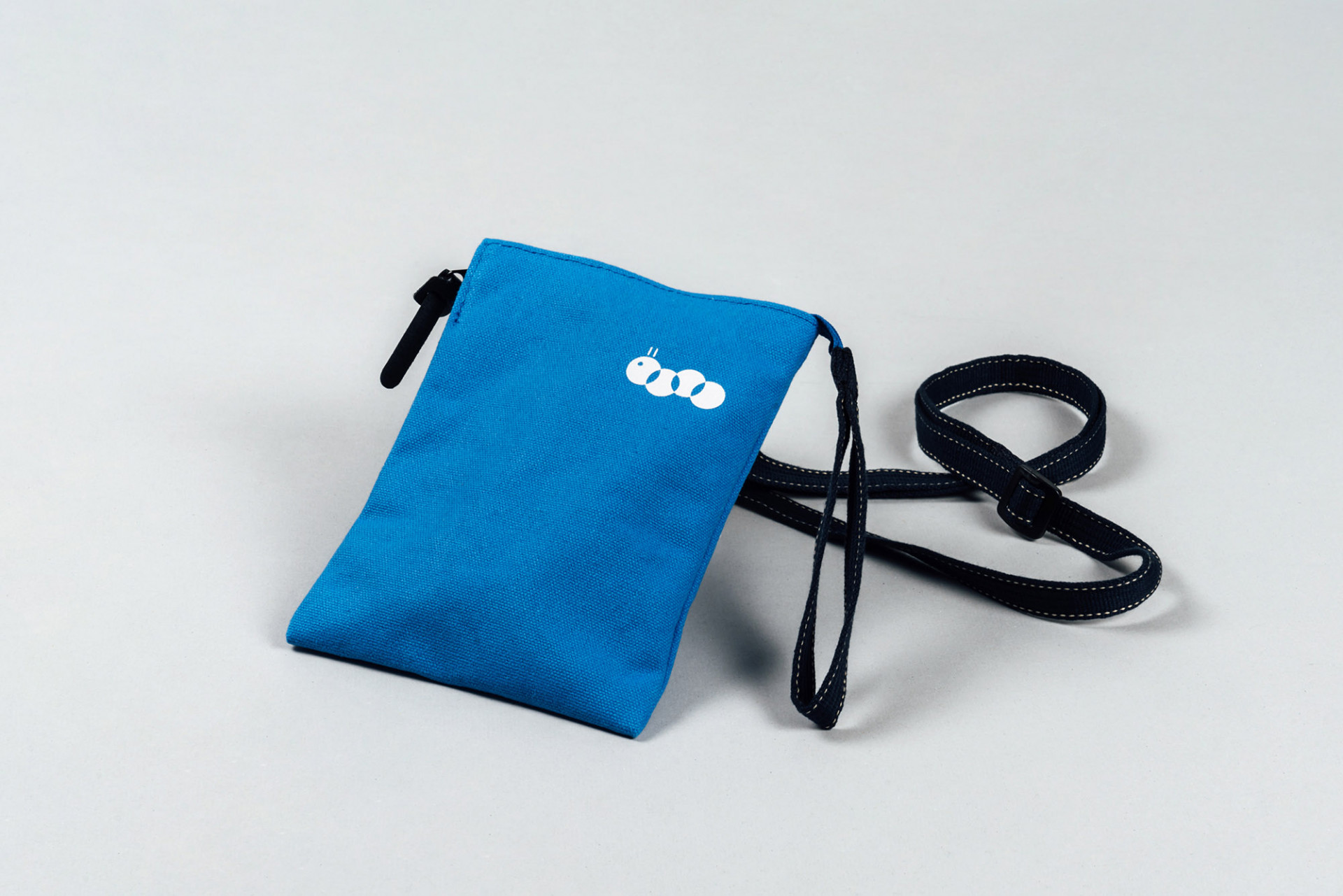
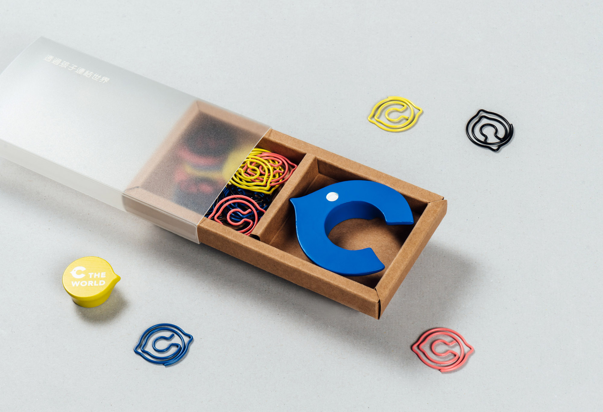
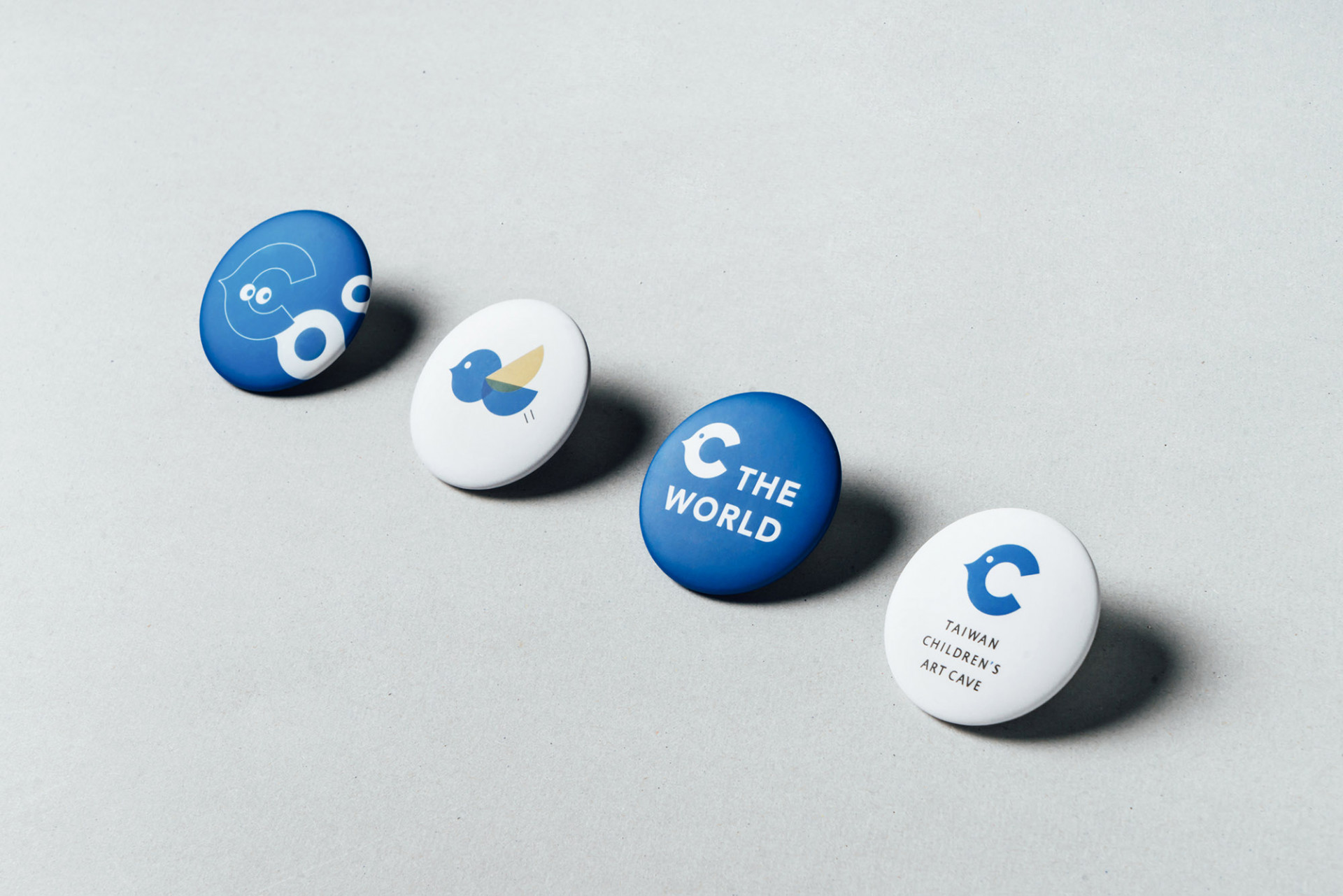
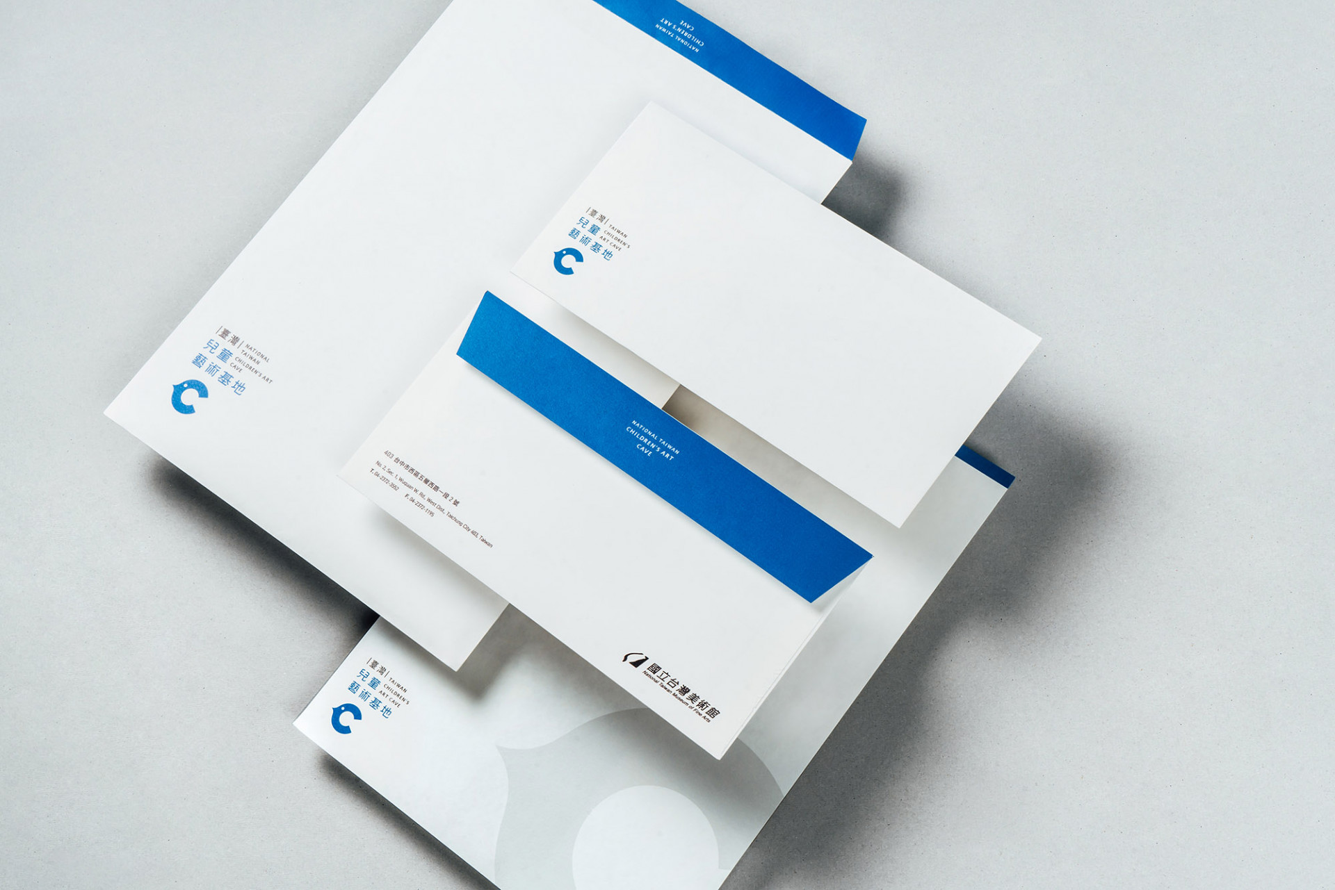
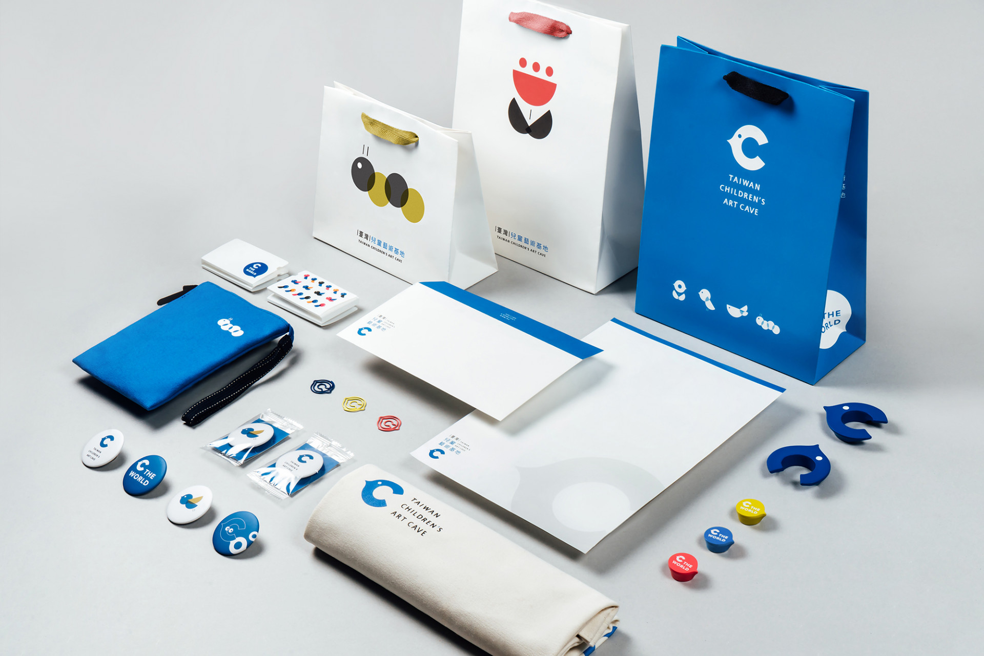
在應用系統的延伸上,以識別的淺毛月色為主要應用設計,並輔以童趣的輔助色與造型,讓不同事務用品在運用上,有更多層次與使用範圍;整體的識別系統的運用上,廣泛地使用 C 識別,以推廣兒童藝術基地,讓兒童藝術基地以更簡單的視覺記憶,逗留在人們的心中,進而強化空間與識別的聯想。
Children are the world.
Children are the world." The National Taiwan Museum of Fine Arts has created a space that belongs entirely to children — a world of imagination and discovery. Here, every child receives a magic key to unlock their creativity and explore the beauty found in everyday life. Inspired by the cave as humanity's first canvas, this secret hideout nurtures a sense of wonder in a safe and welcoming space, where artistic imagination knows no bounds.Vision and the senses are the essential gateways through which we encounter all that is beautiful. Through the pure and unobstructed eyes of a child, more of life's hidden beauty becomes visible. The naming concept takes the "C" from "Children" as its central inspiration, shaping a brand identity expressed through playful illustration and vivid color. The storytelling quality of the visual style evokes imagination, wit, and creative vitality — with the hope that within this space of diversity and wonder, children will find a bridge between art and everyday life, and a companion along the way.
The primary color of the National Taiwan Museum of Fine Arts — a deep, muted moonlit blue — serves as the visual anchor. To establish a visual continuity between the Museum and the Children's Art Cave, the color system builds upon this signature deep moonlit tone, extending it into a lighter, blue-tinged moonlit hue that conveys a sense of artistic continuity. Complementing these are desaturated tones of red, yellow, and black, combined with the moonlit palette to form a CMYK color system exclusive to the Children's Art Cave — an open invitation for children to imagine a future painted in infinite colors.
The brand typeface, ARPHIC JingXi Black, plays a vital role in ensuring clear legibility throughout the space, while maintaining the composed and understated elegance befitting a national museum. The brand's supporting graphic language is built from geometric forms that blossom into the flowers, insects, fish, and birds found in everyday life — bringing flexibility, playfulness, and vitality to the visual identity. These shapes invite children to piece together their own inner worlds, one imaginative angle at a time.
To establish a wayfinding system that seamlessly aligns with the overall spatial design, each sign integrates the brand's visual identity — using the silhouette of the brand mark alongside directional elements to create a sense of dialogue and orientation. Every pictogram represents the function of its corresponding space, while each wayfinding design carries forward the spirit of C the World, marked with two circular dots symbolizing a pair of eyes. Bilingual labeling in both Chinese and English, paired with a thoughtful color system, ensures that the meaning and purpose of each space within the Children's Art Cave is communicated with clarity and warmth.
In extending the application system, the lighter moonlit hue from the brand identity serves as the primary design foundation, complemented by playful accent colors and forms. This allows each piece of stationery and collateral to carry its own layer of character while maintaining versatility across a wide range of uses. Across the overall identity system, the "C" mark is applied broadly as the ambassador of the Children's Art Cave — designed to leave a simple yet lasting visual impression in people's minds, and to strengthen the association between the physical space and its brand identity.
 View more projects


