禾泱泱
品牌形象系統規劃
Rivsea
Branding Visual Identity
Design Project
客戶 : 上海涓海貿易有限公司
品牌 : 禾泱泱
Client : Rivsea international Co.,Ltd.
Brand : Rivsea
Published on 04. 15. 2021
Project Start Date 08.20 2018
品牌 : 禾泱泱
Client : Rivsea international Co.,Ltd.
Brand : Rivsea
Published on 04. 15. 2021
Project Start Date 08.20 2018
Rivsea
Branding Visual Identity
Design Project
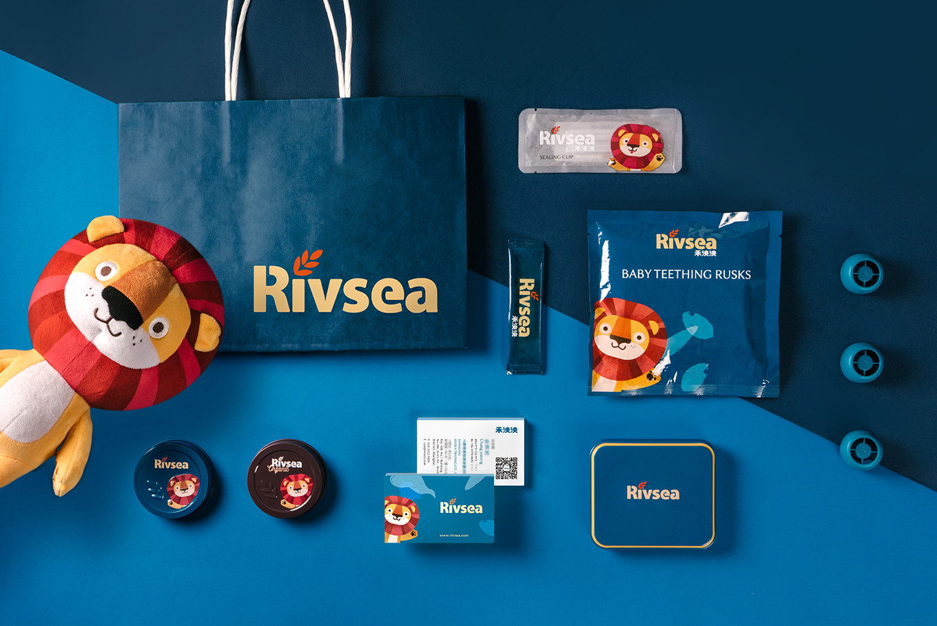
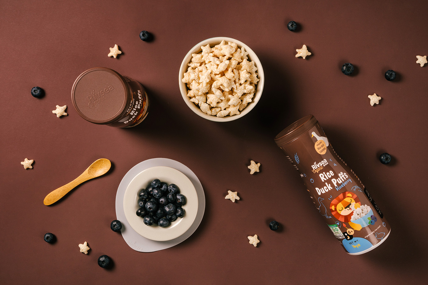
深耕寶寶食品市場多年的禾泱泱,取自世界各地的純淨原料,堅持提供食物原型營養無多餘添加。而原有的包裝在碩大的通路品牌中有著低識別度的情況;透過前期現況的了解,並梳理整體架構,慢慢一次次的溝通與聚焦、檢視目標客群、鎖定品牌核心後,決定保留核心資訊維繫品牌的天然純淨,同時打造出具有信任感與高質感的國際品牌。
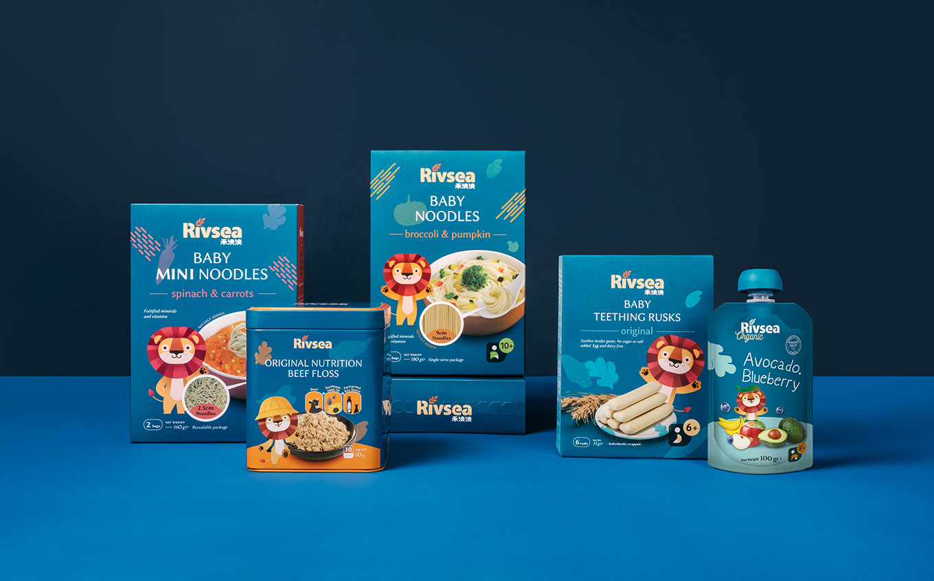
原有的識別以草寫英文為主,加上橘色的主色與獅子的輔助圖型,而改造後的基本識別以英文為主,中文為輔,建構具有國際感與高質感的印象,並以傳達純淨專業為主要設計重點。透過保留原包裝上的獅子,並重新賦予設定與新形象,將其升級成品牌符號並命名為「泱泱獅」,設計出多款不同姿勢以輔助包裝上的使用,與寶寶產品有所連結外也解決了品牌辨識度的問題。包裝設計系統依照產品的類別與分齡訂定出設計規範,品牌色系定調淨水藍以呼應品牌的大器與可靠,並拉出有機系列以棕色為底,加上輔助識別便於區分不同產品架構,現代感的版面規範以提升品牌核心優勢辨識度,運用色彩的辨識度與獨有的排版規劃區隔競爭品牌,亦加深消費者的印象與認同。
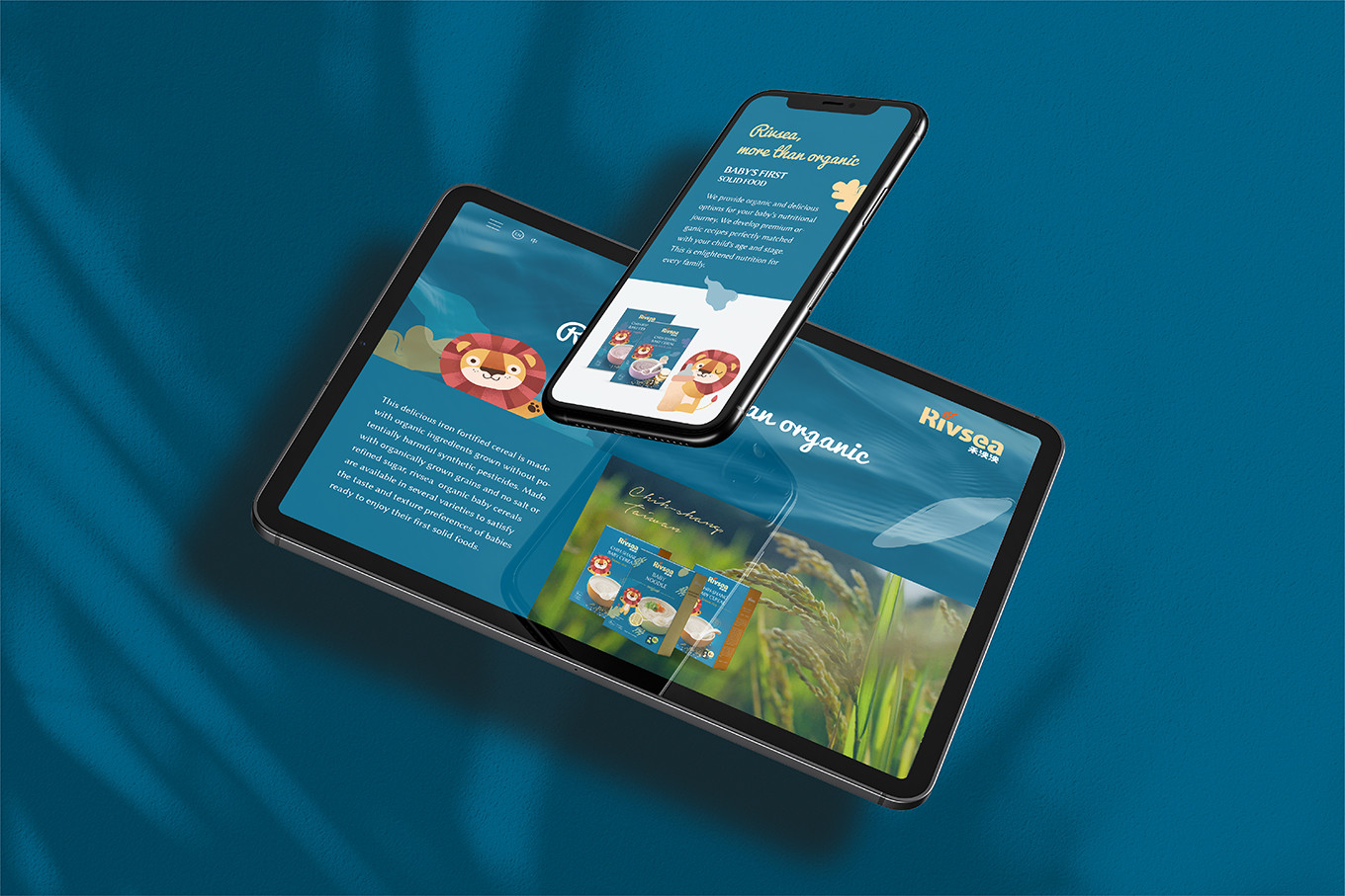
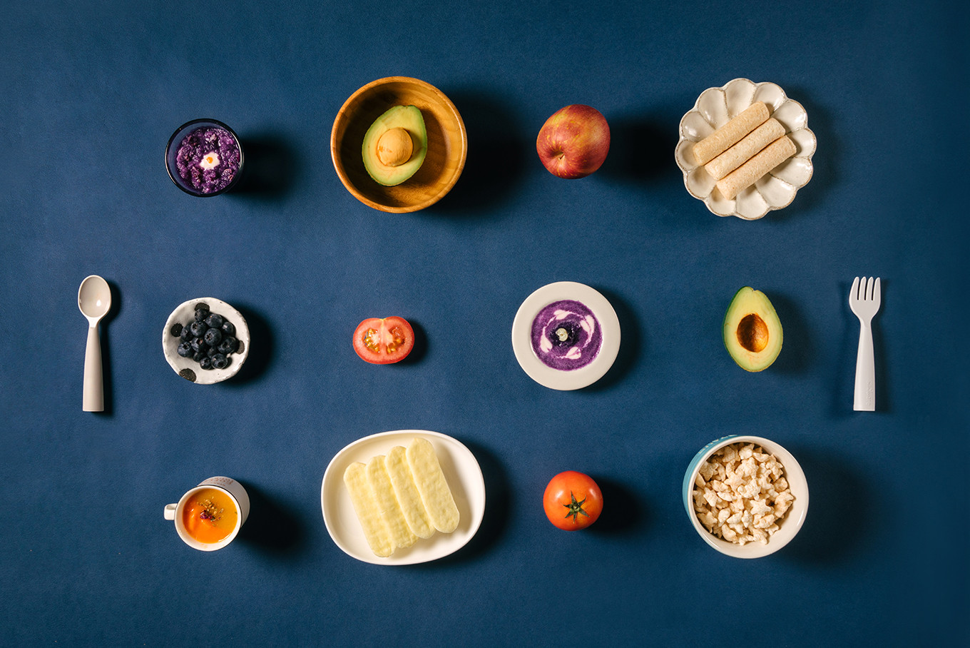
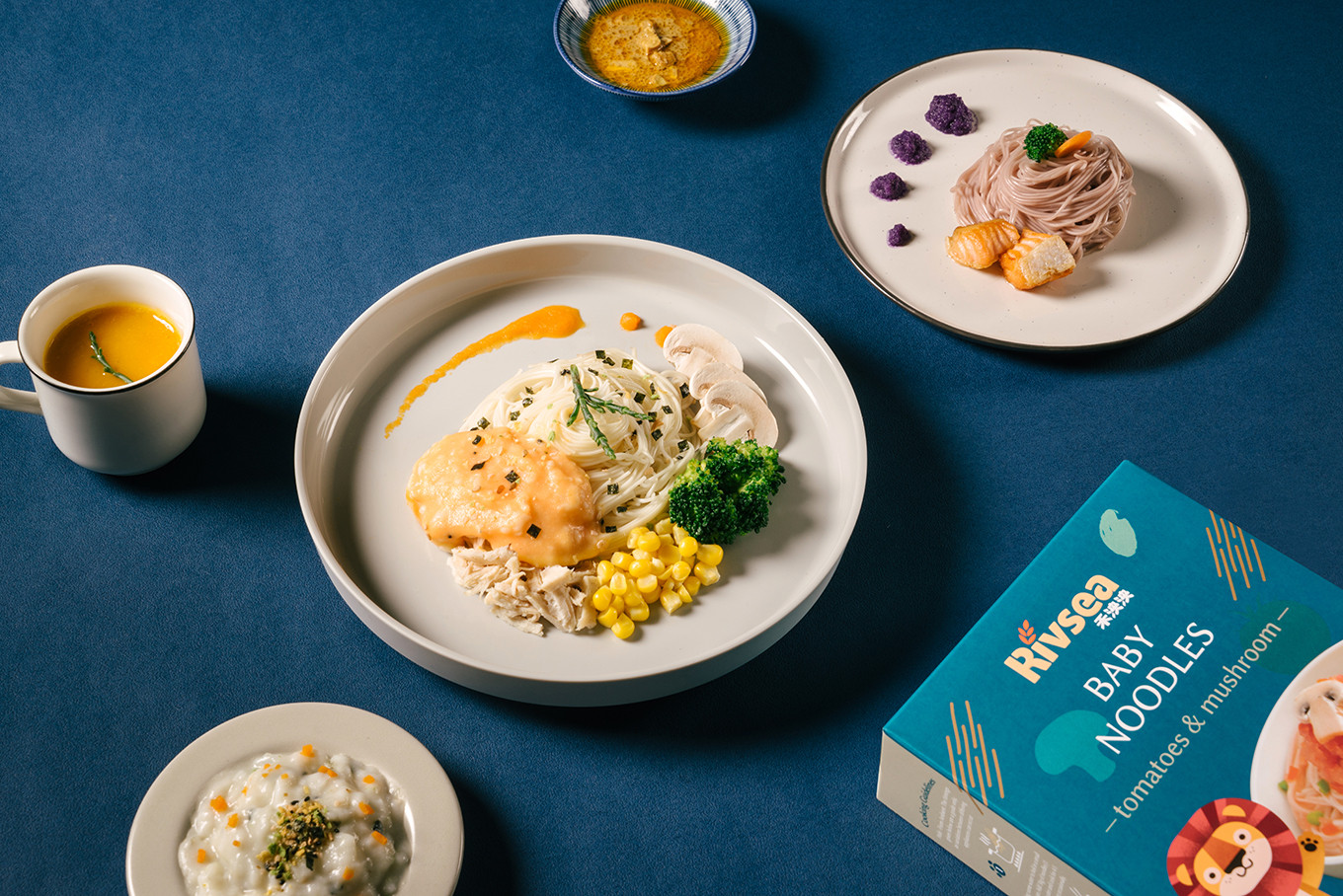
品牌識別以無襯線字體加上渾厚的修飾,強調出信任感,輔以稻禾圖樣增添出對於原料的堅持挑選;在包裝版面的配置上,以泱泱獅串連所有產品,提升品牌辨別度及連結寶寶好感;實品在排版的呈現上亦強化了對於內容物的信任;運用不同產品的食材呈現在背景版面上,提升整體包裝的豐富度。
禾泱泱替你挑選對寶寶好的食物,陪伴寶寶一同成長。
Rivsea has been cultivating the baby food market for many years, collecting pure ingredients from the world, and insists on provide food prototype nutrition with no addition. However, the original packaging has a problem of low recognition in the huge channel market. Through the present pre-understanding and clarify the whole framework, and more communicate, focusing, check the target audience then acquire branding core. We decide to keep the core concept to continue the natural image of Rivsea and create an international brand with trustable and high quality.
The original identity design is orange color, mainly in cursive English, and a lion as auxiliary graphics. After transformation, for making an international and high-quality brand image, that create the branding system and upgrade the lion to the brand symbol naming “Yang Yang Lion” and create several poses using on the layout of packaging design, which connects with baby’s food brand and also solves the problem of brand recognition. The packaging design system will follow the categories and ages to make a design specification. Furthermore, take the water blue as the main branding color to create the personality of the brand. Second, use the brown color for the organic series and design an auxiliary graphic to distinguish the difference of product framework. Overall, The modern style layout specification upgraded the core of branding identification, the color recognition, and design specification are not only separate from other brands and also deepen the impression and recognition of consumers.
Rivsea chooses the good ingredient food for your baby and grows up with them.
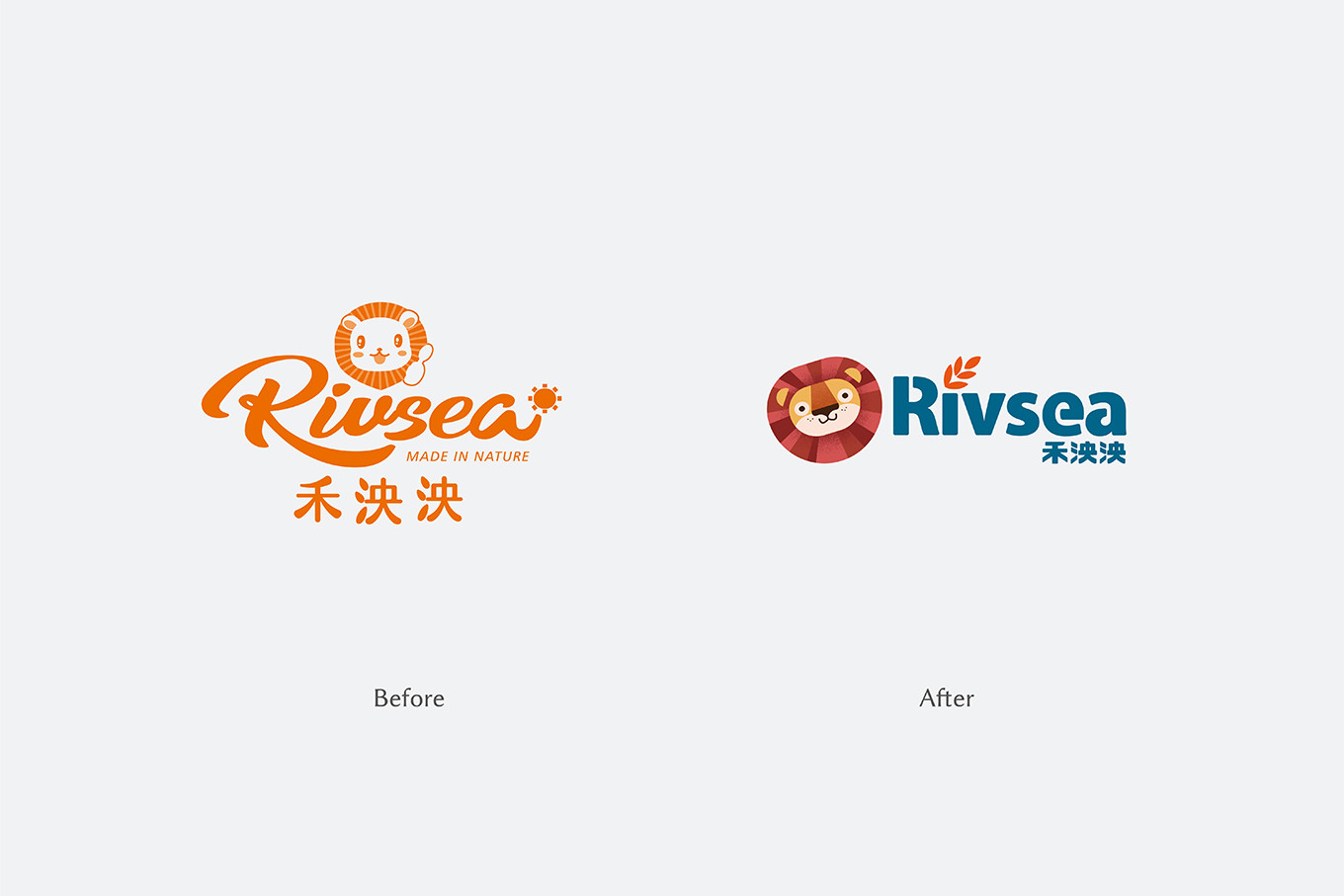
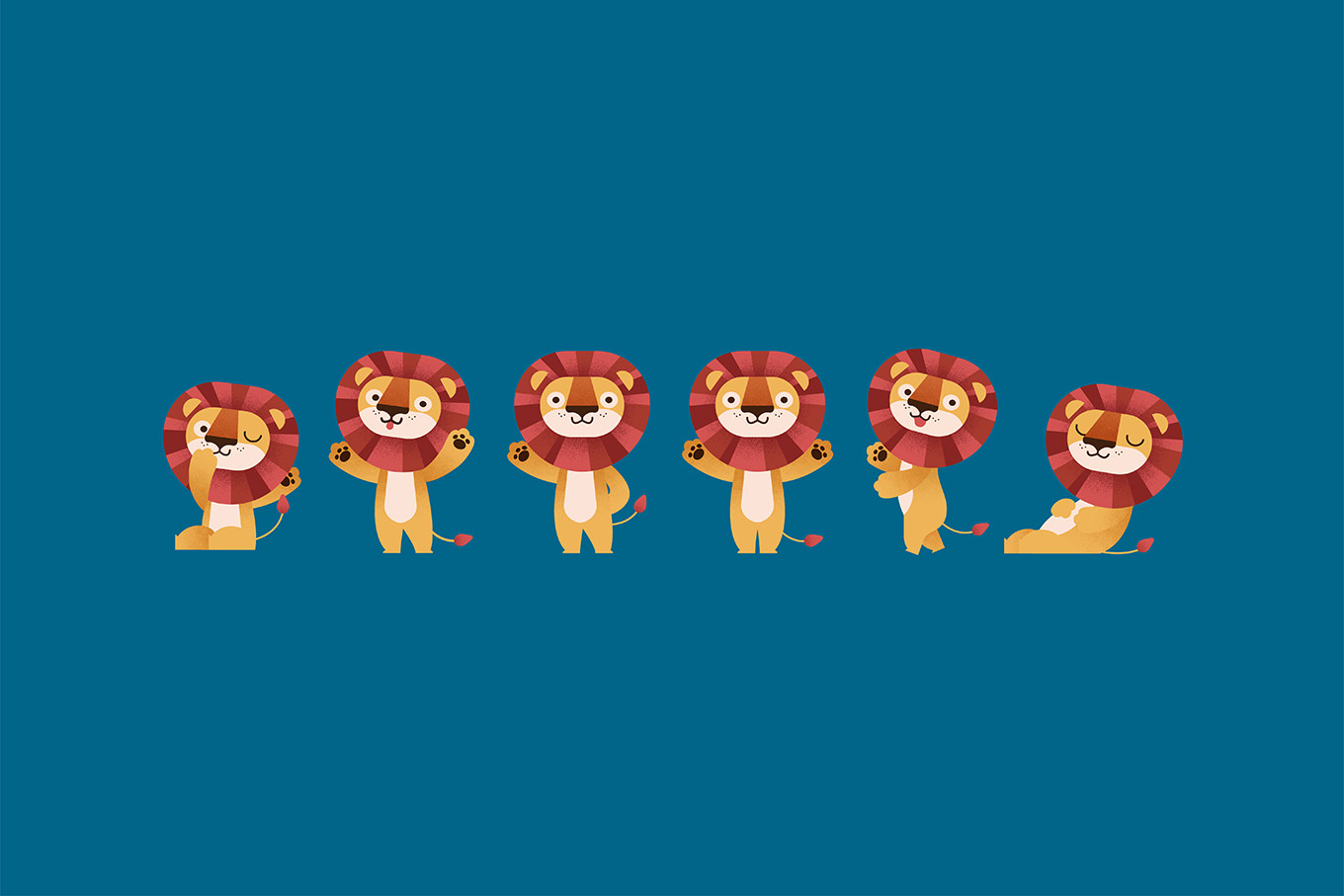
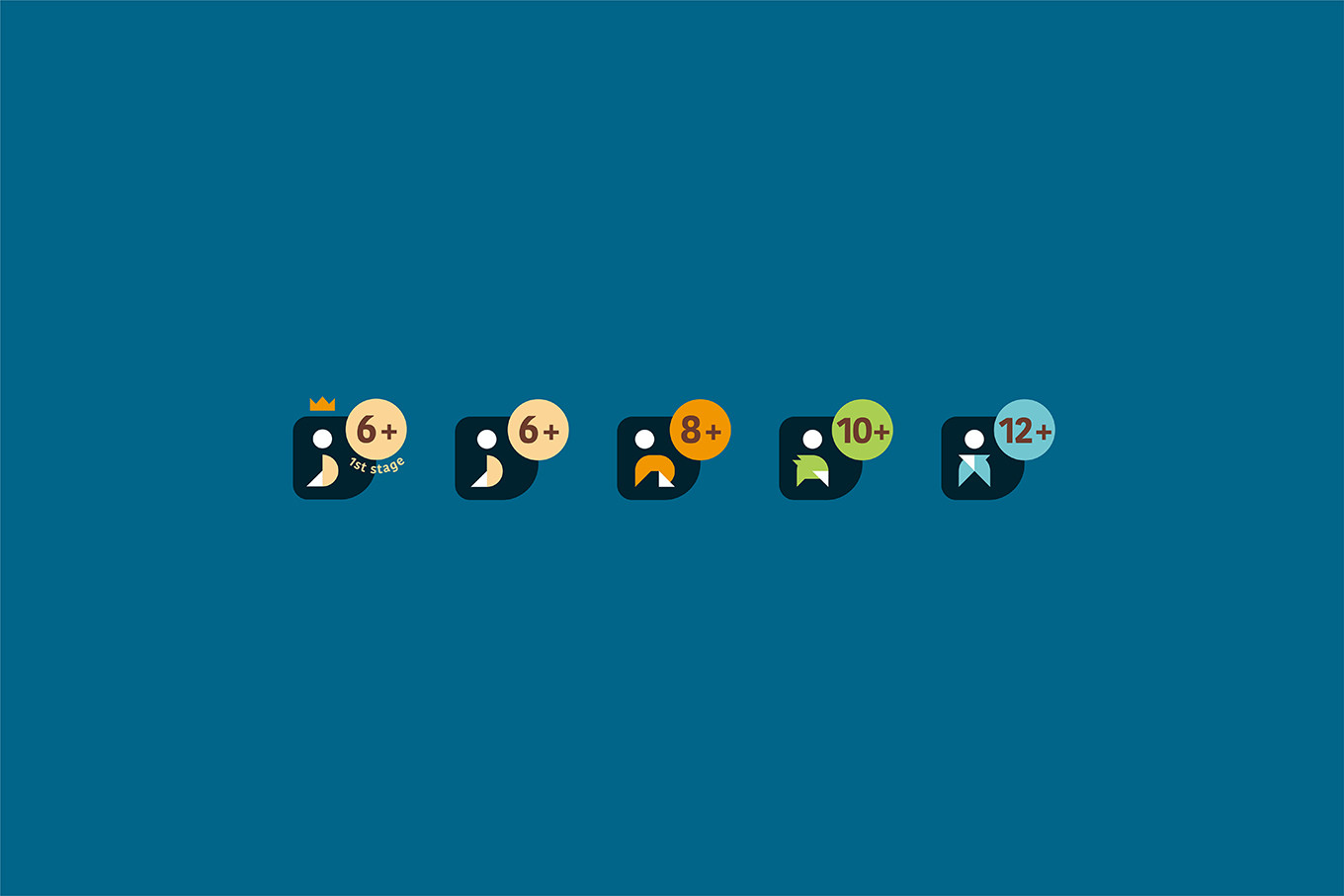
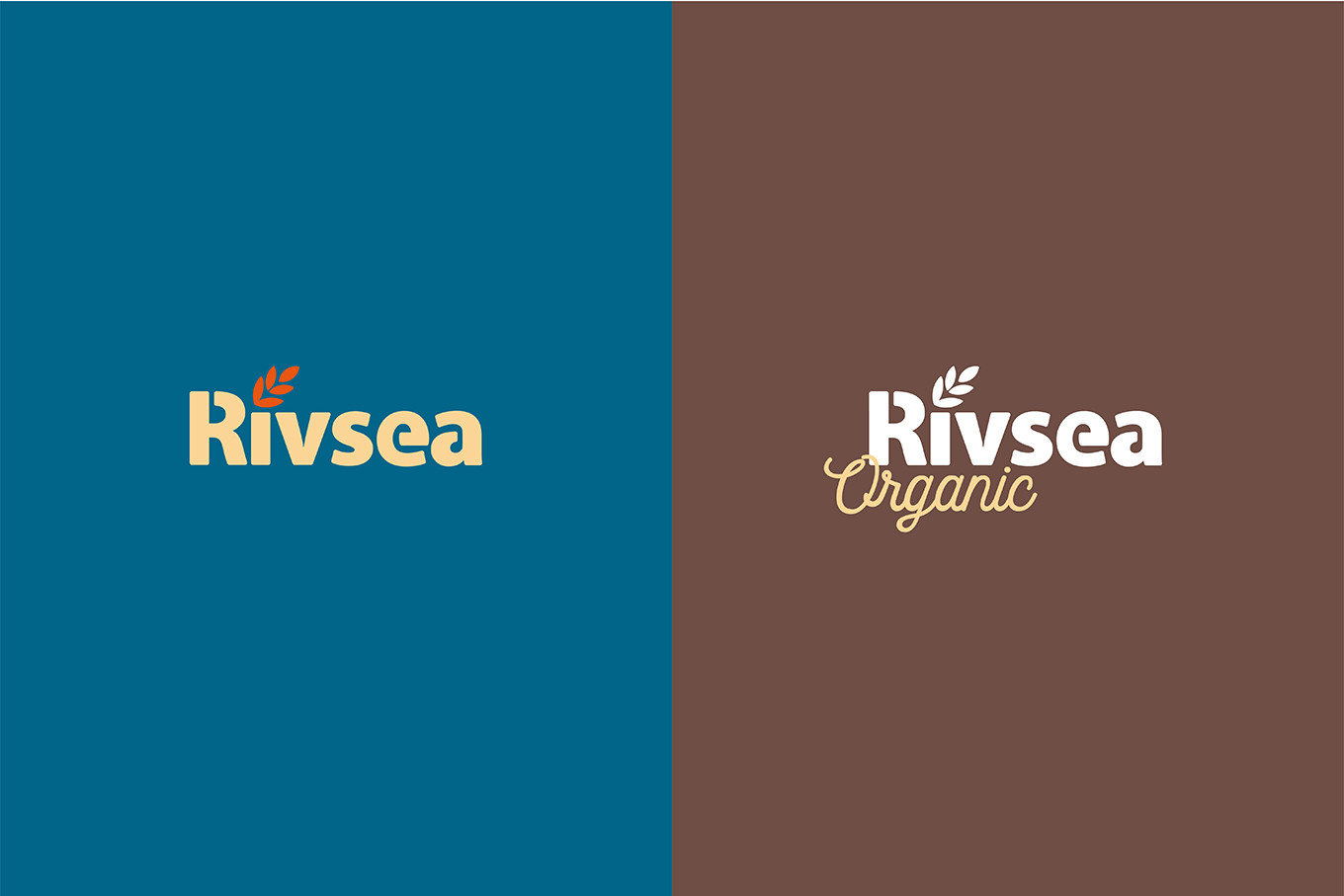
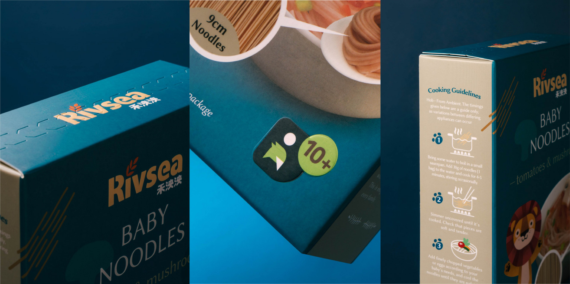
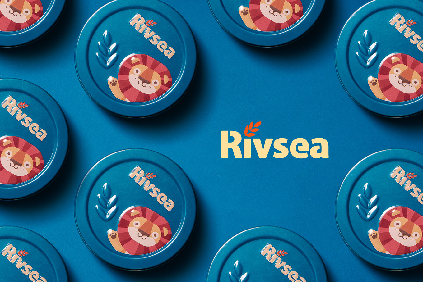
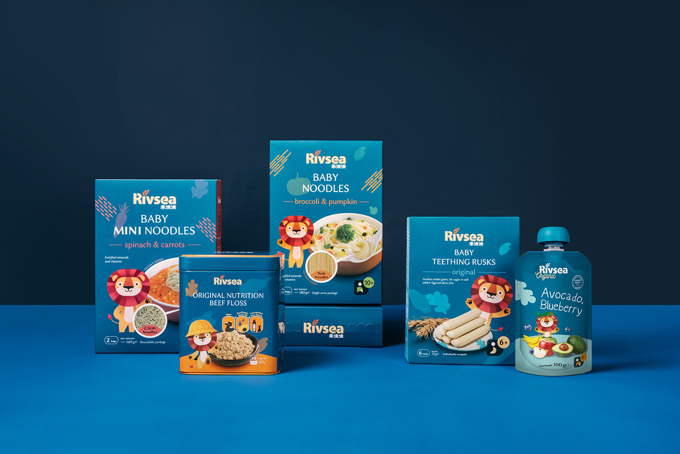
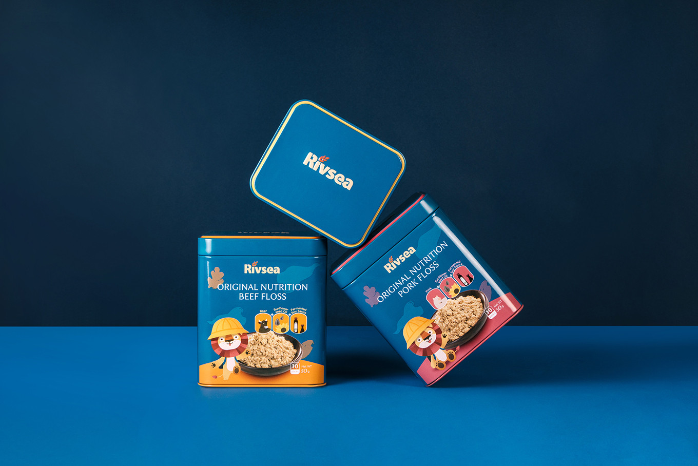
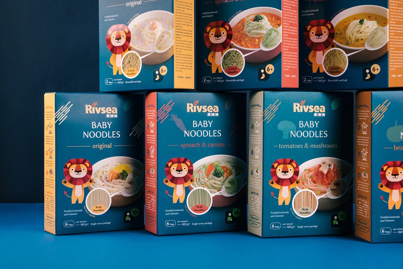
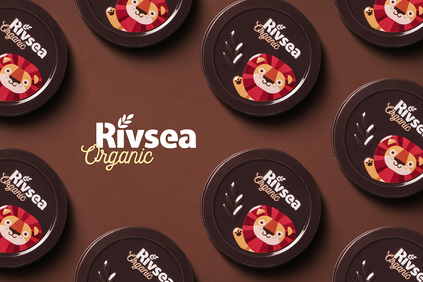
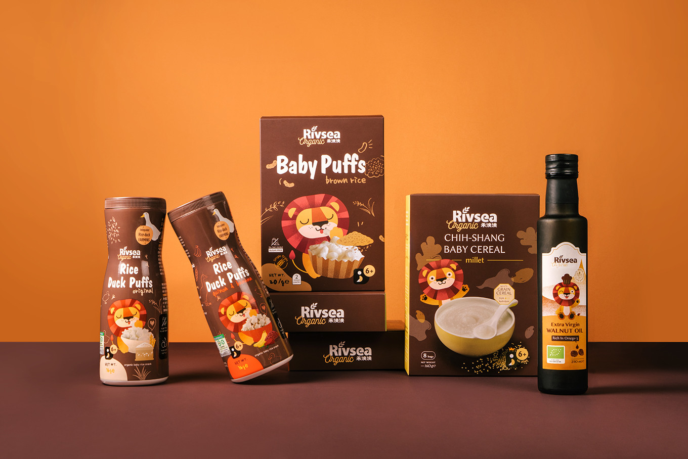
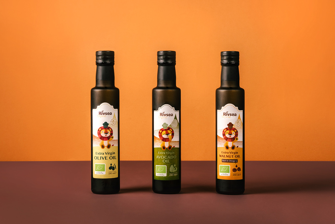
原有的識別以草寫英文為主,加上橘色的主色與獅子的輔助圖型,而改造後的基本識別以英文為主,中文為輔,建構具有國際感與高質感的印象,並以傳達純淨專業為主要設計重點。透過保留原包裝上的獅子,並重新賦予設定與新形象,將其升級成品牌符號並命名為「泱泱獅」,設計出多款不同姿勢以輔助包裝上的使用,與寶寶產品有所連結外也解決了品牌辨識度的問題。包裝設計系統依照產品的類別與分齡訂定出設計規範,品牌色系定調淨水藍以呼應品牌的大器與可靠,並拉出有機系列以棕色為底,加上輔助識別便於區分不同產品架構,現代感的版面規範以提升品牌核心優勢辨識度,運用色彩的辨識度與獨有的排版規劃區隔競爭品牌,亦加深消費者的印象與認同。
品牌識別以無襯線字體加上渾厚的修飾,強調出信任感,輔以稻禾圖樣增添出對於原料的堅持挑選;在包裝版面的配置上,以泱泱獅串連所有產品,提升品牌辨別度及連結寶寶好感;實品在排版的呈現上亦強化了對於內容物的信任;運用不同產品的食材呈現在背景版面上,提升整體包裝的豐富度。
禾泱泱替你挑選對寶寶好的食物,陪伴寶寶一同成長。
Rivsea has been cultivating the baby food market for many years, collecting pure ingredients from the world, and insists on provide food prototype nutrition with no addition. However, the original packaging has a problem of low recognition in the huge channel market. Through the present pre-understanding and clarify the whole framework, and more communicate, focusing, check the target audience then acquire branding core. We decide to keep the core concept to continue the natural image of Rivsea and create an international brand with trustable and high quality.
The original identity design is orange color, mainly in cursive English, and a lion as auxiliary graphics. After transformation, for making an international and high-quality brand image, that create the branding system and upgrade the lion to the brand symbol naming “Yang Yang Lion” and create several poses using on the layout of packaging design, which connects with baby’s food brand and also solves the problem of brand recognition. The packaging design system will follow the categories and ages to make a design specification. Furthermore, take the water blue as the main branding color to create the personality of the brand. Second, use the brown color for the organic series and design an auxiliary graphic to distinguish the difference of product framework. Overall, The modern style layout specification upgraded the core of branding identification, the color recognition, and design specification are not only separate from other brands and also deepen the impression and recognition of consumers.
Rivsea chooses the good ingredient food for your baby and grows up with them.


