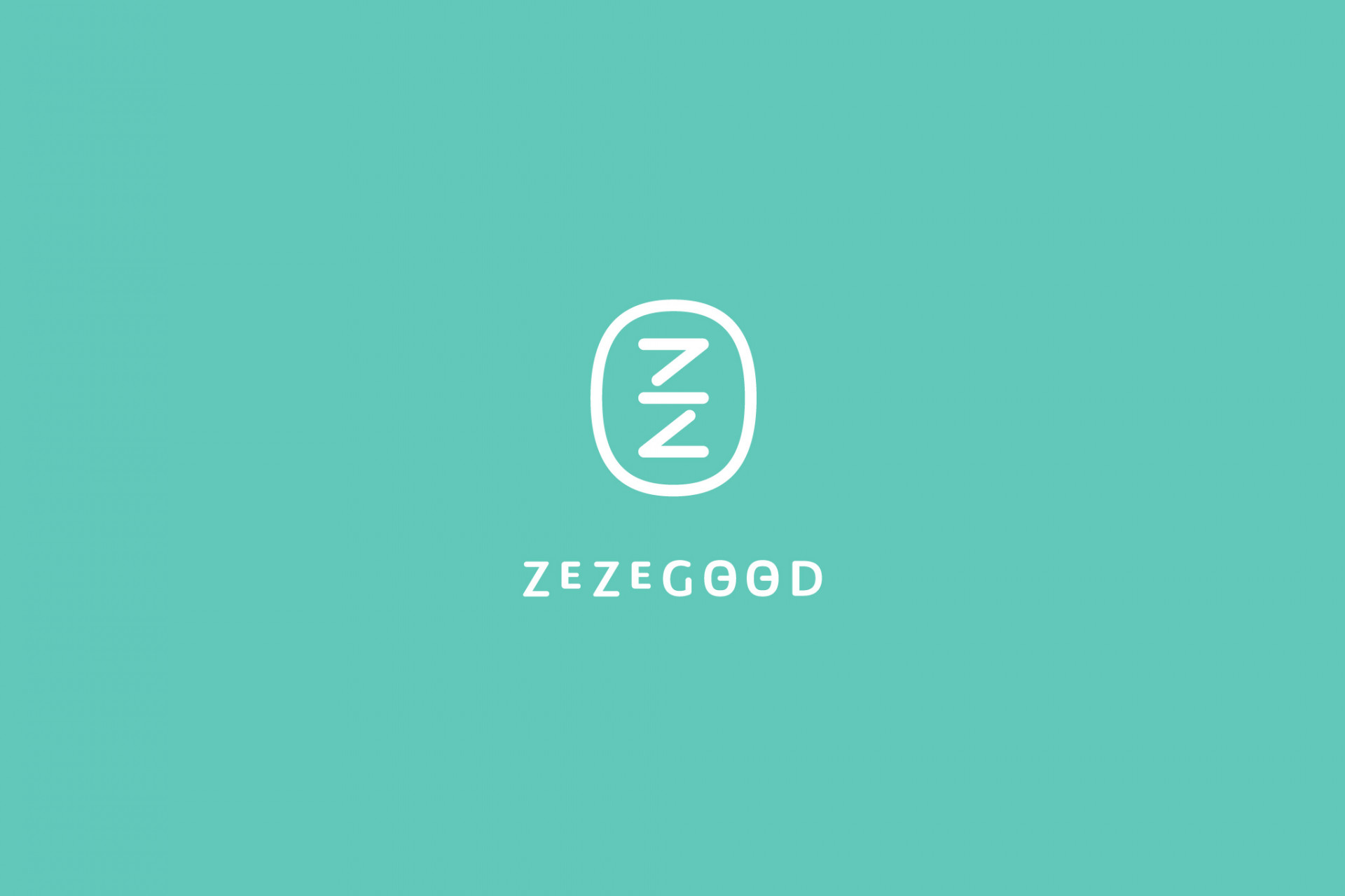
ZEZEGOOD
Branding Visual Identity
Design Project
品牌 : 日日居
Client : E.O.S. international Co.,Ltd.
Brand : ZEZEGOOD
Published on 06. 21. 2022
ZEZEGOOD
Branding Visual Identity
Design Project
堅持的每個細節,只為體貼最真實的你。
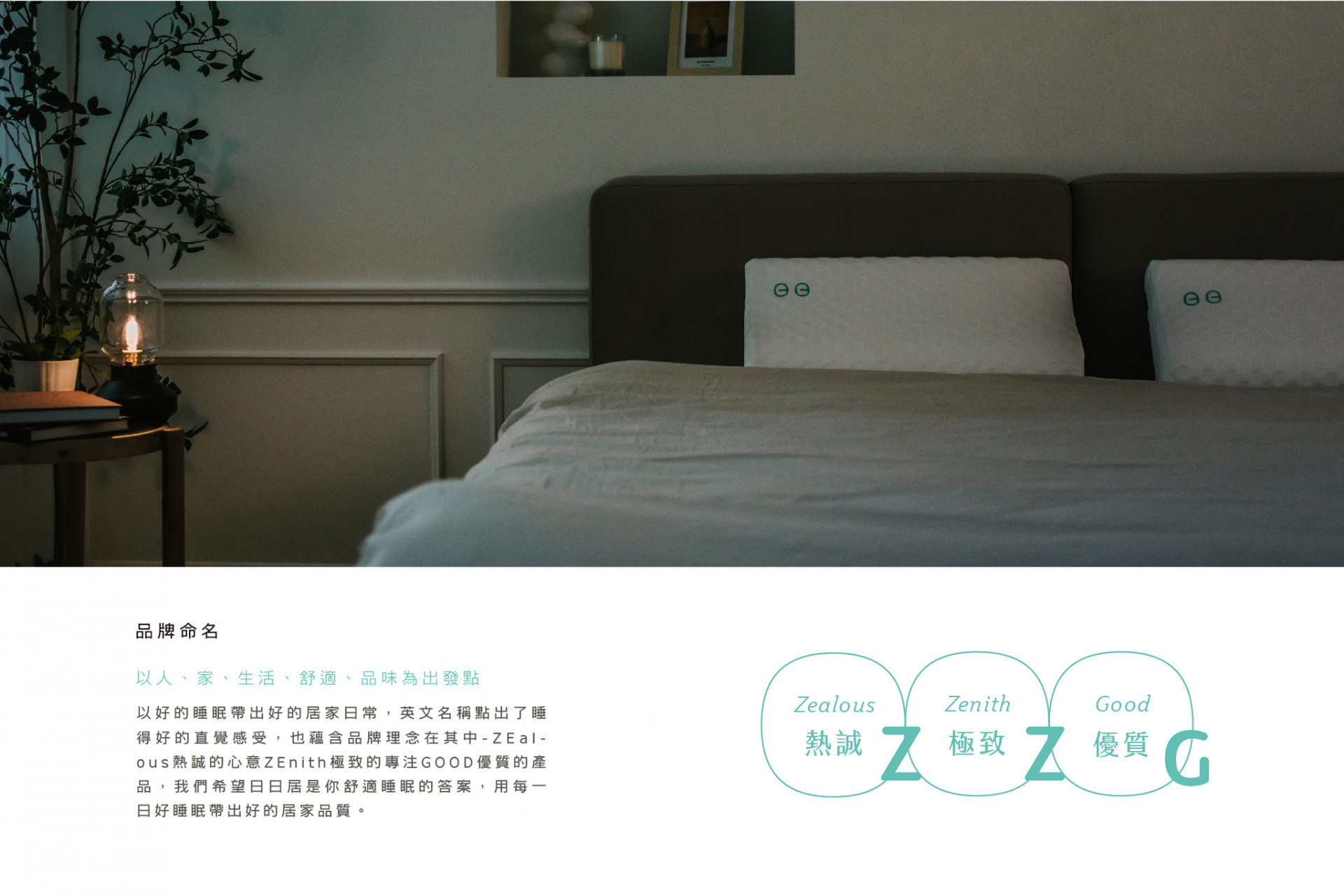
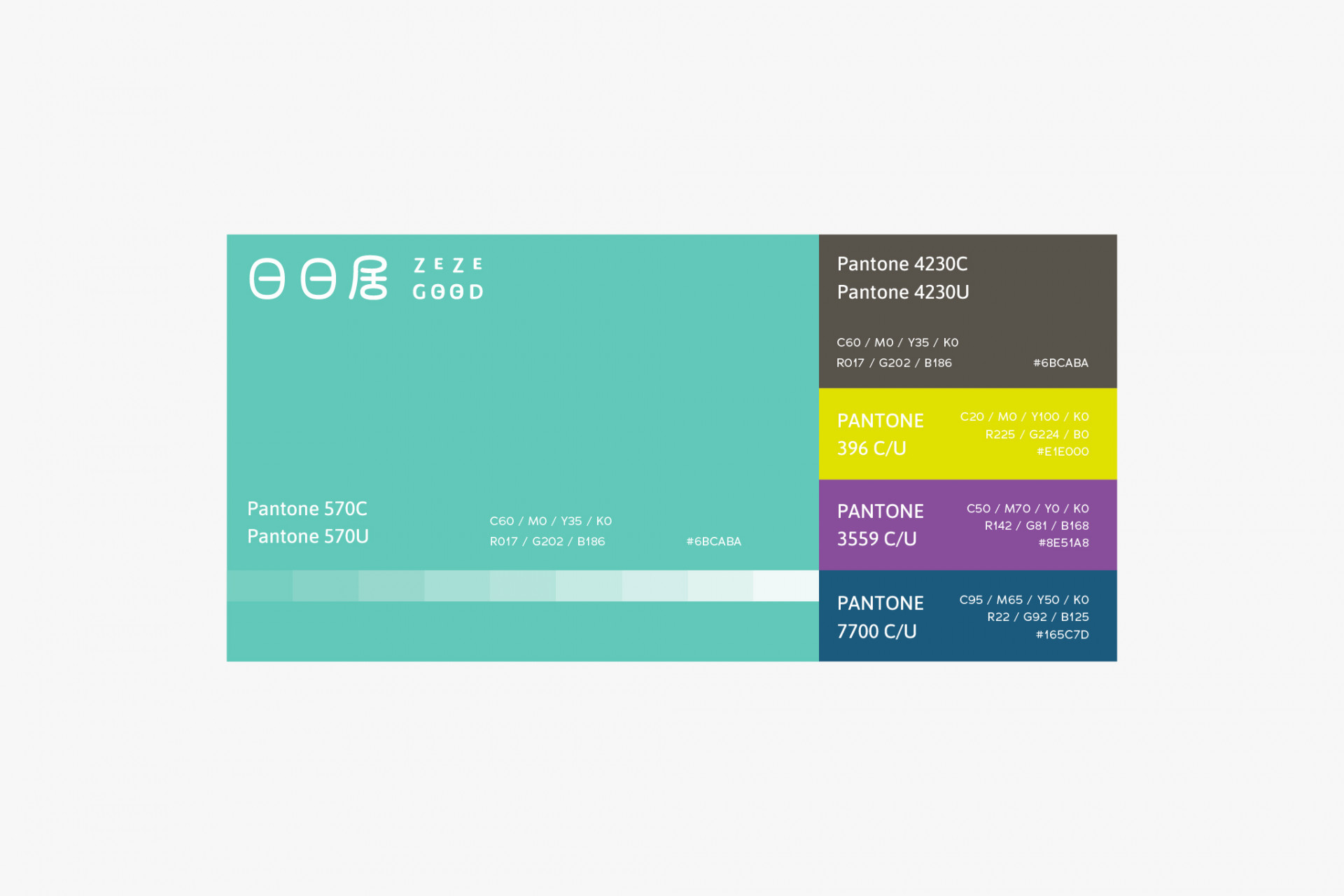
以良好睡眠的提供者為使命的居家寢具品牌-日日居,前期的品牌命名透過人、家、生活、舒適、品味等關鍵字出發,以好的睡眠成就好的居家日常為重點,英文名稱ZEZEGOOD帶出睡得好的直覺感受,也蘊含品牌理念在其中-ZEalous熱誠的心意ZEnith極致的專注GOOD優質的產品,中文名日日居則象徵日日好眠的居家生活嚮往;主色調選擇愜意恬靜的湖水綠搭配質感灰,更加彰顯舒適品味的品牌印象。
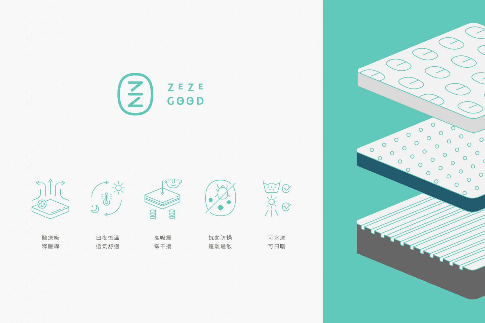
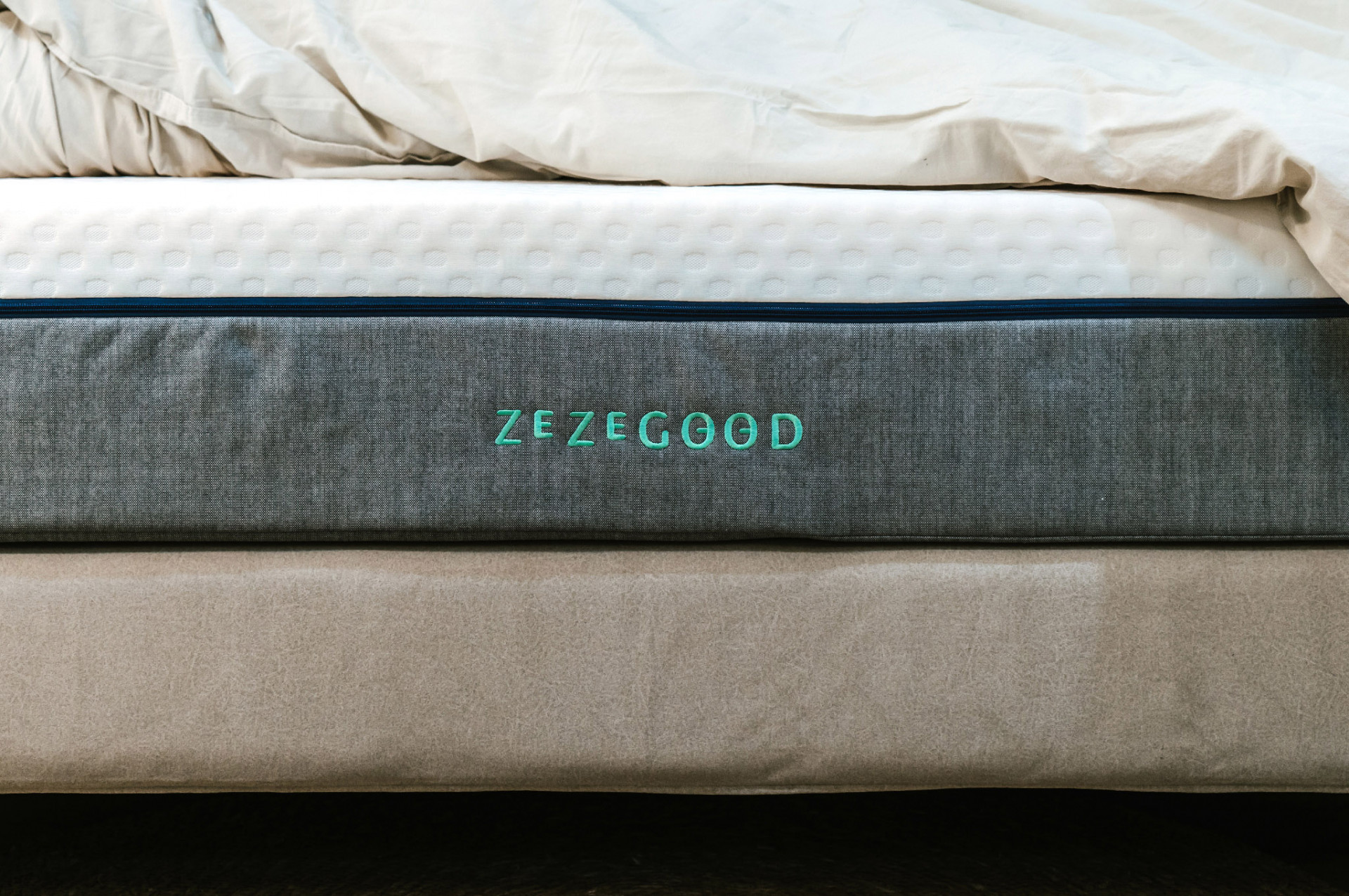
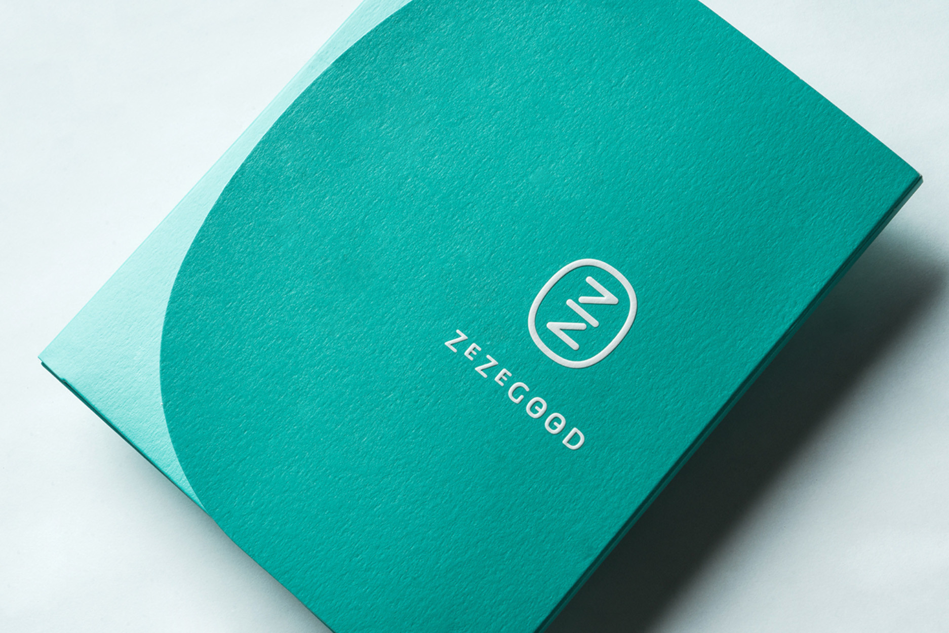
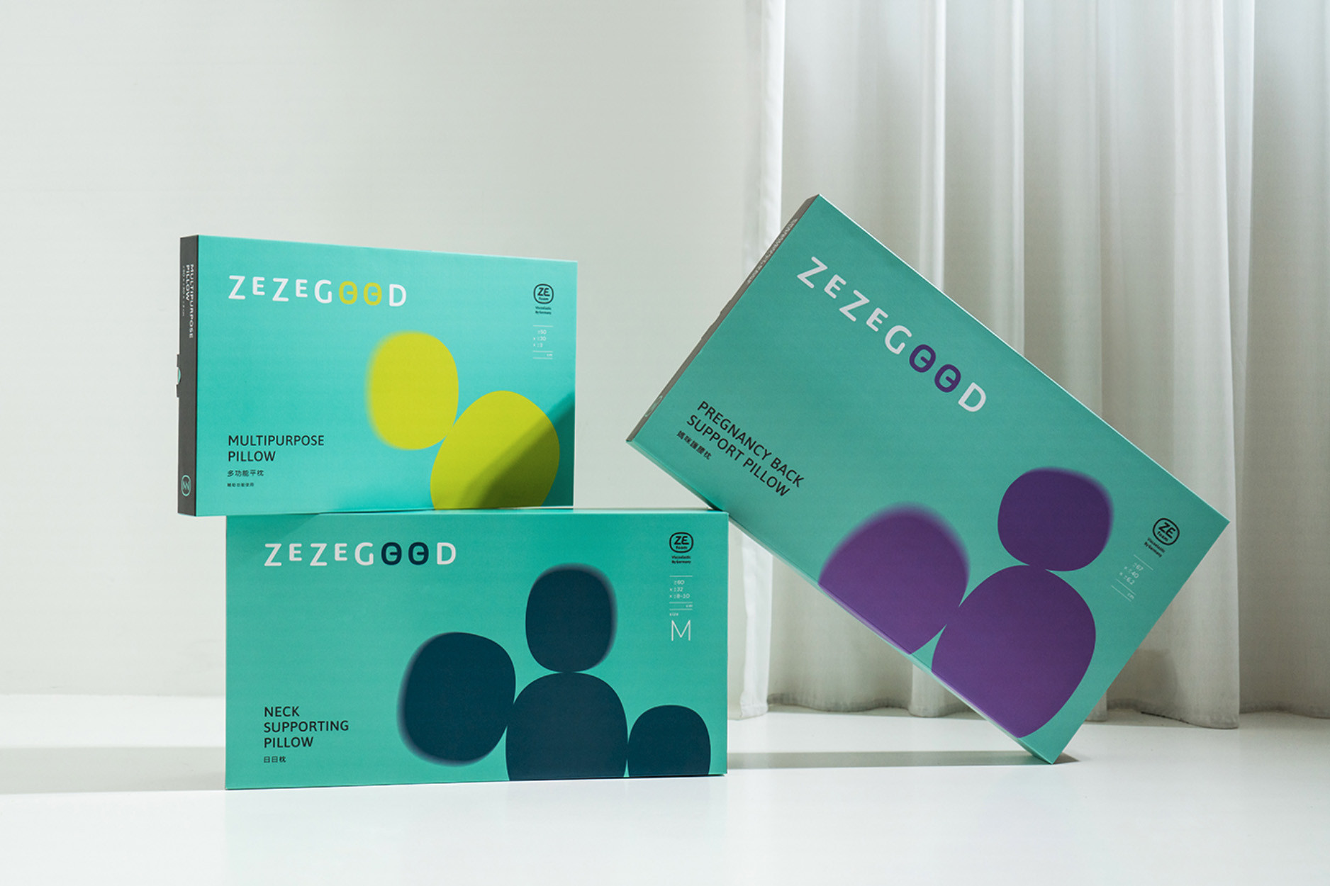
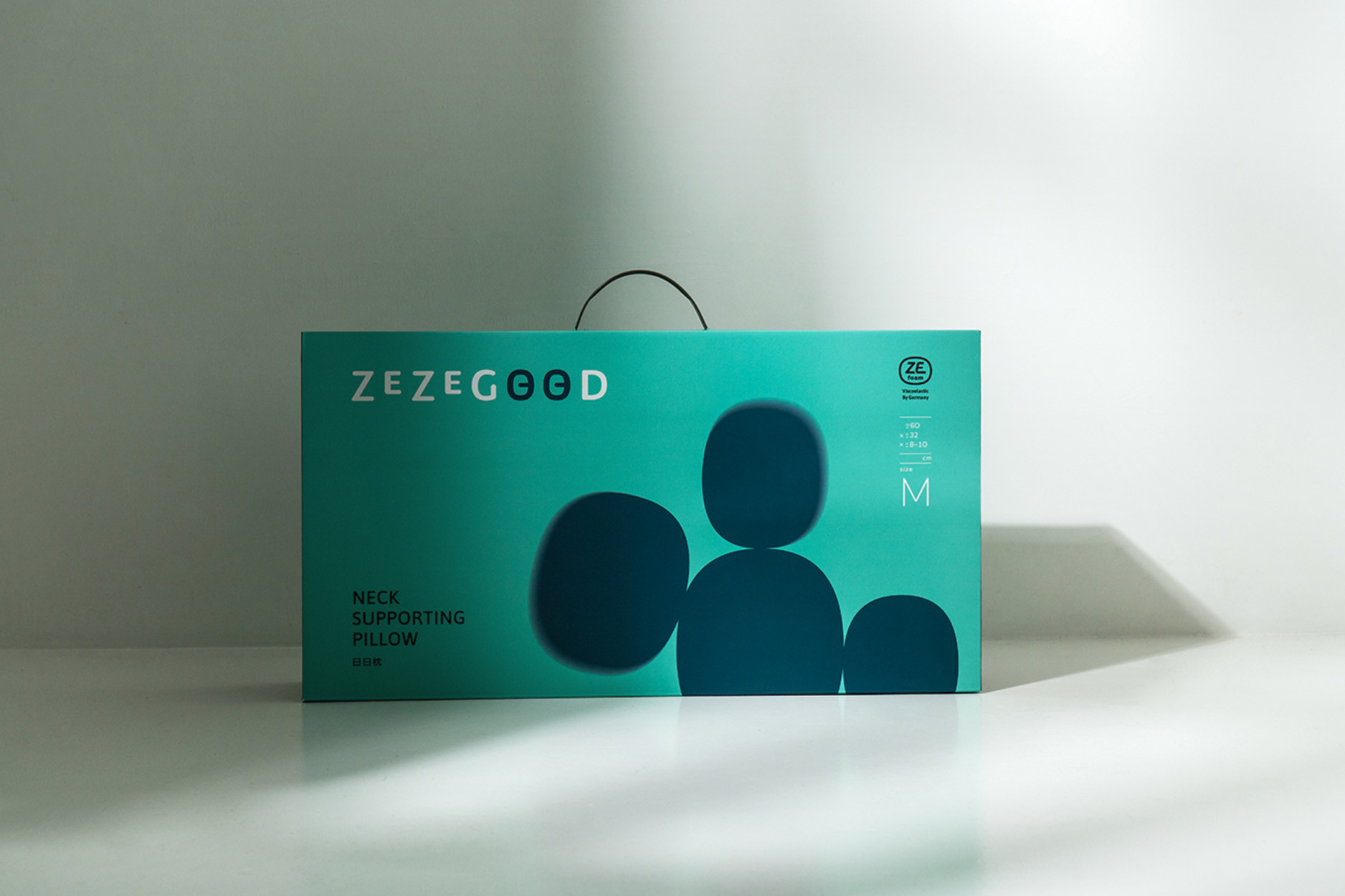
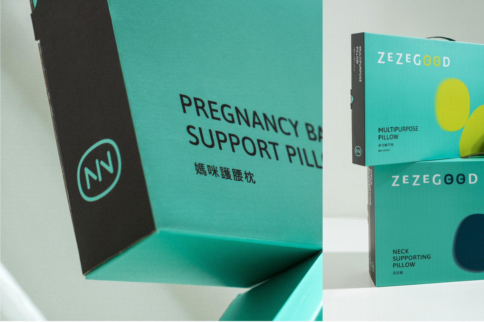
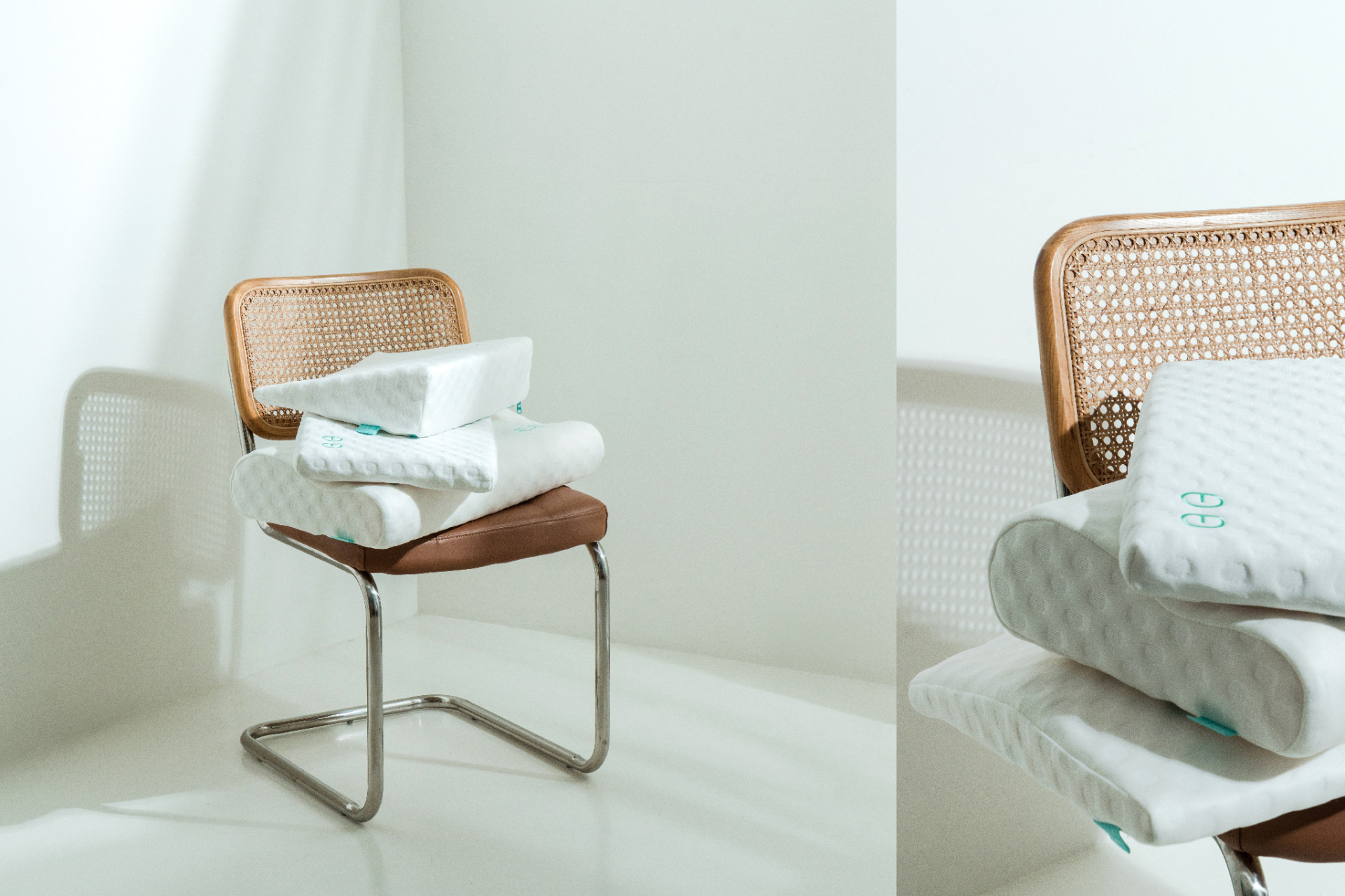
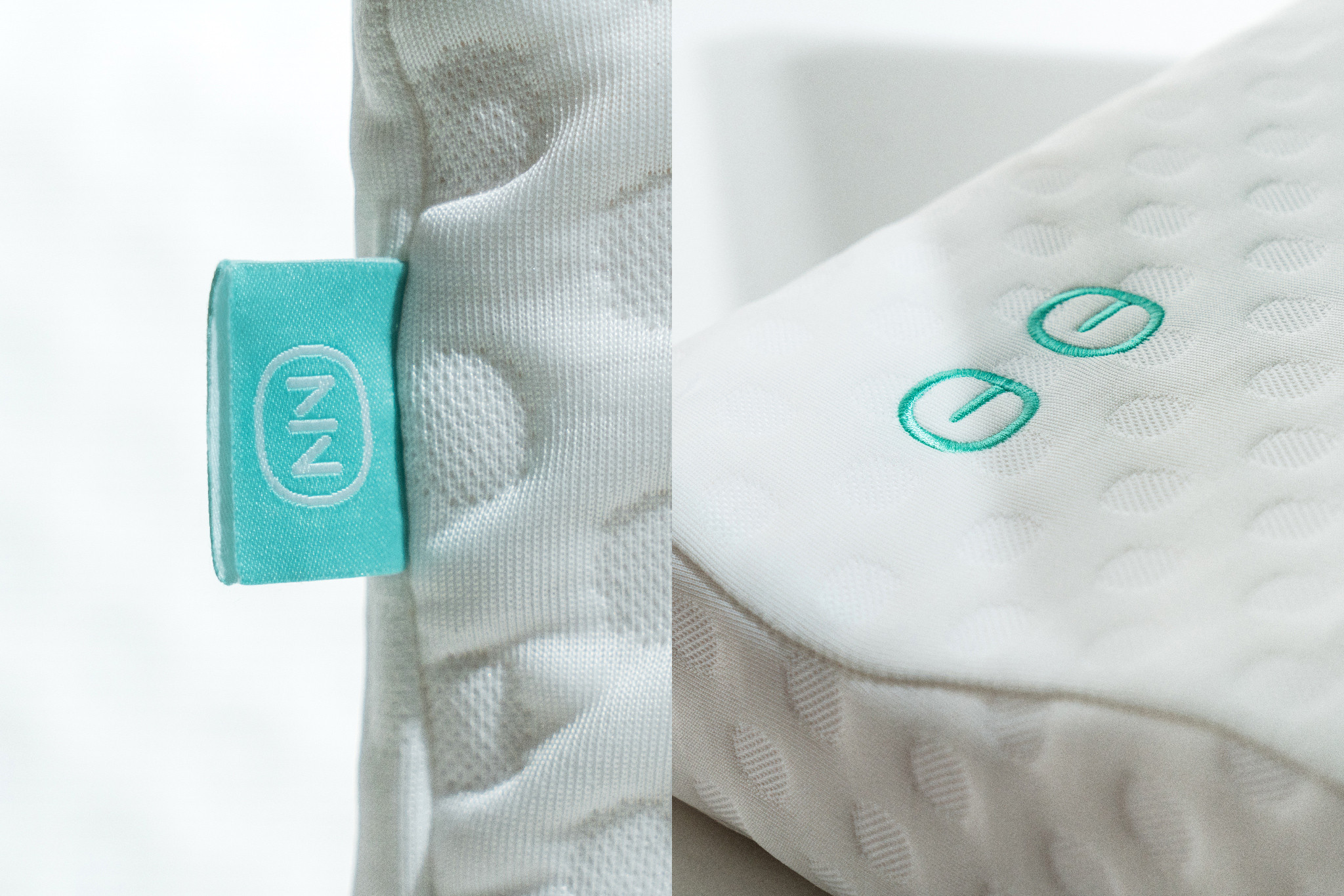
在識別與形象的建立中,從綿體材質與專利結構串連,以床墊的三層結構轉化成logo符號,呈現圓潤包覆的舒適意象,中英文的識別設計中將日與O相互連結,如同享受著良好睡眠的瞇瞇眼;床枕競品調查中,寢具上的識別度通常被忽略,於是在參與產品開發的過程,我們將輔助圖形瞇瞇眼元素應用在枕頭與床墊上,強化品牌與產品的關聯性;全產品使用的德國專利綿體ZEfoam零壓綿,透過符號化的設計,展現出專業與信任,並將綿體五大訴求以簡單易懂的icon呈現,讓消費者更快速認識其獨有優勢。
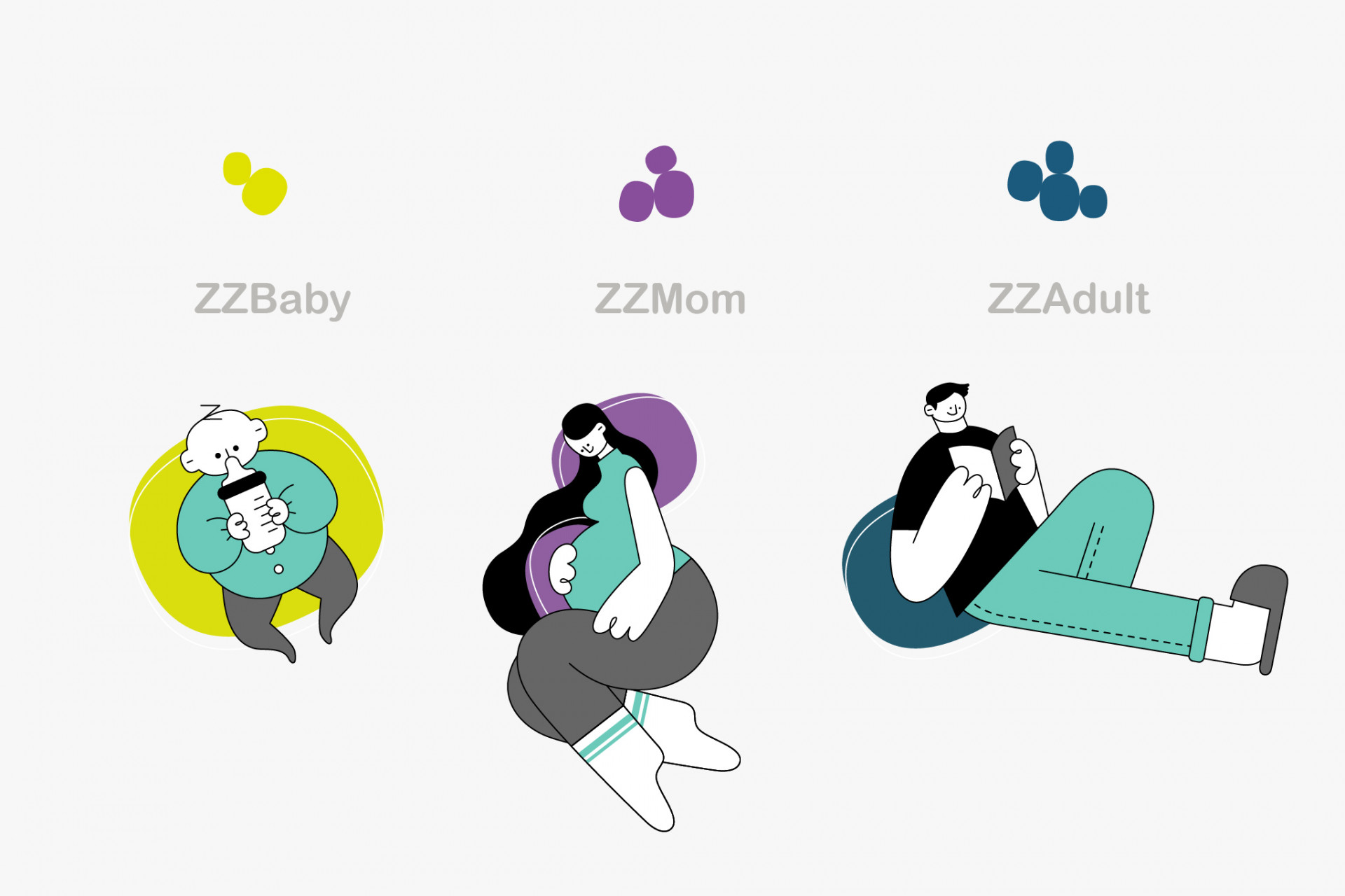
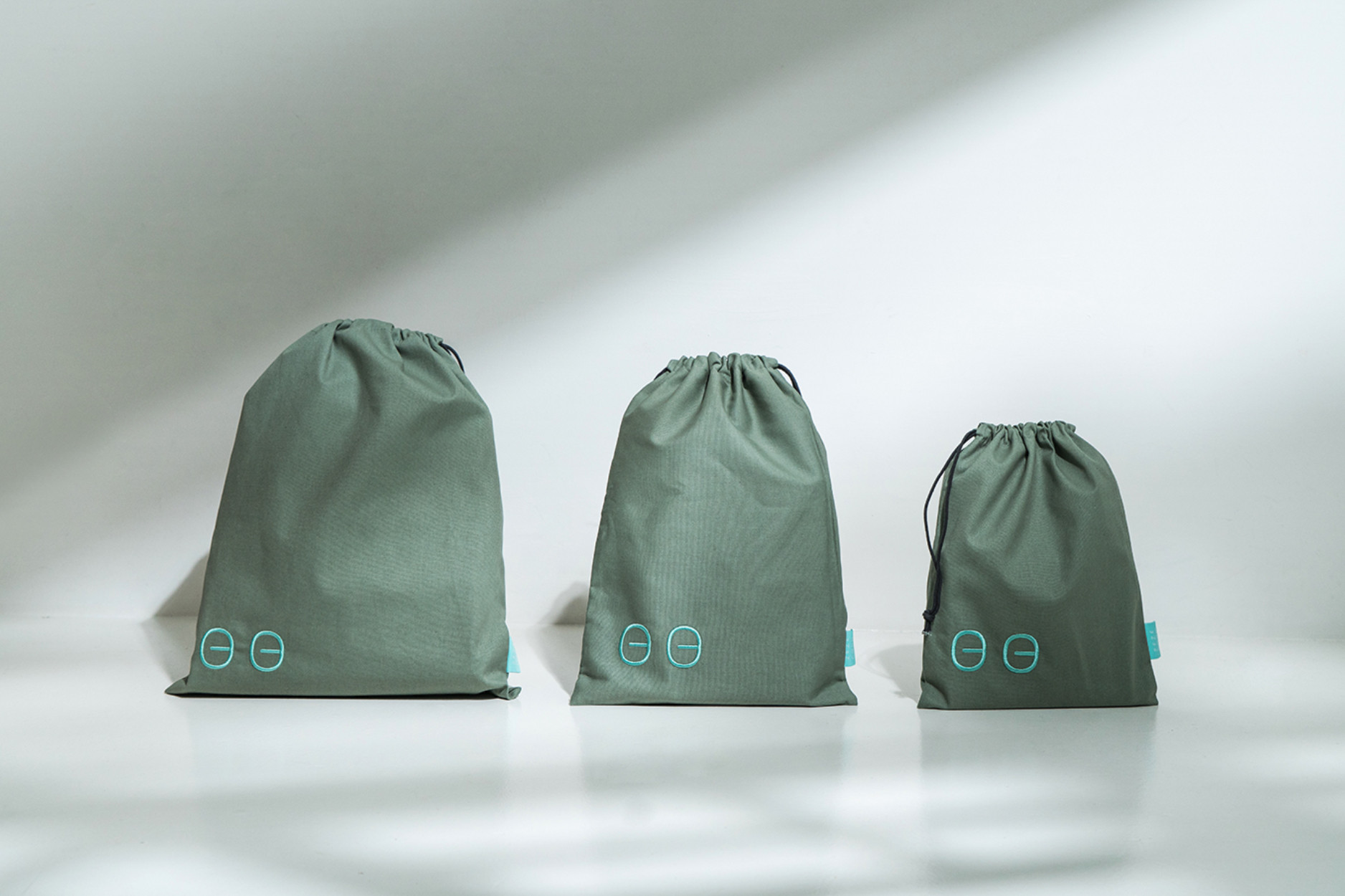
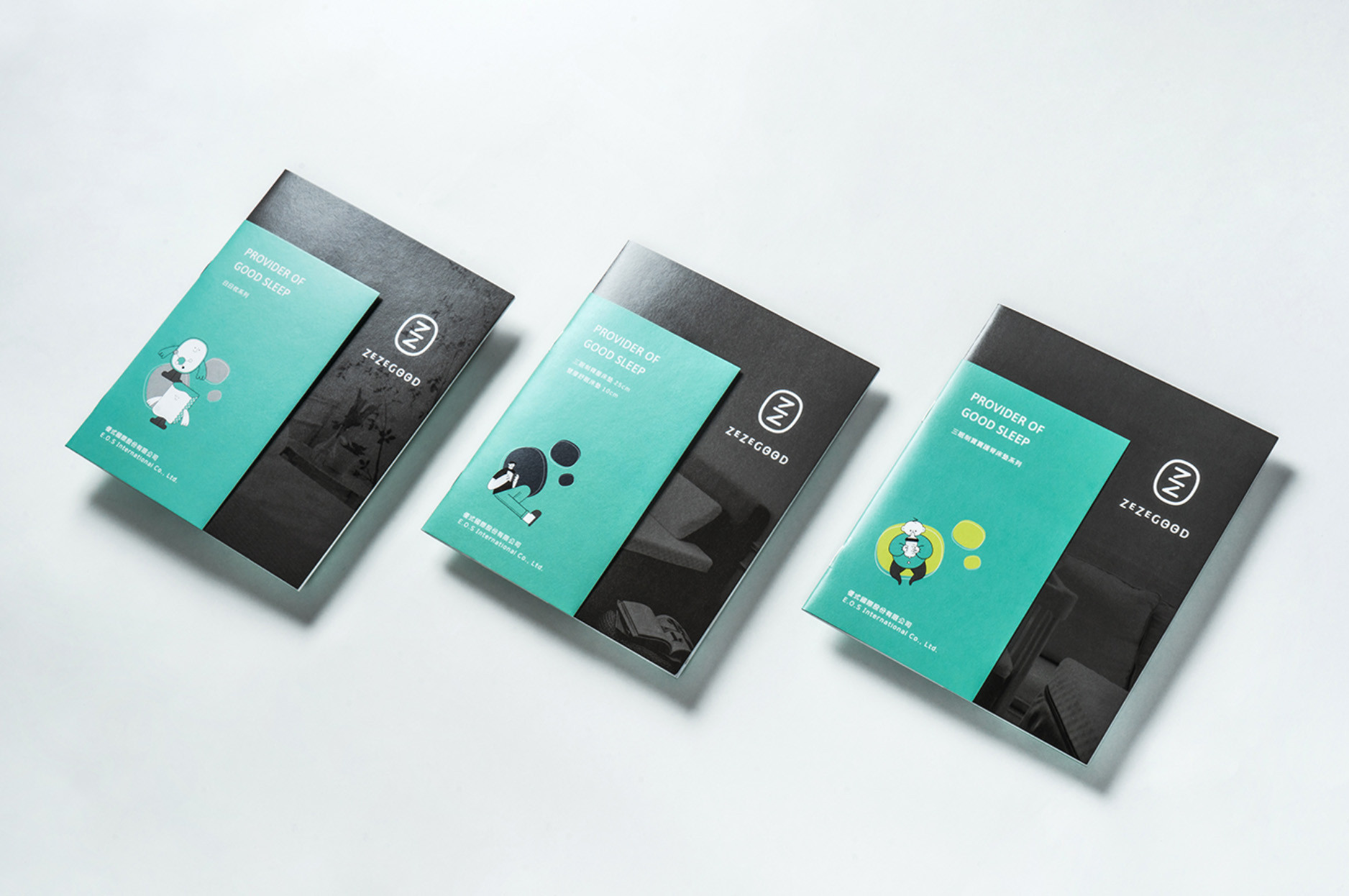
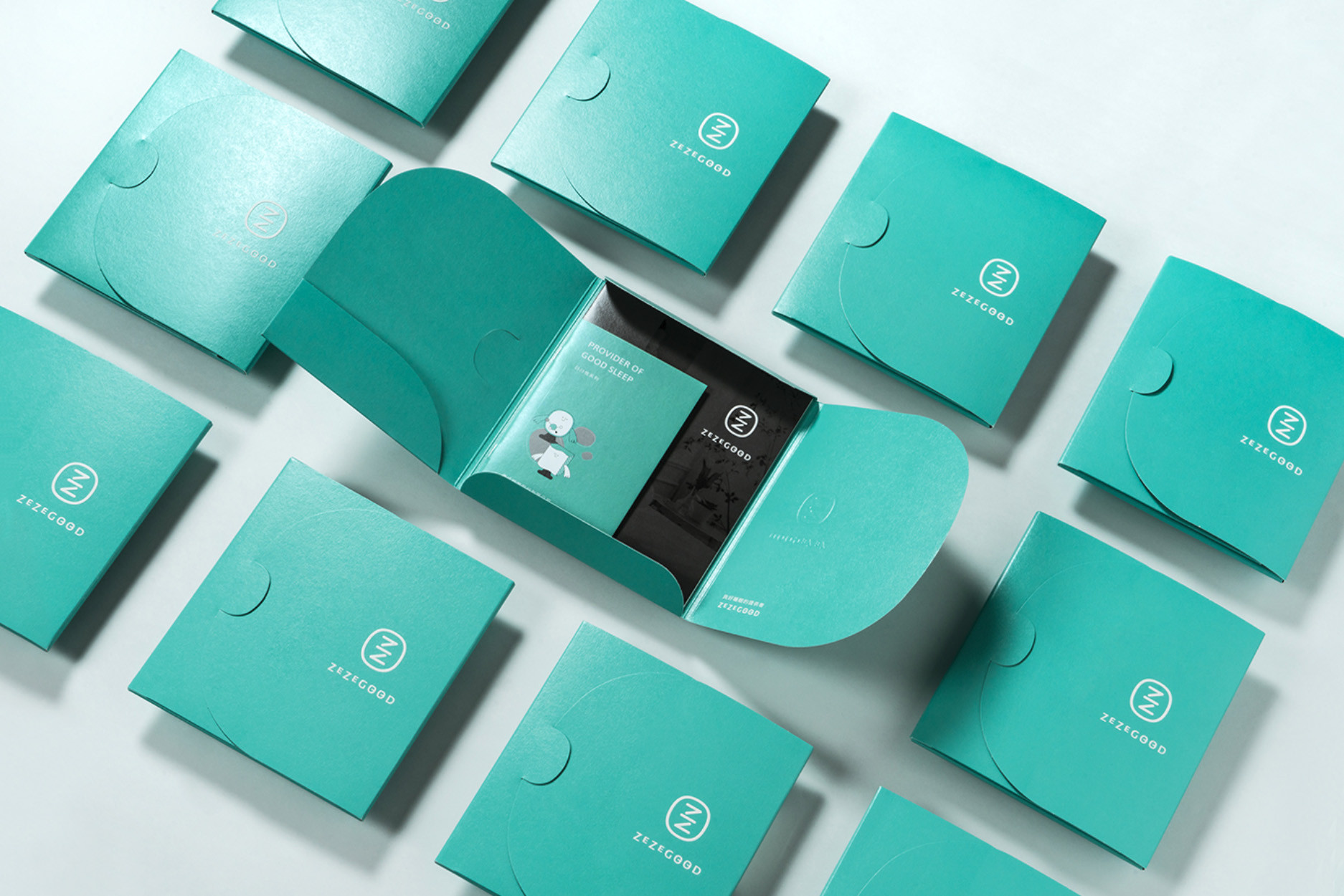
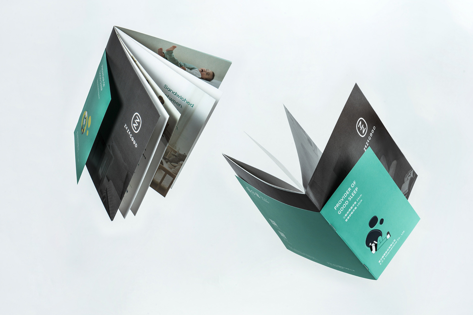
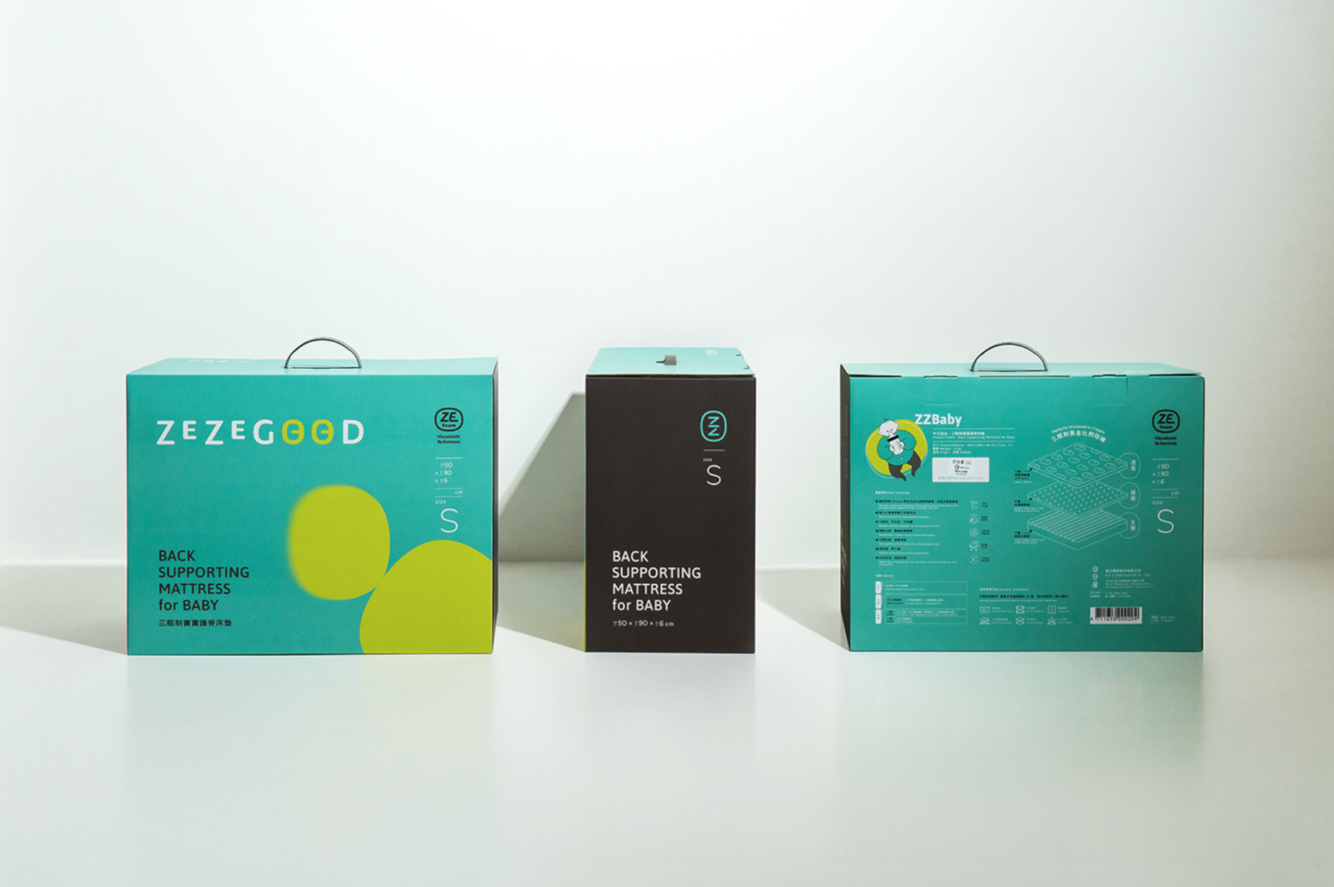
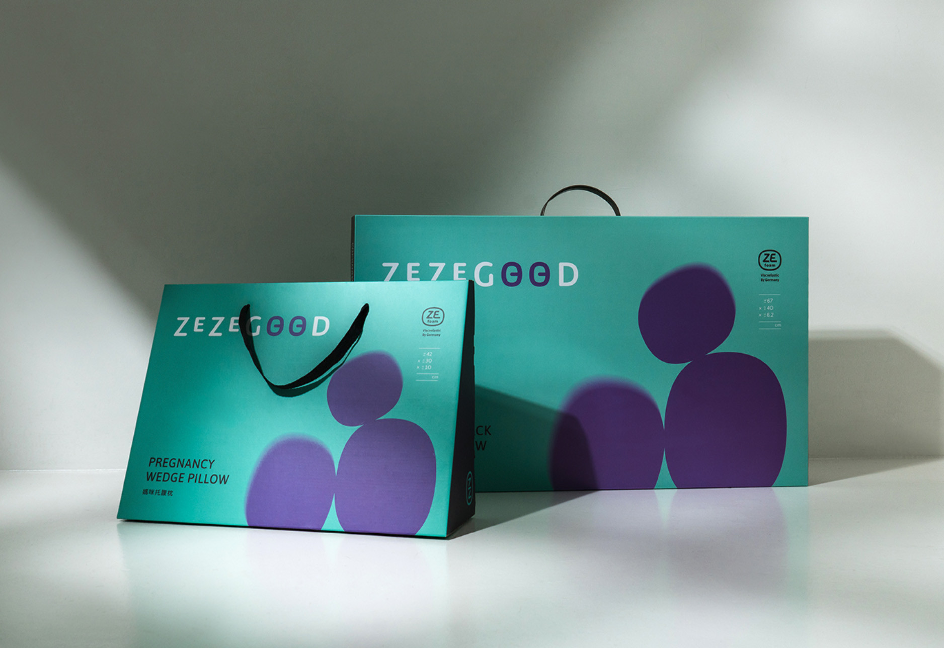
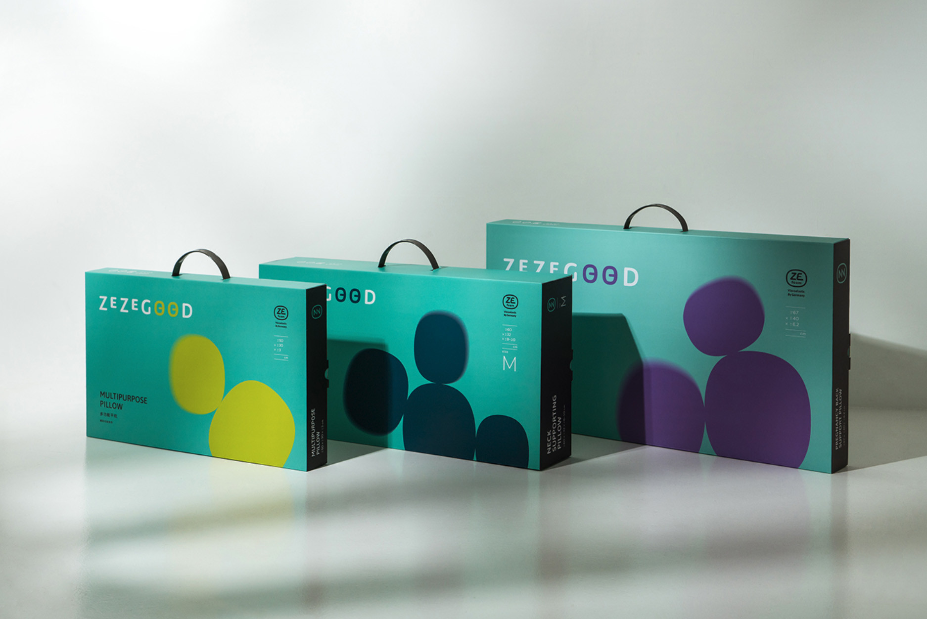
日日居以家的需求為起點,從孕媽咪、嬰幼兒及大眾成人定調三大產品支線,透過色彩與輔助圖形做區別,ZZBaby系列選用象徵新生的嫩芽綠、ZZMom則為溫暖母愛的典雅紫、ZZAdult選擇沈穩的深藍色,針對三大對象開發出合適的枕頭與床墊,外提盒的設計延續此色彩系統,加入卵形意象,展現綿體的柔軟感受,並設定專屬的人物插畫,呈現適用對象與使用情境,讓不同的產品線透過色系、插畫更快速辨別。
與日日居夥伴歷時近一年的時間,不放過每個細節的數次打樣與密切會議,我們希望日日居是你舒適睡眠的答案,用每一日好睡眠帶出好的居家品質,是我們一致的目標。
Focusing on the details, just for the truly you.
Take as the pleasant sleep provider is ZEZEGOOD’s primary mission, in the naming process through people, family, life, comfort, and sense as the keywords to start, and brings out the intuition feeling of sleep well, that also includes the brand concept of ZEalous(sincere heart), ZEnith(extreme focus), and GOOD(an excellent product). Furthermore, the Chinese name represents a life yearning for good sleep every day. Last, the primary color takes the lake green with quality gray that expresses a comfortable taste of brand image.
Connect the sponge material and the patented structure to build identity and visual design, which turns the three layers structure of the bed into the logo design and shows a comfortable image of rounded wrapping. Combine the Chinese “日” and English “O” to create squinting eyes that are just like enjoying a nice sleep. During the competitive mattress survey and figure out that bedding product is often overlooked in showing their identity. Therefore, to strengthen the connection between brand and product, we added squinting eyes on the pillow and bed during the process of product development. Additionally, the whole series of products use German patented ZEfoam, and expressing the profession and trust through the icon design makes customers understand the advantage of this product.
ZEZEGOOD starts from the home living needs, creates three series (Pregnant mothers, infants, and adults), and distinguishes by the color and assistant graphic. First, the ZZBaby series use the sprouted green that expresses newborn, and the ZZMom will be elegant purple showing a warm mother’s love, last ZZAdult chooses stable deep blue. The carrying packaging continued the color system of three series and added the egg shape image that represents the soft feeling of the sponge. Moreover, create the character illustration to express the audience and usage scenario to identify the product through color and illustration faster.
We have corporate with ZEZEGOOD partners for almost a year, after many arrangements and serval times proofing for the product, hoping ZEZEGOOD will be the answer for you to have a nice sleep because sleeping well every night will bring out a quality life, and that is the goal for both of us.