

AFC Circular
Visual Identity Design
Client
豪紳纖維科技
Asiatic Fiber Corporation
Brand
AFC Circular
_
Executive Creative Director
Ying-Fa Wang
Executive Project Director
Hsiu-Ju Hsu
Art Director + Designer
Cih-Wan Wang, Szu-Ying Lu
Project Planning
Chih-Chia Chang
_
Published on 02. 06. 2025
AFC Circular
Visual Identity Design
從廢料翻轉成布料,開展企業永續轉型之路
豪紳纖維科技自創立以來專攻紡織相關製品,目前是台灣特殊性紡織類別的領導品牌之一;其主力產品 #技術型產業用紡織品 包含有:無塵、無菌、靜電防制…等在工業防護與醫療保健上有著極大的應用。而近年持續備受重視的環保永續相關議題,也讓豪紳開啟了與美可特的合作,該如何從既有產品包裝到展覽的展示相關物,進行全面性 #減碳 的相關設計。
🍃AFC Circular永續形象塑造
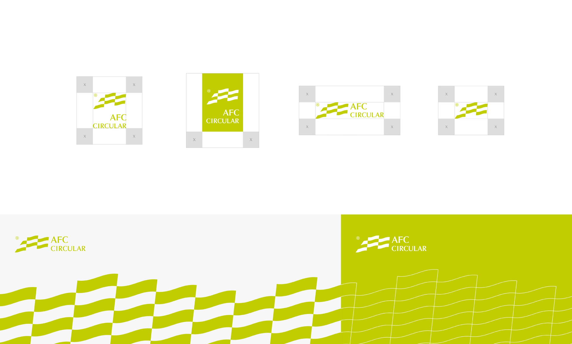
豪紳率先業界,翻轉織物邊料、碎布...等廢棄物被拋棄的命運,將其重新加工產製成可再使用的產品,此系列形象由以產品製程為發想,運用 #拼接風格概念 形塑如旗幟飄揚的AFC 系列LOGO,象徵了材料的再利用性,另一方面也讓標誌更具有動態感;#色系選擇 選用明亮的綠色,來傳達出創新生命&永續力的核心理念,引領企業開展更多可能的未來性!
🍃包裝與展覽相關製作物的減碳策略
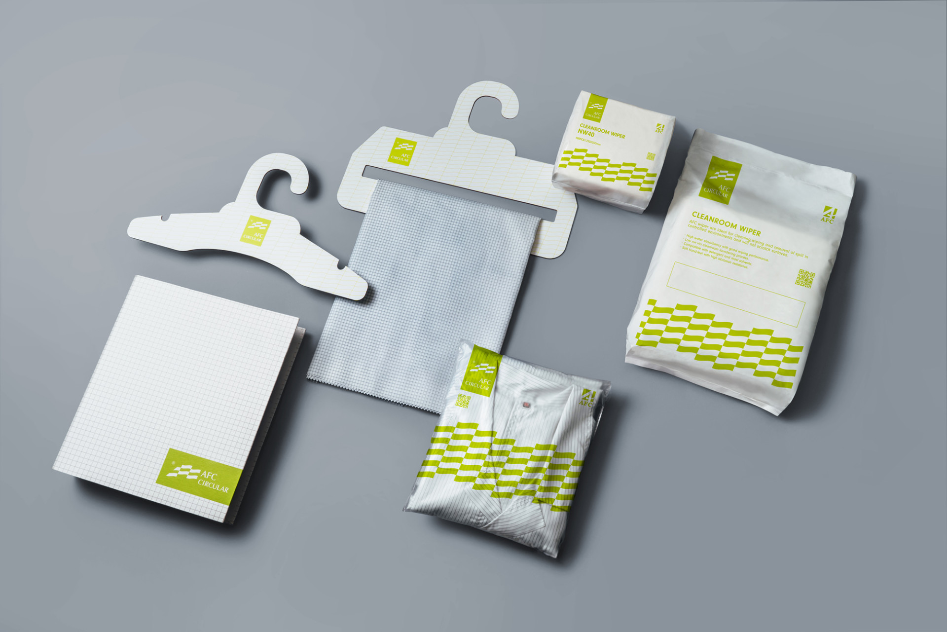
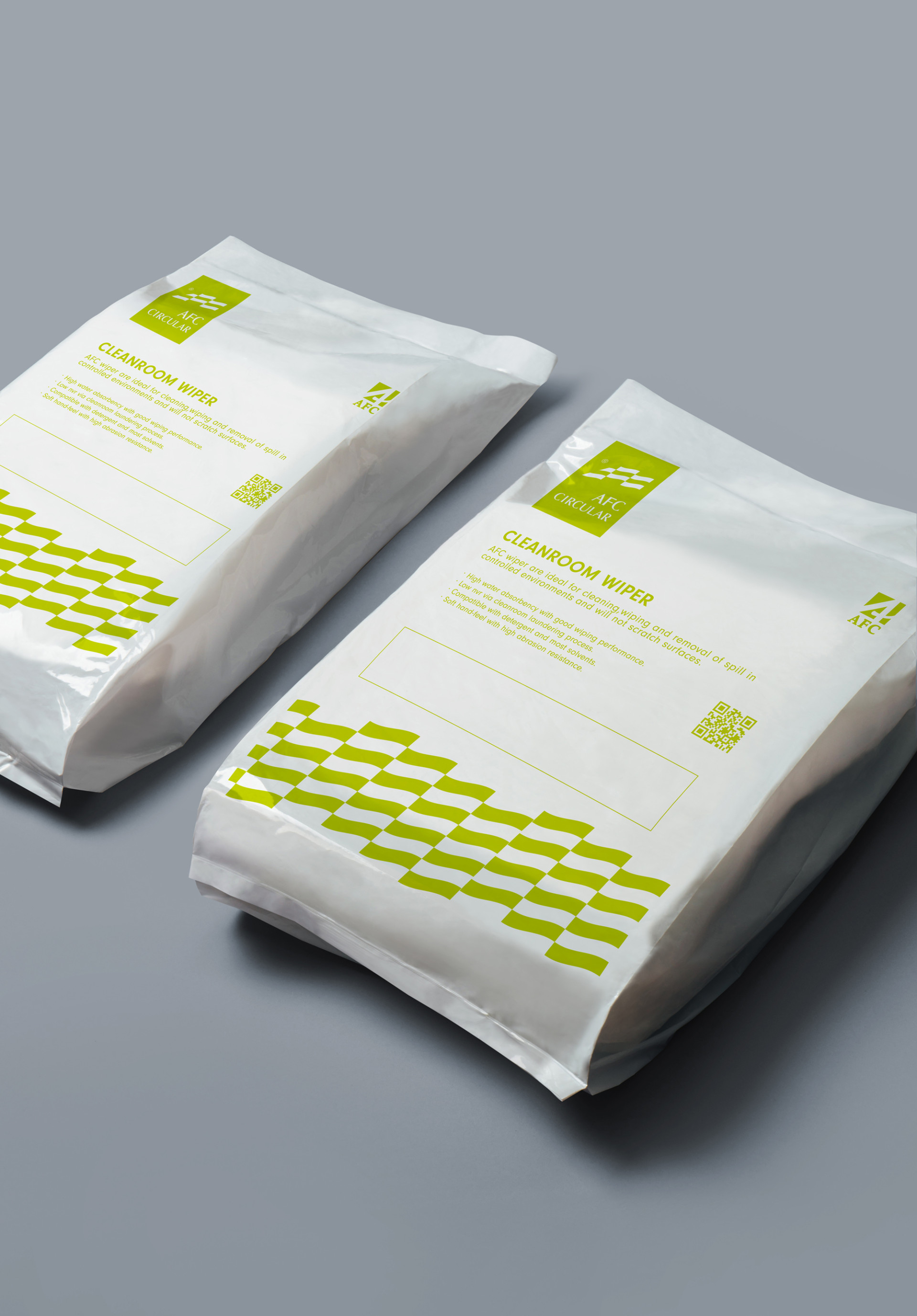
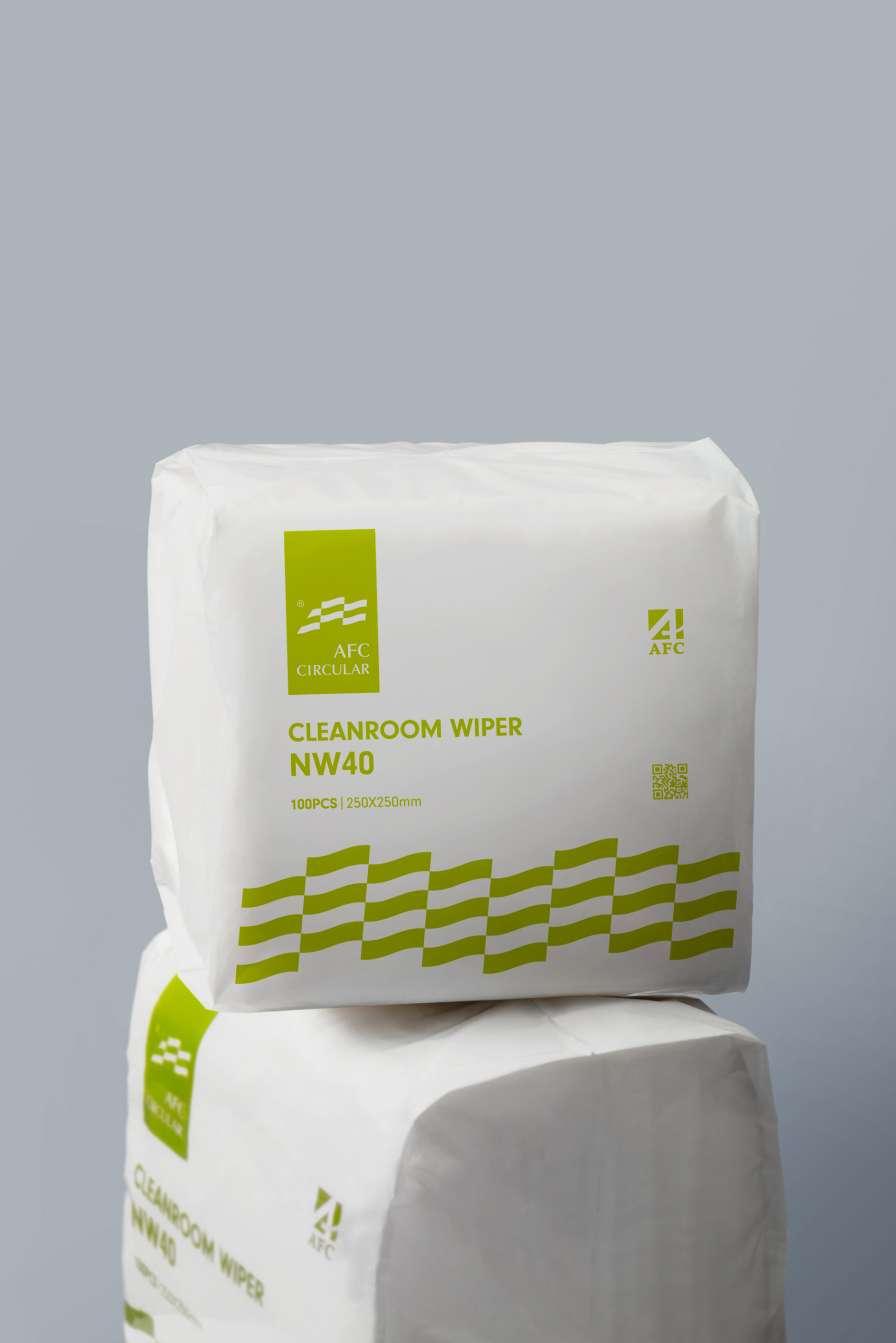
在包裝上運用設計編排讓整體 #印刷面積縮減,產品的詳細資訊也以導入 #數位標籤 方式,讓消費者掃描包裝上的QRcode就能快速閱覽資訊;包裝視覺規劃 #單色印刷 以降低油墨的使用。
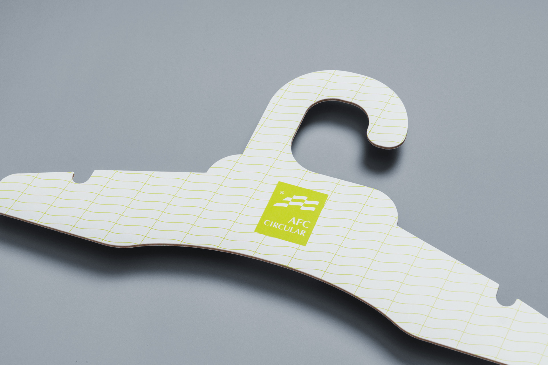
對外展覽用的衣架與布樣吊卡從原本傳統的塑料+鐵件的複合材質,改為一體成型的 #環保紙材 並延伸包裝設計概念,運用圖騰網格減少油墨面積,與過往對折卡紙相比,整體油墨印刷減少↘️ 32%。
🍃網頁架構打造與品牌識別度提升
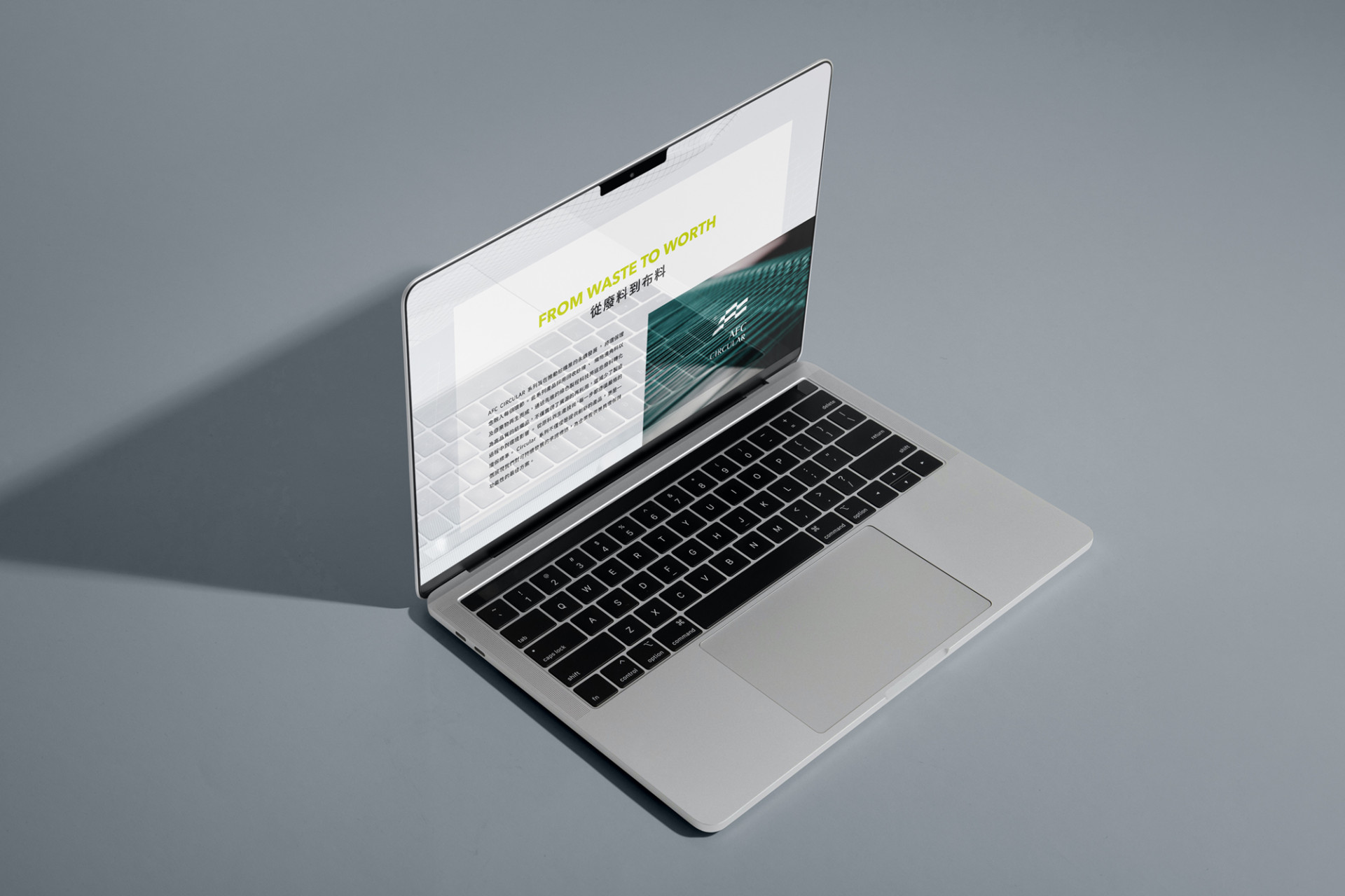
在網頁上主力需傳達此環保系列的整體形象型塑,所以分別從專屬LOGO規劃、色彩計畫及視覺風格等三個面相打造以強化其企業的識別度,並輔以搭配 #直觀圖像 及簡潔的內容規劃,同時將頁面結構彙整,聚焦於其環保價值與展示企業的社會責任與其創新性。
From wasted trash to fabric, start its journey of sustainability.
Since its founding, Asiatic Fiber Corporation has specialized in textile-related products and is now one of Taiwan’s leading brands in the textile category.Its core products — #Technical Industrial Textiles — include: cleanroom, sterile, and electrostatic control applications…with extensive applications in industrial protection and healthcare. In recent years, the growing emphasis on environmental sustainability has led Asiatic Fiber Corporation to collaborate with Victor Design , exploring how to implement comprehensive #carbon reduction design — spanning from existing product packaging to exhibition display materials.
🍃AFC Circular
Asiatic Fiber Corporation pioneering the industry, rewriting the fate of fabric offcuts, scraps, and textile waste, reprocessing and transforming them into reusable products, the visual identity of this series draw inspiration of the process itself.Using a #patchwork style to shape the AFC logo as waving flag- symbolizing the reusability of material with dynamic movement. For the #color palette a vibrant green to communicate the core values of innovative, vitality and sustainability, guiding the brand toward a greater possibility.
🍃Carbon Reduction Strategies for Packaging and Exhibition-Related productions.
Packaging design use visual layout to reduce printing coverage, and at the same time use digital label such as QR code to conduct further details information of the product for consumer to scan and read more.The packaging visual is designed with #single-color printing to minimize ink usage. The hangers and fabric sample hang tags used for external exhibitions have been redesigned — shifting from the traditional composite material of plastic and metal to a fully integrated #eco-friendly paper material. Extending the packaging design concept, totem grid patterns are applied to reduce ink coverage. Compared to the previous bi-fold card design, overall ink printing has been reduced by ↘️ 32%.
🍃Website Structure Development & Brand Identity Enhancement
The primary goal of the website is to convey the overall brand image of this eco-friendly series. To strengthen corporate identity, the design is approached from three dimensions: dedicated logo planning, color palette, and visual style.
This is further supported by #intuitive visuals and concise content planning, while the page structure is streamlined to focus on the brand's environmental values and showcase the company's social responsibility and innovative spirit.
Entering a new era of sustainability, Victor Design partners with businesses to reduce carbon — from product to packaging, together for the Earth!
邁入減碳永續的世代,美可特持續與企業協力從產品至包裝一起為地球減碳!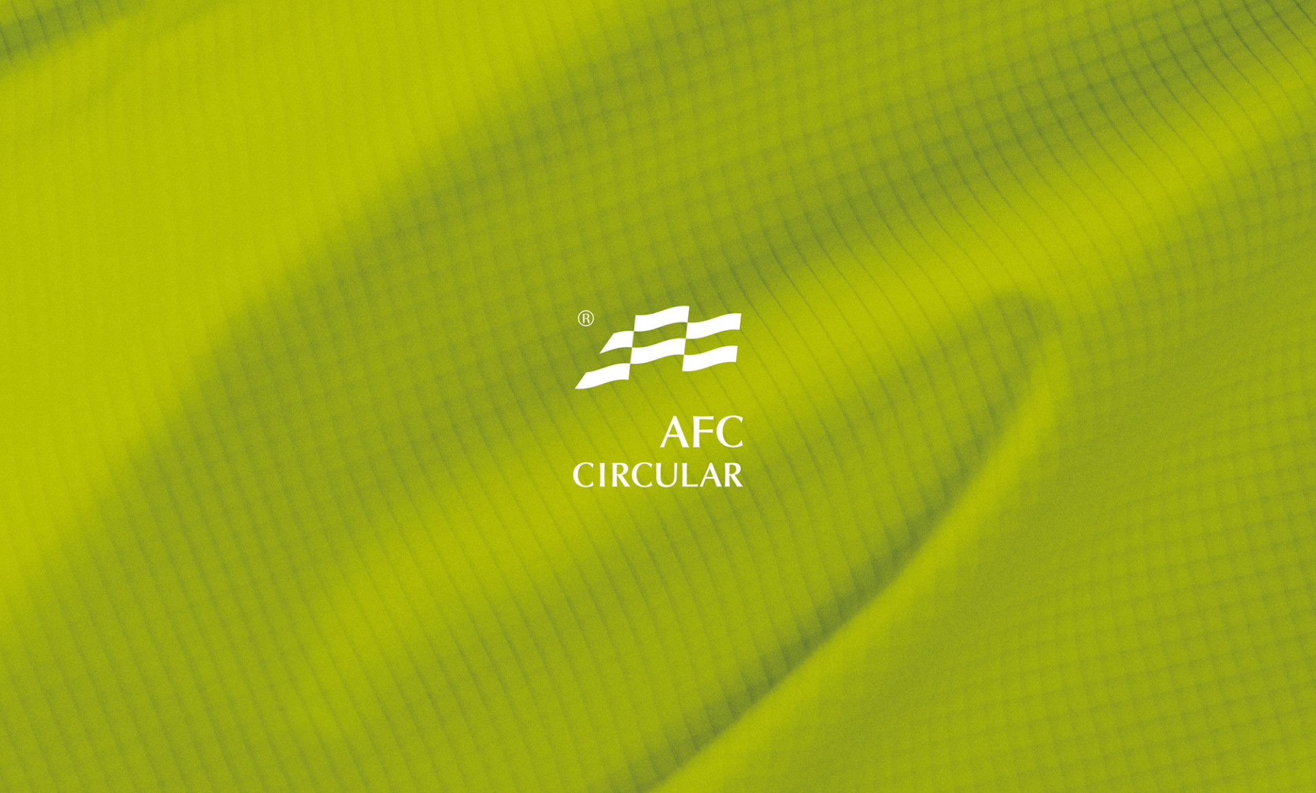




 View more projects
 Next post


