socks Series
Packaging Design Sprightly stroll
品牌 : 足倍健
Client :ORIENTEA ENTERPRISE CO., LTD.
Brand : Zube J
Published on 05. 16. 2013
socks Series
Packaging Design Sprightly stroll
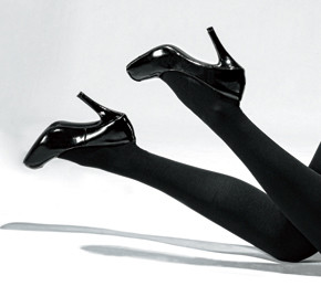
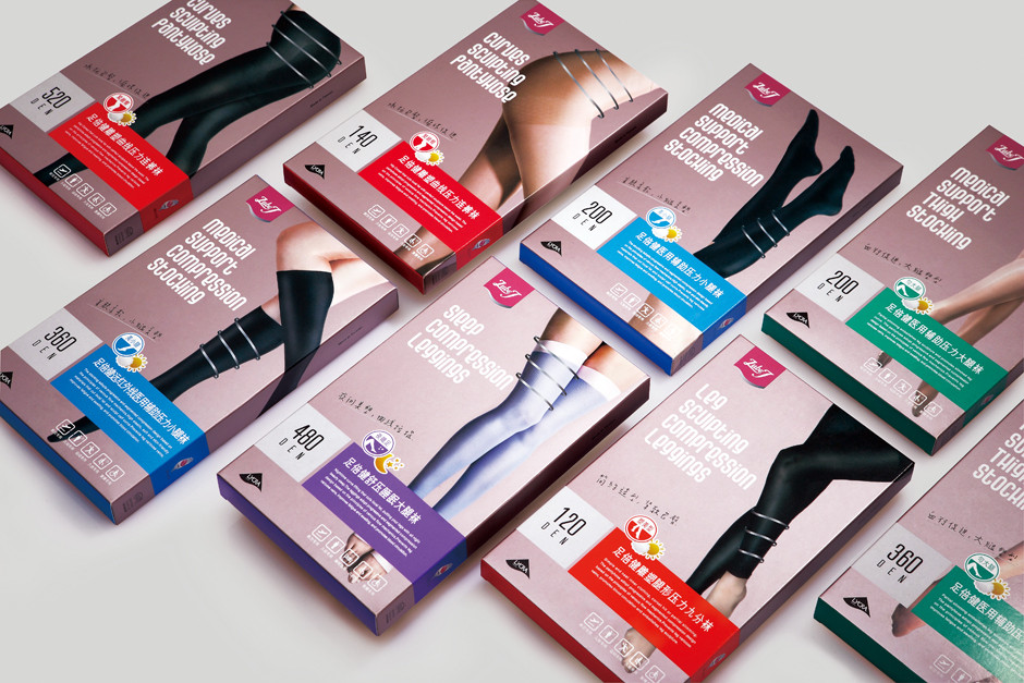
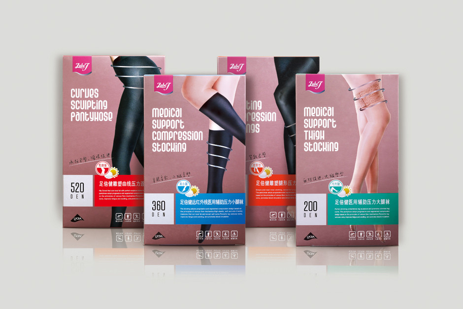
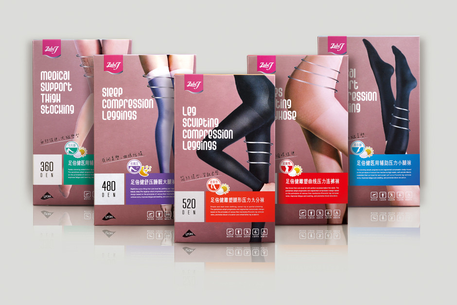
ZUBE J,取「足倍健」諧音轉換為俏皮現代的英文品牌名,「J」有Jump、輕盈跳躍的意涵,也象徵修長有力的腿部線條;識別設計將產品意象適度轉化,流暢輕揚、延伸包覆的字形設計,展現襪品柔軟彈性及腿部曲線弧度;包裝部分考量襪品為消費型商品,須能清楚辨識資訊,除依模特兒身著的襪品區隔,更系統化運用色彩及圖示區分產品特性,完整表現品牌洗練專業感。
“Zube J” is taken from a Chinese homonym converted into a modern playful English brand name, “J” with the implication of sprightly and leaping, which also symbolizes the long and powerful leg lines. The design identification converts the product image to textual design with sprightly, light, extending, and coverage, featuring the softness, flexibility, and leg curves of the functional socks. The package takes into consideration of consumer-oriented sock products and needs to clearly identify the information; not only does it segment the sock products worn by the model but also intuitively applies colors and image zones to separate product characteristics, thereby comprehensively presenting the experience and professionalism of the brand.