PHERMPEP
KEFPEP Packaging Design
客戶 : 中化健康生技公司
品牌 : 中化健康
Client : PHERMPEP Health BIO. CO., LTD.
Brand : PHERMPEP
Published on 03. 24. 2016
品牌 : 中化健康
Client : PHERMPEP Health BIO. CO., LTD.
Brand : PHERMPEP
Published on 03. 24. 2016
PHERMPEP
KEFPEP Packaging Design
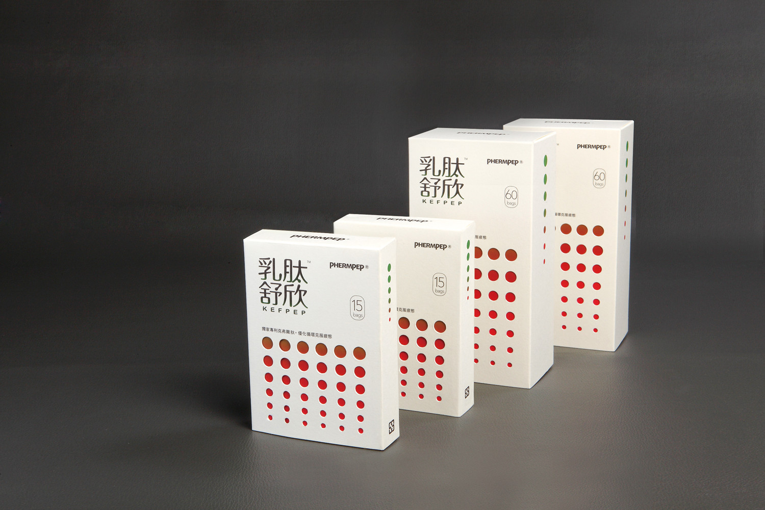
中化健康,以全方位的健康服務,致力於新穎保健素材研發。現今,高血壓已為台灣國民病之一,而乳鈦舒欣為中化健康,針對有高血壓前期症狀與患有高血壓病患所開發的產品。
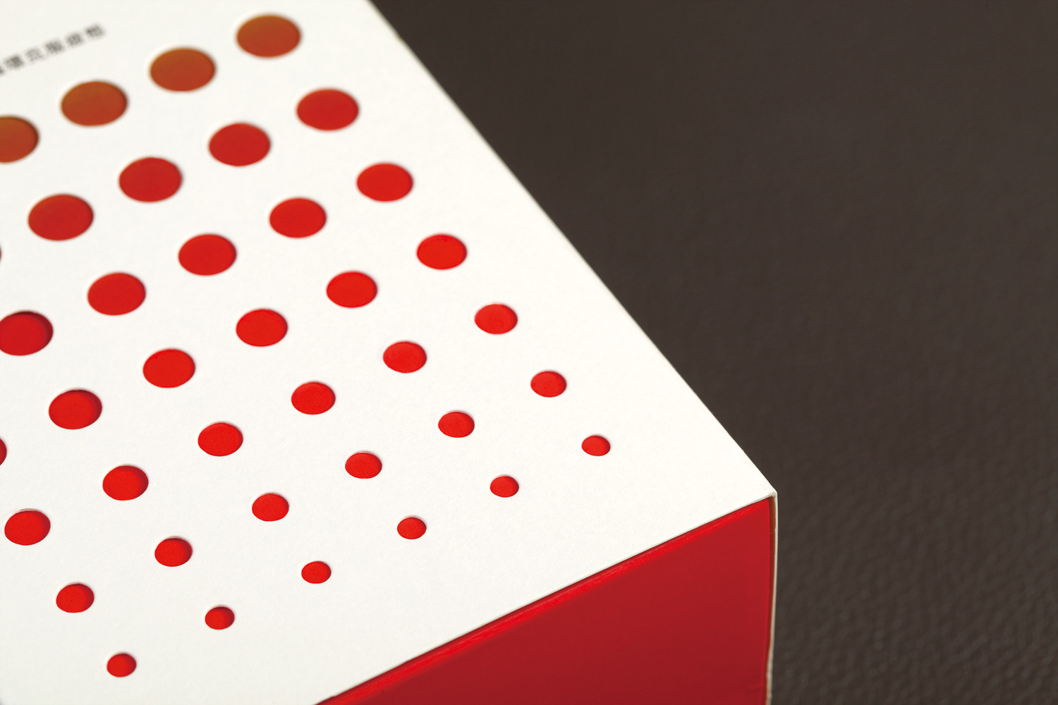
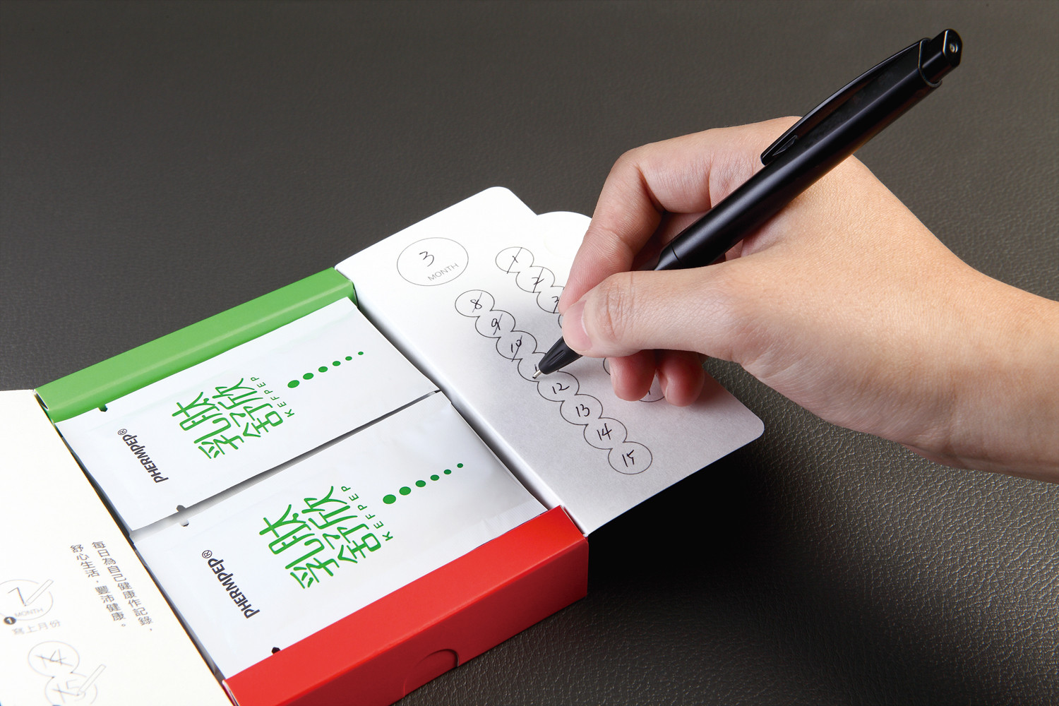
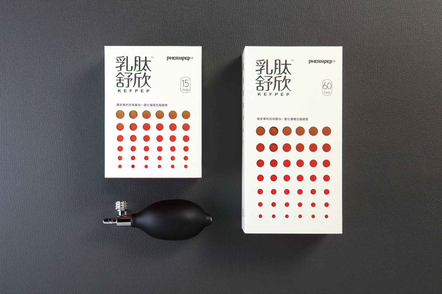
有感於健康食品總給人冷硬的印象,整體包裝設計以擺脫傳統保健食品刻版的藥品感,於盒形上嵌入互動的巧思,增添與服用者的互動感,而簡潔的版面亦保留了專業安全的品牌形象。利用由大至小的摟空圓點與漸變的顏色來示意血壓的趨緩,抽取盒子的同時,由大至小的圓點便由“警戒紅色”漸變為“安心綠色”,意味服用後,身體可以獲得適當的趨緩。內盒貼心繪製填空日期,每日為自己的健康作紀錄,感受自身豐沛的健康,得以享受最舒心的生活。
PHERMPEP Health is working on developing the newest health material for comprehensive health services.
Nowadays, hypertension is one of the common Taiwanese diseases, however, KEFPEP develops a product for hypertension patients or with prehypertension symptoms person.
Normally, healthy food has a cold impression, add some ingenuity design on the package for taking off this stereotype, however, keep the professional safety brand image from the simple design.
The circles big to small on the box represent to the symptoms of hypertension is getting control. Furthermore, the red inside the circle changes to green while opening the box, which means the body got proper treatment. Inside the box has a blank for filling the date when took the meds also record the health by yourself.