SASSIBABY
Baby Bath Series
Packaging Design
品牌 :誰是寶貝
Client : 10 Art BIO. CO., LTD.
Brand : SASSIBABY
Published on 04. 19. 2016
SASSIBABY
Baby Bath Series
Packaging Design
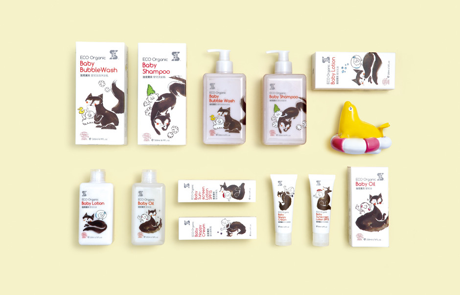
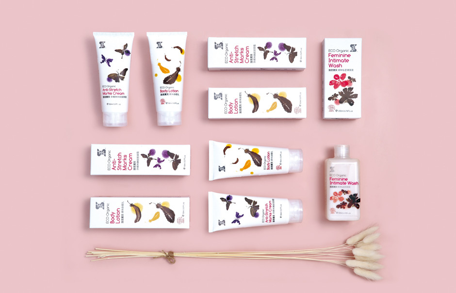
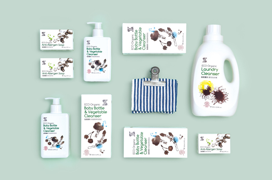
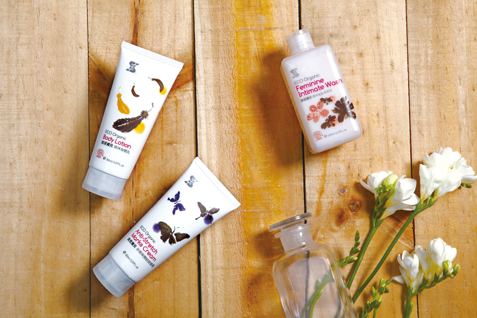
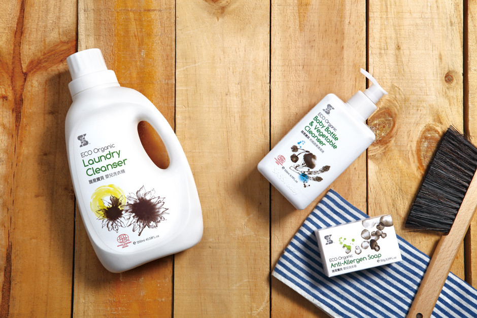
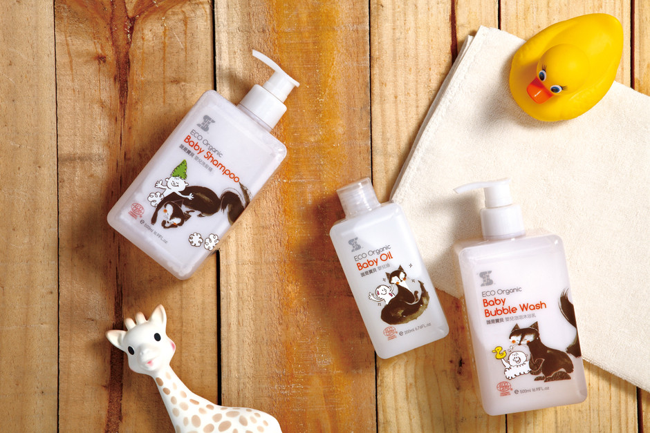
The maternal and child brand emphasize kind to environment, take existing conservation animal – Fennec Fox as the spirit symbol, present to the respecting nature and the yearning of purity, keep the consistent image from idea to design.
With the ink paint style, rich and opaque art techniques present to the insist of back to nature, bringing the product feature of different series transform to image elements and make the visual design, the interaction of Fennec Fox with babies on the package, just bringing the soft and kind feelings of brand to consumers. Around the green thoughts paper is selected from FSC certified wrapped environmentally bottle, through visual design with high visible and story present to the unique tone of eastern maternal and child brand.