SCHOKOPÜRE
Chip Chocolate
Packaging Design
客戶 : 巧克力雲莊有限公司
品牌 : SCHOKOPÜRE
Client : SCHOKOLAKE INTERNATIONAL (TAIWAN) CORP.
Brand : SCHOKOPÜRE
Published on 12. 30. 2016
品牌 : SCHOKOPÜRE
Client : SCHOKOLAKE INTERNATIONAL (TAIWAN) CORP.
Brand : SCHOKOPÜRE
Published on 12. 30. 2016
SCHOKOPÜRE
Chip Chocolate
Packaging Design
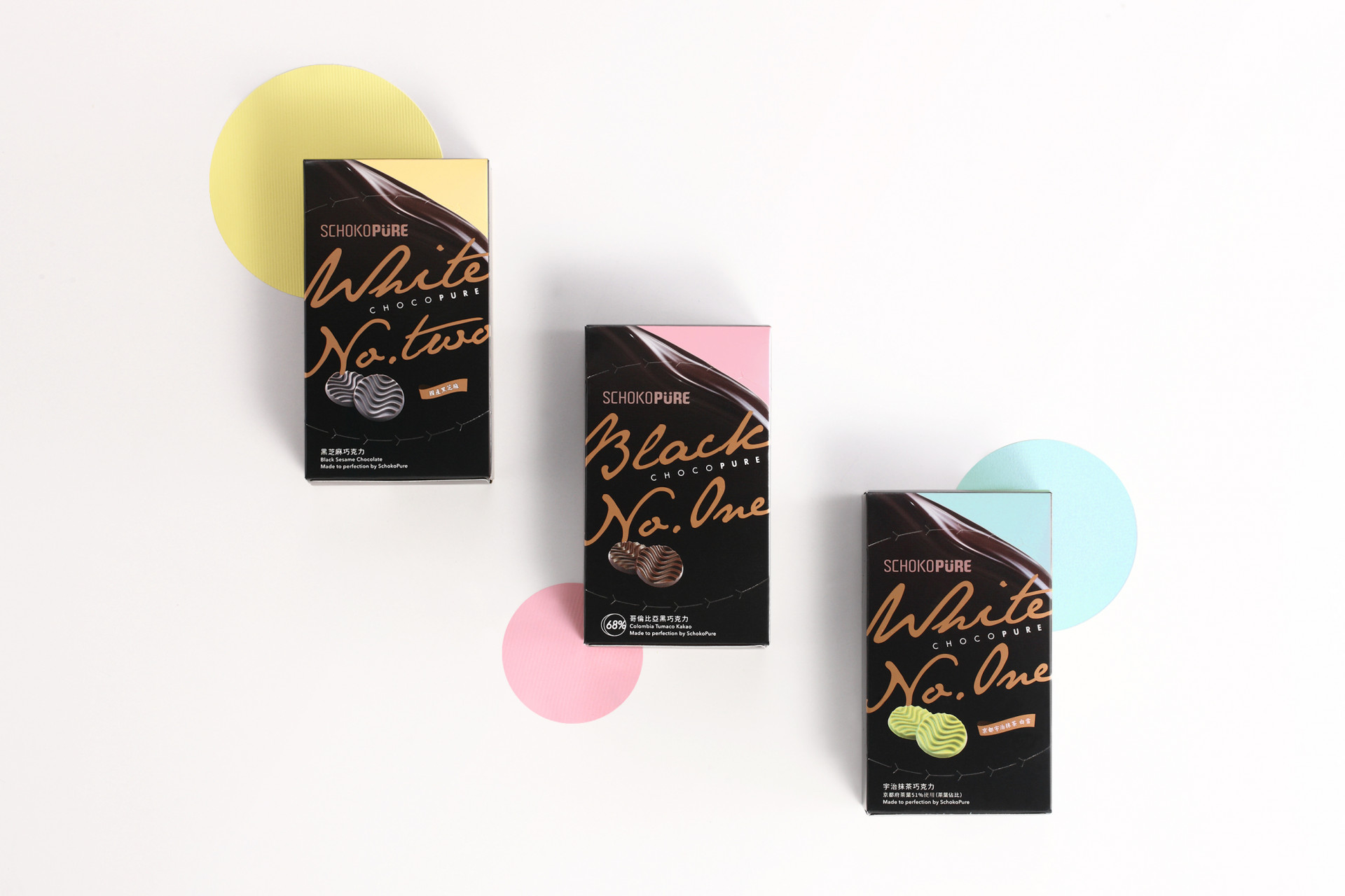
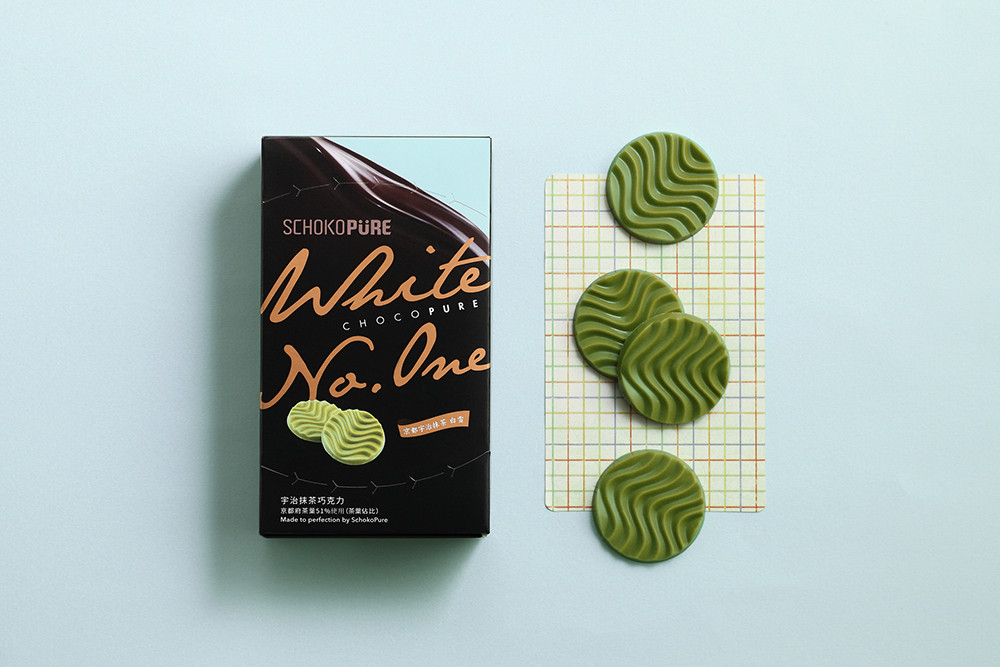
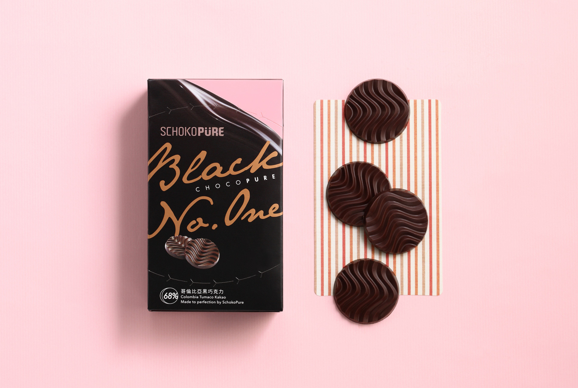
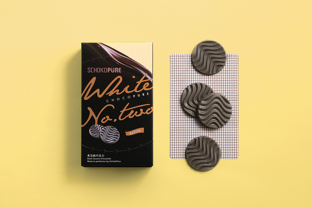
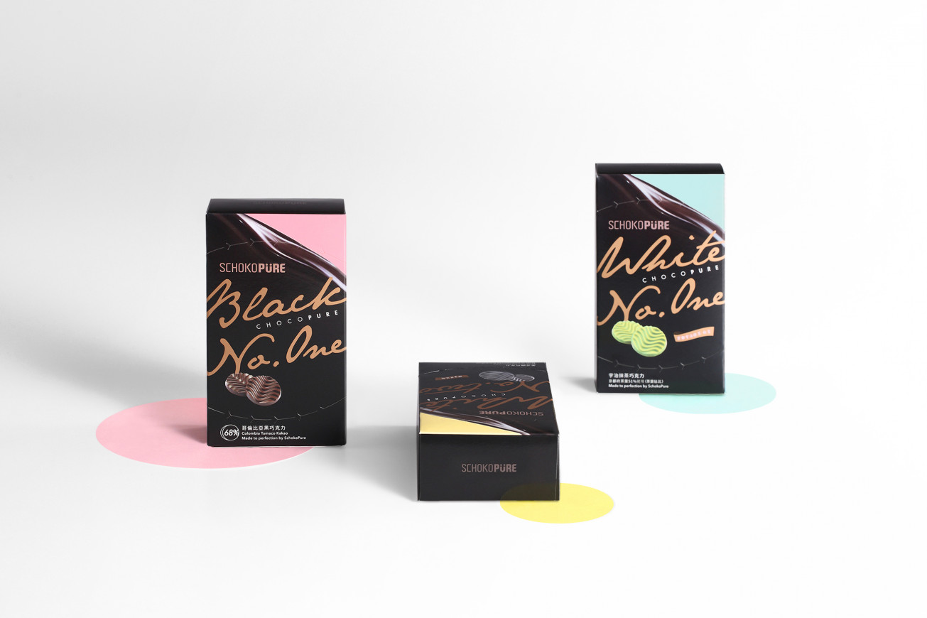
依循「SCHOKOPÜRE」品牌時尚的調性脈絡, 在版面上大膽以撞色的設計手法呈現,讓融化的巧克力在流動中挹注繽紛的色彩,結構上圓弧的撕裂線便是以巧克力外型為呼應,表露出給你完整的高品質可可原料。刻意制定的手機尺寸比例,便於日常的攜帶,精巧的放置於化妝包或是隨行包袋,不論是隨意的熱量補充或是午茶分享,皆能輕鬆享受巧克力所帶來的愉悅。
Follow the fashion brand tone of [SCHOKOPÜRE], the melted chocolate match with different colors for three flavors, the curve open line is same as the shape of chip chocolate for easier to open it. On the size chosen, for easier to take out or put into bag, thus, create a small size like mobile phone, so you can enjoy the happiness from chocolate whenever easier.