SCHOKOPÜRE
Almond Chocolate
Packaging Design
Almond Chocolate
Packaging Design
客戶 : 巧克力雲莊有限公司
品牌 : SCHOKOPÜRE
Client : SCHOKOLAKE INTERNATIONAL (TAIWAN) CORP.
Brand : SCHOKOPÜRE
Published on 02. 06. 2017
品牌 : SCHOKOPÜRE
Client : SCHOKOLAKE INTERNATIONAL (TAIWAN) CORP.
Brand : SCHOKOPÜRE
Published on 02. 06. 2017
SCHOKOPÜRE
Almond Chocolate
Packaging Design
Almond Chocolate
Packaging Design
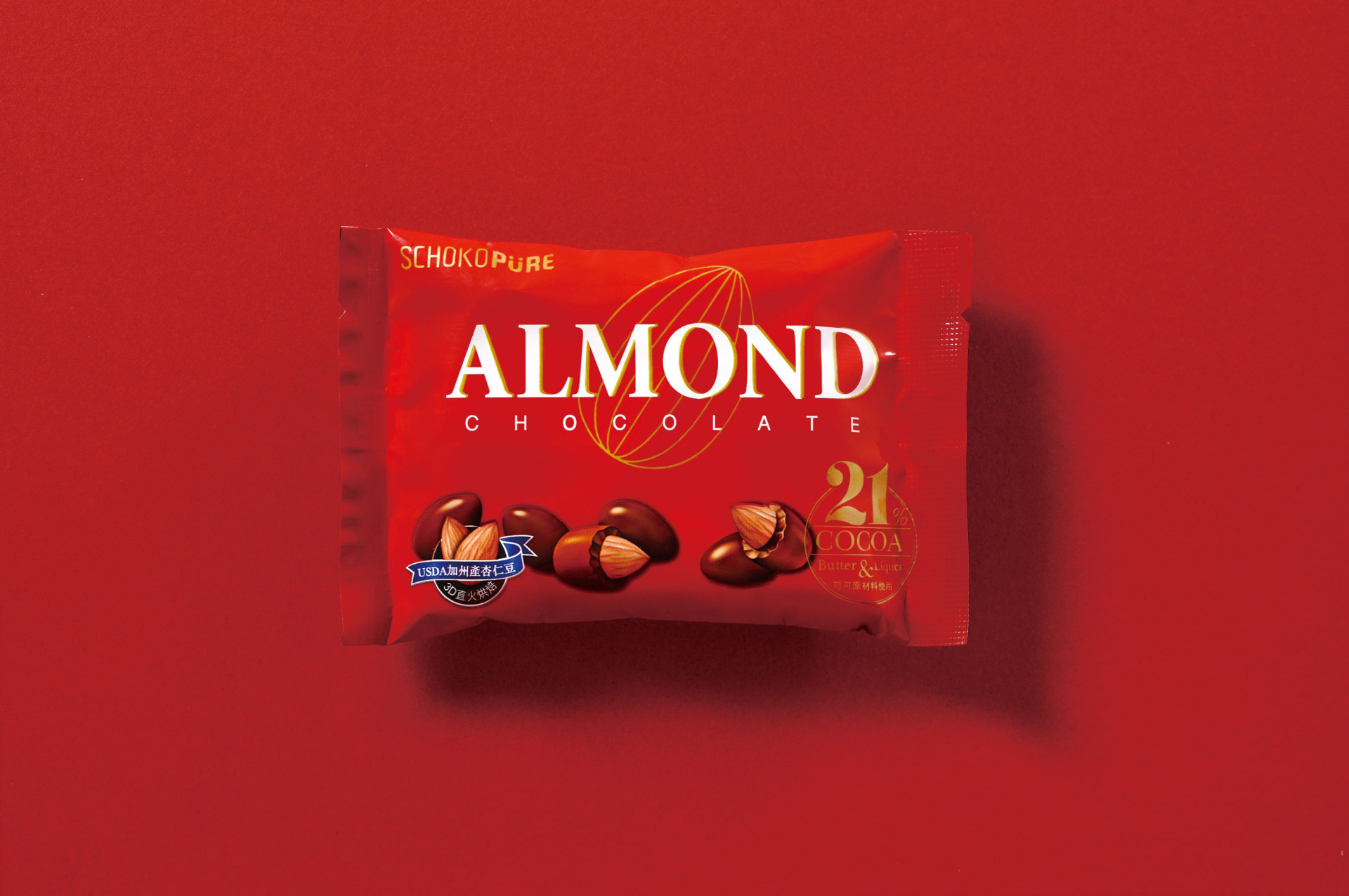
以強烈亮眼的飽和紅色為包裝主視覺,大大提升在通路市場上的注目度; 運用白色英文字體,在消費者挑選上便能一眼清楚辨識與傳達訊息。來自獨特技術烘焙的杏仁豆,除了運用圖像上半剖的實體圖,更於版面中央以金線描繪杏仁輔佐,以表示選用高品質杏仁的堅持。在品牌對於自家原料、美感各層面的注重下,運用色彩與圖像,自然帶出整體的奢華感。
With the strong conspicuous Red for package main visual will increase the visibility on the market remarkably; with the white text for transmitting the information from the product to customers clearly. A golden line almond drawing on the central, and real almond chocolate picture below presenting the insist of high-quality almond chosen. Forthputting color and image, bringing out the whole luxury sense.