Shaanxi Thirteen
Branding Visual Identity Design &
Packaging Design
品牌 : 陝拾叄
Client : Shaanxi Thirteen
Brand : Shaanxi Thirteen.
Published on 04. 21. 2017
Shaanxi Thirteen
Branding Visual Identity Design &
Packaging Design
以陝西的農業發展出友善交易品牌,並開發十三朝古都的悠久糕餅食品文化。而西安從秦漢時期到現今,共跨越13個朝代的建構與融合,奠定了超過1077年的古城之稱。我們透過深入探訪,將陝拾叁所在地的景觀和當地的古文化地景,鐘樓,古城牆,大雁塔…等,保留品牌發跡地所蘊含之深厚文化底蘊,並結合當代美術思維,新舊元素揉合,激盪出嶄新的《陝拾叁》品牌風格,建構出形象與包裝的整體感。
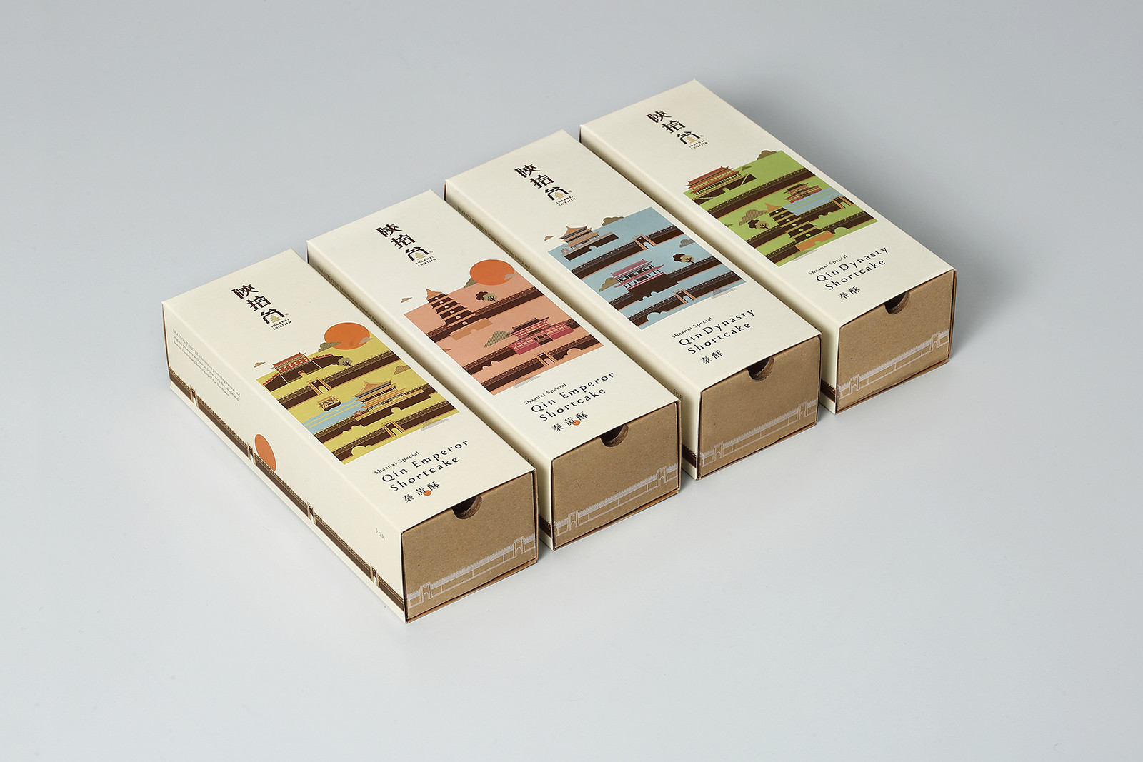
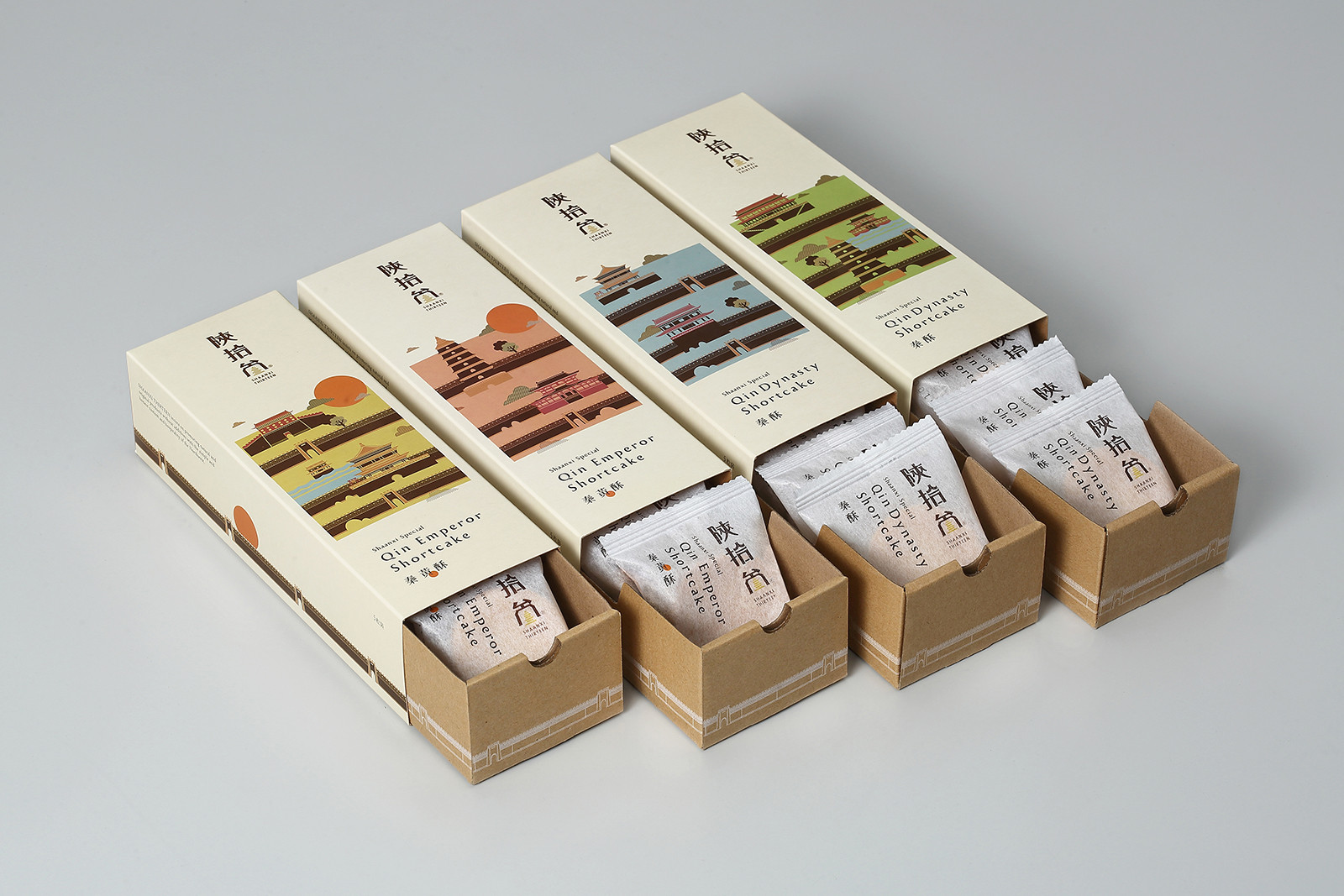
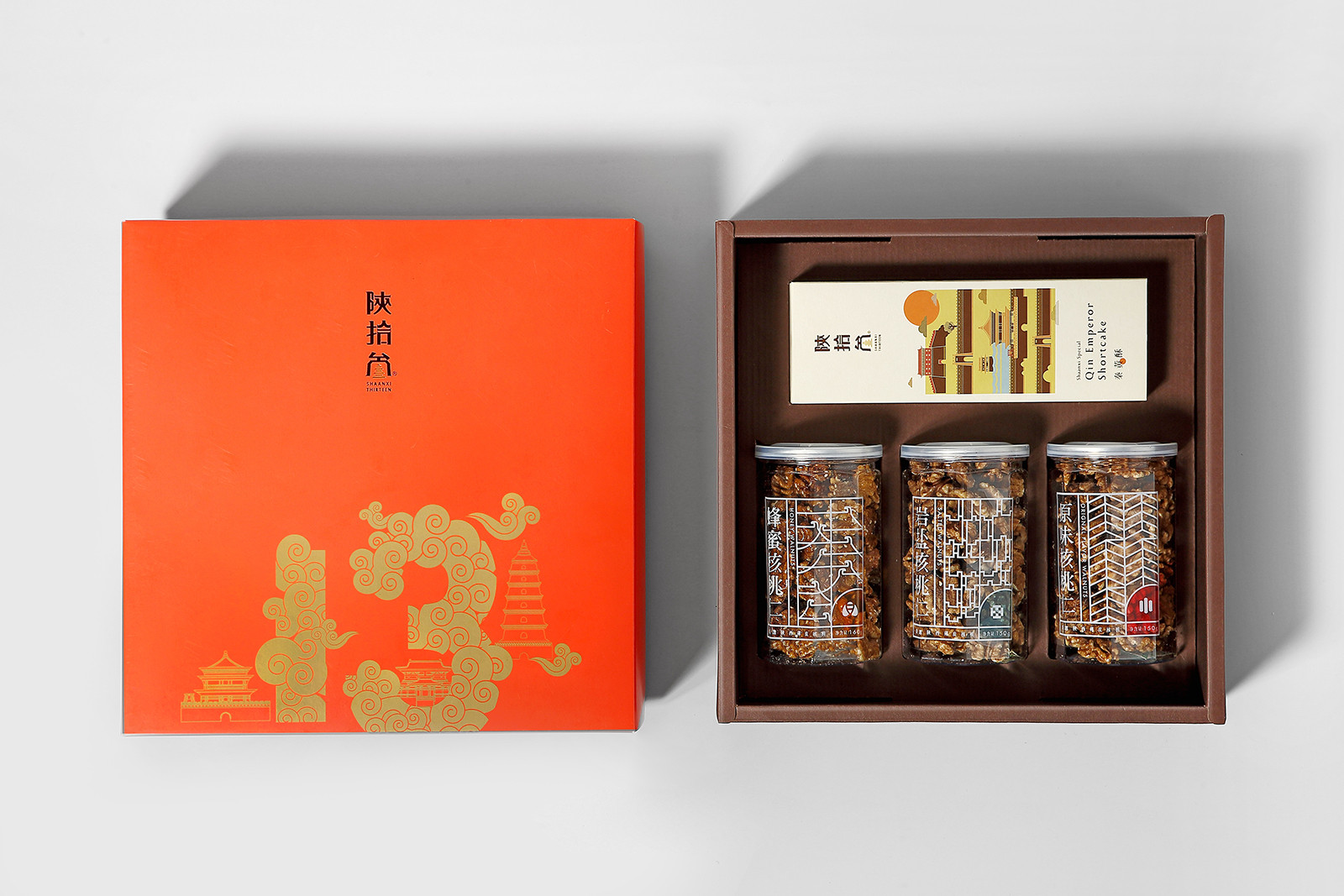
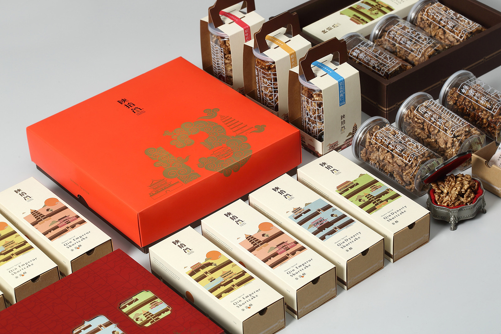
【秦酥/秦黃酥系列】
風土民情始於四季變換,[秦酥/秦皇酥]除了古都建築、名勝景觀的嵌入,便帶入四季縮影,以抽屜盒的方式隱藏城牆巧思帶來驚喜,並延續城牆綿延的歷史壯麗感,注入強烈藝文感,活化品牌價值。
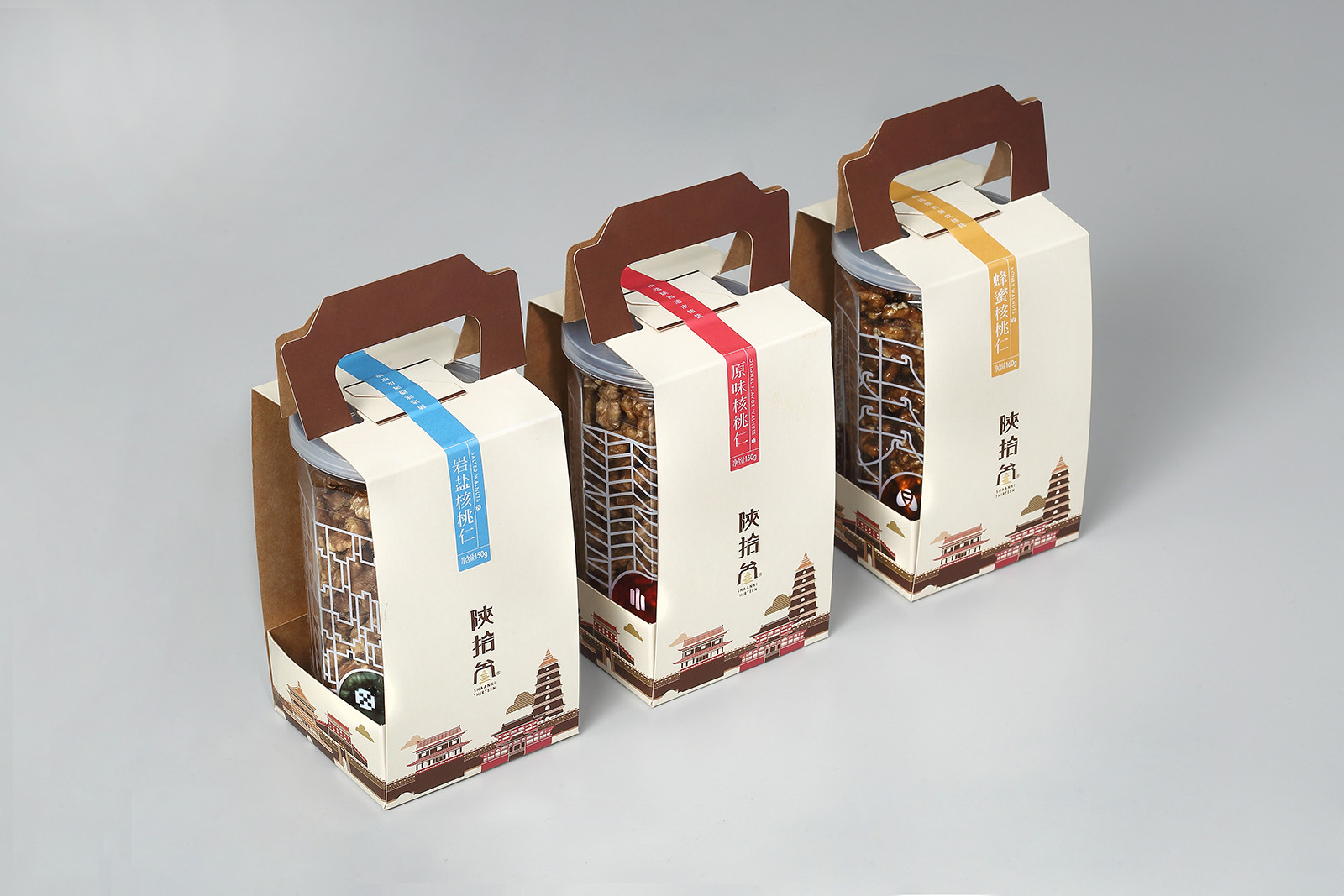
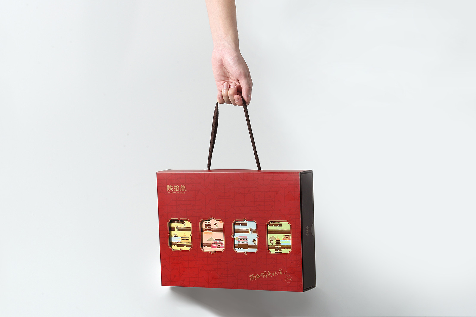
【核桃仁系列】
單盒包裝以輕巧手提的便利性為原則,在提把上以城牆的造型延續設計,建立品牌的識別性,禮盒採用映入眼簾的磚牆紅色,連結禮盒送禮的喜氣感亦帶有西安磚牆強烈的色彩印象。透過包材的減量選用,在品牌專屬美學、環保與便利性達到最佳平衡。
A brand launched from the development of agriculture in Shaanxi, and innovate the culture of cookies and food from the past thirteen dynasties. Xian crossed thirteen dynasties after construct and integrate, establish over 1077 years so has a name of “ancient city”. Combine the new and old elements, keep the local profound culture like landscapes and ancient construction blend with contemporary art thoughts, created a brand new brand style [Shaanxi Thirteen] and make whole visual image and package.
| Qin empire shortcake series |
Custom and tradition change with seasons, to continue the strong history of the city and add more artsy, thus, put in the ancient city, popular landscape and four seasons’ landscape onto the package design.
| Walnut series |
For the convenient, the single packaging takes portable as the principle, the handle design is the extension from the ancient city, the brick red connects the Chinese traditional gift box for establish brand’s identity, and also present to the strong color image of Xian’s brick wall. For decreasing the material on package to make the best balance from branding aesthetics, environmental protection and convenient.