Bottle Shape &
Packaging Design
品牌 : 綠藤生機
Client : Greenvines BIO. CO., LTD.
Brand : Greenvines
Published on 09. 07. 2017
Bottle Shape &
Packaging Design
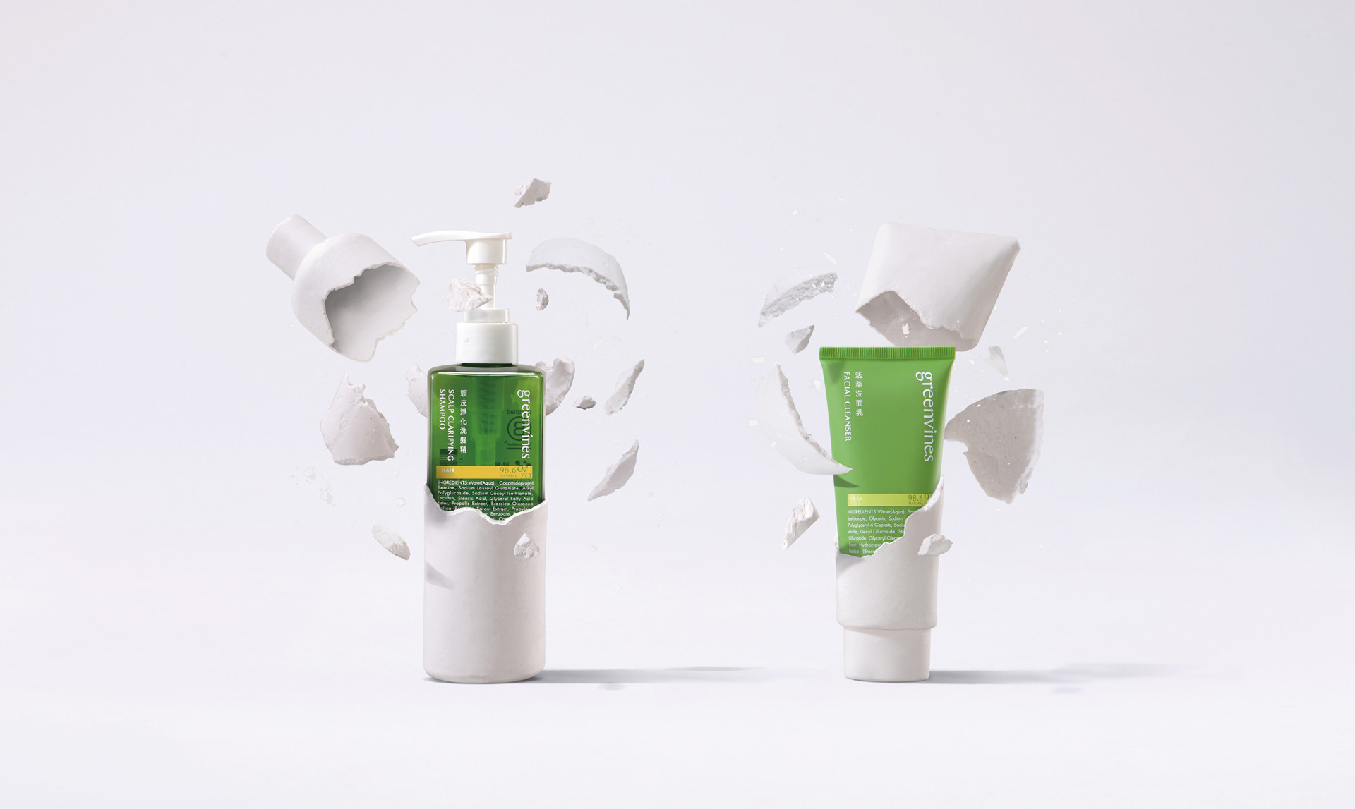
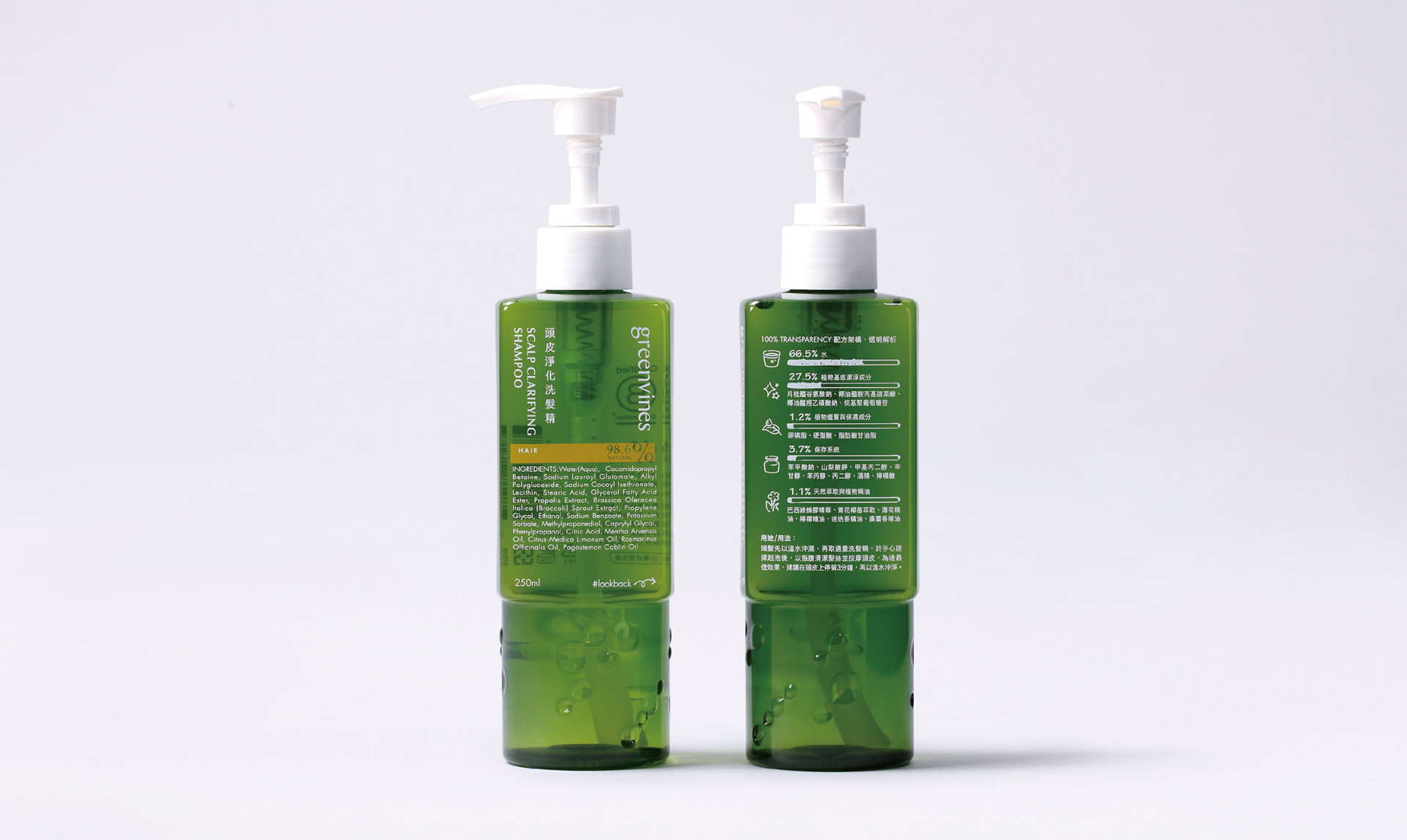
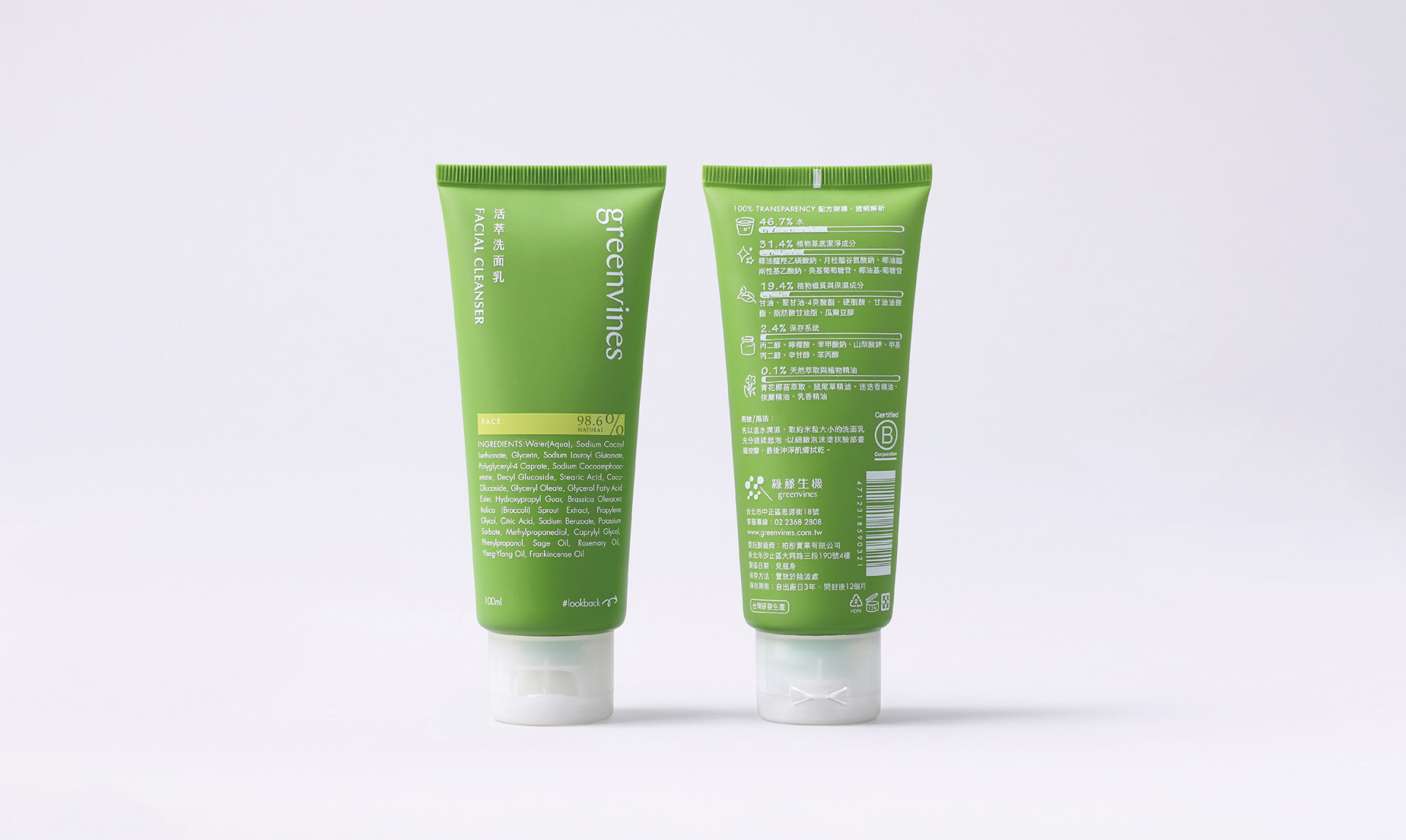
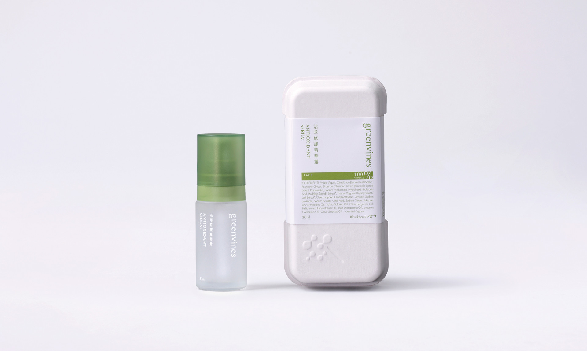
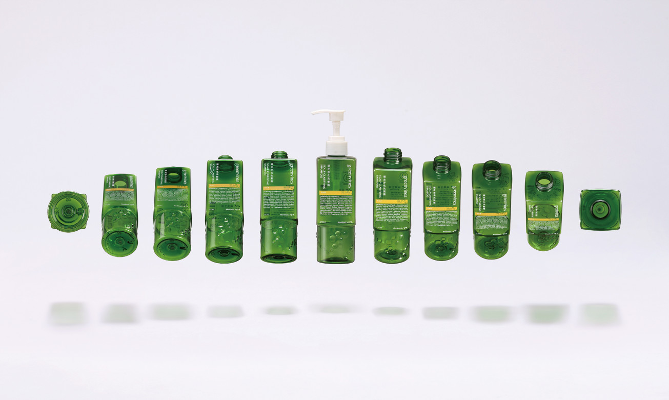
在綠藤的專案中,一項極為重要的任務便是瓶器設計和包裝設計,在識別形象確立後,如何讓包裝維繫品牌的調性,又能夠創造專屬性?我們將對於綠藤的實質感受轉換至瓶器理念上,取「方圓、真實與透明」做為象徵。方圓,代表品牌理性堅持與感性呵護的並重;真實,在品牌與商品間信念一致;透明,讓配方完整露出。
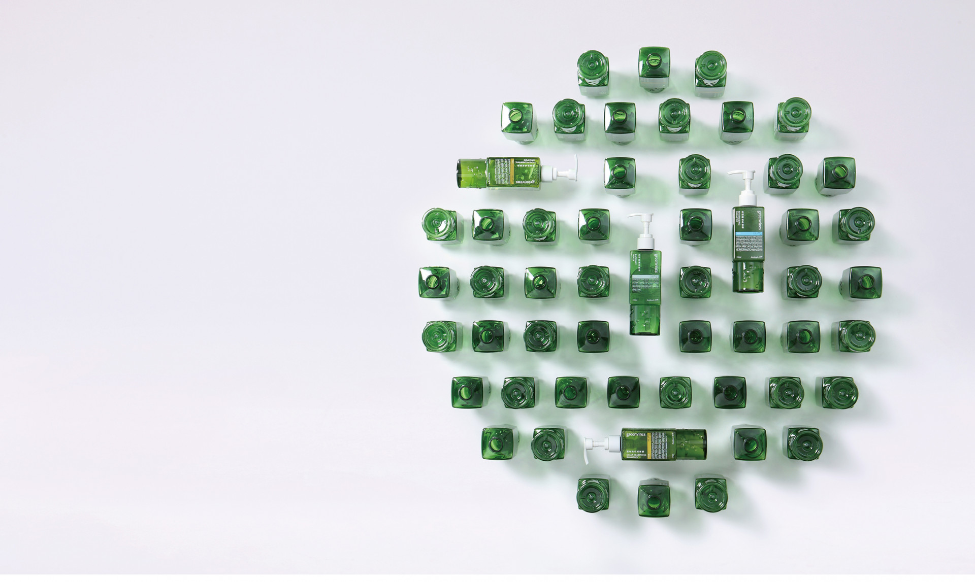
歷經28個月的設計、溝通、生產,不僅是外型的打造,瓶器壓頭的選擇,或是色號的反覆篩選,紙漿塑模的選擇,為的是讓異材質減少,讓環境更好,另一面更為了提供消費者便利的使用情境,這些瓶身與包裝,還有不被看見的歷時與過程,恰巧已表達出我們呈現的綠藤自我風格。
In Greenvines project, we have a very important mission – bottle and package design. How to keep the brand tone and also create the exclusiveness after visual identity image confirmation is our main goal. We took “square, circle, true and transparent” as the theme for transforming the feel of Greenvines to the bottle concept.
“Square& circle” means rational persistence of brand is as important as perceptual carefulness.
“Ture” is the consistency between brand and product.
“transparent” show the formula completely.
After 28 months of design, communication and production, not just consider about the shape of the bottle, color and paper chosen, moreover, for reduce the wasteful and for the environment better, all the consideration expresses the self-styled of Greenvines.