trreeo
Branding Naming, Branding Visual Identity and Packaging Design
品牌 : 樹重奏
Client : Sanguo CO., LTD.
Brand : trreeo
Published on 09. 13. 2017
2019 Golden Pin Design Award

trreeo
Branding Naming, Branding Visual Identity and Packaging Design
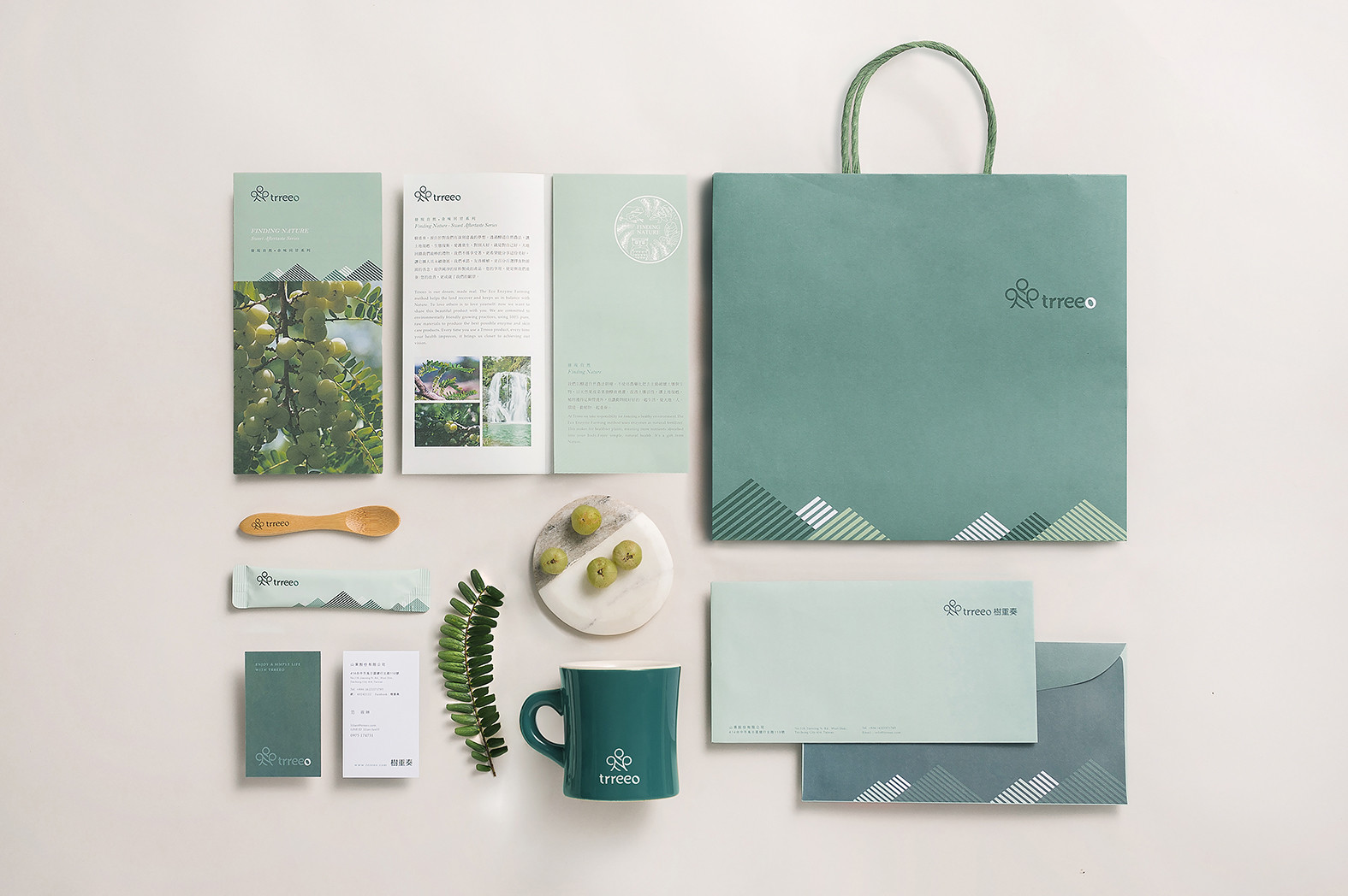
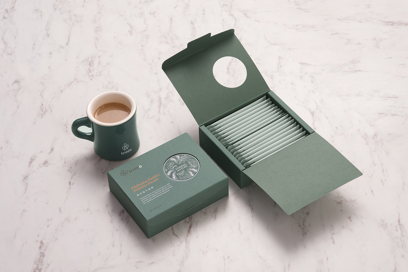
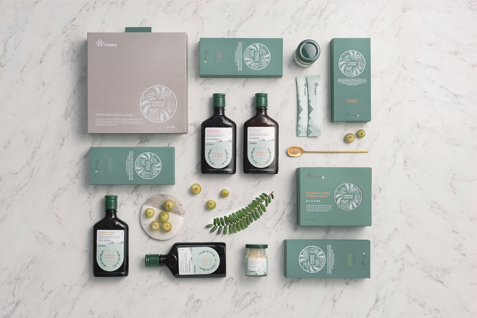
以油甘果為推廣的「trreeo 樹重奏」,透過酵道自然農法,三層立體種作,讓土地復甦和生態平衡,提供純淨的原料製成相關產品。從品牌命名便依循品牌的核心優勢和理念,品牌形象和包裝設計維繫此脈絡,呈現自然和鳴的俐落簡約風格。
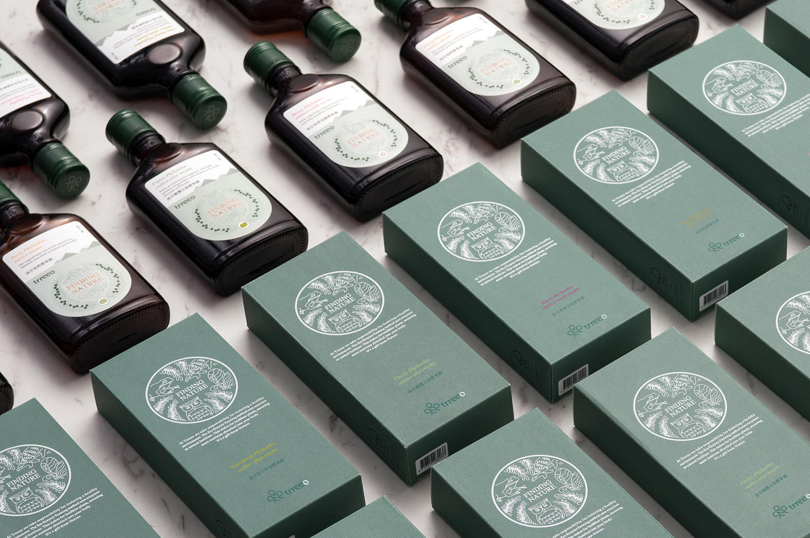
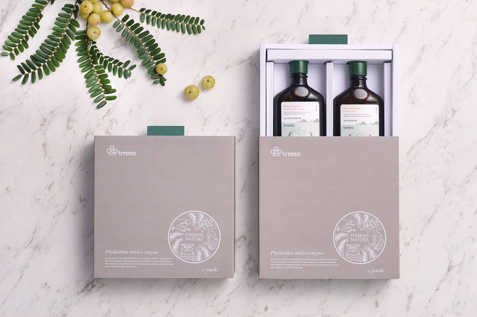
識別上利用樂譜線結合樹型,讓果實在樹上譜出美麗的三「O」樂章;三個O也代表著Original、Organic、Orchard。 [發現自然 余味回甘系列] 將探索果園的驚奇樂趣與真實遇見的動物轉化為主視覺元素,試著將真誠且自然的氛圍渲染給食用者,罐裝以扁瓶裝 ,增加攜帶的便利性,減少置物所需的空間,刻意選用綠色瓶蓋,提升品牌的連結度,包裝上特別採用FSC環保認證紙張,結構上採一體成型的無膠包裝,深植環保信念,為消費者健康把關。讓身體的健康保養於理性中賦予輕鬆的感受。
[ trreeo ] promote the Indian Gooseberry with Eco Enzyme Farming and also three layers growing way to make the ground and ecology balanced. Followed the main concept of the brand, and create the brand image and package design.
Additionally, connect the music score and tree, so create three wonderful 「O」 on the visual identity design; furthermore, three 「O」 mean Original、Organic and Orchard.
The series of “Finding natural, sweetness after tasting” is trying to give people the feel about real and nature, so transform the animals in the farm to the main visual iconic. On the package design there is three concepts, first of all, a flat bottle for bringing convenience, and a green cap for the connection of brand, last, use FSC environmentally certified paper for protecting the environment.
Give you a light feeling for your body’s health maintenance.