
BnnBee
Branding Visual Identity
and Packaging Design
客戶 : 當支蜜有限公司
品牌 : 當支蜜
Client : BnnBee CO., LTD.
Brand : BnnBee
Published on 10. 27. 2017
品牌 : 當支蜜
Client : BnnBee CO., LTD.
Brand : BnnBee
Published on 10. 27. 2017
BnnBee
Branding Visual Identity
and Packaging Design
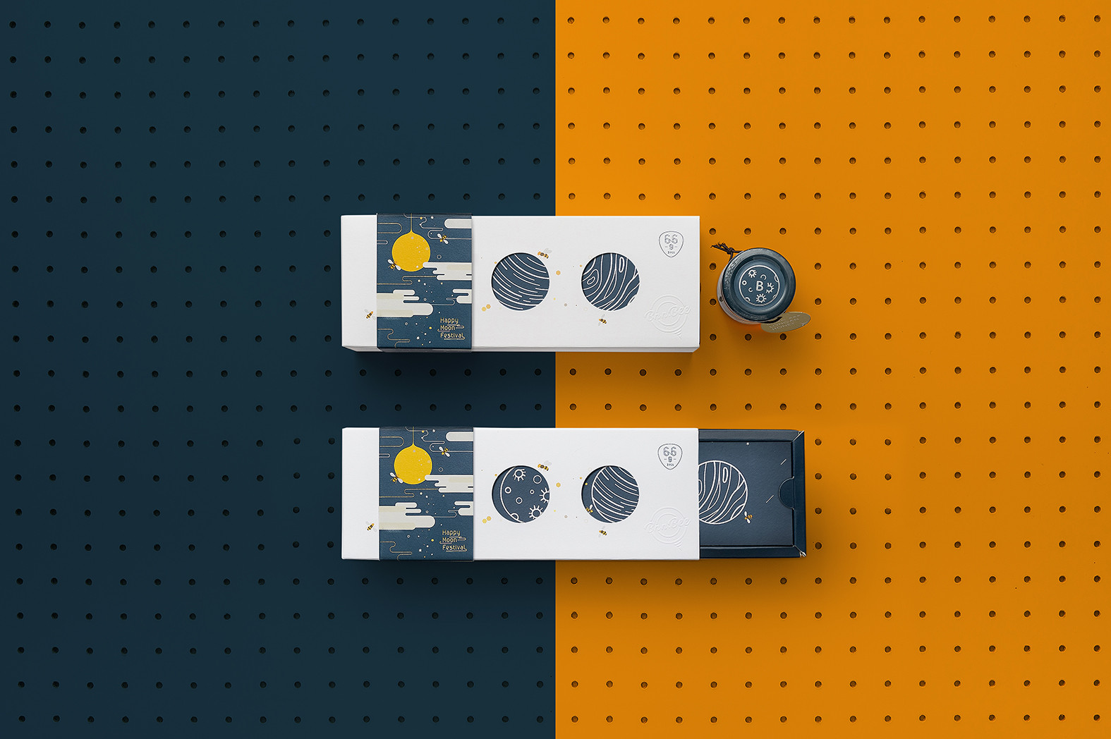
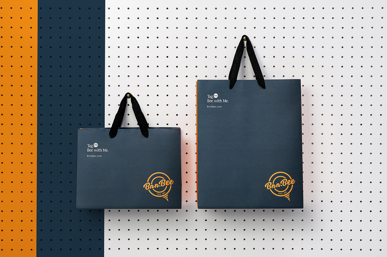
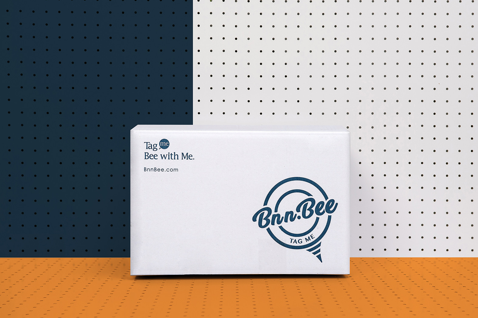
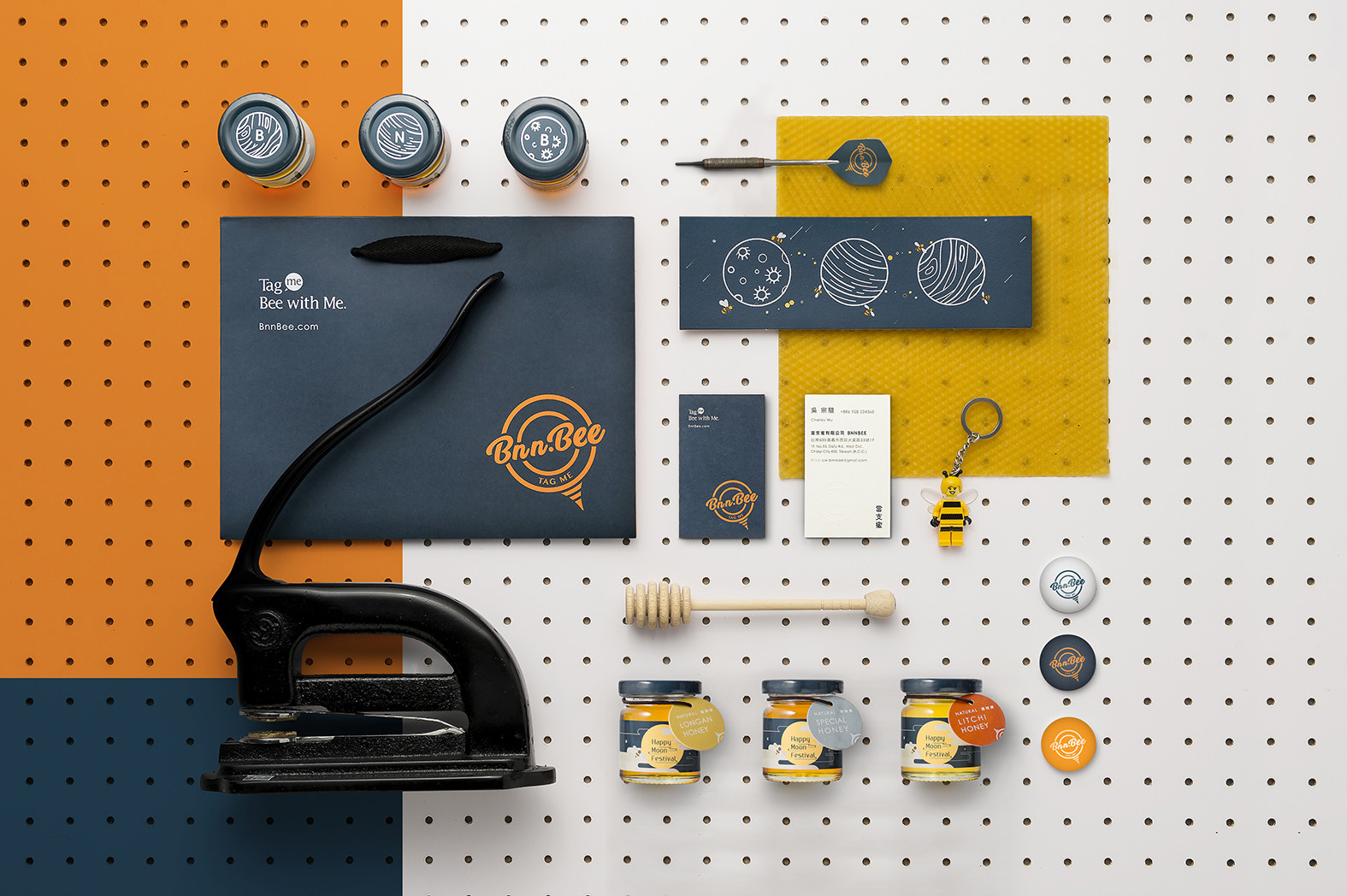
BnnBee 有著三宜百年蜂業的專業背景,從命名開始,我們便從蜜蜂教會我們的事為出發點,學習好物分享,學習互信,學習合作轉換至品牌整體架構上。在識別上以「tag me」 概念,用圖釘意象轉化成好禮的暗號,表達品牌搜羅各地好物的專業與心意,塑造具世界觀的在地禮品品牌,在品牌個性上除了真心真意也帶有好奇創新,自在揮灑創意的調性氛圍,賦予品牌有專業的背景技術兼具新穎玩味的品牌感受。
因此在包裝上刻意將場景帶到另一個虛幻的星球宇宙,帶有想像且有趣的生活意味。在三入裝蜂蜜罐上的BNB可以視為品牌名的縮寫,加深消費者的品牌印象,另外的巧思便是一般蜜與特別蜜的代稱,容量我們更精巧設計以有順利含義的66g,整體表現出將好蜜封存,將好禮給適合的你,變成人與人間不需言語的默契,在送禮與祝福上皆能帶來好的意象。
BnnBee has the background from “Sanyi 100 years bee company”. For naming it, we start from “what bee taught us” – learn to share, learn to believe and learn to cooperate, and then transform on the branding entire structure. On the visual identity concept [ tag me], use the drawing pin image transfer to indicate as a good gift, also presenting this brand has a professional background, moreover, showing the brand feature is young and fun.
On this package design, with the imagination and interesting meaning, so we bring the scene from the planet and universe to the package on purpose.“B N B” on the honey can could be seen as abbreviation of the brand name for making brand impression deeply for customers, additionally, there is a 66g on it and “66” has a meaning with happiness in Chinese. This product is not just a present but also a bless that for you and who you care.
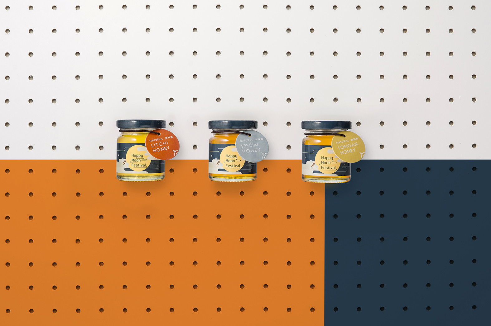
On this package design, with the imagination and interesting meaning, so we bring the scene from the planet and universe to the package on purpose.“B N B” on the honey can could be seen as abbreviation of the brand name for making brand impression deeply for customers, additionally, there is a 66g on it and “66” has a meaning with happiness in Chinese. This product is not just a present but also a bless that for you and who you care.


