MaruWen Food
Branding Visual Identity Packaging Design
品牌 : 丸文食品
Client : MaruWen Food CO., LTD.
Brand : MaruWen Food
Published on 11. 23. 2018
2018 Taiwan OTOP Award Winner
MaruWen Food
Branding Visual Identity Packaging Design
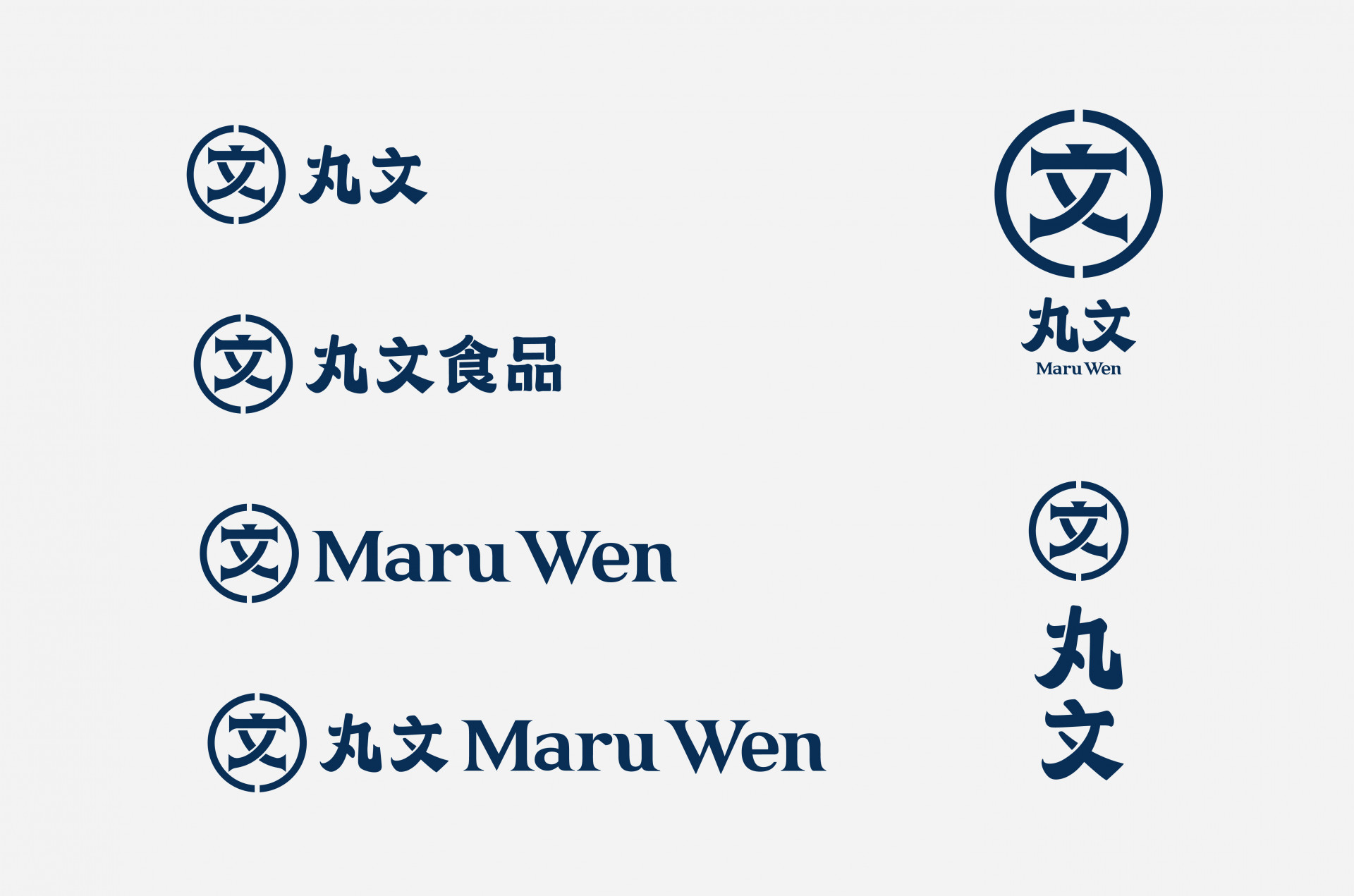
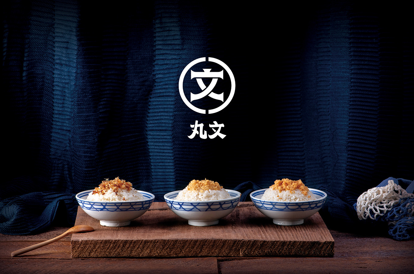
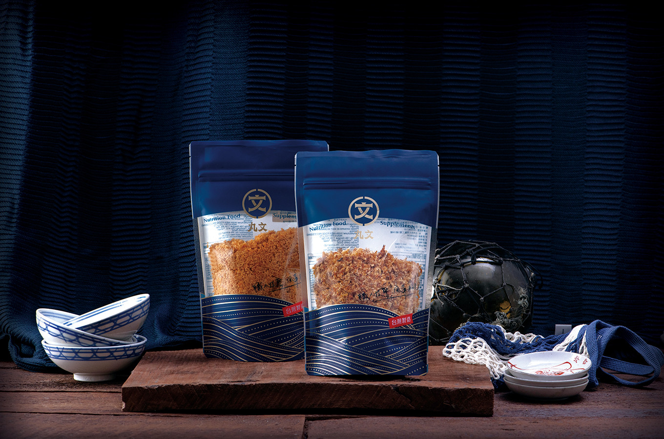
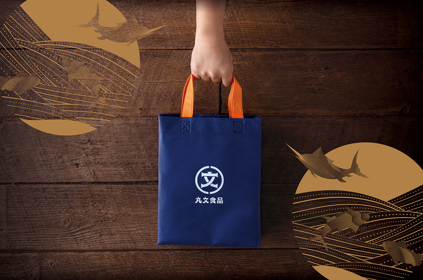
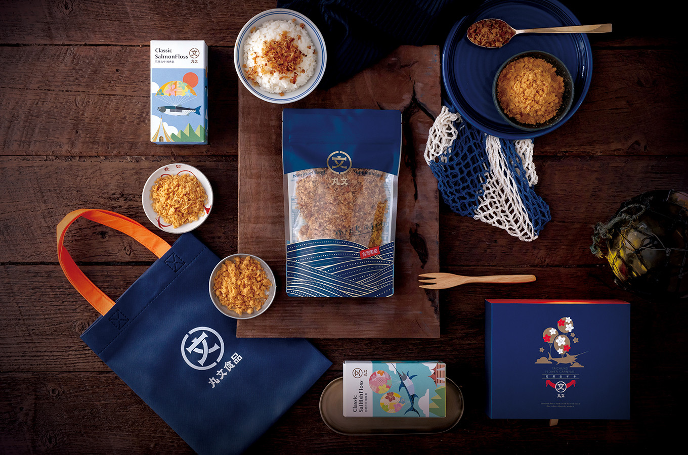
本次形象更新,我們以經典復刻、風華再起為主軸,將老台中人口中第一市場老舖瑪露文 (MaruWen),透過復刻歷史與回歸初衷概念重新聚焦品牌理念,以 “文” 與 “圓圈” 為識別表現主題,透過帶有刻畫烙印痕跡的手法,重新詮釋日治時代的丸文商號 “ 瑪露文MaruWen ” 的風華。
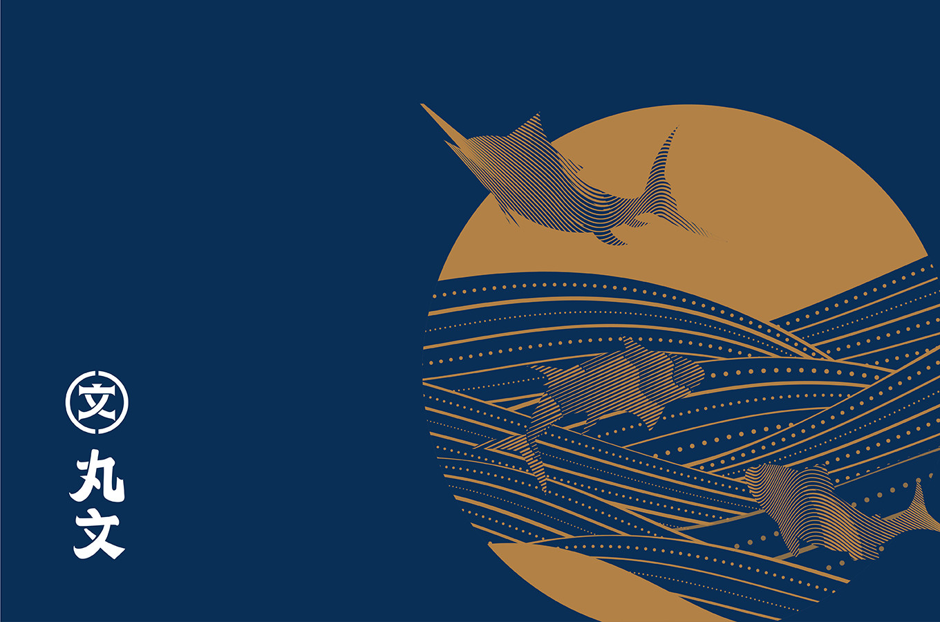
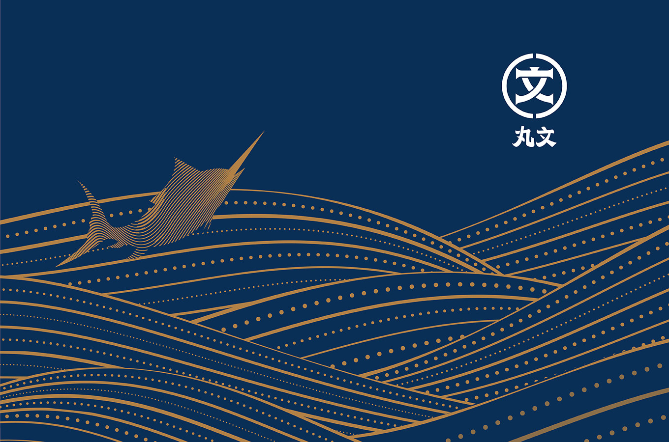
輔助圖案則是透過古典金配色的大太陽圖騰,以摩登古典的圖形設計手法,詮釋職人口中那面豔陽下波光粼粼的海上故事,帶出屬於台中舊城繁華印象與職人技藝傳承的味道。色系採用深色藍包裹整體形象色彩,從品牌至包裝一路延伸,透過一致性的配色與俐落簡潔的版面編排策略,打造出整體品牌調性的經典歷史與老字號風華。
Classic and elegant as the main concept for renew the visual identity this time, so that reinterpret “MaruWen” ,present the identity with “文“ and “circle” reappeared Japanese era style with modern design. On the side image is a golden Sun totem with classic modern style represent to the story on the ocean under the sun. Furthermore, bringing out the memory of prosperity of the old city, and the flavor from the professional master.The dark blue is the main identity color, from brand to packaging. In addition, create a branding tone for classic old brand style with consistent color and simple layout.