Family Fresh Food
Family Mart Fresh Food
Branding Design
品牌 : 全家鮮食品牌
Client : TAIWAN FAMILYMART CO., LTD.
Brand : Family Fresh Food Brand
Published on 04. 25. 2019
Family Fresh Food
Family Mart Fresh Food
Branding Design
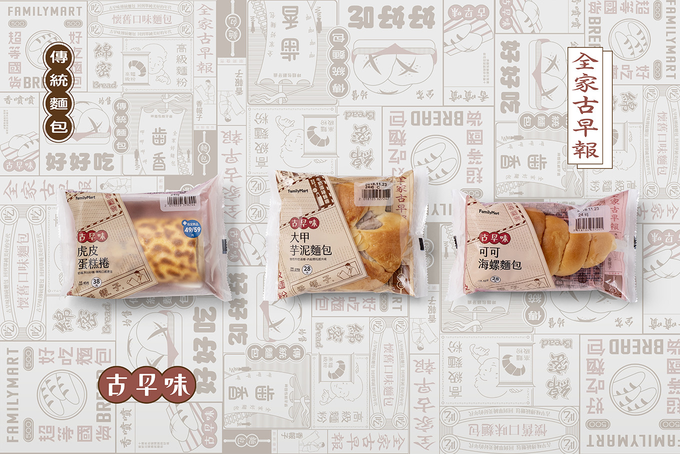
便利商店鮮食品牌包裝設計規範,2018年全家麵包&蛋糕系列系統規範案例。
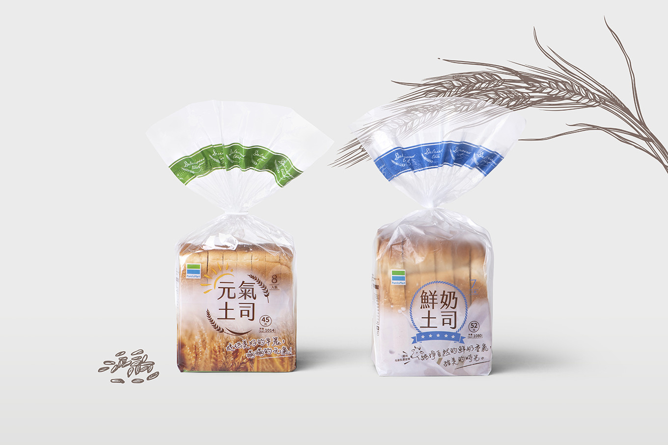
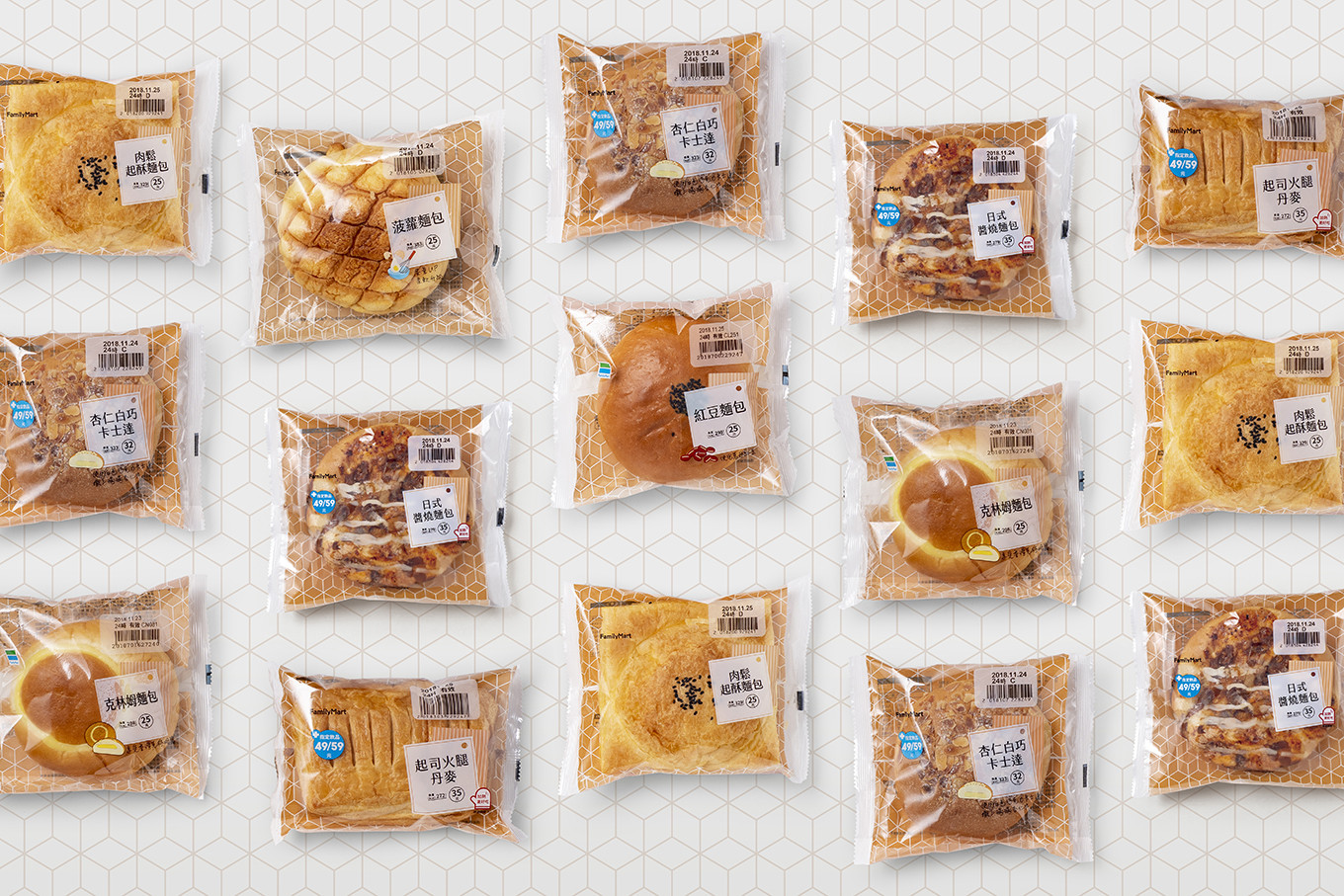
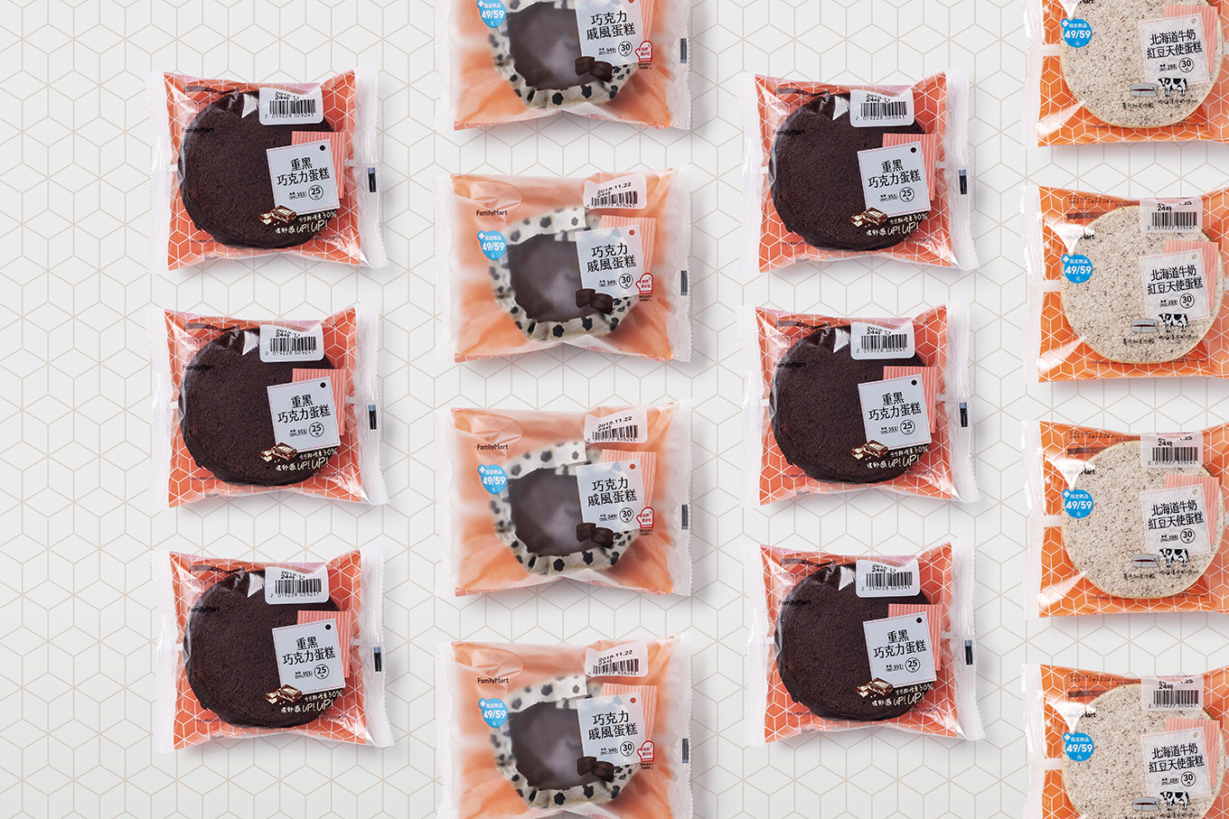
便利商店商品類型與項目繁複多樣,如何清楚規範各品項不僅是設計首要考量,更肩負傳達消費者明確販售資訊的責任。此次形象策略依照口味與食品內容區分三大項目:經典台式麵包系列、幸福午茶系列、營養吐司系列。經典台式麵包以「古早味」為主軸,純樸的懷舊風格帶領大家重回五零年代的鹹香歲月;午茶麵包&蛋糕以輕盈線條和溫暖背景色,分享著下午茶時光的美好幸福;營養吐司系列則使用代表全家企業識別的安心藍與新鮮綠,塑造兩款常態吐司簡潔有力的品牌形象。
不同產品背後被賦予的銷售企劃與消費目標截然不同,透過精準而鮮明的包裝設計,才能同時滿足多種需求與嚴謹的企業規範。
Convenience store fresh food branding package design specification, the project of 2018 Family Mart fresh food series of meal box system specification.
There are many types and items products in convenience store, how to classify and design specification different item is the most important point, it is also affected consumers receiving the information. This time, follow the difference of flavor and type to distinguish three series: classic Taiwanese bread, happy afternoon tea and nutrition toast.
ake the “old flavor” as the main concept for classic Taiwanese bread, the pure retro style will lead us back to the 50s; the afternoon tea bread and cake match with the light lines and warm background color, sharing the wonderful afternoon tea time; with the Family Mart presenting identity color “blue and green”, making the two nutrition toasts clean and strong branding image.
Different product with different selling plan and consumption target, however, to satisfy multi needs and strict business specification should through the precise and distinct package design.