FANGUS
Branding Visual
Identity Design
品牌 : 方格氏
Client : Q-YO BIO. CO., LTD.
Brand : FANGUS
Published on 07. 15. 2019
FANGUS
Branding Visual
Identity Design
| 自然循環的保養美學 |
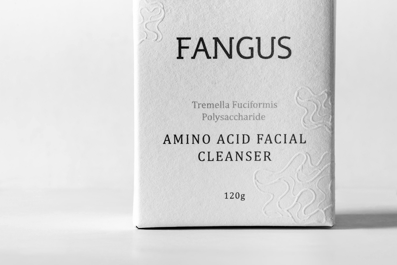
取自蕈菇英文Fungus轉化成方格氏Fangus,主張不只對身體內外的保養,更希望對整個產業生態做永續的經營;針對蕈菇深入研究並使用專利技術萃取出天然多醣體;設計出多款保養品來分享純淨天然的保養美學;將自然導入科技,再以科技回歸大地,在生活上實踐永續的綠色環境。
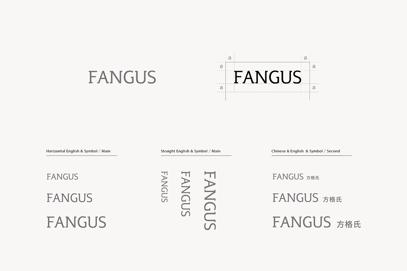
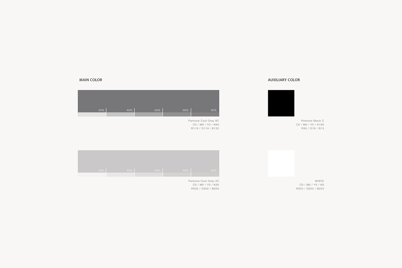
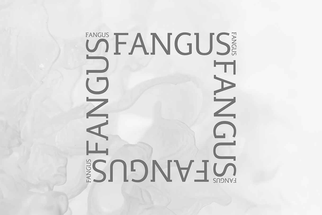
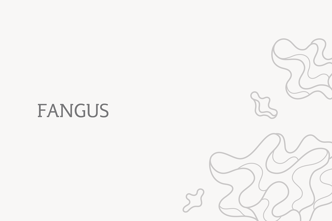
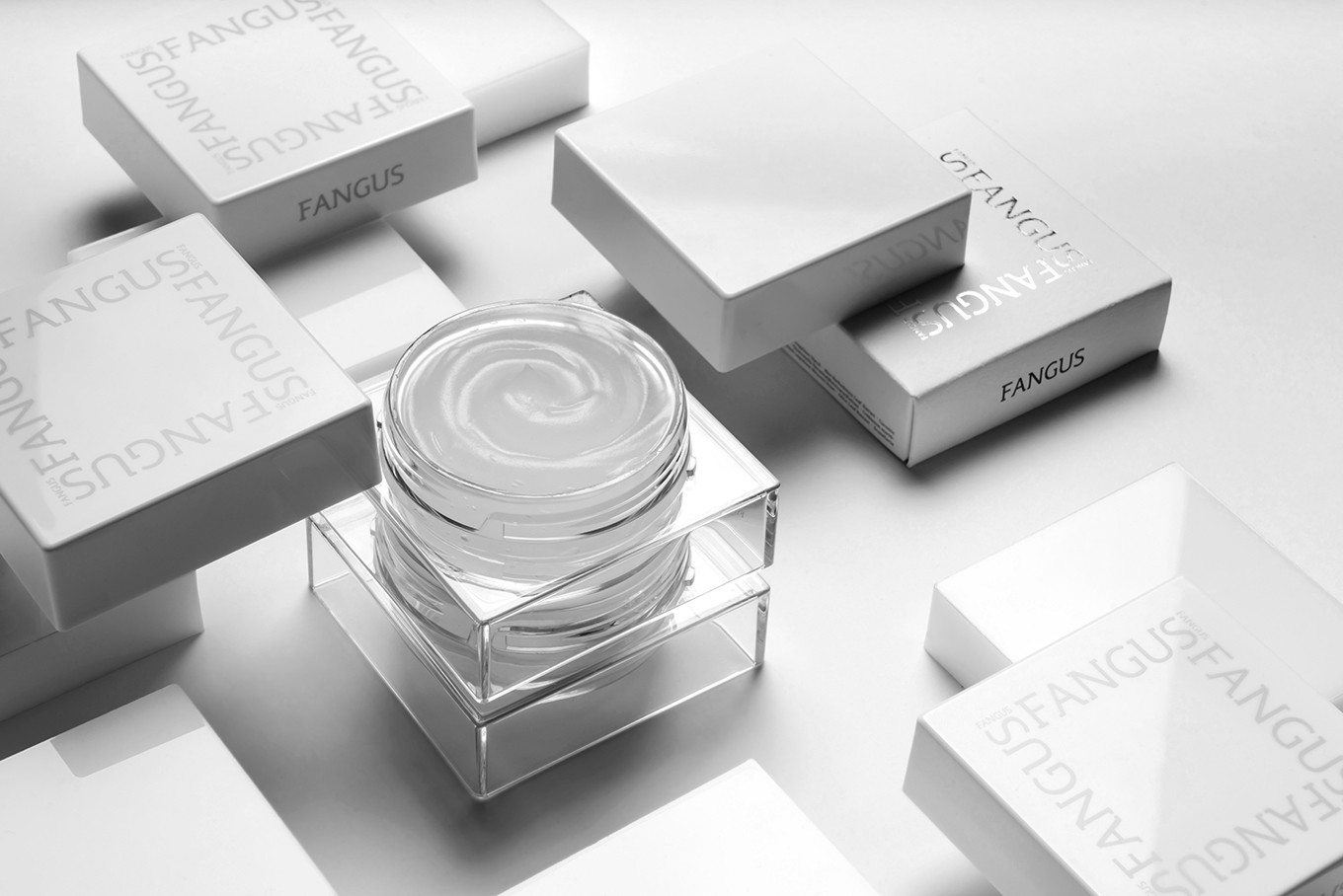
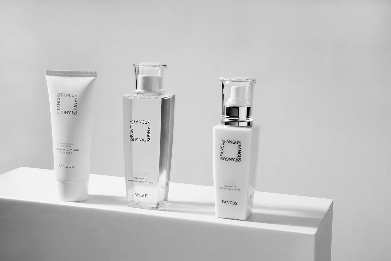
在思考過方格氏的純淨理念及自然美學後,決定採用典雅的字體塑造出專業與感性的新視覺形象,整體色系選用黑、灰、白強調方格氏的自然純淨,在輔助圖形上結合方格氏及自然循環的概念將FANGUS環繞排列,另搭配上銀耳的視覺意象讓整體品牌個性更加鮮明。
| Natural circulation of mushroom health and beauty aesthetics |
Named from the Fungus transform to Fangus, not just focus on the healthy body maintaining, moreover, to sustain operation for the entire ecology. Research deeply on fungi and extract the natural polysaccharide with patented technology; sharing the pure nature maintenance beauty; make technology into nature and bringing technology back to the land.
With the elegant text type to create the professional and sensitive visual identity, additionally, the color system chosen is for highlighting the naturally pure, and the aid pattern is connected with the concept of natural circulation and Logo, moreover, the tremella illustration makes the whole brand personality more distinctive.