IDODO
High Protein Cooikes
Packaging Design
品牌 :IDODO
Client :IDODO CO., LTD.
Brand :IDODO
Published on 07. 09. 2020
IDODO
High Protein Cooikes
Packaging Design
iDODO高蛋白曲奇餅,針對現代外食族長期缺乏基礎營養、有時嘴饞、偶而運動、注重健康養生的特性,推出隨手一包的健康零食,在閒暇之餘及時補充。
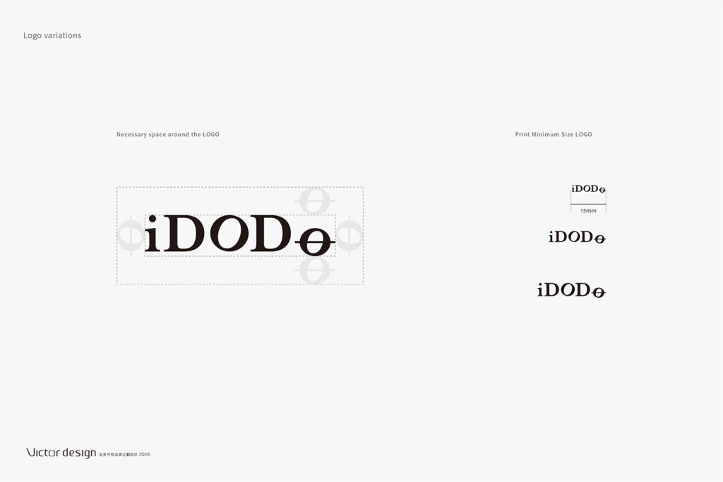
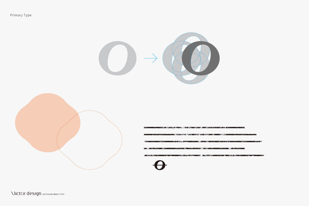
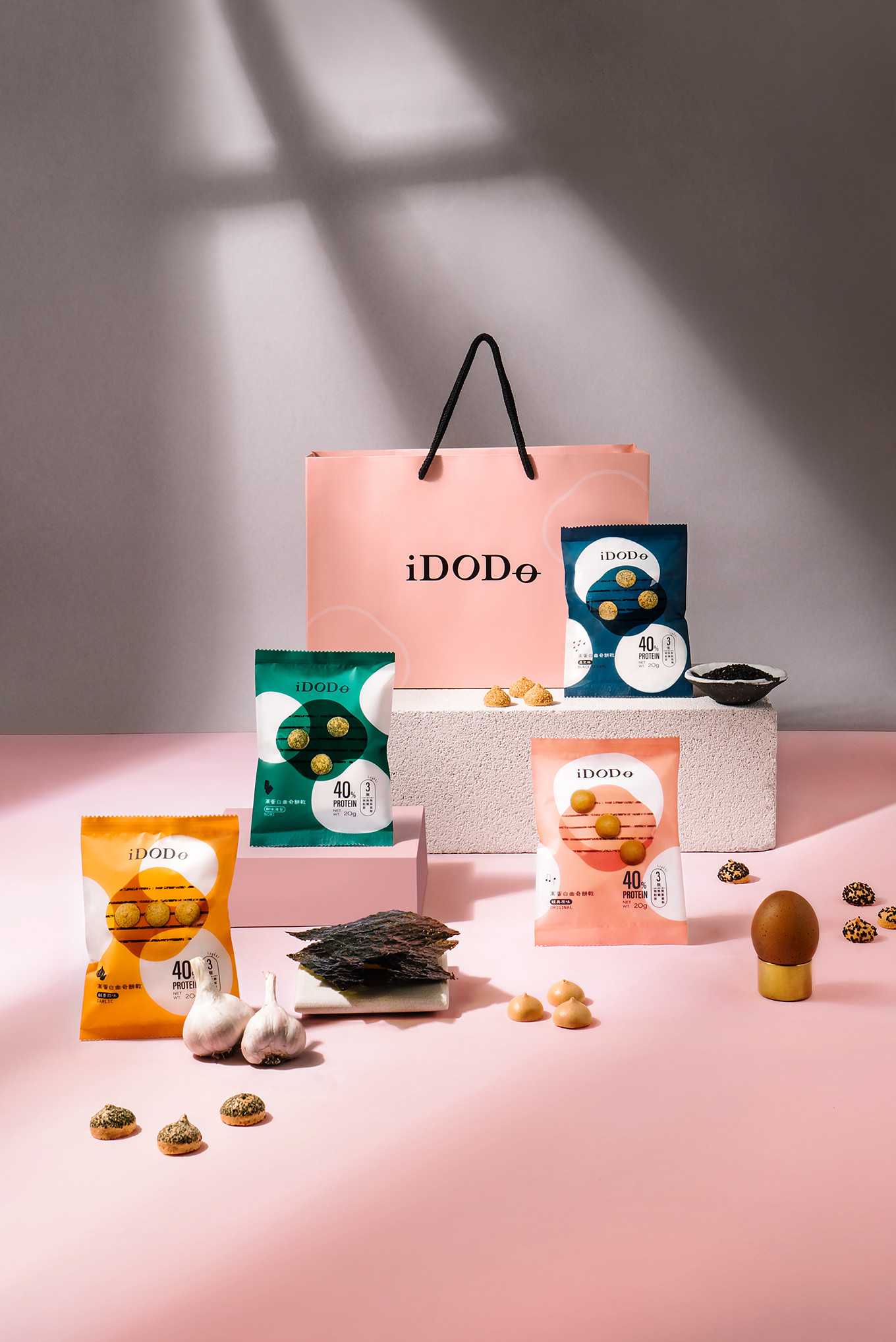
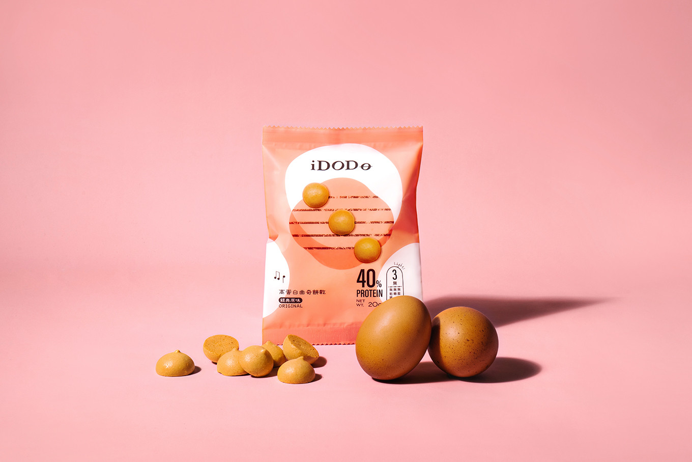
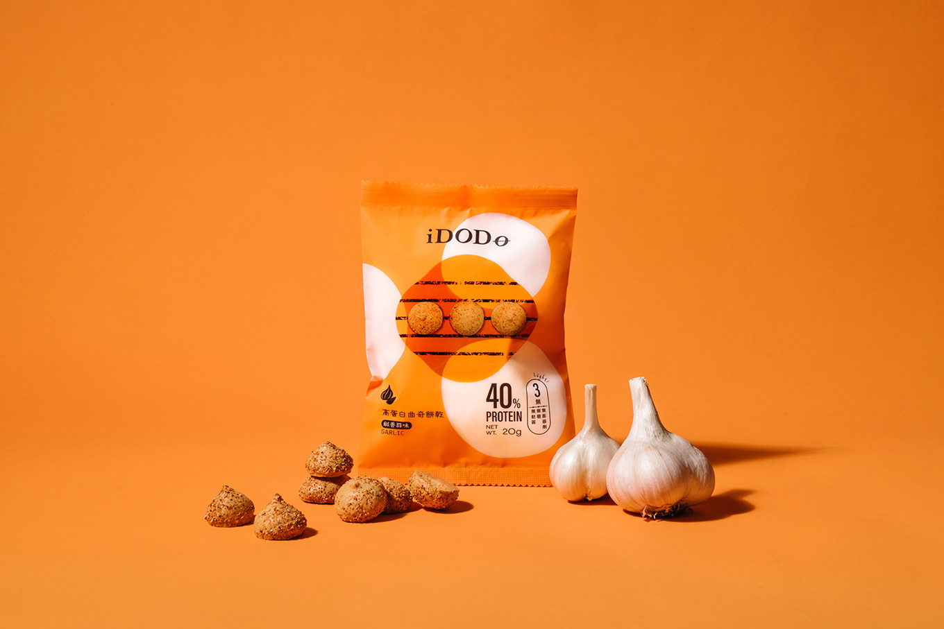
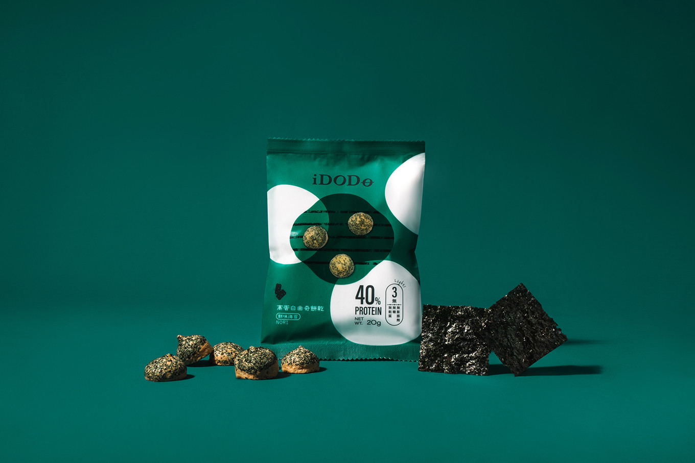
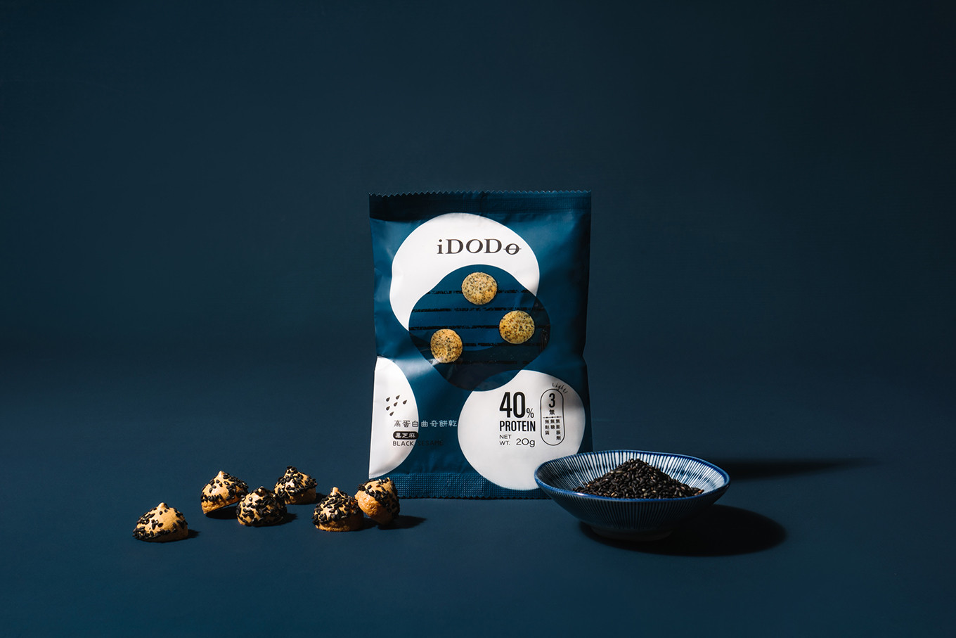
在識別形象設計上,以身體輕盈唱和的概念轉化成全音符與英文名結合,增加品牌記憶點及傳播效果,以經典黑色搭配不同口味並揉合進輕盈的色系,營造出氣質又不失時尚感的調性;識別設計將第二個o以音符的概念呈現,整體視覺效果有著音律跳動的感覺。視覺輔助將O環繞排列並形成圓菱花型,設計在包裝上並加上印刷感的五線譜,而餅乾則代表音符跳動排列,讓整體音符的視覺形象更加鮮明。
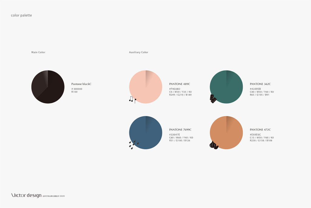
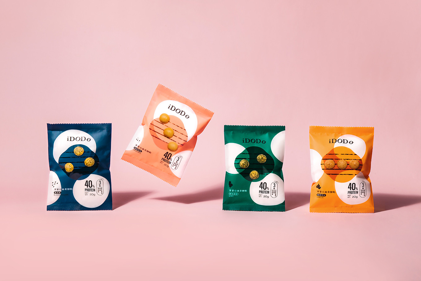
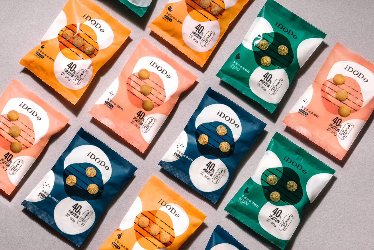
包裝分為四種顏色分別代表不同口味並搭配icon設計,在資訊的標示上以高蛋白含量與iDODO主打三無的健康標示為重點,讓高蛋白攝取族群和嚴格控管飲食的族群能一目了然。
Simple is strength, delicious should be simple.
iDODO high protein cookies launch a healthy snack as far as is concerned about modern people eating outside who short for nutrition, want some snack, work out sometimes and want to be healthier.
Taking make the body lighter as the concept and transform the English to music note on the visual identity design, which increases the branding memory point. Furthermore, the classic black match with soft color for the different flavor that creates an elegant and fashionable tone.
The sheet music is designed on the package with painting style and the cookies represent as the note that shows each flavor are different songs. In addition, four icons create for each flavor, and there is diet information on the right side of the package that provides different diet groups could see at a glance.