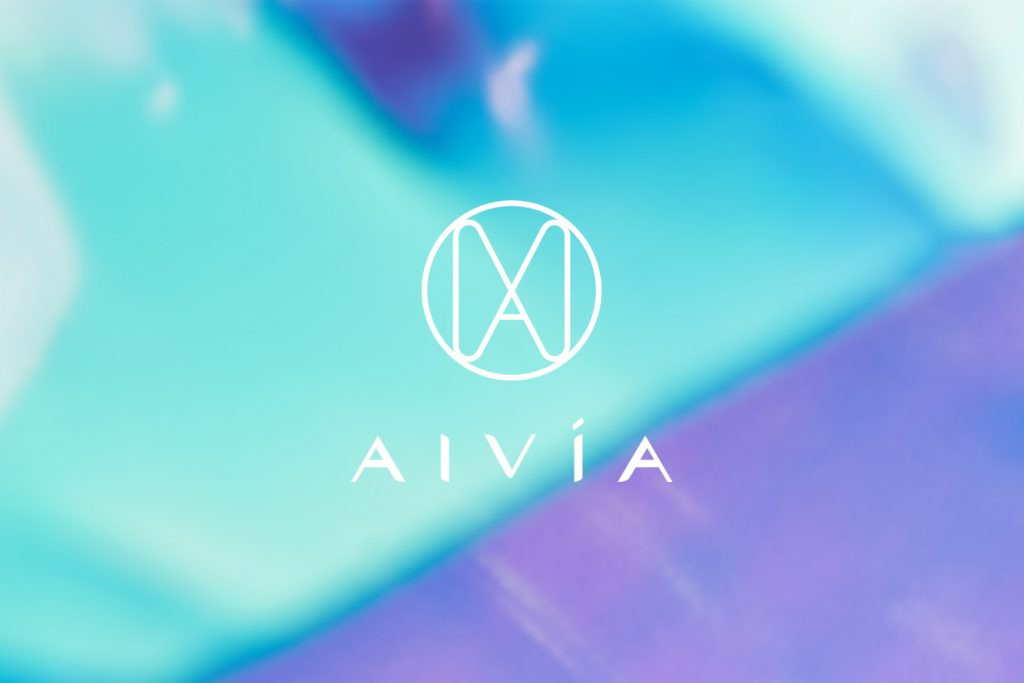
AIVÍA
Branding Visual Identity
Packaging Design
品牌 :艾微漾
Client : Panion & BF Biotech INC.
Brand : AIVÍA
Published on 07. 16. 2020
AIVÍA
Branding Visual Identity
Packaging Design
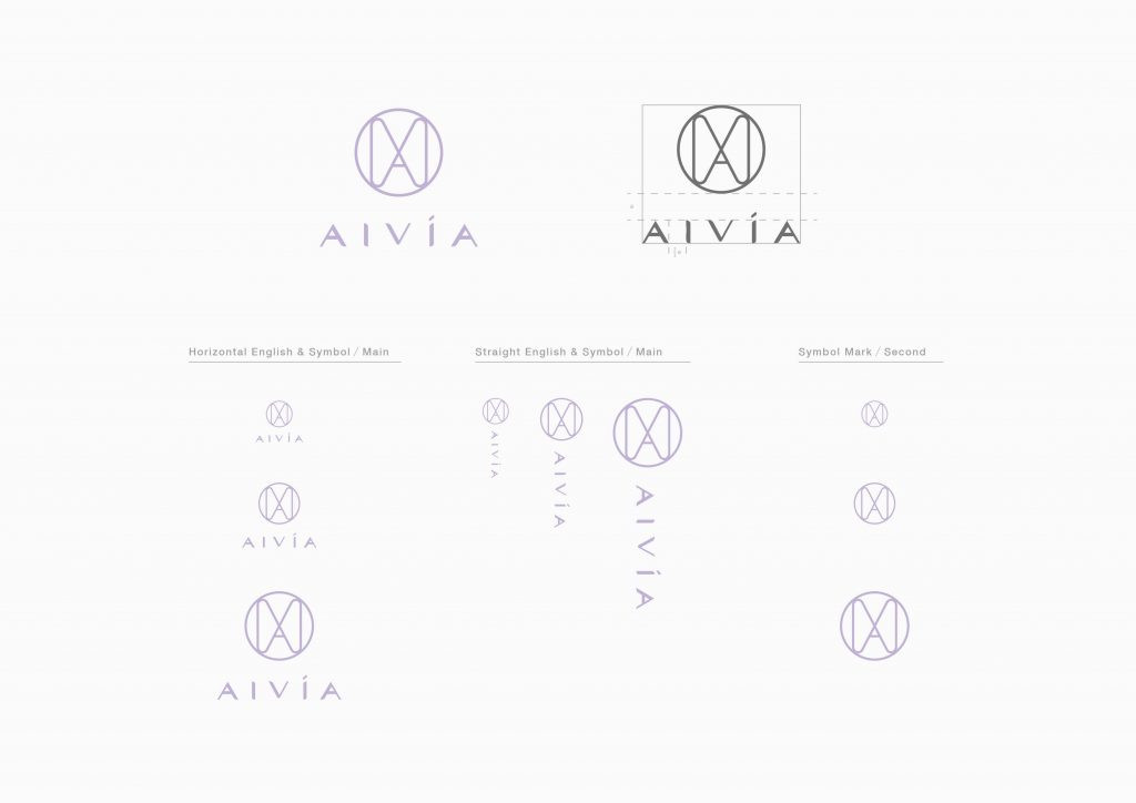
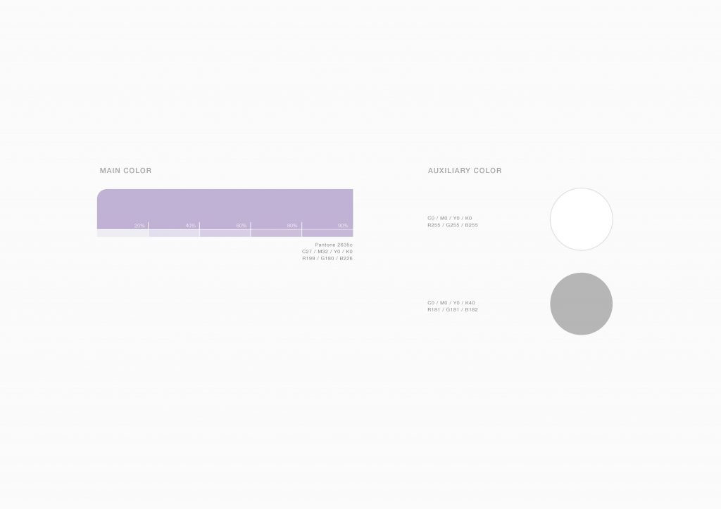
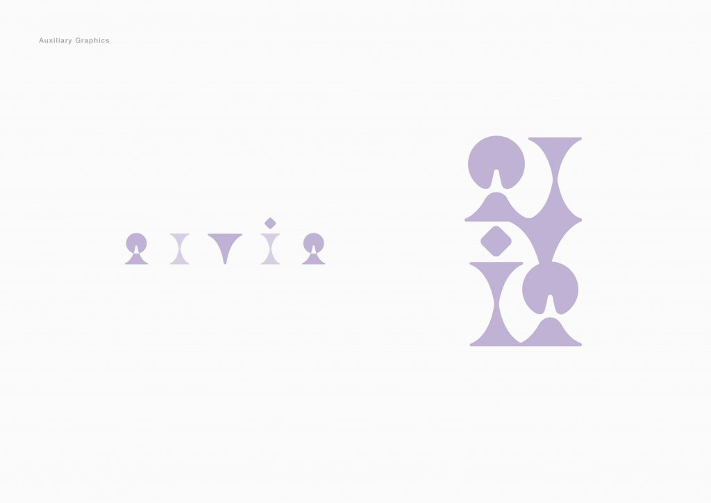
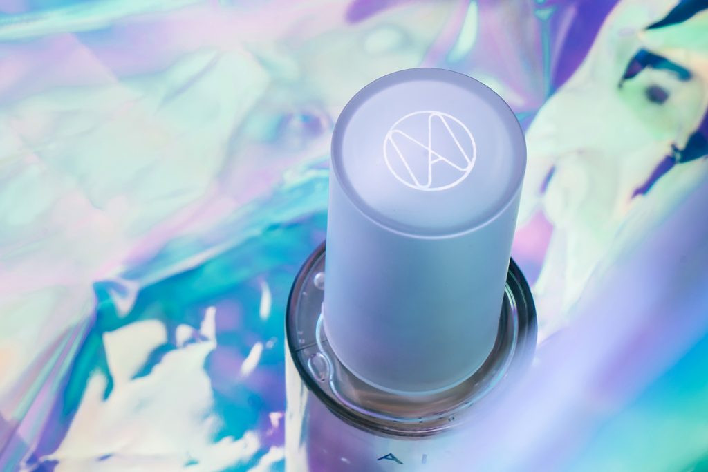
運用“無暇白“以傳達對於衛生與安全的堅持,而”無限紫“代表了專業縝密的技術,科技與人的相互輔佐所迸出的無限可能則以”鐳射“技術呈現。根據微針貼片以精密的點延展成線再擴張成面,在logo的設計上便以點線面的概念,將V與A線條交織並融入微針的意象,形成了面。標準字保留了科技精密的理性菱角並融入女性柔和的線條。在點跟線之間,不斷加疊建構出多維空間,並透過完全對稱的鏡像呈現AIVÍA的輔助圖形。
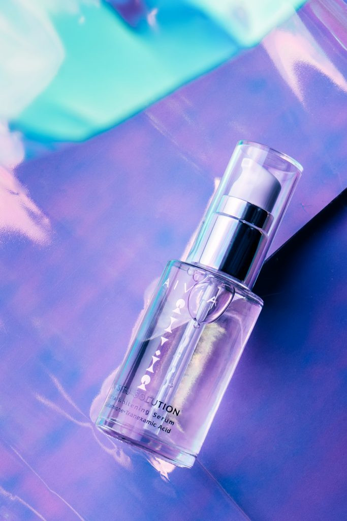
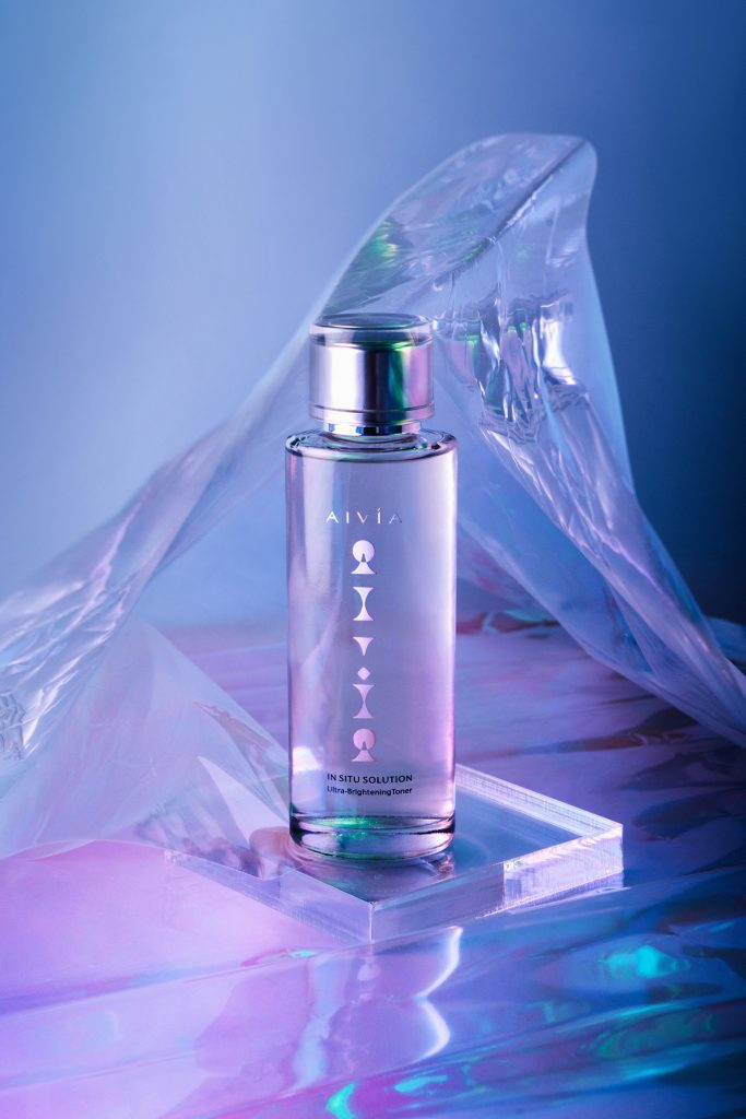
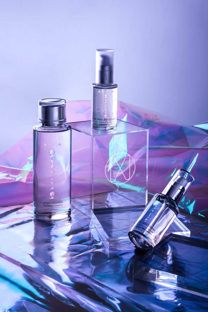
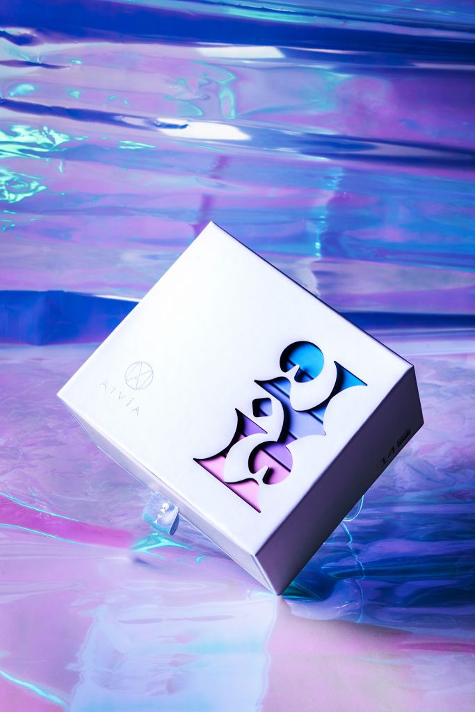
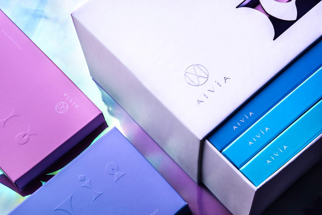
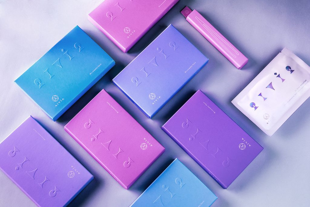
外盒的包裝上,以鐳射技術凸顯出AIVÍA的人與科技的結合,不同角度呈現的光彩傳達出各種顏色的不完美都可逐漸淡去;另外以雷切方式將輔助圖形做一個穿透的效果,並呈現出內盒的顏色變化,抽屜式的外盒,讓你一天一天抽取使用,瑕疵漸漸變淡。保養品瓶身保留產品本身的透明度,加上鐳射效果的識別系統,透過角度的變化產生不同的色彩。
AIVÍA has the professional background of Panion & BF Biotech Inc. which is a professional in pharmaceutical medicine. In an environment where medical aesthetics is gaining popularity, they see what another group needs, thus after years of research, development, and breakthrough, AIVÍA creates a microneedle technique for improving skin problems.
For creating the visual identity, that connects white to express sanitation and safety, and purple means the professional technique, moreover, the laser technique shows the mutual assistance of technique with humans and creates an unlimited possibility. According to the point on the microneedle that creates to the line then becomes an area, so with the concept of point, line, area connect V and A, then design the logo. Keep building the multi-space between the point and line, thus creating the auxiliary graphics with mirror visual.
Highlighting the combination between humans and the technique of AIVÍA by laser on the outer package design, that each angle represents different colors. Furthermore, laser cutting the auxiliary graphics on the package shows the gradient colors inside packs.