Vilson
Branding Visual
Identity Design
品牌 : 米森
Client : Qing He International CO., LTD.
Brand : Vilson
Published on 10. 22. 2020
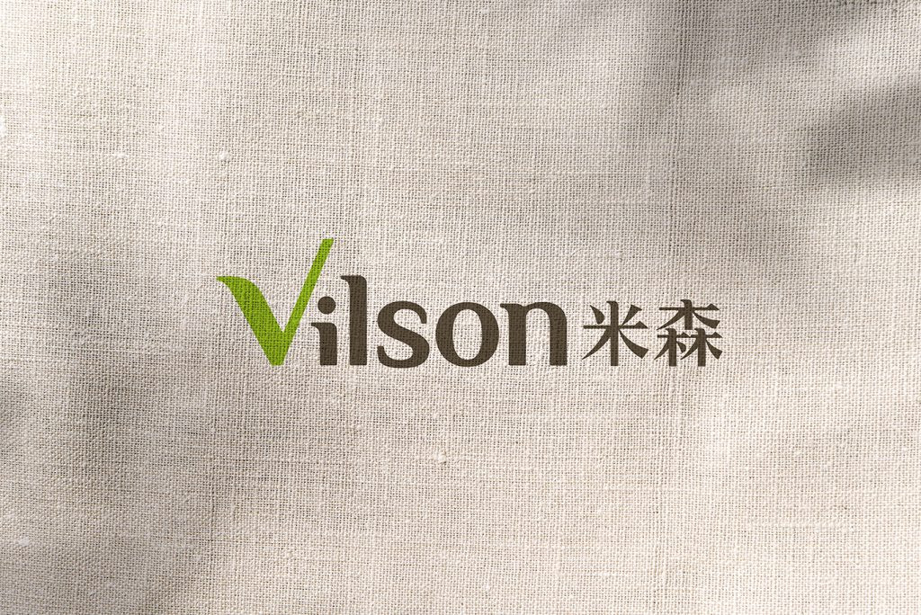
Vilson
Branding Visual
Identity Design
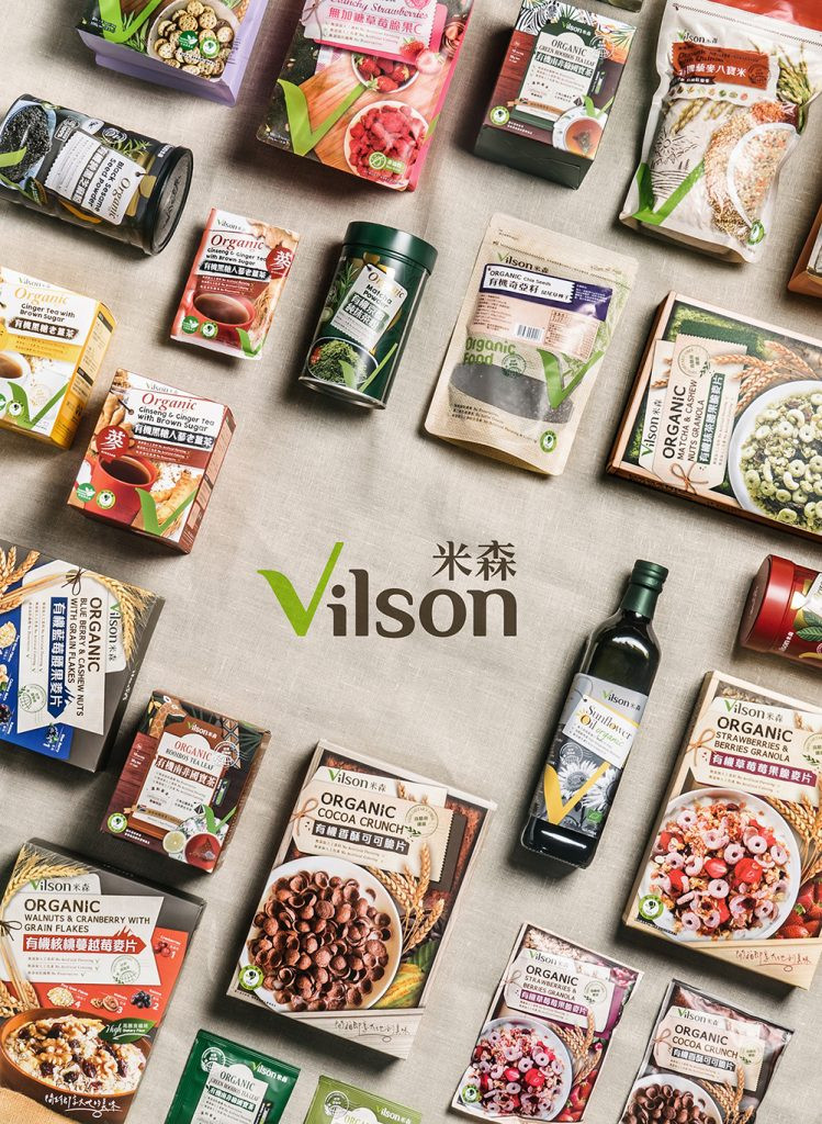
作為「世界有機原料的選物家」,從世界出發,嚴選來自各地的食材,乘載美味,宣揚有機。
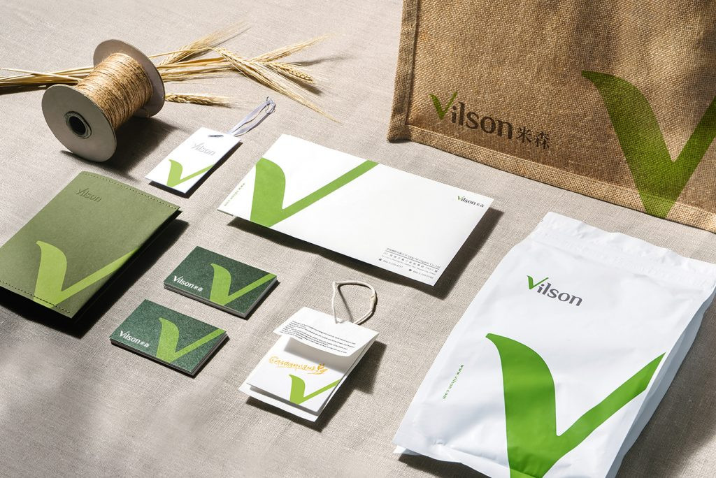
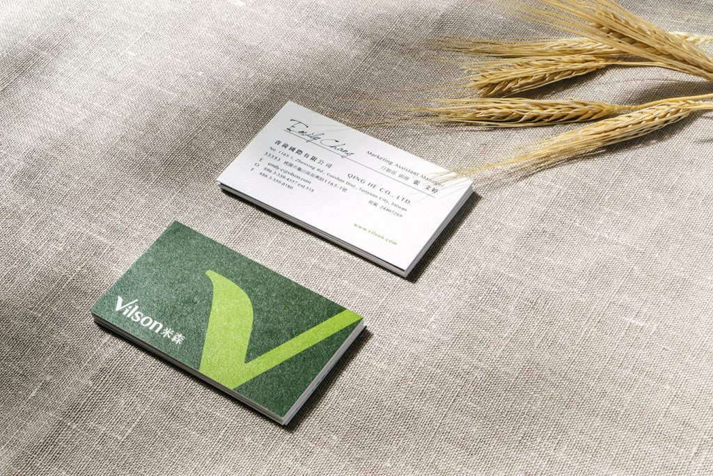
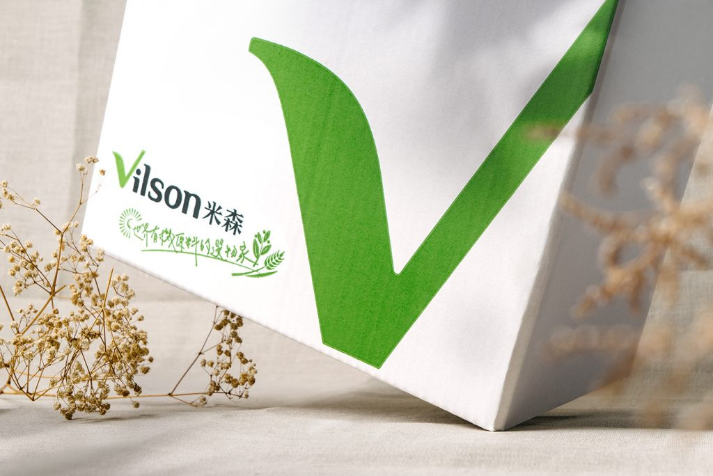
在品牌的形象設計上,為凸顯自然與有機感,以字體延伸設計,將V轉化成打勾的圖象,替你check每天的生活飲食,是一個認證、是一個責任的乘載;並象徵著每種原料都通過米森精準挑選,層層把關,讓你吃的心安理得,進而提升品牌辨識度。
大自然造就食物真實的形狀,與大地友好的米森,讓飽滿的營養釋放,享用貼近幸福的好時光。包裝上強調產地直送的新鮮美味,以新式的版面配置帶入日常的飲食習慣,並延續品牌獨特元素,透過專屬圖騰建立消費者的識別印象同時區隔競爭品。
每個日常都是累積成生活的重要點滴,米森用最嚴苛的標準成為有機原料的採集者,並為你的每一口美味累積健康。
As the “World Organic Ingredients Selector” Vilson starts from the world and filter the ingredients for bringing the delicious and publicizing the organic food.
For putting out natural and organic that design from the logo text, and transform the V to a tick icon, which checks the diet for you every day. Moreover, represents that each ingredient is passed by Vilson’s high standard, then increases brand recognition.
Nature made food for humanity, and Vilson collects the ingredient for people and develops products. The packaging emphasizes delivered directly from the origin with freshness and deliciousness, the new layout design brings in the daily diet habit, and more continues the unique element of the brand, that builds the identity image through the specific icon.