Branding Visual Identity
Desing Project
品牌 : 酵慕兒
Client : Hong Kong Healthcome International CO., LTD.
Brand : Zymore | Enzyme
Published on 06. 22. 2021
Branding Visual Identity
Desing Project
「 體驗大自然給予的美好,微酵面對每一天 」
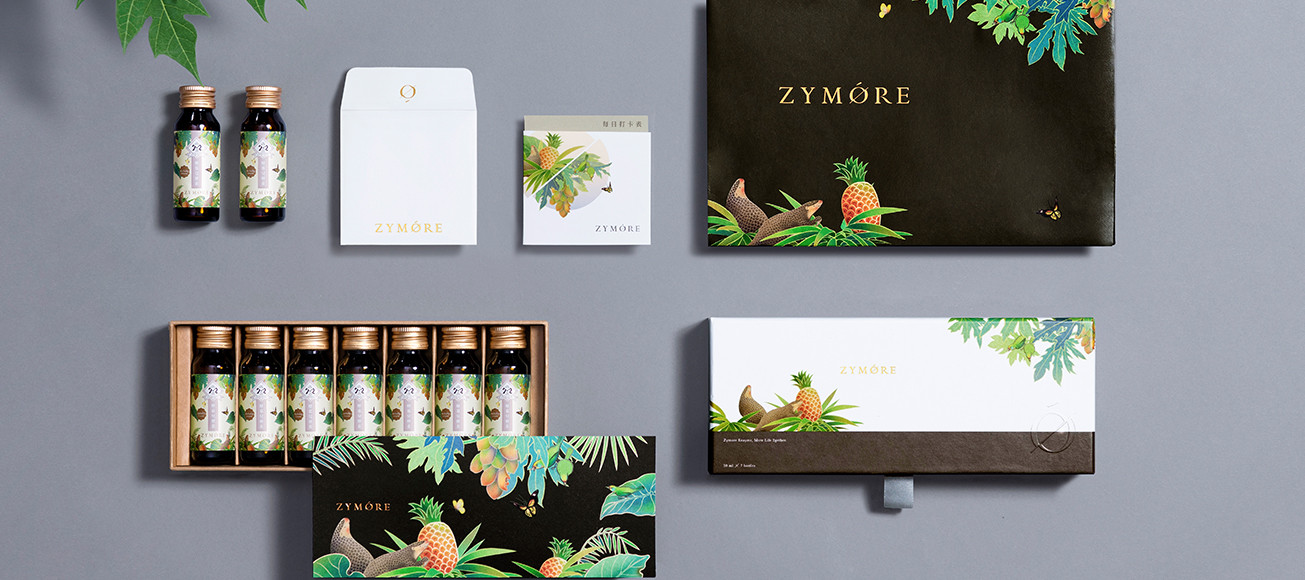
大地生生不息,滋養萬物豐富生態,Zymore酵慕兒以傳遞大自然的恩惠作為品牌精神,並用最純粹的形式呈現。選擇鳳梨與木瓜兩種具高活性真酵素的水果,並透過高科技萃取出水果酵素,2×2的配對,打造雙倍以上的營養價值。
識別上以兩種水果碰撞的概念透過『O』呈現,並藏入兩果酵素雙拼的巧思。輔助圖紋則與logo相呼應,將鳳梨與木瓜連結穿梭於果園的穿山甲與五色鳥,傳達出產地的自然無污染。從形象到包裝以凸顯使用2種原料的單純,皆以對稱的手法構圖。並以溫潤的繪圖風格勾勒出整體視覺感受,不僅傳遞亞熱帶的摩登時尚,更帶出生活中值得細細品嚐的雅緻。
Experience the wonder from nature, be smile every day.
The ground grows endless, which provides rich nutrition for everything. Zymore takes “transfer the gift from nature” as the brand spirit and represents with the most purist way. So choose pineapple and papaya that contain the highly active enzymes, and extract the fruit enzyme with high technology, double nutrition creates double value.
With two fruit creating an “O” shape that represents the visual identity. For showing the place of origin is natural has no pollution, then connect the fruit with a pangolin and five-color bird playing in the orchard. Additionally, create the visual sense with a warm hand-drawing style which expresses the subtropical feeling and also shows the elegant lifestyle.
Zymore provides people with the purist ingredients start from the inner body nutrition to skincare that is based on two kinds of enzyme, which is the simplest and best.