Branding Visual Identity Desing Project
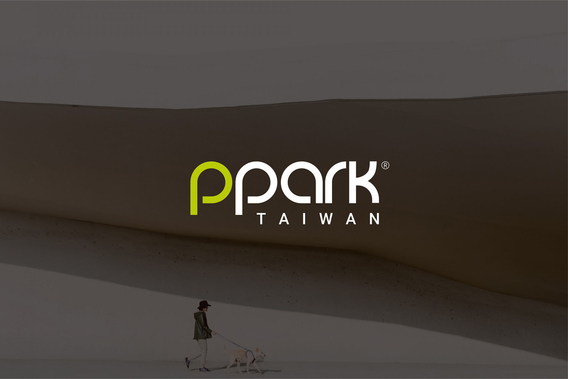
品牌 : ppark
Client : Ppark LTD. INC.
Brand : ppark
Published on 07. 27. 2021
Branding Visual Identity Desing Project
寵物的一生,只是我們人生中的一個過程,但對寵物而言,主人則是他們的全世界;寵物決大部分的時間,都是在等待中度過一生,而對於我們的陪伴,則格外珍惜;當我們拼命追求生命的豐富度時,停下腳步思考,或許家人與寵物最想要的,是陪伴在身邊的溫度大於物質上的給予;做彼此的陪伴 (Peiban),成為對方生命中的一部份 (Part)。
ppark,Peiban 陪伴+Park 公園,寓意著給予滿滿的陪伴與廣闊的愛,也代表了給消費者的愛與承諾。堅持不只要 made in Taiwan 還要 All in Taiwan,從上游廠商到供應商,皆採用台灣自製廠商以確保品質;運用有機棉與回收素材,以高標準給予寵物最舒適的體驗。
如何展現品牌魅力、品牌想傳遞的核心以及包裝系統的一致性,為本次品牌規劃的主要重點。識別改造的部分,原始的識別蘊含了深厚的意義,為此我們只做了一些小修改,將其更加優化,將雙P連結處做更為細膩的處理,不僅讓 Logo 更加柔和,在運用上也更加便利。並訂定了使用計畫,讓往後在延伸使用時有跟準確的方式,以維持品牌視覺一致性。
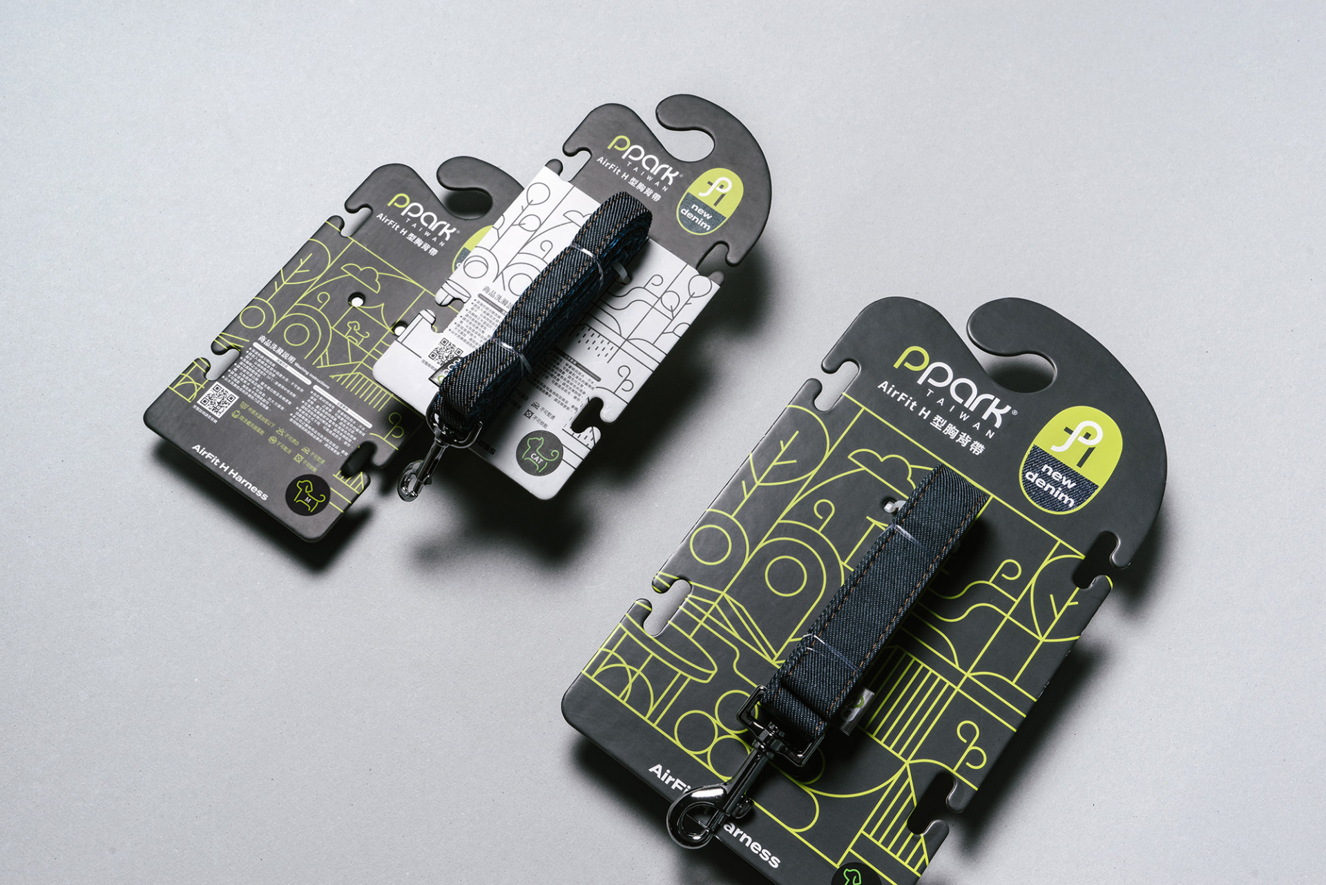
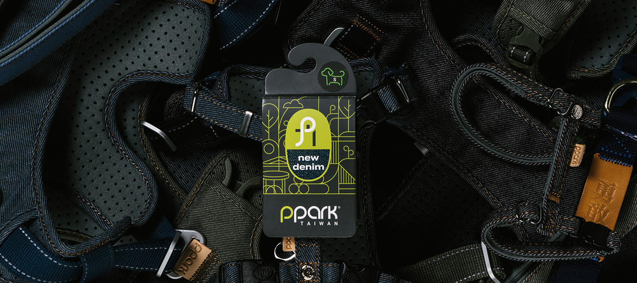
原始的包裝設計,在陳列視覺感受上略為雜亂,品牌識別的呈現與產品相比較為不顯眼;在包裝設計的改造上,為加深品牌形象,不僅加大了視覺在版面上的位置,增加品牌色公園綠與石紋灰面積,另外延伸線性風格的輔助圖紋,描繪出寵物與飼主於公園玩耍的意象。產品支線分成經典款的狗派、貓派與限定主題,經典狗派系列以系統石紋灰色為底,搭配公園綠線條;貓派則以白色底加上灰色線條以提升辨識度,並更細分成了三個部分,依照材質與結構形式的不同,分成了新丹寧、無限8與復古派對,並為其結合識別的”P”設計了專屬 icon,在吊牌的版面配置上結合輔助圖紋與專屬icon,加上不同顏色的配置,讓整體一致並提升產品辨識度。限定產品則會以花紋與主題的不同設計專屬的包裝設計。另外,為提升消費者對於布料上的信任度,設計可觸摸式專屬吊卡,以觸摸的方式直接與消費者對話。
在影像與網頁的設計計畫中,為讓品牌名稱與視覺感受有更強的連結,以公園、草皮、野餐等戶外場所為主要佈景,給毛小孩們更廣闊的世界,讓彼此的陪伴不再侷限。在整體品牌提升規劃的過程中,將ppark所有的產品與系統進行更完整的梳理,放大品牌的傳遞價值,並加上輔助圖形強化視覺形象,有了好的品牌寓意,也要有相對的品牌傳達方式,才能讓品牌更完整並有系統地繼續延續下去,最好的照料,即為陪伴。
A pet’s life is a part of humans; however, the host is their world. Most time of pet is passing through on waiting, and our being accompanied is very precious. When we are chasing the richness of life, we may think about what family and pets really want.
Ppark equals peiban ( accompany) plus park, that means giving full of company and wide of love to pets, it also represents a promise to the customers. Adhere to not only made in Taiwan but also All in Taiwan. From upstream manufacturers to suppliers, that use Taiwan-made manufacturers to ensure quality, using organic cotton and recycled materials to give pets the most comfortable experience with high standards.
How to express the charm and core of the brand, and keep the packaging system consistency are the main point of the branding plan this time. The original identity includes a deep meaning, and we only make a few adjustments to improve it, as well as create an identity using a plan to keep the branding visual consistent.
For deepening the brand image, expand the identity size on the package layout, and increase the brand color area of park-green and stone-gray, moreover, creates the line style auxiliary pattern that the pet having fun with the owner in the park. Products branches are divided into three lines the classic dog, cat, and limited theme. The classic dog series takes stone gray matches park green line as the main visual design. The cat series use a white background and grey line to increase the recognizability and is more subdivided into three parts new tannin, infinity 8, and retro party which followed the difference in material and structure. The limited product will design an exclusive packaging design depending on the pattern and theme. Furthermore, design a touchable material card to elevate the trustability of the customers.
In the process of promoting the whole brand project, we make all products and systems arrange systematically, and expand the brand value with the auxiliary pattern to strengthen the visual image. A nice branding sense needs a matching brand communication that makes the brand keep forward wonderfully.