Cha Tzu Tang
Branding Visual Identity & Packaging Design
品牌 : 茶籽堂
Client : ORIENTEA ENTERPRISE CO., LTD.
Brand : Cha Tzu Tang
Published on 05. 29. 2013
2015 臺灣國際平面設計獎 全場大獎
2015 Taiwan International Graphic
Design Award Winner
2014 台灣年度傑出設計公司 商業設計類金獎
2014 Taiwan Advertlsers' Assoclation
2013 比利時 Pentaward 銀獎
2013 Pentaward Winner
Cha Tzu Tang
Branding Visual Identity & Packaging Design
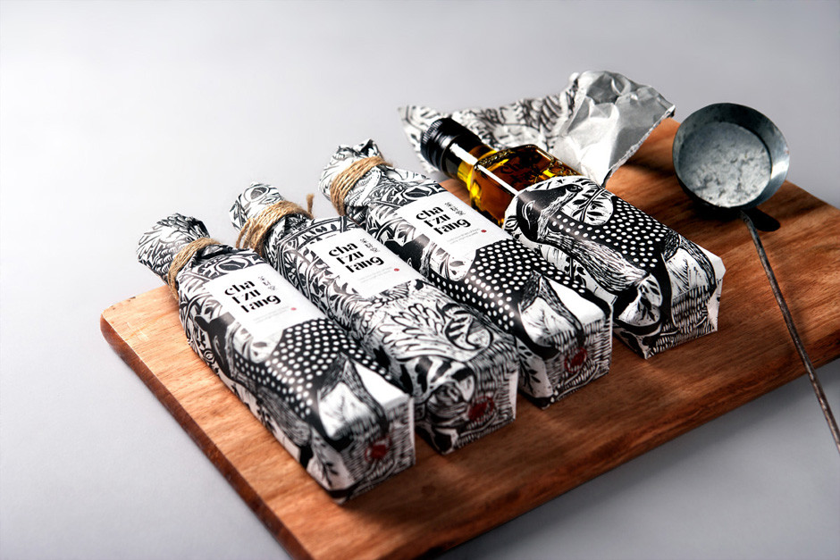
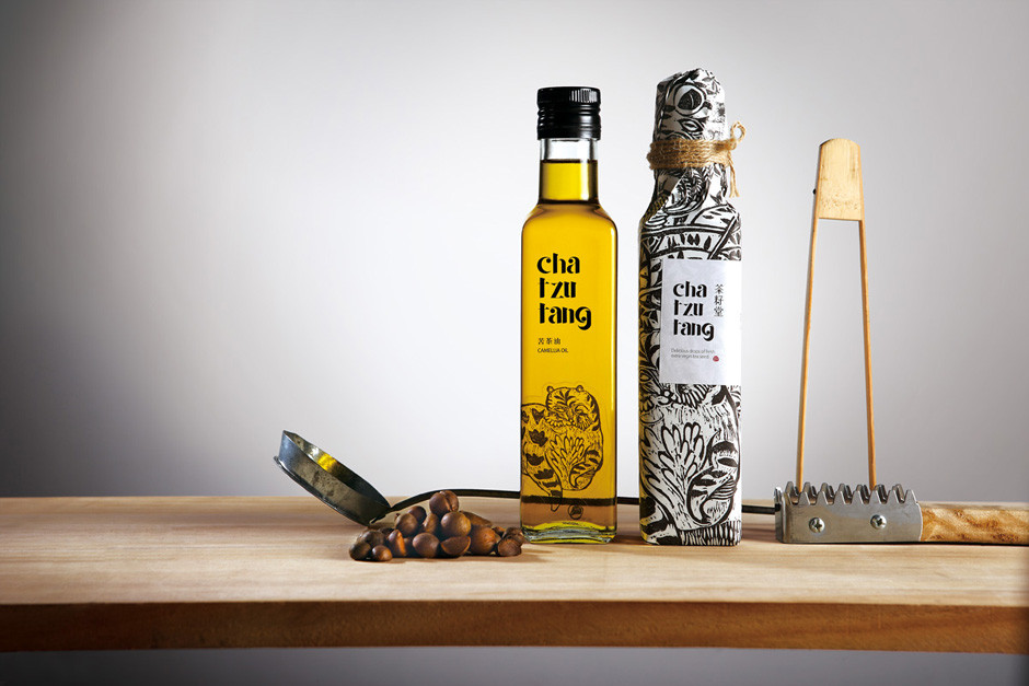
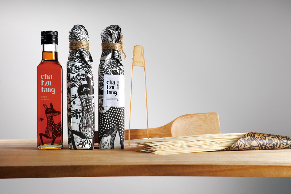
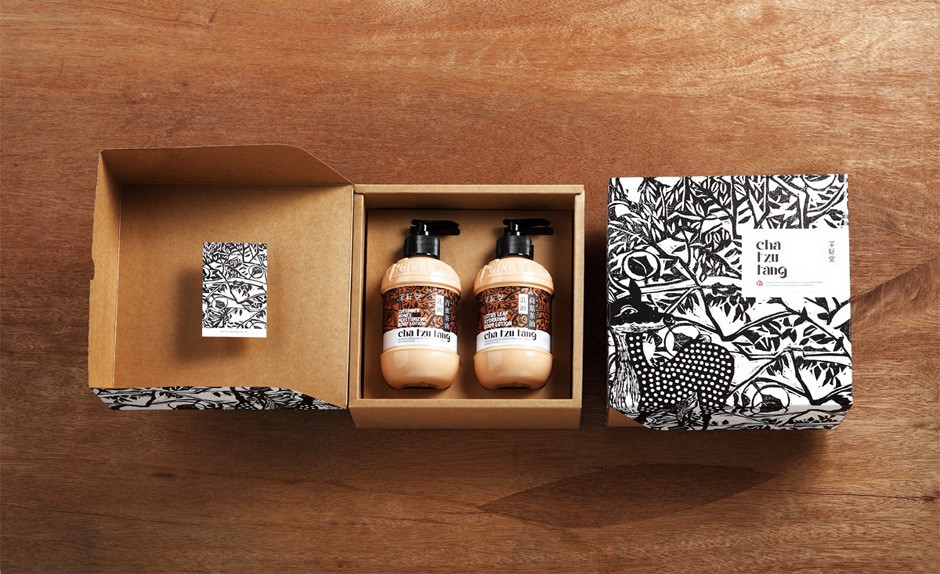
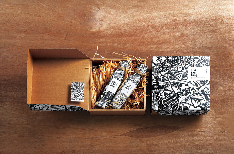
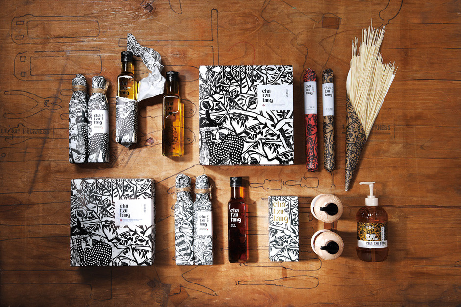
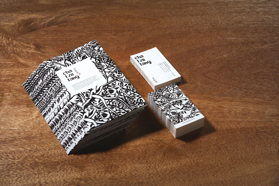
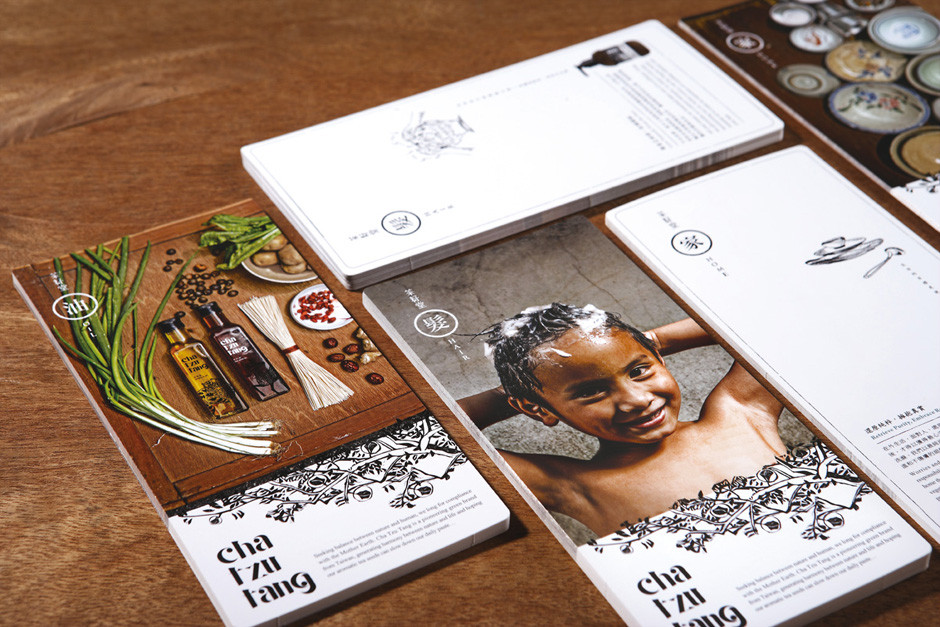
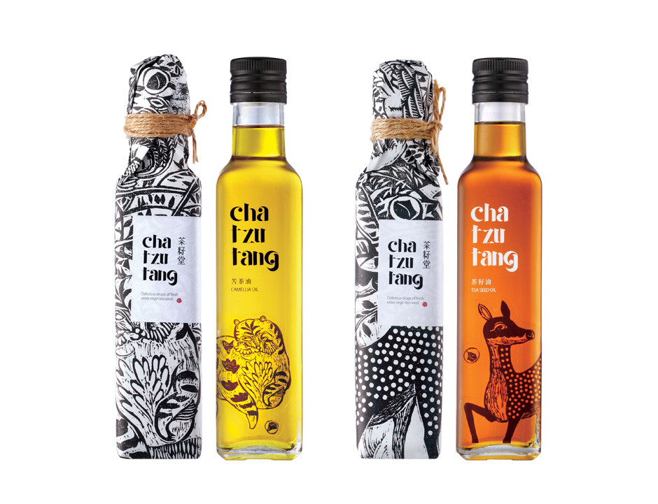
追求天然與人文間的和諧,來自台灣在地的「茶籽堂」,讓大自然與生活交融調和,冀望茶籽的馥郁芬芳能緩解日常的緊湊步伐…包裝概念以台灣年輕版畫藝術家SHIU, RUEI JR的筆觸,描繪出在地樸質的圖像張力,枝葉扶疏、點綴著一顆顆醇潤茶籽與神獸的生動參與,象徵大自然的生生不息,傳統單色版畫形式與複合媒材的運用,體現產品手作溫度感,新舊思維揉合碰撞「由內而外,以最自然的方式生活」。
From Inside to outside, live a natural lifestyle.
Seeking a balance between nature and humans, we long for compliance with Mother Earth. Cha Tzu Tang is a pioneering green brand from Taiwan, generating harmony between nature and life and hoping our aromatic tea seeds can slow down our daily paste. The concept of the package comes from the brush of young Taiwanese print artist, Rei JR Shiu. Shiu portrays the local and plain image with tension, whereas the branches are profusely covered with leaves, highlighting the tea seeds with the active involvement of beasts to symbolize endless nature. The use of traditional monochrome prints and composite materials present the handmade texture of products, an infusion and a collision of the modern and traditional thinking “From Inside to outside, live a natural lifestyle”.