Branding Identity Design & Packaging Design
Executive Creative Director
Ying-Fa Wang
Executive Project Director
Hsiu-Ju Hsu
Art Director + Designer
Cih-Wan Wang
Shao-Chun Liao
Ting-Ju Lin
Project Planning
Chih-Chia Chang
Published on 12.03 2025
Branding Identity Design & Packaging Design
讓奢華滋養成為日常美學
「御燕軒」堅持從燕窩養成到製成都層層把關,致力將珍貴營養以最安心的形式呈現。品牌核心在於打破燕窩僅作為奢侈品的既定印象,轉化為融入日常的營養選擇。除了推出傳統的高端禮盒,也積極推廣客製化鮮燉服務,讓傳統送禮的概念重新回歸到日常生活滋養。
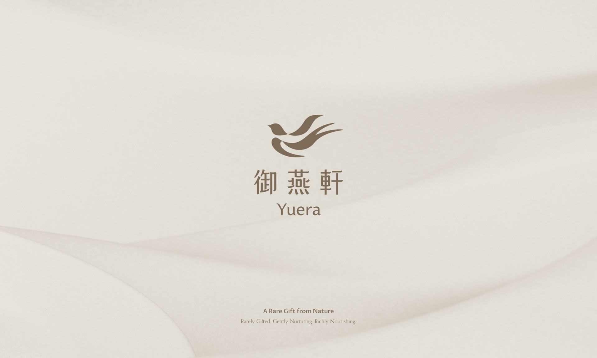
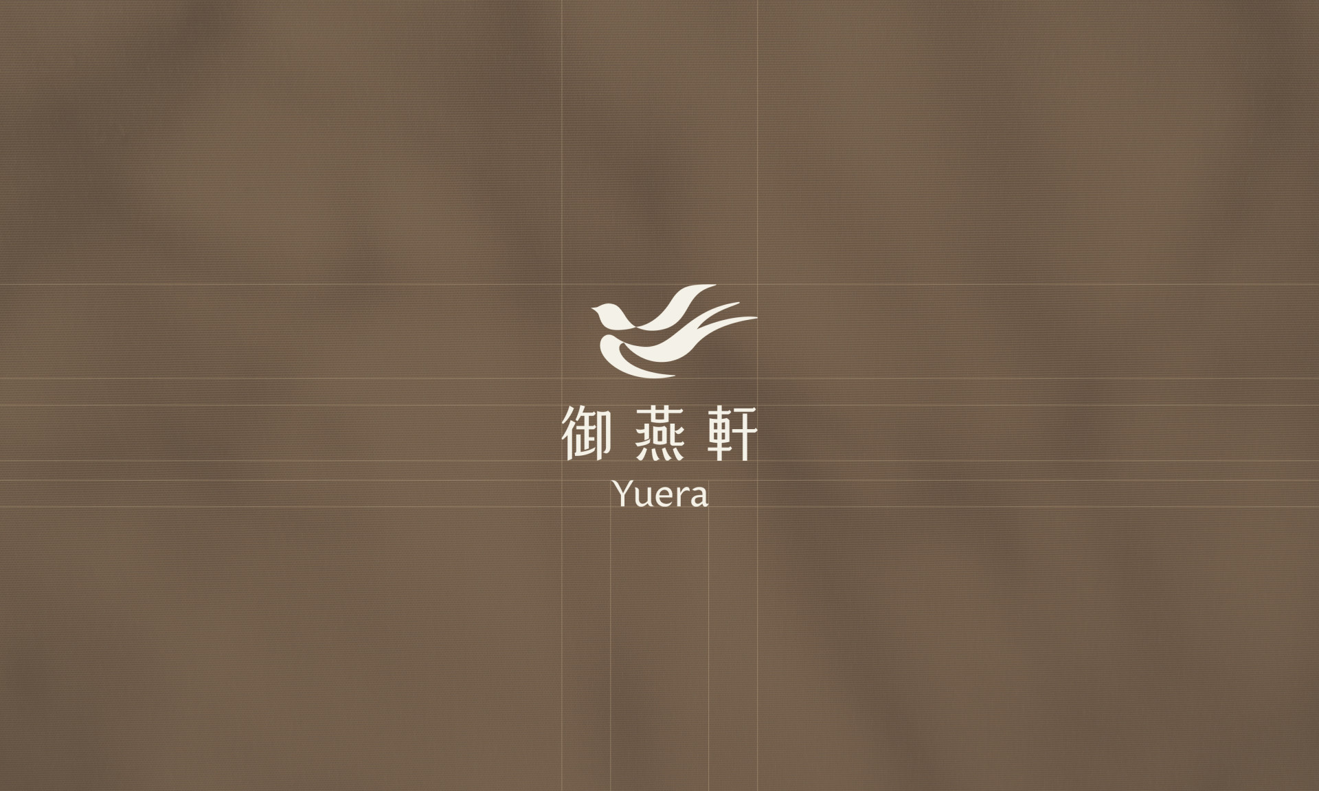
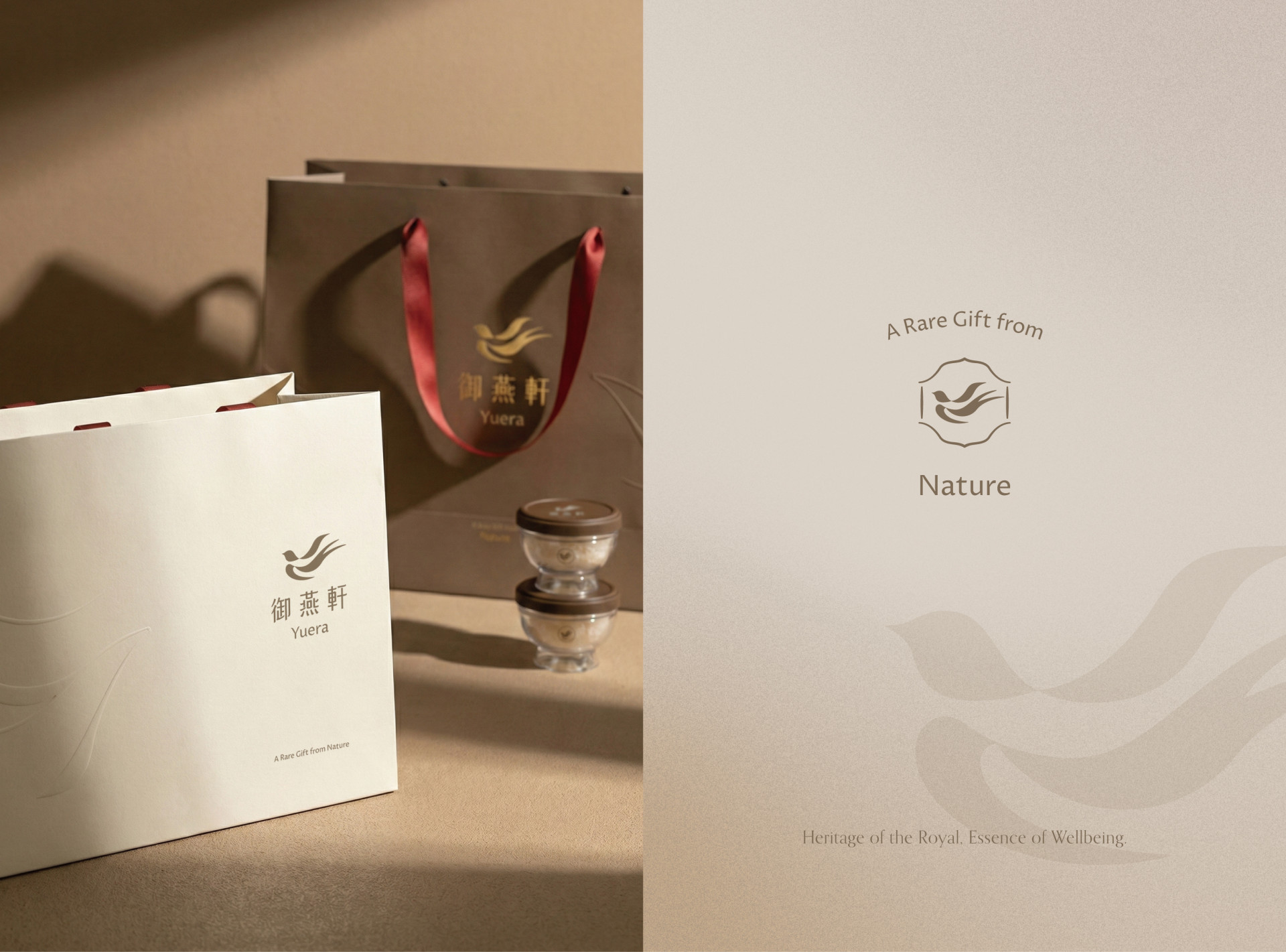
|識別設計| 識別設計以 #自然溫潤 #優雅細膩 #日常陪伴 為核心,運用交錯簡約的色塊,抽象地勾勒出燕子翱翔的姿態與軌跡。線條同時演繹了盛裝燕窩的器皿意象,在俐落與柔和的交織間,精準捕捉品牌安心細膩的初心。英文命名「YuEra」結合了「御」的音譯與「New Era(新時代)」之意,象徵燕窩常伴的新生活方式。
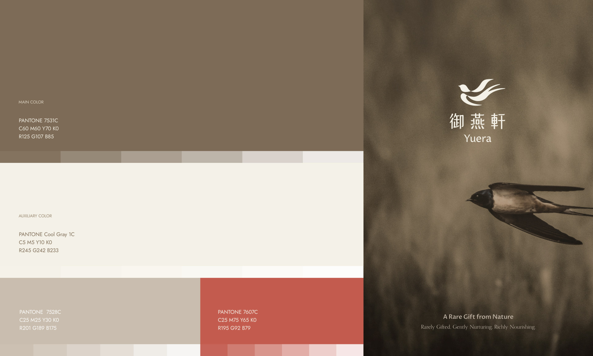
|色彩計畫| 以純淨、溫潤且代表燕巢的褐色作為主色調,搭配柔白、米棕與赭紅為輔色。色彩配置上展現出精緻呵護的觸感,整體營造出日常典雅的視覺氛圍。
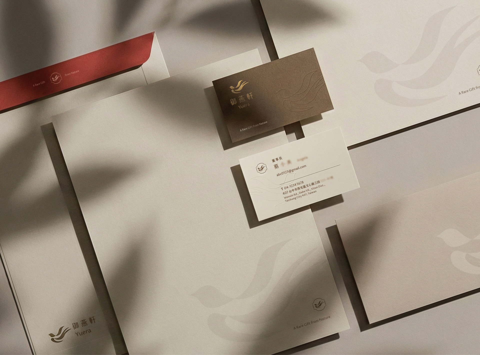
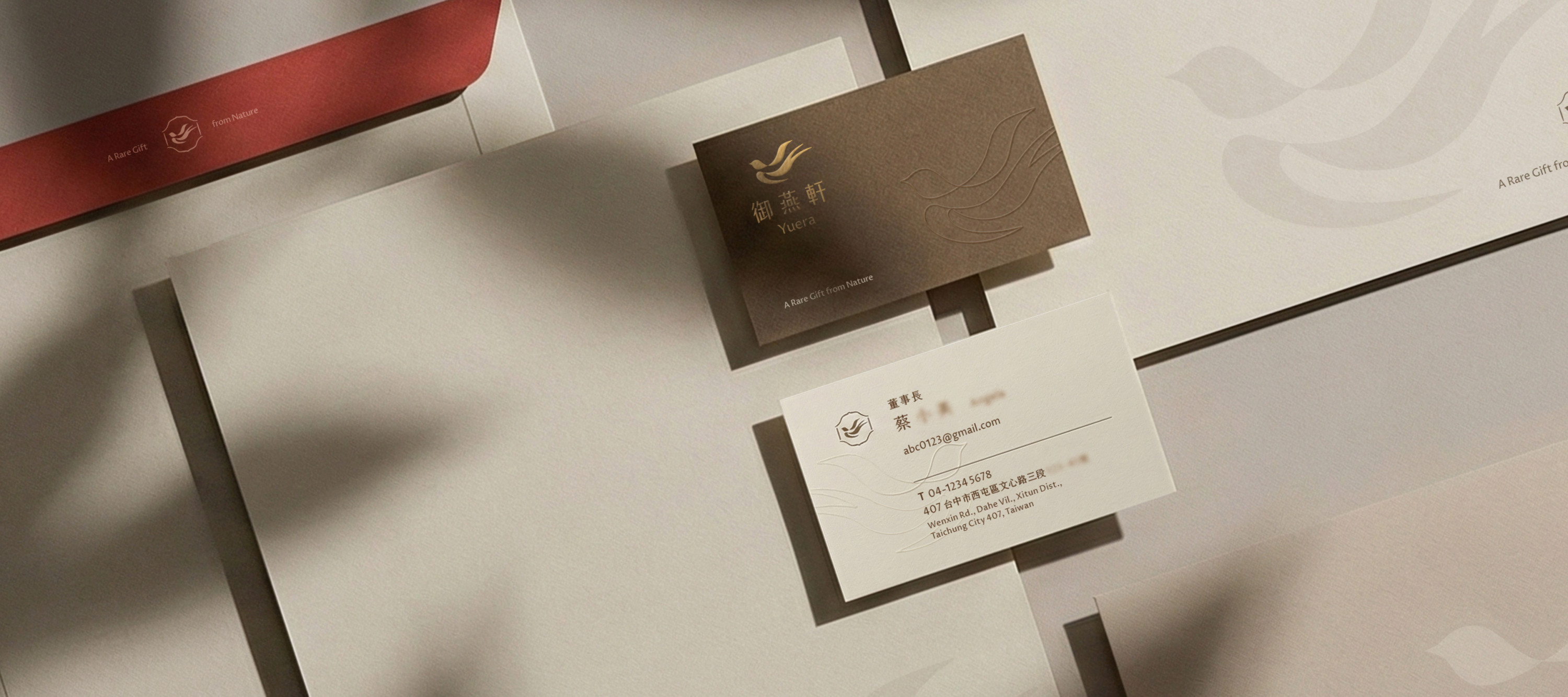
|包裝設計| 包裝延續品牌的溫潤調性,材質選用手工濕裱盒搭配字體燙金工藝,並以柔軟的緞帶作為提把設計,在細節處展現柔和而沉穩的品牌氣質。
運用設計的巧思,將御燕軒每一次細心守護的心意融入日常,那份安心與從容,成了最珍貴的生活日常。
YuEra: Redefining Luxury Nourishment as Daily Aesthetics
YuEra oversees every stage of production from the nesting process to the final preparation dedicated to presenting precious nourishment in its most secure form. The brand’s core mission is to deconstruct the conventional image of bird’s nest as a purely luxury item, transforming it into a seamless choice for daily nutritional wellness. Beyond traditional high-end gift sets, the brand actively promotes customized fresh-stewed services, reintroducing the concept of gifting into the rhythm of daily nourishment.
|Visual Identity Design|
The identity design revolves around the core pillars of Natural Warmth, Elegant Finesse, and Daily Companionship. Utilizing minimalist, overlapping blocks of color, the logo abstractly traces the soaring flight and trajectory of a swallow. These lines simultaneously evoke the imagery of the vessel holding the bird’s nest, capturing the brand’s meticulous sincerity through a blend of sharp and soft strokes. The English name, "YuEra," combines the transliteration of "御" (Imperial/Yu) with the concept of a "New Era," symbolizing a new lifestyle where bird’s nest becomes a constant companion.
|Color Strategy|
The palette is centered on a pure, warm brown that represents the bird's nest, supported by soft white, beige-brown, and ochre red. This configuration evokes a sense of delicate care and creates a visually elegant atmosphere for daily living.
| Packaging Design|
Extending the brand’s warm tonality, the packaging features handcrafted wet-mounted boxes paired with delicate gold foil typography. A soft ribbon handle is incorporated into the design, showcasing a gentle yet steady brand temperament through subtle details.