
HerbChicken
Chicken Essence Packaging Design
Executive Creative Director
Ying-Fa Wang
Executive Project Director
Hsiu-Ju Hsu
Art Director + Designer
Cih-Wan Wang | Shiang-Yin Su
Project Planning|Yen-Chi Chang
Typeface
森澤文鼎字體
Published on 2026/07/23/
Project Start Date 2025/08/01
HerbChicken
Chicken Essence Packaging Design
#香草科學‧極致鮮甜
HerbPork香草豬以香草入飼,去腥提鮮,讓肉質甘甜自然浮現。飼養過程定期為動物健檢,製程全程低溫保鮮,從源頭到餐桌,堅持「安心健康的美味」。
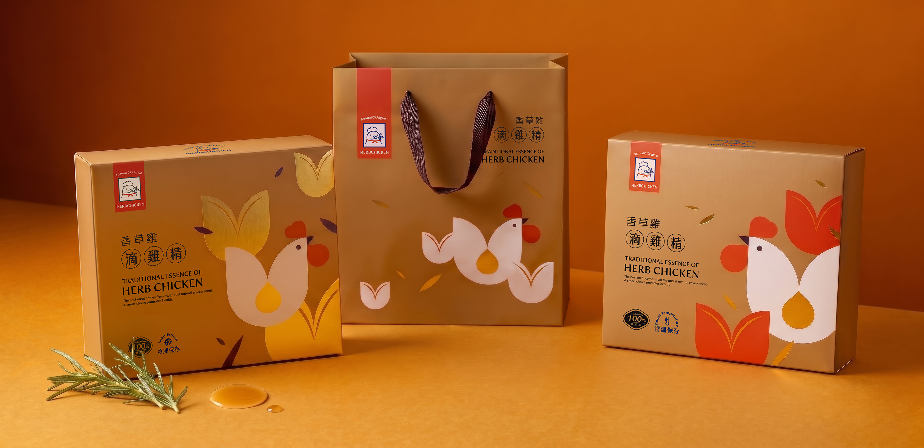
香草豬亦推出支線品牌 #香草雞,承襲同樣理念,在LOGO設計上以同樣的概念呈現,美可特這次則攜手打造#香草雞 滴雞精的包裝設計。
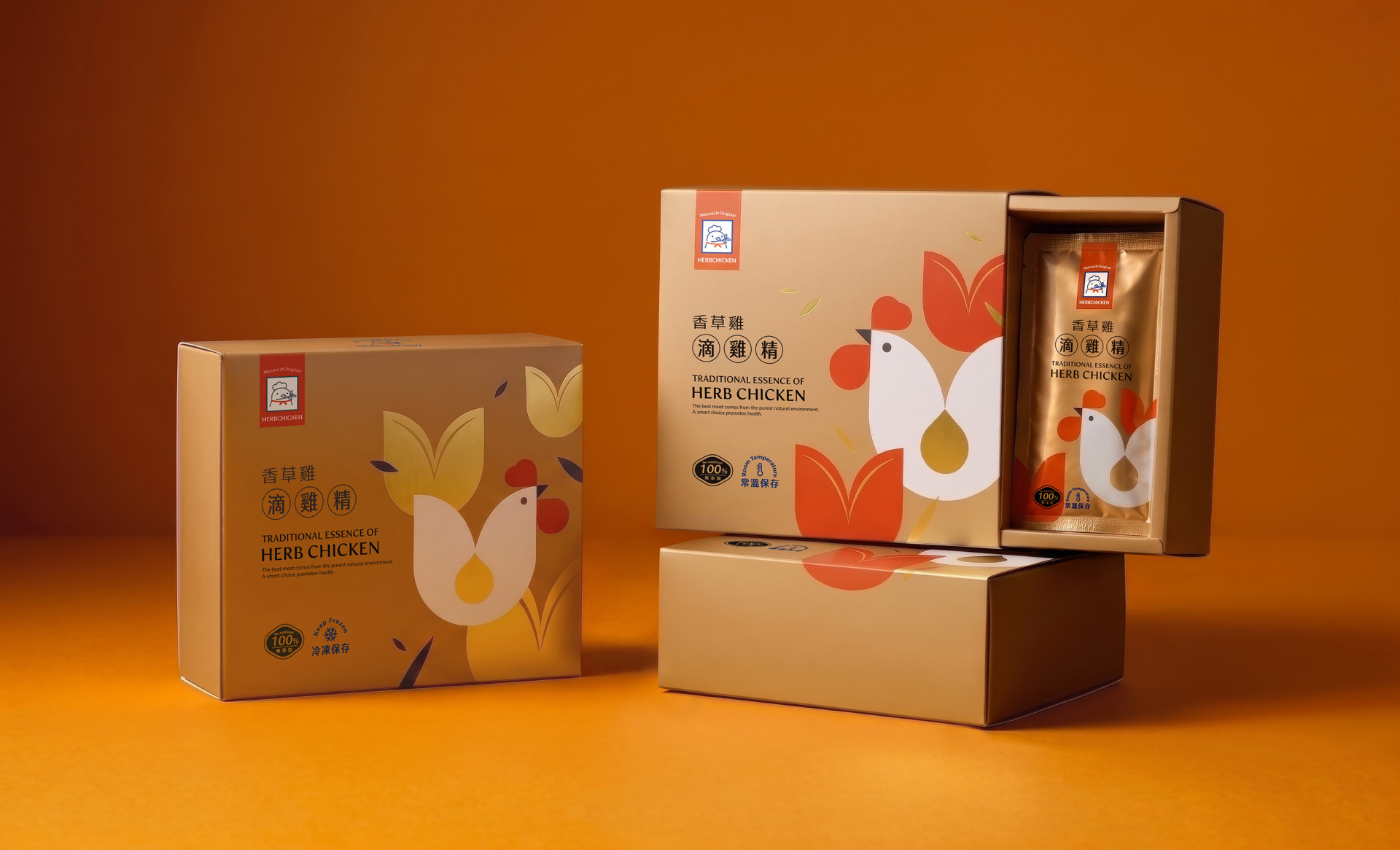
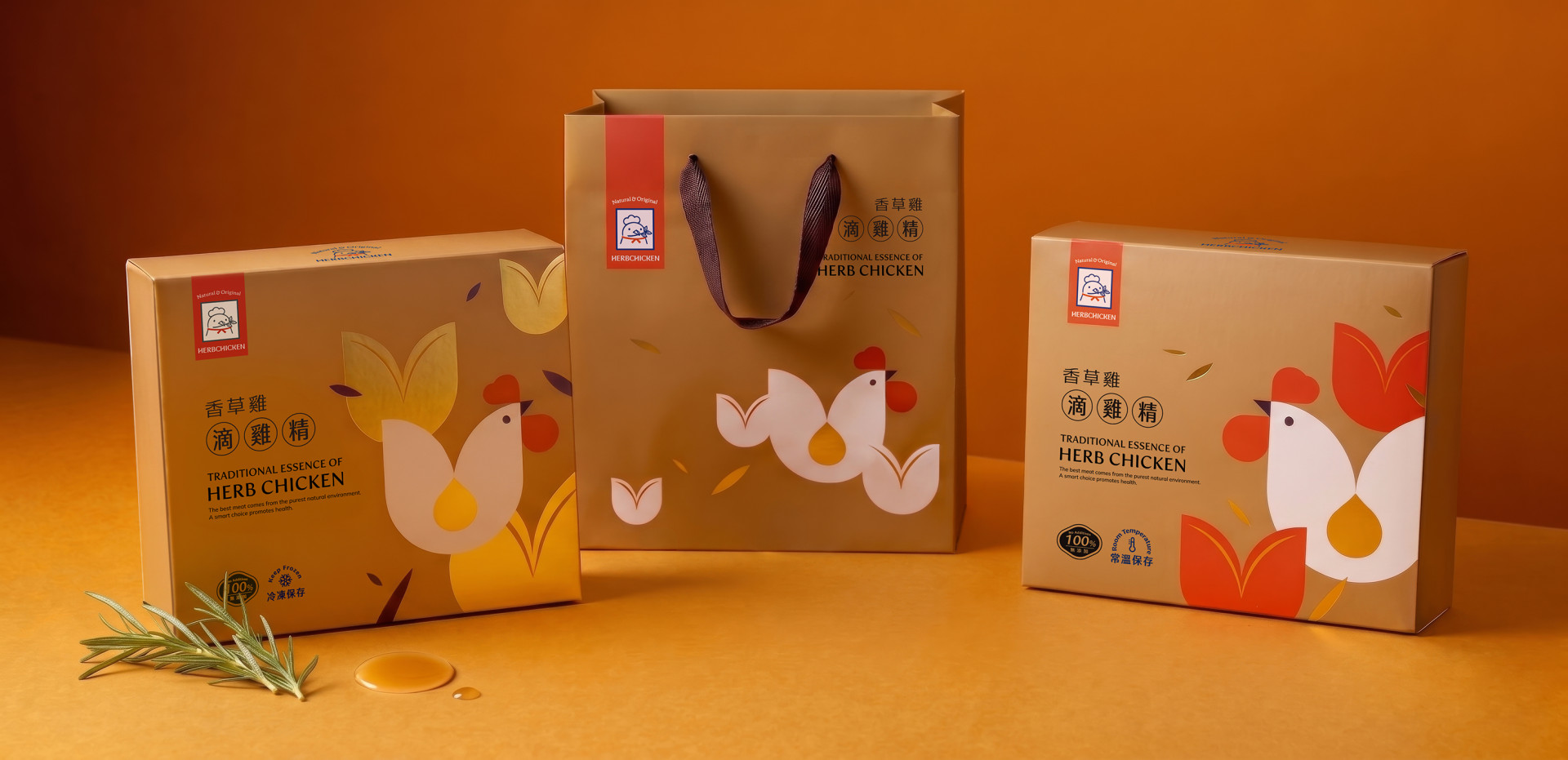
包裝色彩以大量金色為基底,強調滴雞精的金黃色澤及滴滴精粹,並以溫潤的幾何圖形展現香草雞的輪廓,並以品牌主要色調紅色及藍色,象徵著品牌溫暖飼育、科學提煉的精神。
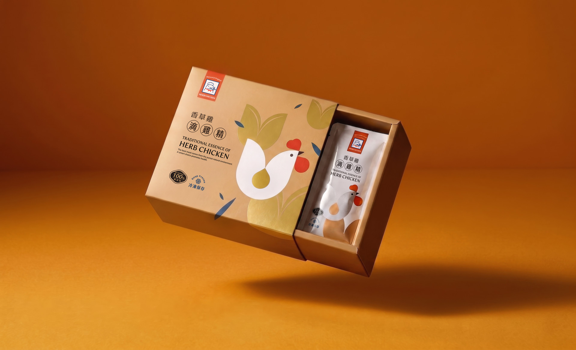
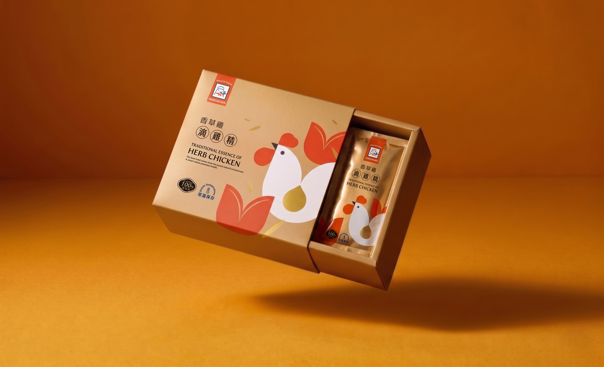
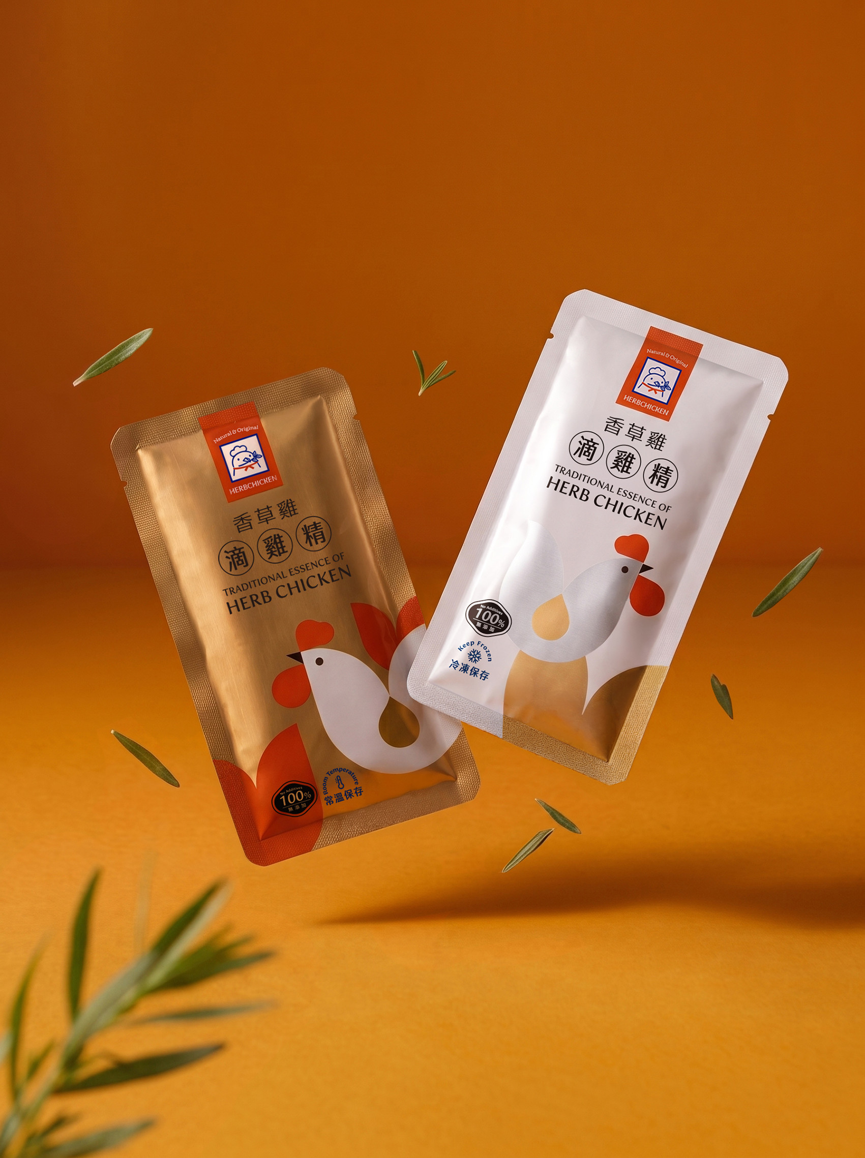
系列包裝設計則以不同的保存方式區別,常溫版以金色為主色調,呼應長效保存的沉穩質感,冷凍版則以白色為底,搭配局部金黃漸層,呈現清爽、純淨的視覺印象,凸顯冷凍鎖鮮的清新感。
兩者皆保留品牌識別色,僅透過底色配置輕鬆區隔出「常溫」與「冷凍」兩種產品差異,並保有系列感。
HerbPork香草豬堅持每一處細節的最高標準,用心飼養、科學提煉,將高品質產品運用設計語彙傳遞安心好選擇的資訊。
#Herbal Science, Supreme Freshness and Sweetness
HerbPork raises its pigs with herbs infused into their feed, naturally eliminating any unwanted odor while drawing out the meat's inherent sweetness. Regular health checks are conducted throughout the rearing process, and low-temperature preservation is maintained at every stage of production. From source to table, the commitment to "safe, healthy, and delicious" never wavers.
HerbPork has also launched a sub-brand, #HerbChicken, built on the same philosophy and expressed through a consistent logo design language. Victor Design joined hands with the brand to create the packaging design for the #HerbChicken Dripped Chicken Essence.
The packaging is anchored in an abundant use of gold, emphasizing the rich golden color of the essence and every precious drop within. Warm geometric forms define the silhouette of the herb-raised chicken, while the brand's primary colors, red and blue, speak to the spirit of nurturing care and scientific precision. The series is differentiated by preservation method: the ambient version uses gold as its primary tone, evoking the composed quality of long-shelf-life storage, while the frozen version takes white as its base, paired with selective golden gradients for a clean, pure visual impression that highlights the freshness locked in through freezing.
Both versions retain the brand identity colors, with the base color configuration alone serving as a light and intuitive distinction between the ambient and frozen product lines, while maintaining a cohesive series feel.
HerbPork holds every detail to the highest standard: thoughtful rearing, scientific refinement, and a design language that communicates quality and confidence in every choice made for the consumer.
 View more projects
 Next post


