
Rivsea
Infant Rice Cereal
Packaging Design and Age-Stage System Planning
Executive Creative Director
Ying-Fa Wang
Executive Project Director
Hsiu-Ju Hsu
Art Director + Designer
Cih-Wan Wang |Chia-Ling Tseng
Project Planning
Yen-Chi Chang
Published on 2026/11/13
Project Start Date 2023/5/8
Rivsea
Infant Rice Cereal
Packaging Design and Age-Stage System Planning
#有機稻鴨原生米粉 🦆
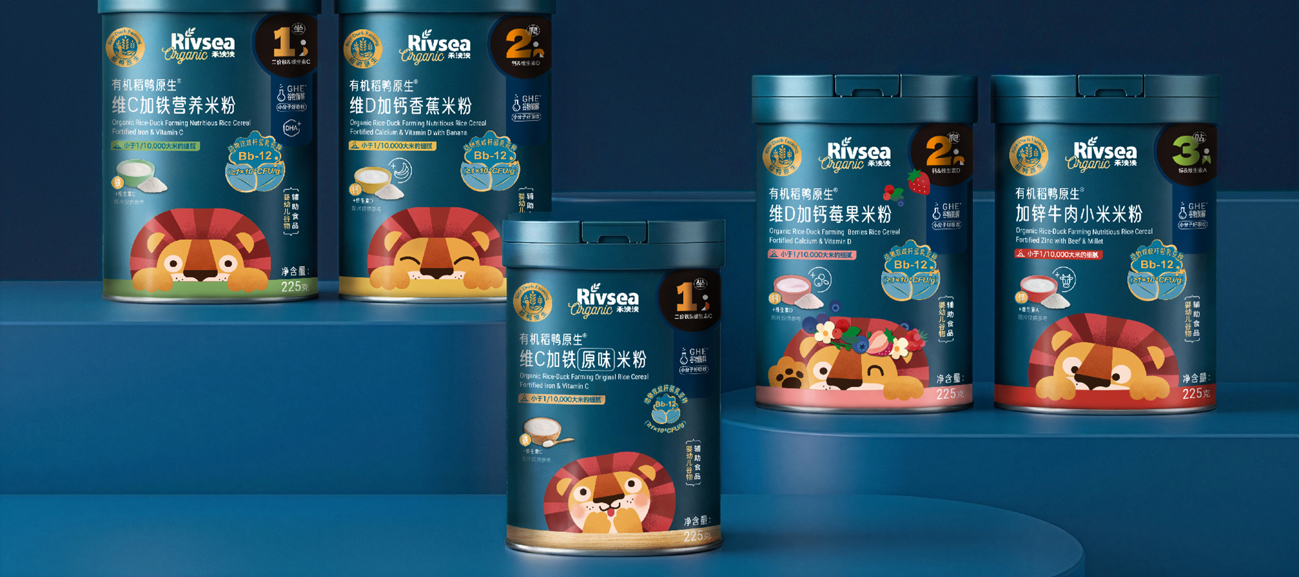
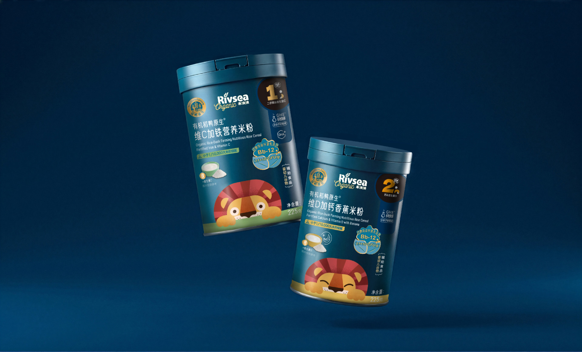
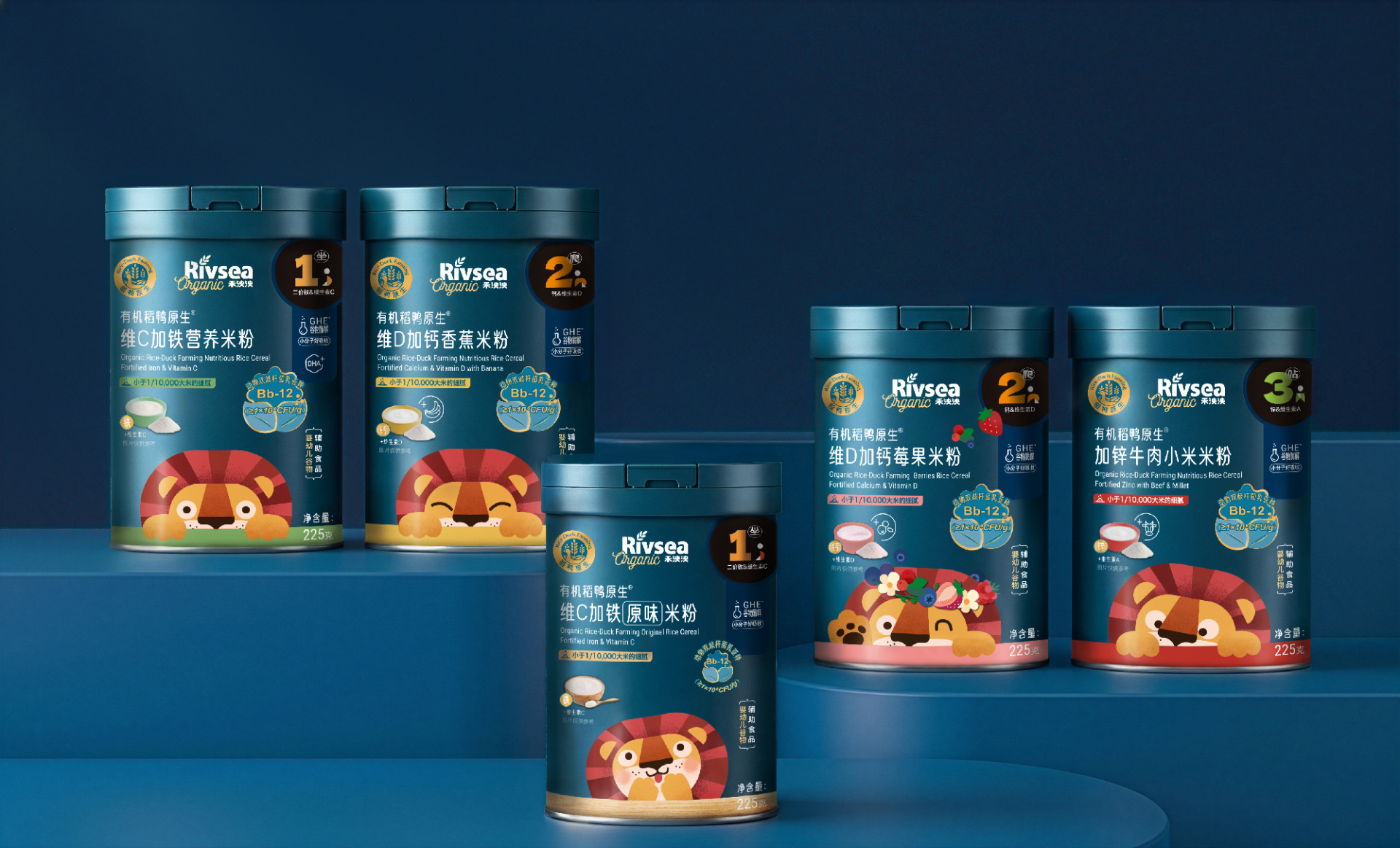
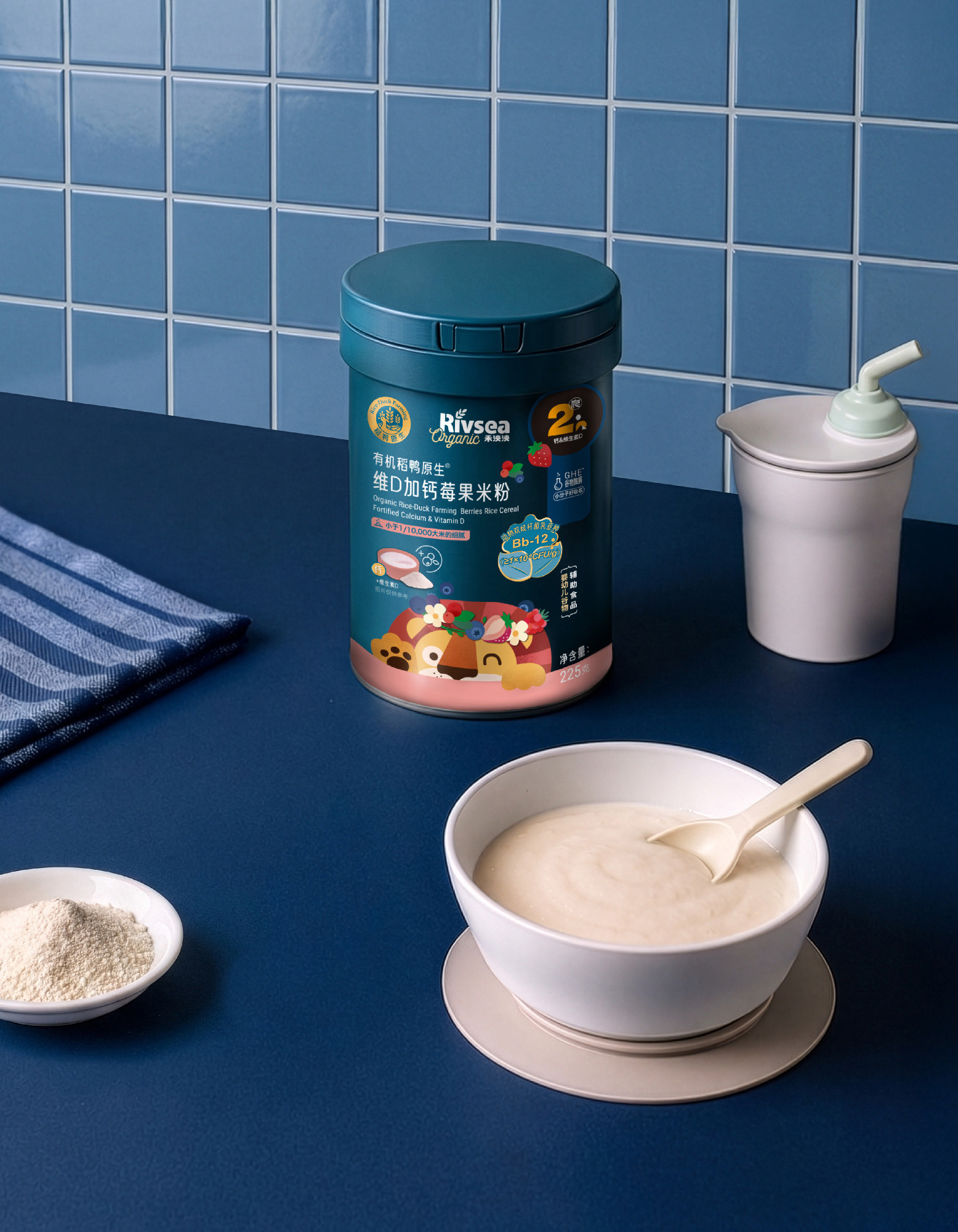
❰ 系列包裝規劃 ❱禾泱泱「有機稻鴨原生米粉系列」嚴選天然多元穀物,專為嬰幼兒打造純淨安心的副食品。視覺設計延續品牌經典標準色淨水藍,並依據不同月齡階段規劃專屬標示,建立直覺且清晰的分齡識別。包裝主視覺也同樣以活潑的泱泱獅為主,透過寶寶初嚐米粉、好奇探索世界與新滋味的可愛模樣為靈感,讓探頭而出的泱泱獅以不同表情或元素展現風味區別,不僅充滿童趣,也更一目瞭然。
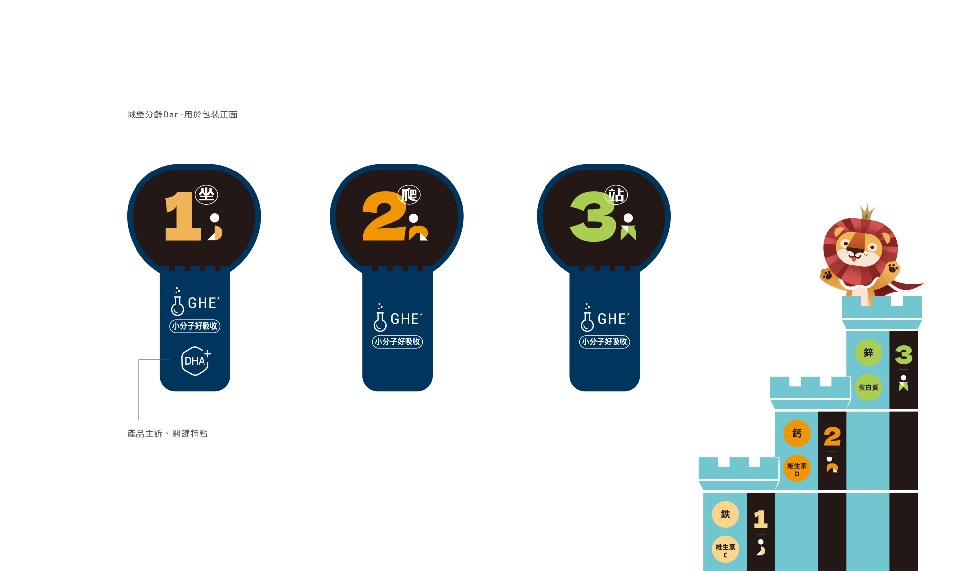
❰ 分齡系統設計❱分齡系統以品牌 IP 「泱泱獅」象徵萬獸之王強壯而穩固的守護形象,將成長階段化作三座漸進式的城堡,從「1坐」、「2爬」到「3站」,對應寶寶各階段的營養科學需求,讓資訊清晰易懂,更強化品牌對品質精準細膩且堅實的精神。
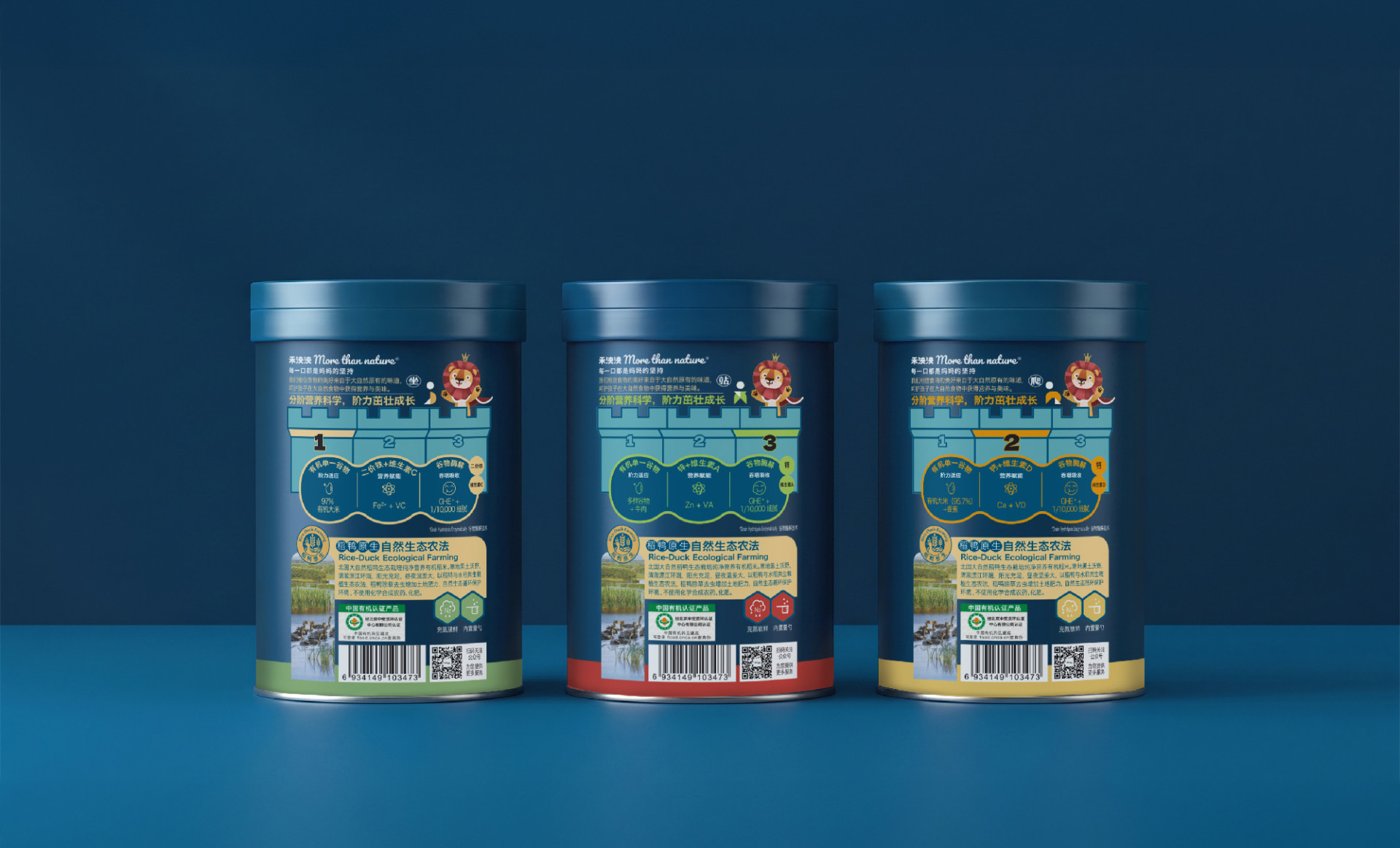
產品資訊採用簡潔的線性 Icon 呈現,並結合金色外框強化功能性標籤,交織出兼具專業信任感與親和童趣的品牌形象。透過圖文並茂的資訊層級排版,精準傳遞產品特點,展現對新生命的呵護、大自然的恩賜,以及禾泱泱對品質的嚴格堅持。
# Organic Rice-Duck Heirloom Rice Cereal 🦆
❰ Series Packaging Planning ❱ RIVSEA’s "Organic Rice-Duck Heirloom Rice Cereal Series" selects natural, diverse grains to create pure and safe complementary foods tailored for infants and toddlers. The visual design carries forward the brand’s signature Pure Water Blue, incorporating dedicated indicators tailored to different age stages to establish an intuitive and clear age-grading identification. The key visual continues to feature the lively brand mascot, Yangyang Lion. Inspired by the adorable moments of babies tasting rice cereal for the first time and curiously exploring the world and new flavors, the peeking Yangyang Lion showcases different expressions and elements to distinguish flavors—making the packaging both playful and easy to recognize at a glance.
❰ Age-Stage System Design ❱ The age-stage system centers on the brand IP, "Yangyang Lion," symbolizing the strong and steadfast protective image of the king of beasts. Developmental milestones are transformed into three progressive castles—from "Stage 1: Sitting," "Stage 2: Crawling," to "Stage 3: Standing"—corresponding to a baby’s scientific nutritional needs at each phase. This makes the information clear and accessible while reinforcing the brand’s precise, meticulous, and solid commitment to quality.
Product information is presented using clean linear icons paired with gold borders to accentuate functional labels, weaving together a brand image that balances professional trustworthiness with approachable playfulness. Through well-illustrated, hierarchical typography and layout, product features are accurately communicated, reflecting tender care for new life, the bounty of nature, and RIVSEA’s uncompromising dedication to quality.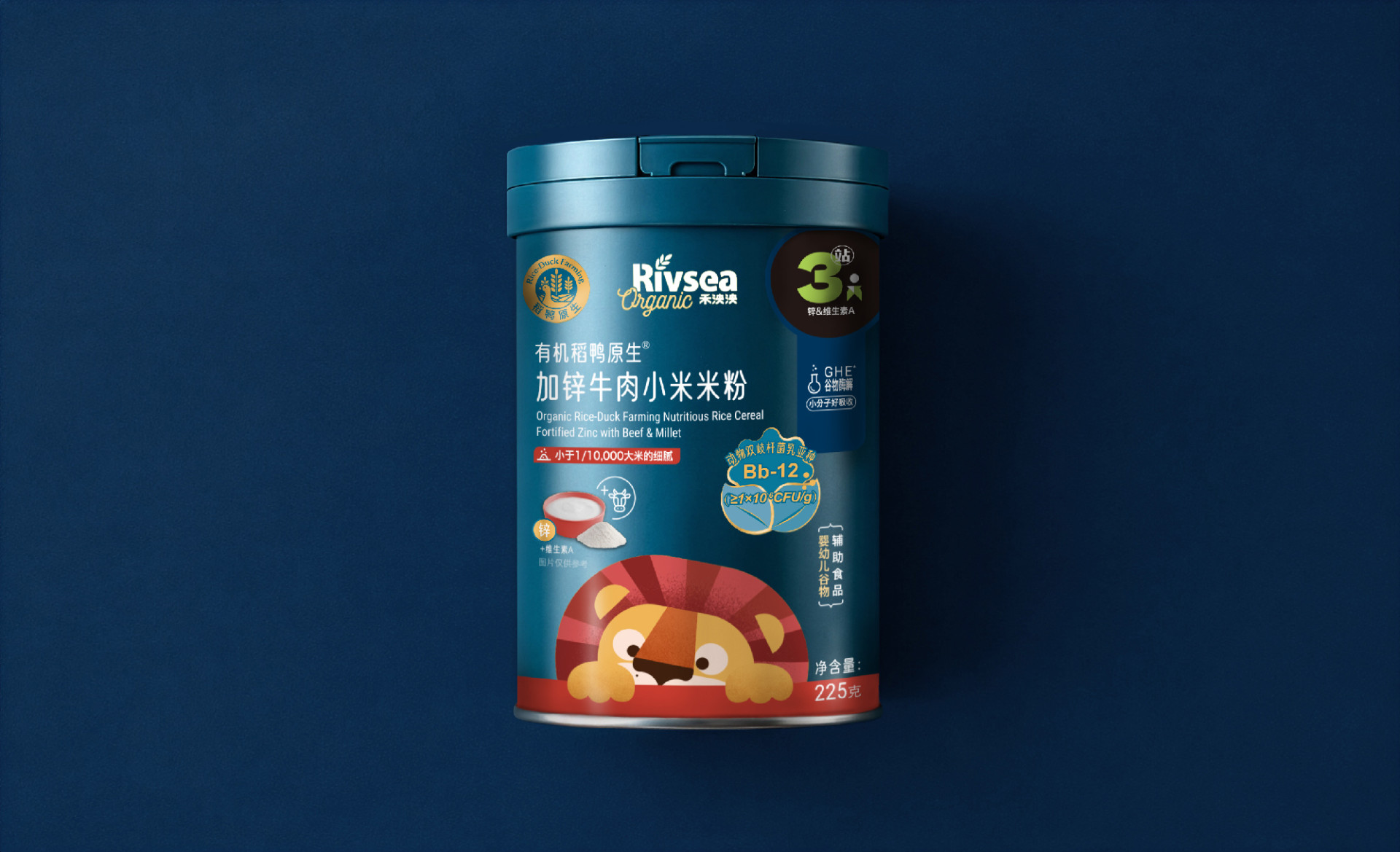
 View more projects
 Next post


